tile
posts displayed by tag
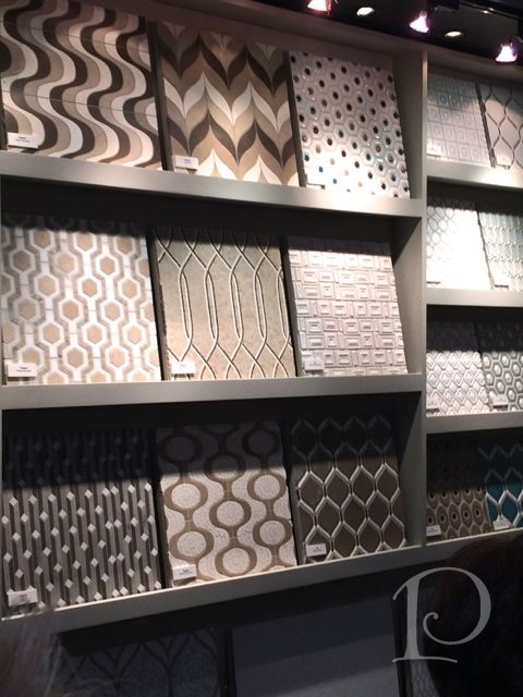
BlogTour Vegas: The Wonderful World of Walker Zanger
Feb 18 2015 ·0With a proud tradition rooted in the ancient quarries of Europe and spanning to the present day Central Mexican Highlands where craftsmen finish terra cotta tile by hand, Walker Zanger is one of the world’s most respected luxury stone and tile companies. Inspired by architecture, art, fashion and nature, Walker Zanger offers their clients prized marble and stone from quarries throughout the world, each individually selected and evaluated by their experienced stone masters.
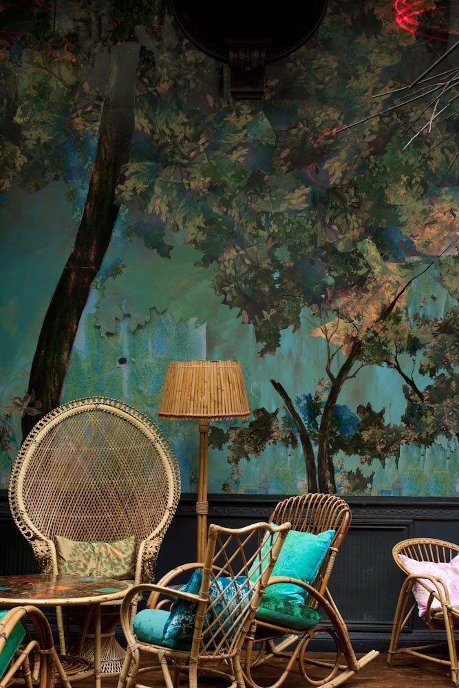
Posh Pinterest Board of the Week: Interior Design: Ceiling, Floor & Wall
Nov 04 2013 ·0This week’s Posh Pinterest board caught my eye with all of its fabulous sparkle, chic, and unique designs. Take a peek at the gorgeous Posh Pinterest board of the week Interior Design: Ceiling, Floor & Wall by Hansol Kim. Here are a few of my favorite pins…
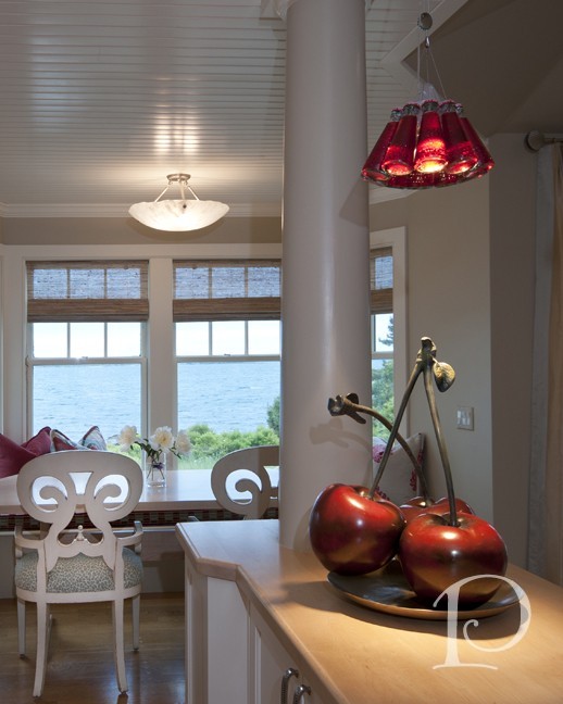
Diary of an Interior Designer: Cape Cod Seaside Home, Kitchen and Powder Room
May 29 2013 ·0It’s finally time to wrap up this huge project!
Like the family room, the kitchen is a gathering place for families. You may be curious about the Kitchen in this retreat home: how does it accommodate the large family, the guests and all the cooks? In this case, very well indeed. The existing footprint for this space was perfect, open to the Living Room and outfitted with updated cabinetry. With no major construction necessary, I was able to concentrate my design for the space on the cosmetic changes that allow the Kitchen to work in harmony with the rest of the home and the views beyond. That meant new tile, new light fixtures, and paint for nearly every surface. We also created a spacious eating nook in a space that was undersized for the proportions of the home…
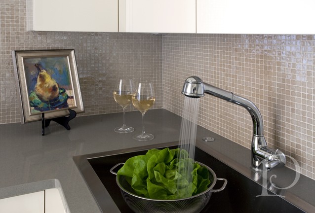
The Teeny, Tiny Kitchen in Boston’s Back Bay
Apr 23 2013 ·3As an interior designer, some of my most challenging projects have been jewel box size, most especially kitchens! Why so challenging? Because in a 10 foot space I have to place a full size stove and vent, a refrigerator, a dishwasher, a compactor and a microwave. Did I mention a sink and cabinets? And it has to be posh and inviting. This is the best kind of challenge for me and my team. To create the kitchen I’m featuring today, I collaborated with the best: Venegas and Company. Donna and her team represent the best in cabinetry and know how to work within a 1/16” of an inch. They are awesome!
First, a few before photos to give you a sense of the space…

Down to the Wire: Teenage Domain Update
Aug 28 2012 ·0Our Teenage Domain project is humming right along but the deadline for completion is fast approaching. I promised the family (and myself) that we would be finished by the first day of school ~ which is next week! As with any construction project, we’ve had our share of hiccups: tile quantities that were 1 box short, the pocket door that would not accommodate the light fixtures because of the molly bolts (are they really named after a girl?? ), juggling schedules due to summer vacations. With all that, we are now in the homestretch with just a few days of work remaining. I truly believe my clients’ (bless them) patience will be beautifully rewarded with a stunning new space for their son.
Without further ado, let’s take a peek at some of the current progress.
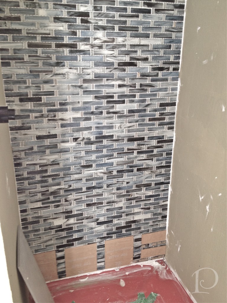
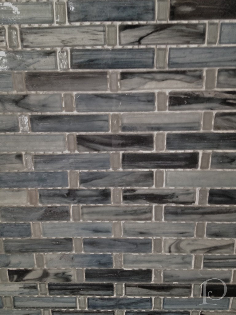
This is the focal wall in the bathroom ~ this tile is actually a mix of matte and polished finishes. In the light it is just lovely, creating the illusion of depth and movement.
Here is a close up shot of the tile. There are so many colors in this grey/blue palette, it really is glorious.
The floor is a grey porcelain tile in a generous 12″x 24″ size. The larger size actually visually expands this small space and creates interest.
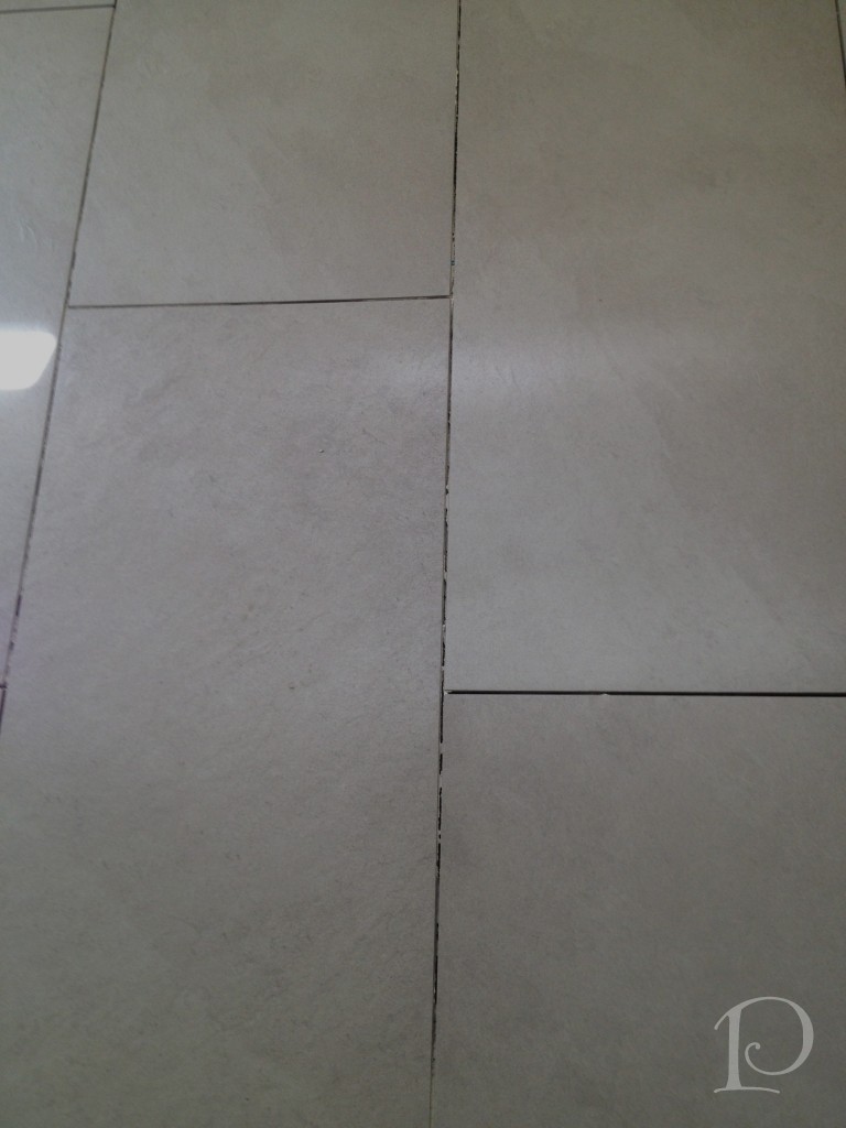 This same tile is going to be used on the side walls of the shower. The inside of the shower, including the focal wall, will be visible through the glass shower door providing a pleasant vista for the young man who will be inhabiting this space. The overall look will be sophisticated and masculine.
In addition to all of the fabulous tile in the space, we are using a trio of Benjamin Moore paint colors in the bathroom. The vanity color is Benjamin Moore Stonington Gray:
 The walls will be painted Benjamin Moore Wickham Gray:
 I love adding a subtle color on the ceiling, here we will be going with a 50% color concentration of Benjamin Moore Woodlawn Blue:
Finishing off the space will be Benjamin Moore Super White trim.
I am so anxious to see everything come together, it won’t be long now!
Speaking of anxiously awaiting something, next week at this time I’ll be packing my bags for New York and the events of Brizo Fashion Week with Jason Wu ~ can’t wait!
“People often say that motivation doesn’t last. Well, neither does bathing~that’s why we recommend it daily.”
~Zig Ziglar
xo,
Pamela
To receive new blog posts in your inbox, be sure to subscribe via email! Just click on the link in the right sidebar.
Contact me about Pamela Copeman Design Group services.
To follow me on Pinterest, click here.
To follow Pamela Copeman Design Group on Facebook, click here.
To follow me on Twitter, click here
My Design Projects: Teen Bathroom
Jun 26 2012 ·0A transformation is in the works!
I am excited to share with you one of several new projects that I am currently working on. You are in for a treat because I am able to show you the progression of this project in real time, as I am working on it. I hope you enjoy being along for the design journey!
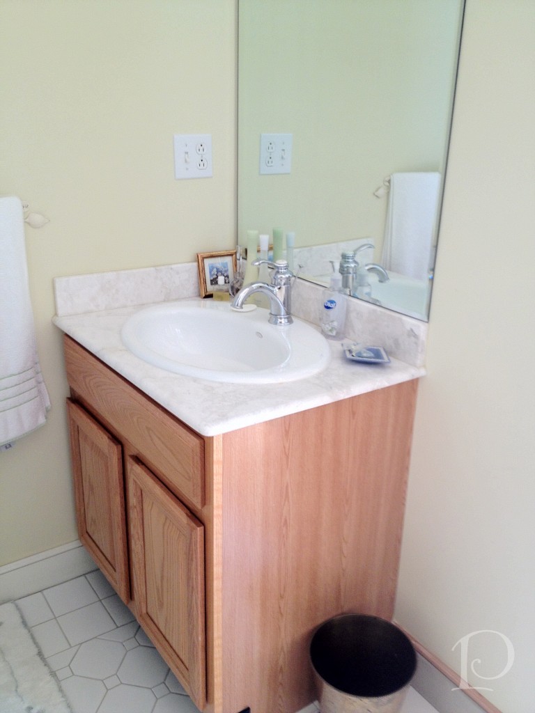
Prioritized as the one of first spaces to be transformed in a larger project, this en suite bathroom for a teenage boy is quite small and ready for an update.
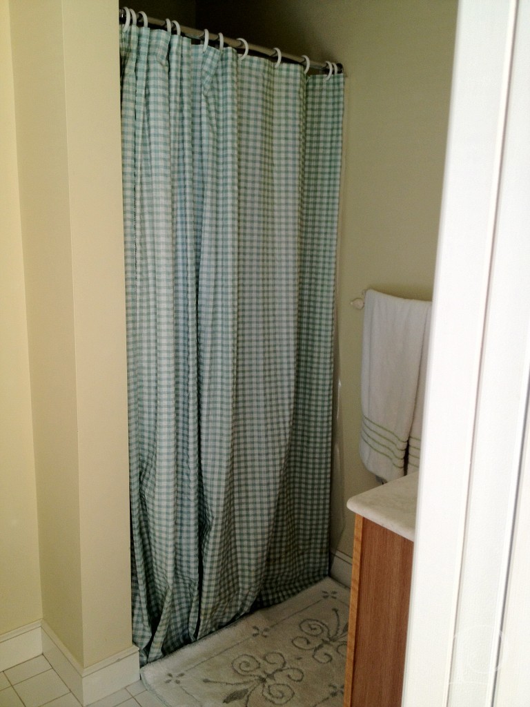
Here is the requisite “before” shot of the vanity in the existing bathroom:
 and the 1 piece shower:
While certainly functional, the space does not reflect the aesthetic of the teenage boy who lives here.
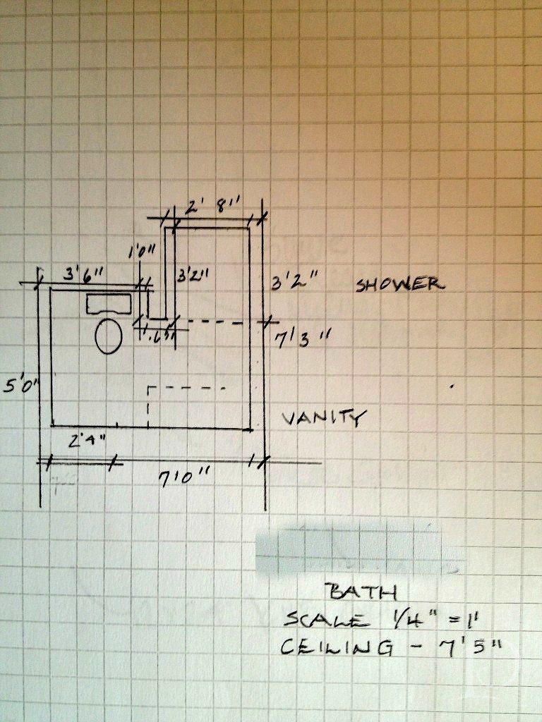
My first step was to draw up a floor plan, a must for planning the space and ordering materials.
While we knew this bathroom would need to coordinate with the adjoining bedroom, I was curious to see what ideas my young client had for the overall design. During our initial design meeting we discussed the function of the room (sleeping, studying, entertaining friends) and color preferences (red). I knew I was going to have a great time with this young man he likes the color red! After a bit more delving, he told me about some posters he collected last summer. The posters are sophisticated in shades of charcoal, reds and other vivid hues. What a great jumping off point for the design of our project! Every design has to have an inspiration and this young man’s poster collection is ours.
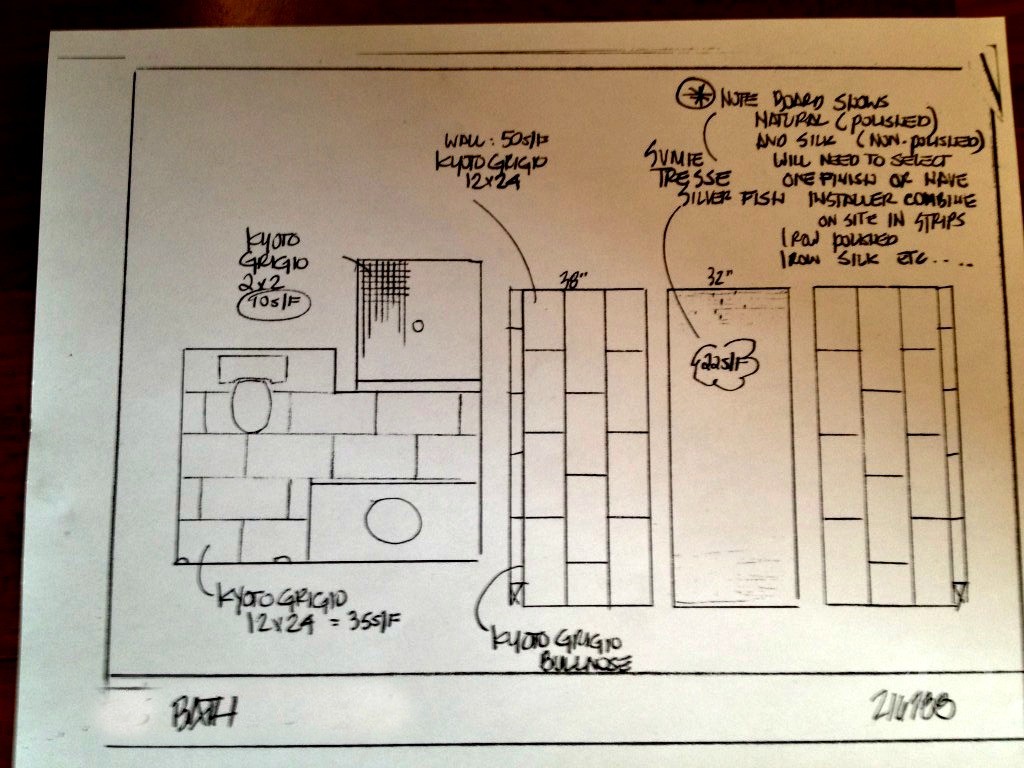
After our discussion, I wrote up my ideas and met with Christine at Tile Showcase at the Boston Design Center.
We found some wonderful tile selections and Christine sketched a quick plan:
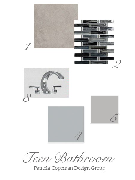
To make the plan come to life for you, I put together this mood board for the space:
Details:
1. Kyoto Grigio tile for the back wall
2. Sumi-e Tresse Silver Fish Natural glass mosaic tile for the side walls on the vertical and the floor ~ using the same tile on both surfaces will give the illusion of a larger space
3. Sigma Palermo faucet is one of the options for faucetry, I love the modern look of the polished chrome
Two of our options for wall color, both from Sherwin-Williams:
4. Monorail Silver
5. March Wind
Stay tuned to see progress, plus more on the bedroom design. I promise it is creative and amazing ~ and just wait until I show you the inspirational posters!
“Design is a constant challenge to balance comfort with luxe, the practical with the desirable”
~Donna Karan
xo,
Pamela
Contact me about Pamela Copeman Design Group services.
To follow me on Pinterest, click here.
To follow Pamela Copeman Design Group on Facebook, click here.
To follow me on Twitter, click here
