NYC
posts displayed by tag
Caught My Eye, Vol. 53
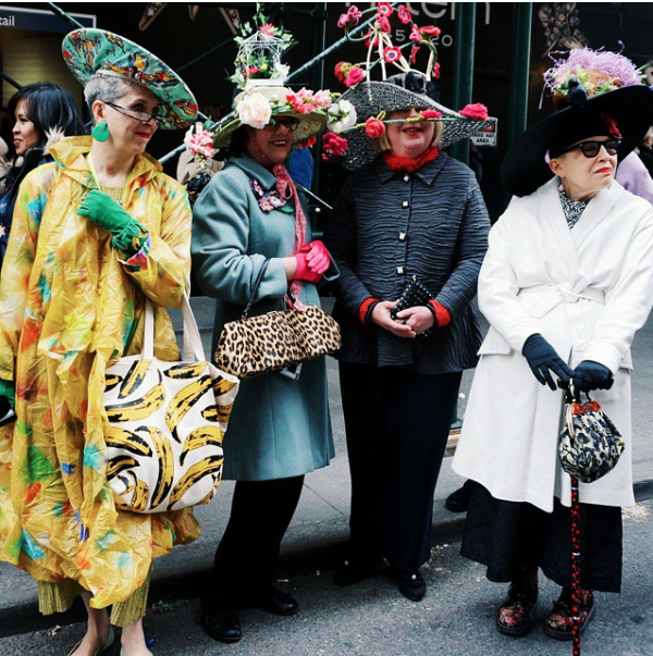
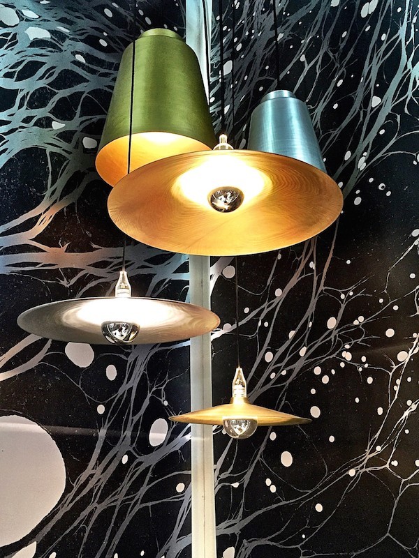
May 15 2015 ·0Still in recovery mode from Em’s wedding, but here are a few of the things that Caught My Eye this week…

Bergdorf Goodman Holiday Windows 2014
Dec 10 2014 ·0The Holiday Windows in New York City are one of my favorite traditions. Whether I view them online or am fortunate enough to see them in person, I am always in awe of the creativity, hard work, and planning that goes into bringing each window to life. The windows at Bergdorf Goodman are among my perennial favorites. This year Bergdorf’s has dedicated a window to each of a sampling of the Arts ~ Film, Literature, Painting, Theater and Dance among them. I’ll be visiting NYC the week after Christmas when I’m hoping to view several of the holiday displays, including these amazing windows. Until then, these photos from Racked NY will have to do…
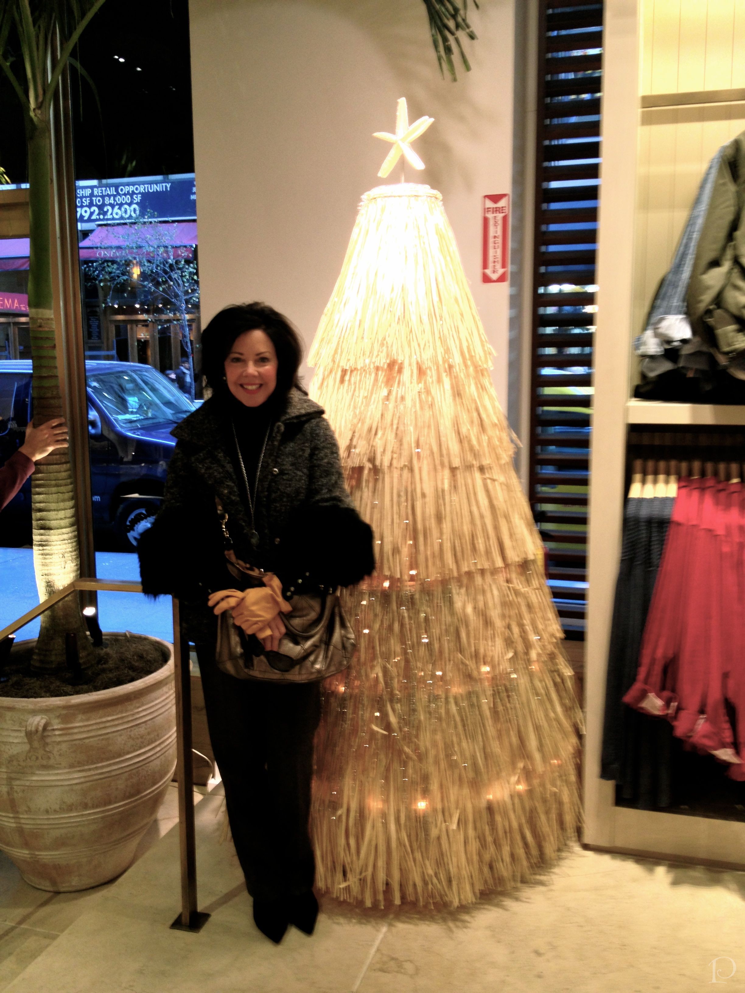
New York City Gets Ready for Christmas
Nov 26 2013 ·0“Start spreading the news,
I’m leaving today
I want to be a part of it,
New York, New York.”
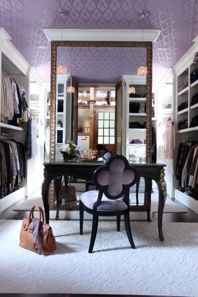
Posh Pinterest Board of the Week: Designate A Dressing Room
Oct 21 2013 ·1This week’s Posh Pinterest board is curated by interior designer Sarah Sarna. I met Sarah as part of my Blogger 19 trip to NYC last fall. Sarah happens to live in New York City where she is the founder of the lifestyle and design blog Live The Life You Dream About and, her latest endeavor, co-founder of interior design firm Franklin Eighth.
Sarah is incredibly beautiful with a wonderful smile framed by bright red lipstick with a personality to match. Bright and beautiful describes Sarah to a tee! Her Pinterest board are also bright and beautiful, with this week’s featured board being Sarah’s Designate A Dressing Room.

Pamela’s Posh Picks: Jason Wu at New York Fashion Week
Sep 13 2013 ·0Last fall I was thrilled to attend my very first (and hopefully not my last!) show at New York Fashion Week as part of the Blogger 19, courtesy of Brizo. If you’ve been following my blog you know that not only did we attend the runway show of designer Jason Wu, we also met & mingled with him at a post-show party. I was in heaven! Jason Wu is an incredible designer and such an interesting, creative person. I know because of my experience last year, I will always hold Jason Wu and his show at NYFW close to my heart. With another Fall Fashion Week in the books, I wanted to highlight my Posh Picks from the Jason Wu Spring 2014 Runway Show.

An Interior Designer’s View of The Yale Club, NYC
Jun 11 2013 ·2Recently I had the privilege of staying at the historic and exclusive Yale Club in New York City. Located just steps from Grand Central Station on Vanderbilt Avenue, this neo-classically designed building combines traditional elegance with contemporary amenities. Come take a tour of some of the public areas with me…

View from the Empire State Building
May 21 2013 ·2While I had to cancel my trip to BlogFest in New York City this week, I did happen to fit in a quick, fun trip to NYC last week. For the first time in all of my visits, it was a clear, beautiful day when we ventured to the top of the Empire State Building. The views from the observation deck were stunning…

Posh Pinterest Board of the Week: The City That Never Sleeps
May 20 2013 ·2This week BlogFest 2013 is taking place in NYC. I was planning to attend, but unfortunately I am unable to. However, that won’t stop me from thinking about all my wonderful friends who are there ~ girls, I’ll see you next time!
With BlogFest and NYC on my mind, it’s only natural that this week’s Posh Pinterest board features none other than New York City ~ my board: The City That Never Sleeps!
Here are a few of my favorite pins highlighting a few of my favorite things about this amazing city…
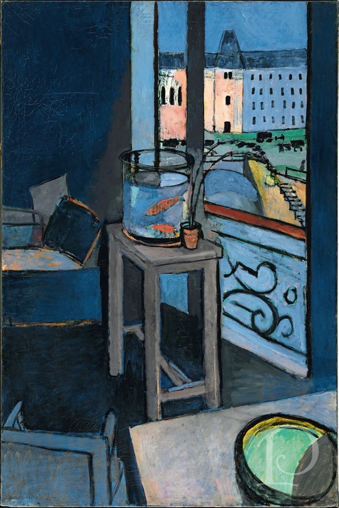
Matisse at the Met
Dec 19 2012 ·0While visiting NYC a couple of weeks ago I had the great pleasure of viewing the Matisse exhibit at the Metropolitan Museum during the member’s preview. The exhibit spanned his career and included paintings in pairs, trios and series. Matisse (1869-1954) was continually trying, as he put it, “to push further and deeper into true painting”. Along with my friend and fellow artist Page, we explored the exhibit, Matisse: In Search of True Painting.
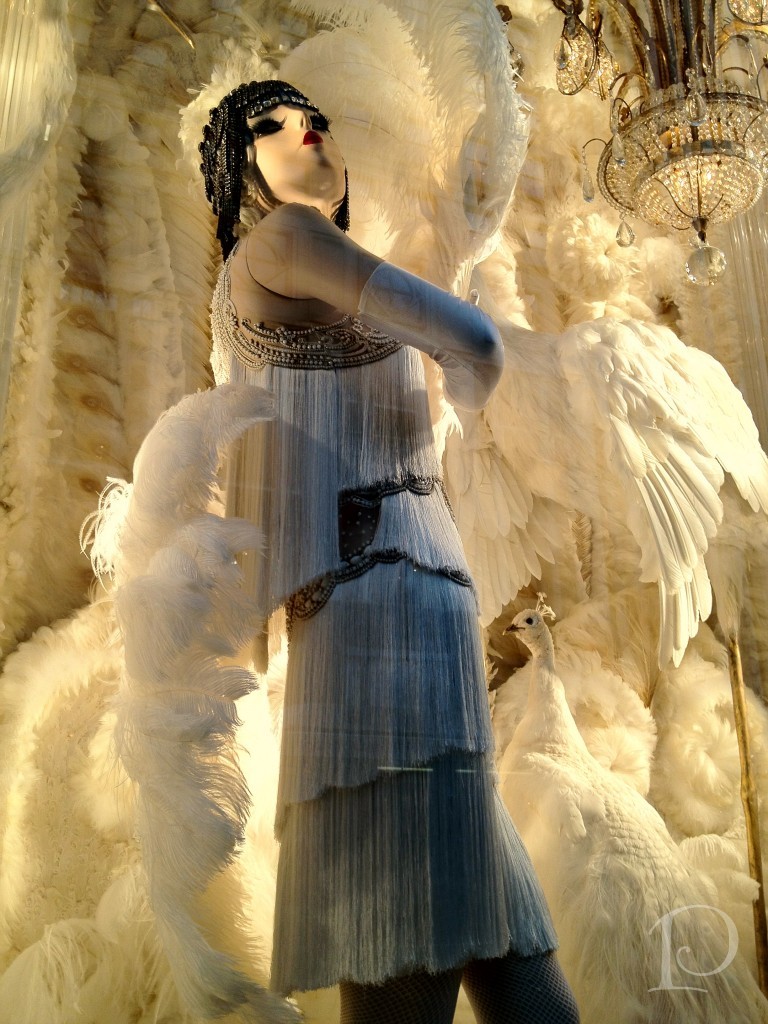
‘Tis the Season: Christmas in NYC
Dec 05 2012 ·1Last weekend I traveled with a dear friend to the “city that never sleeps”. If you’ve never been to New York during the Christmas season, you simply must go! Even more than usual, the city is stunning, vibrant and full of light. I had a ball taking in the energy of Manhattan and the sights of the season.
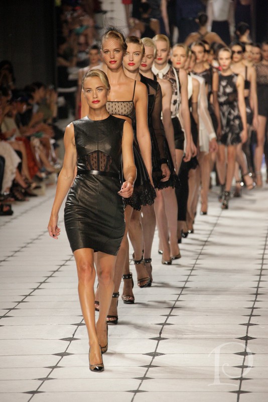
Pamela’s Posh Picks: Jason Wu Fashion Show, Spring 2013
Sep 14 2012 ·0I thought I’d wrap up this week of posts on the Brizo Fashion Week event by featuring some of my favorite looks from the Jason Wu Fashion Show showcasing his Spring 2013 collection.
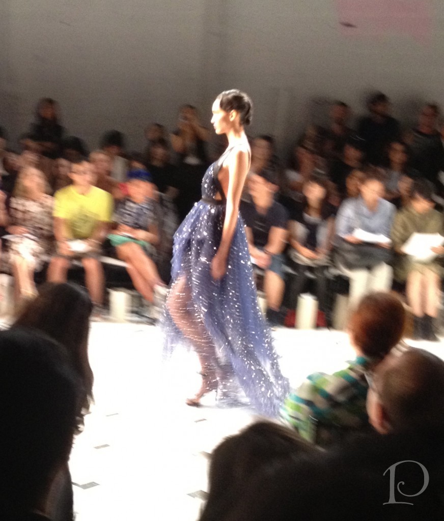
Recap: Brizo Fashion Week & Jason Wu, Part 2
Sep 13 2012 ·0“ Style comes from imagination and creativity and willingness to take risks.”
~Jason Wu
While our workshops and brand immersion seminars during Brizo Fashion Week were both inspiring and educational, they were also intense ~ in the best possible way of course! Lucky us, the Brizo team also built in plenty of opportunities to explore the fashion side of Fashion Week in NYC. You won’t believe the fun we had, I’m still reliving it myself!
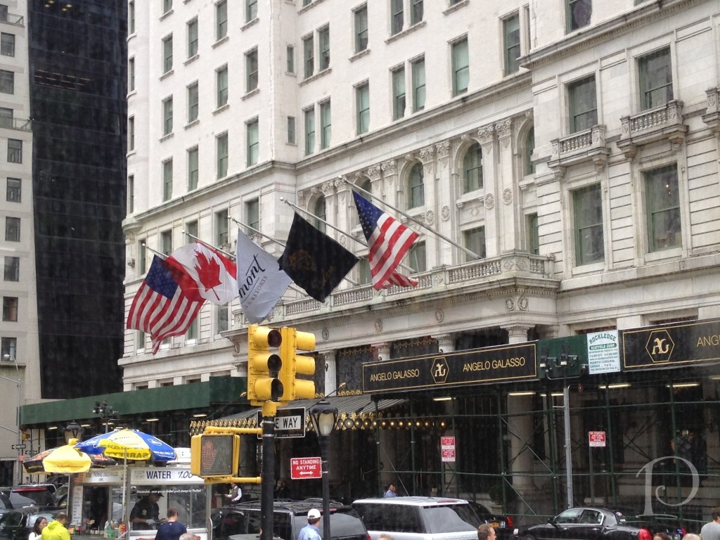
Brizo Fashion Week…Here I Come!
Sep 04 2012 ·0Tomorrow I depart for New York City and Brizo Fashion Week! Tomorrow!
As most of you probably know by now, I am part of a small group of interior design professionals (the “Blogger 19”) who have been invited by Brizo, the faucet brand for the fashion forward, to attend its’ semi-annual Fashion Week event in New York City, September 5-8.
Blogfest 2012: Publishing Powers
Jun 12 2012 ·0“I deeply believe that a beautiful decor can have a beneficial influence on our lives.”
~Albert Hadley
For my final Blogfest 2012 wrap-up post I want to focus on the morning we spent at Hearst Tower with some of the most powerful people in the design publishing world. The publishers and editors from Veranda and House Beautiful magazines moderated panels with elite designers who have been published in these national magazines. It was a wonderful opportunity to hear about how designs are chosen for publication and how great designers work.
We gathered on the 44th floor of the Hearst Tower for breakfast. What a beautiful location!
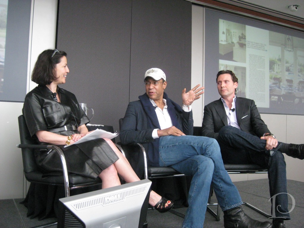
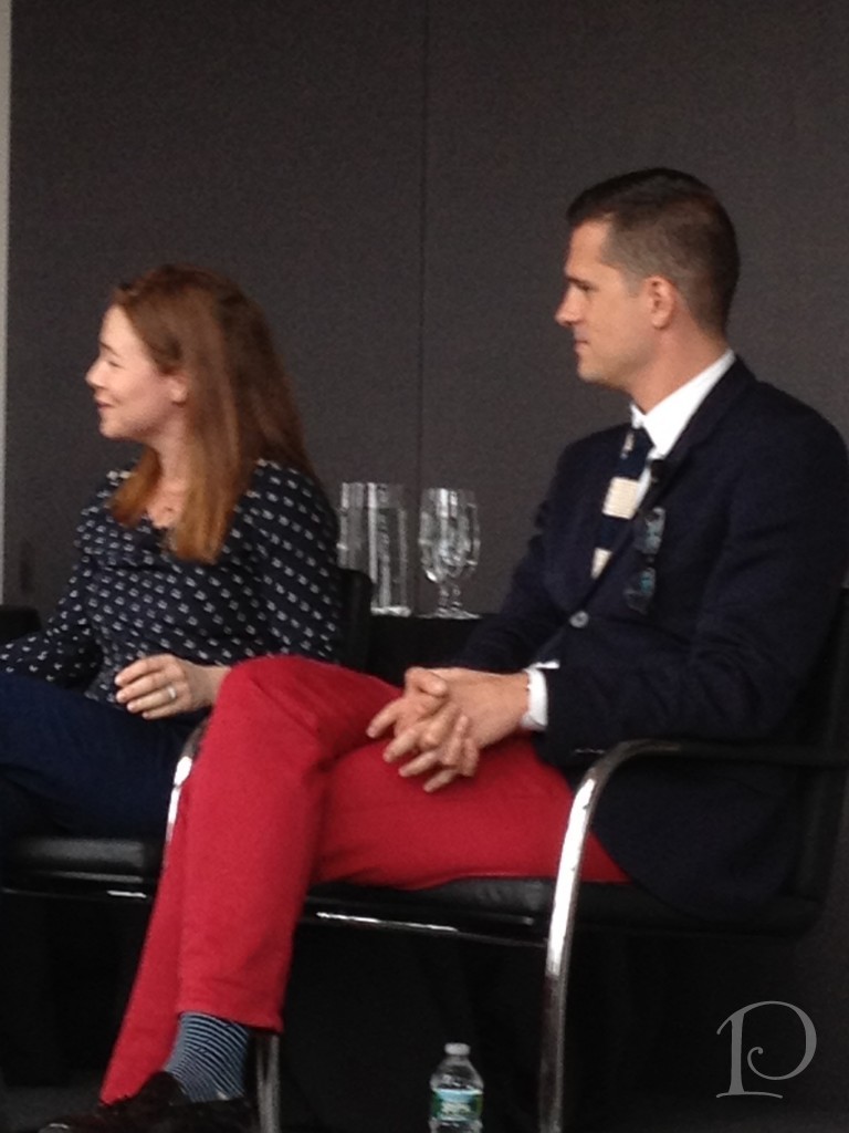
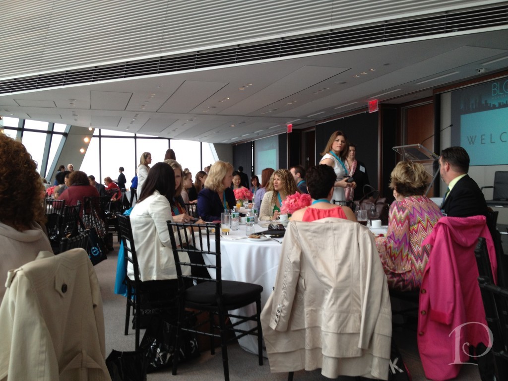 We went Inside the Issue with the Veranda panel: Publisher Jennifer Levene Bruno, Editor-in-Chief Dara Caponigro, designers Darryl Carter and Timothy Whealon
 This panel offered behind the scene glimpses of their designs. Featured in the May/June issue, both Darryl Carter and Timothy Whealon shared their personal stories about coming into the design profession after they were trained in the field of Law.
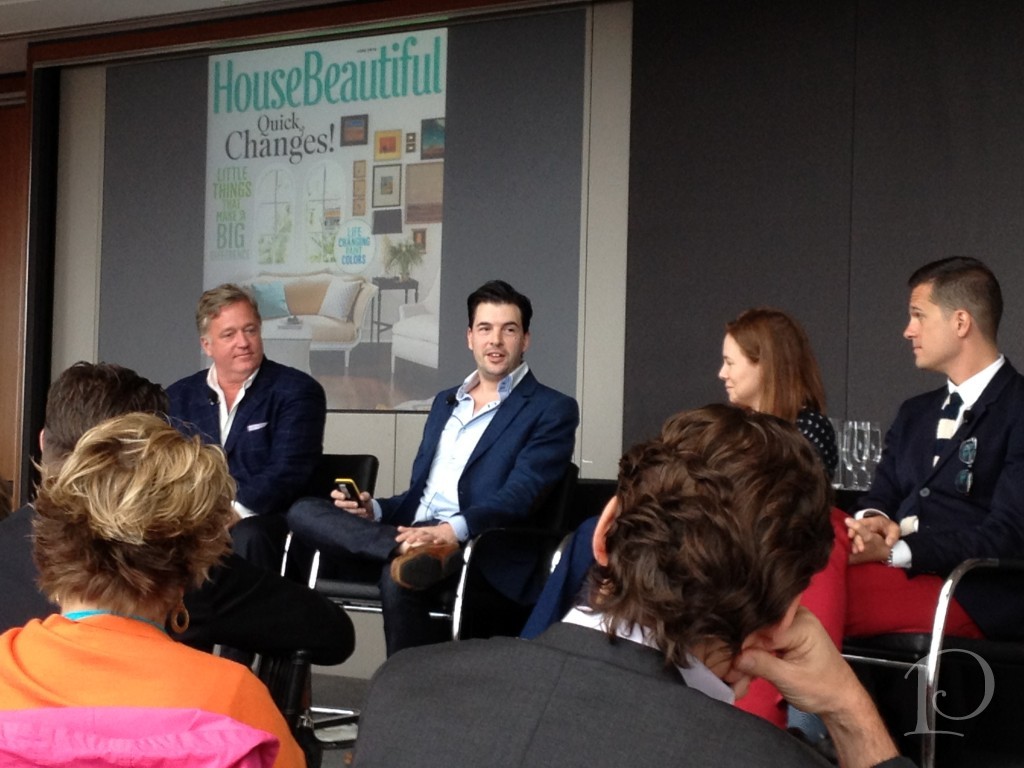
During the next segment, House Beautiful Editor-in-Chief Newell Turner moderated a panel with the theme “Creating the A-Ha Moment”. His panel included three of House Beautiful’s Next Wave Designers: Michael Herold, Jill Goldberg, and Jon Call.
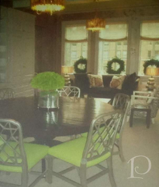
The next few photos were taken of the screen presentation so the quality is lacking but they illustrate some striking “A-Ha Moments”. This first example is a scouting shot from a few years ago that was submitted for publication. The editors liked the fact that there was interesting seating (the sofa near the window) in a Dining Room.
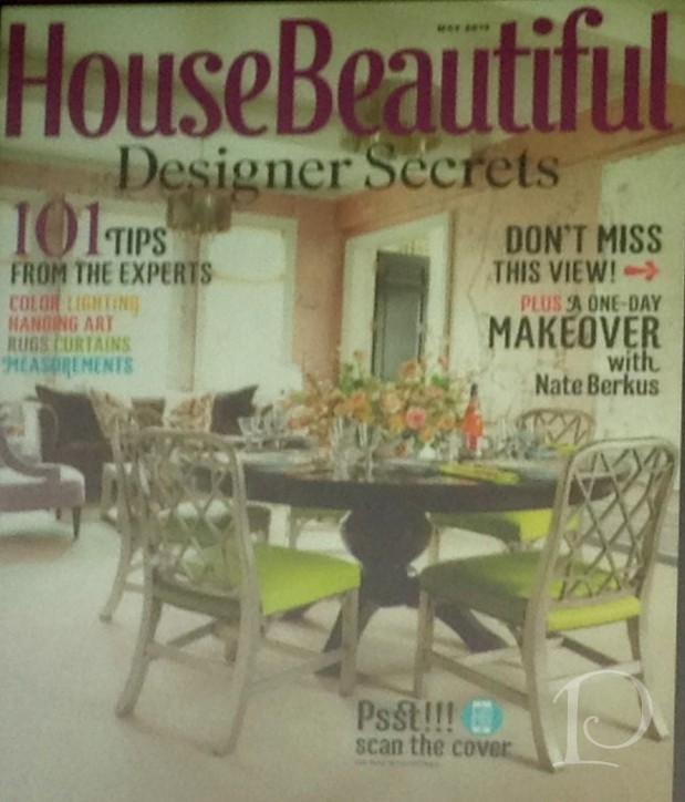
 This is how the room looked on the cover shot. Notice how subtle tweaks: changing the angle of the shot, taking away the wreaths and adding fresh flowers, make this room a star!
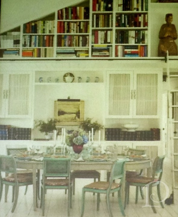
I love the transformation of this library:
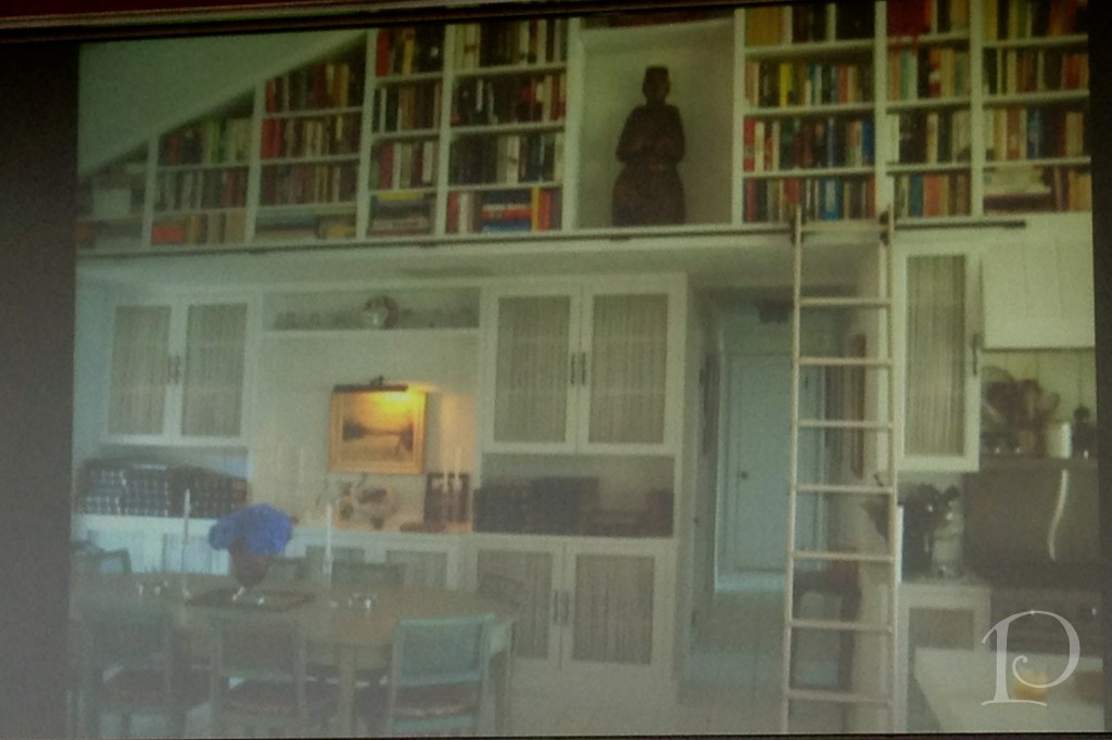 What a difference some fleurs and a beautiful tablescape can make when the bones of the room are perfect!
Both of the panels were relaxed yet informative. All of the designers were charming, humorous and very articulate. They were generous with their trade secrets and lingered patiently for photographs.
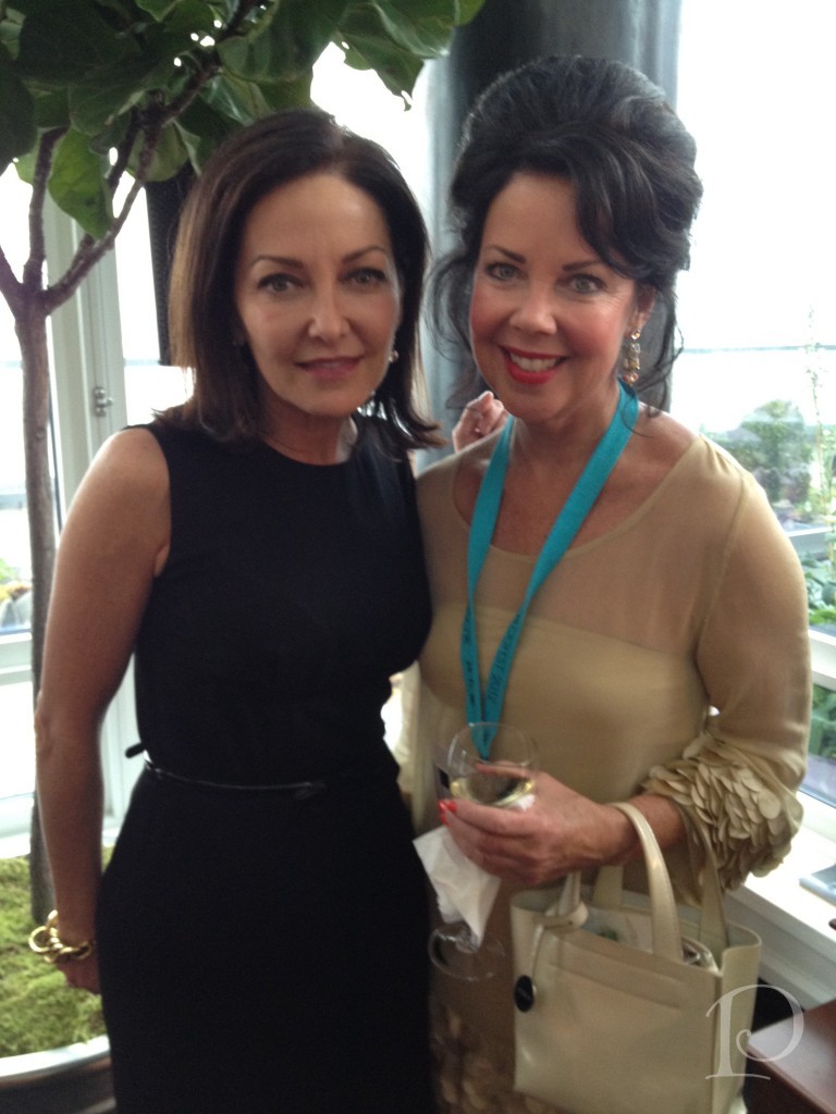
Of course how could I post about the Publishing Powers of the Design World without including Margaret Russell? Editor-in-Chief of Architectural Digest, Margaret elegantly welcomed us to the Kips Bay Showhouse on our first day in NYC.
 Blogfest 2012 was such a wonderful experience for me on so many levels. It was a whirlwind full of amazing people and a wealth of design information and inspiration. I can hardly wait to see what’s in store for Blogfest 2013!
xo,
Pamela
Blogfest 2012: Kravet Studio Tour
Jun 07 2012 ·1“Creativity involves breaking out of established patterns in order to look at thing in a different way .”
~Edward de Bono
Without a doubt, the highlight of Blogfest 2012 in New York City for me was the Kravet Studio Tour. When I begin a design project I always start with fabrics for inspiration. Naturally, on the morning of the Kravet Studio Tour I was the first one to arrive and secure my place on the first tour of the day. You can imagine what a thrill it was for me to have a chance to get a behind-the-scenes look at the studio where so many of my favorite lines are created!
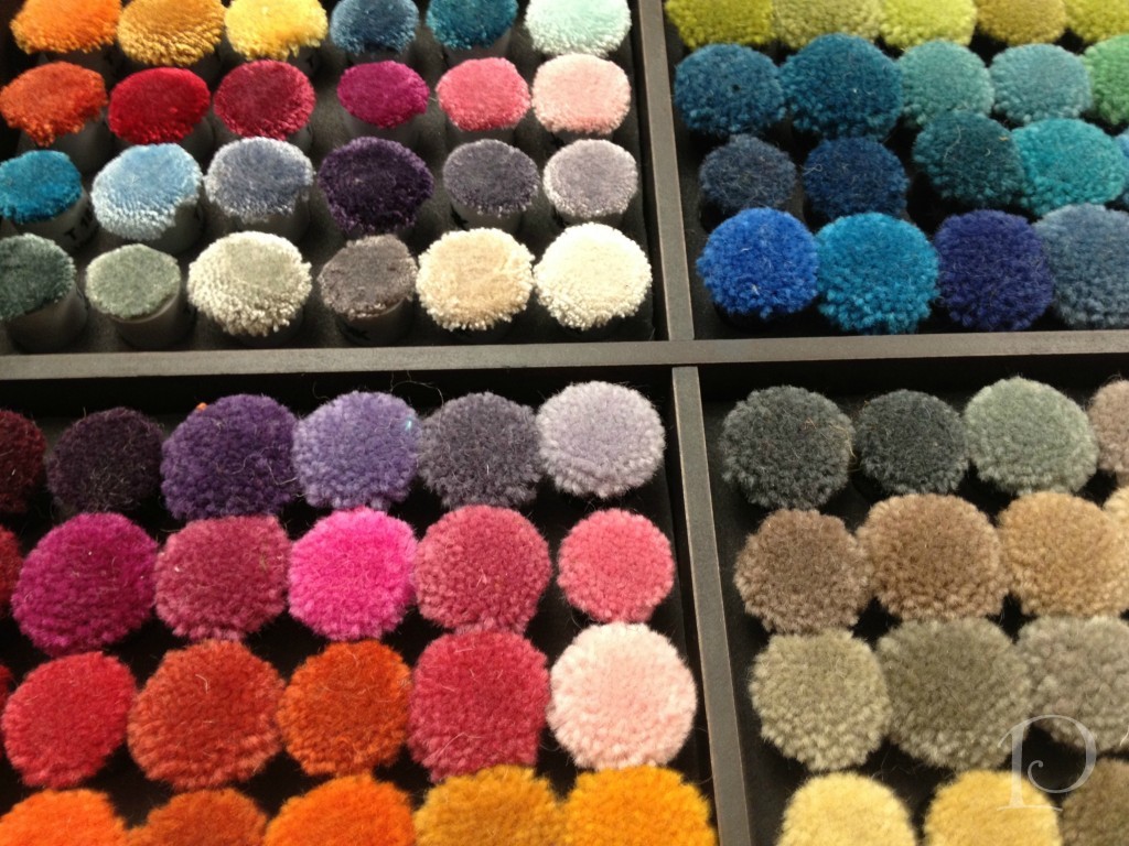
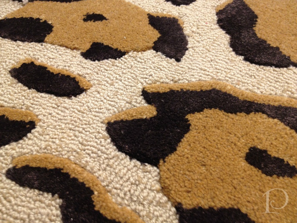
The first studio we visited was the carpet shop. Look at this array of wool yarns ~ the colors are so pure and glorious.
 This is a carpet sample that caught my eye~animal print of course. I can think of a dozen spaces this would be perfect in.
The next studio we visited displays Kravet fabrics that are available in showrooms across the country, I have used many of these and they are luxurious…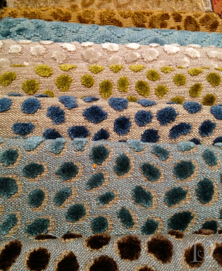 The next stop on our tour really captivated me. Here we got a peek at custom fabric design. The designer starts with original artwork, in this case a pencil drawing. Using a sophisticated scanning process to digitize the artwork, the design is then tweaked and reproduced on either cotton, linen or a leather-like fabric.
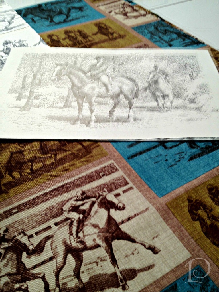
The designer extraordinaire has created this “racing” fabric from these original sketches, isn’t it amazing? He was so proud to share his story, can’t you see it in his smile?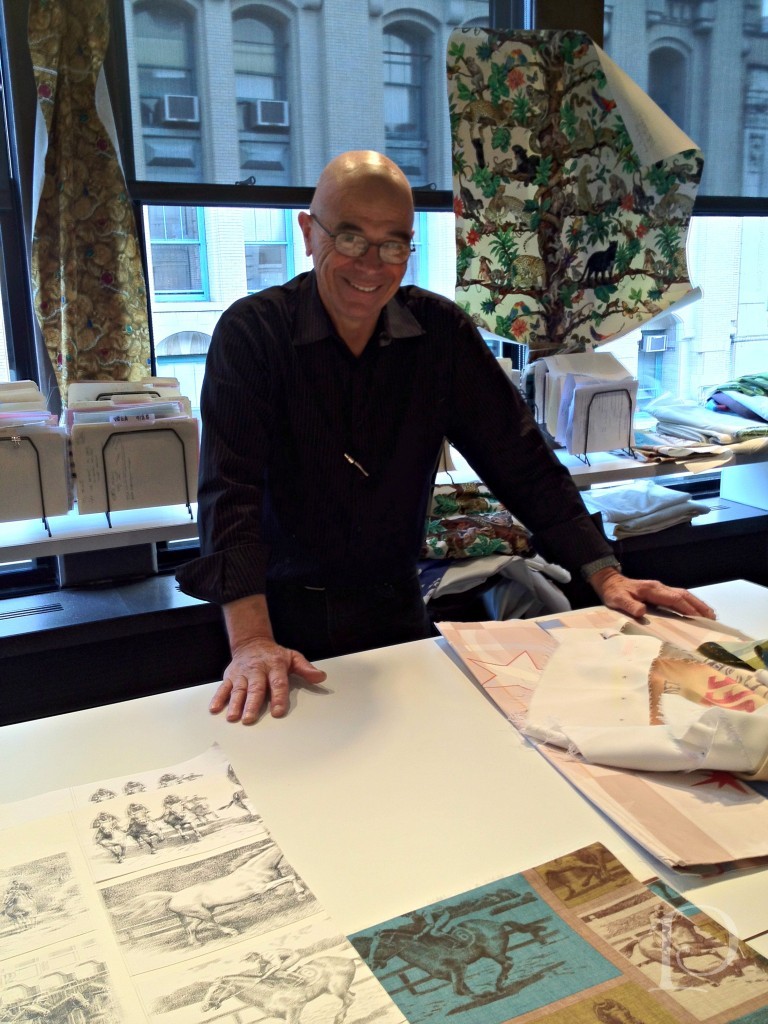 In the Brunschwig & Fils area we saw architectural plans for a brand new showroom.
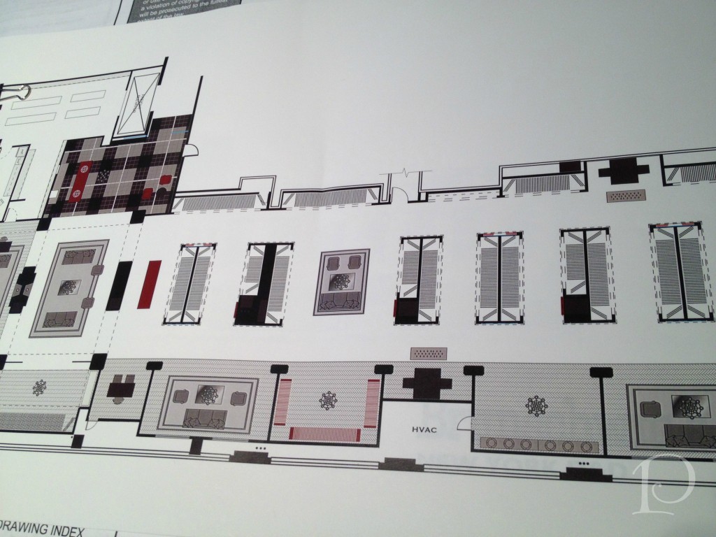
Here is a Studio wall filled with colorful Brunschwig &Fils fabrics.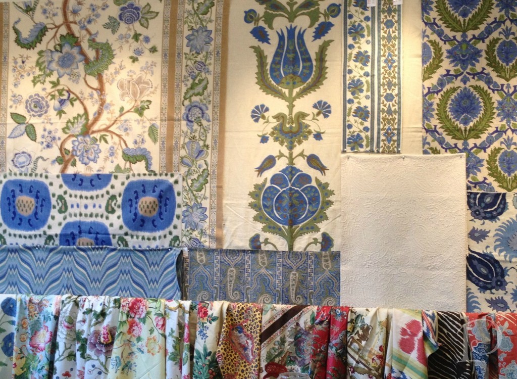
Can you believe that once upon a time, this wood block was used to print this Lee Jofa fabric? So interesting to get a glimpse into history.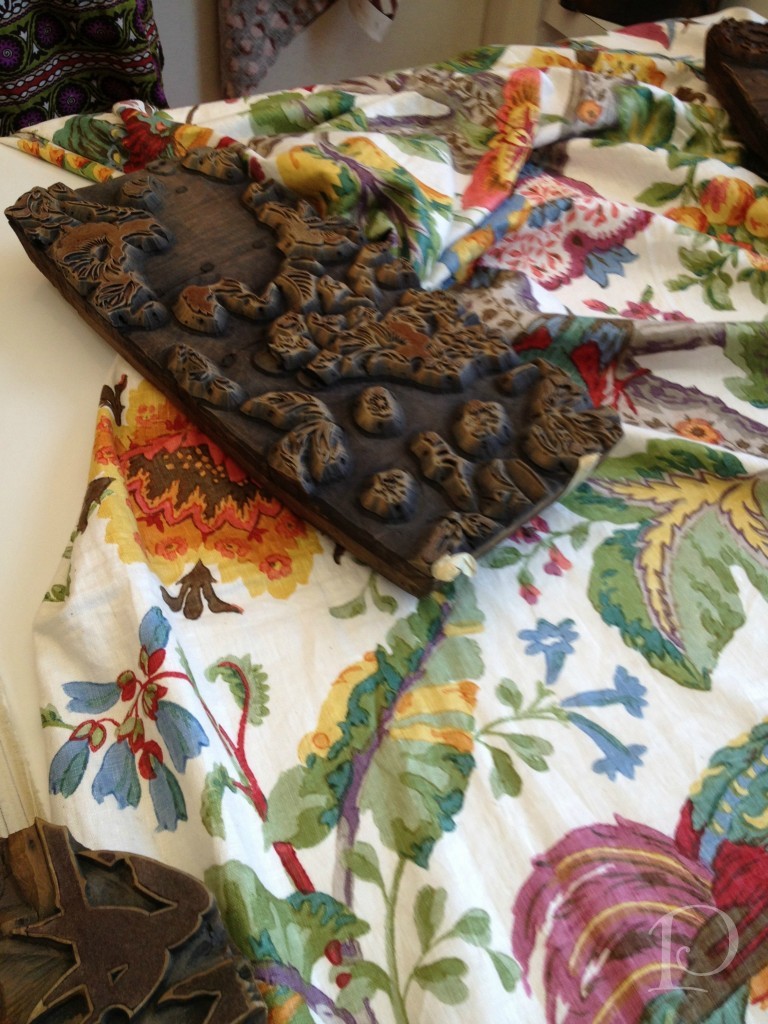
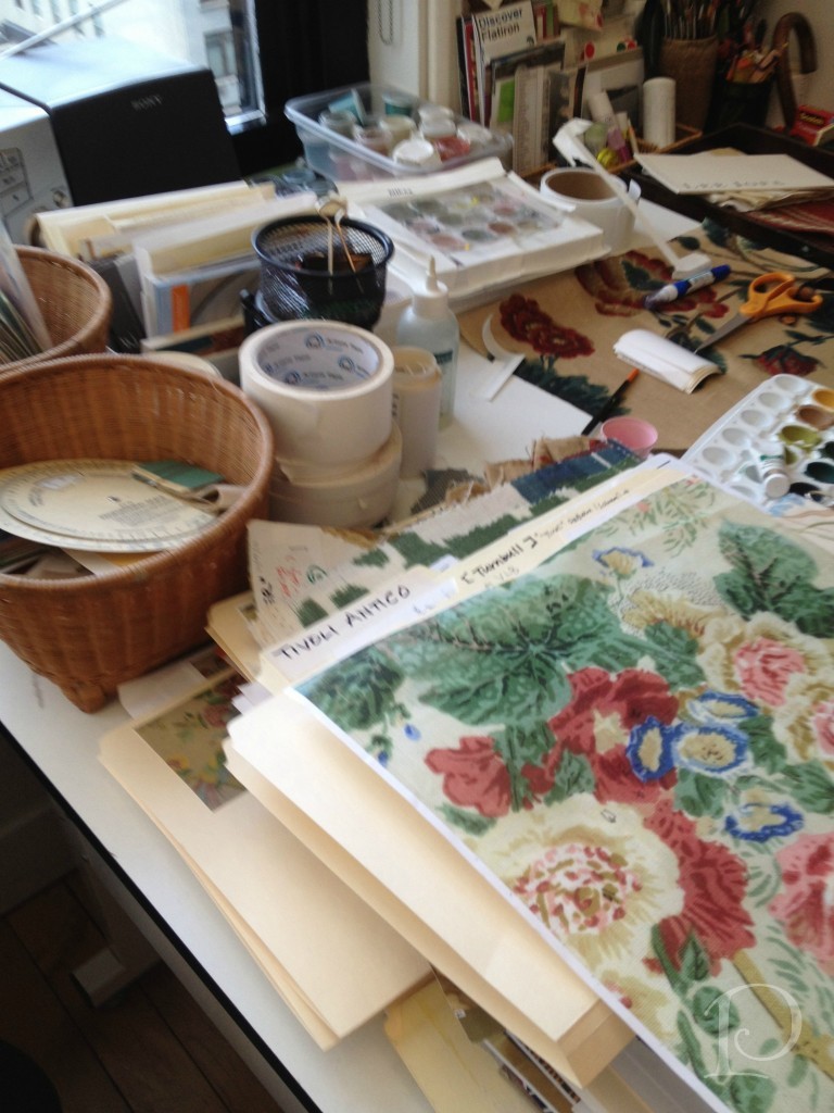
I felt right at home in this section of the studio. This small corner is where an artist paints designs for some of the fabrics. I would love to have this job for a week…or maybe even two??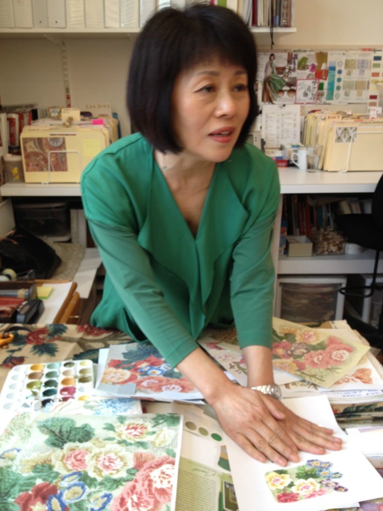
Her desk is quite petite but somehow she makes it all work, such a delightful jumble!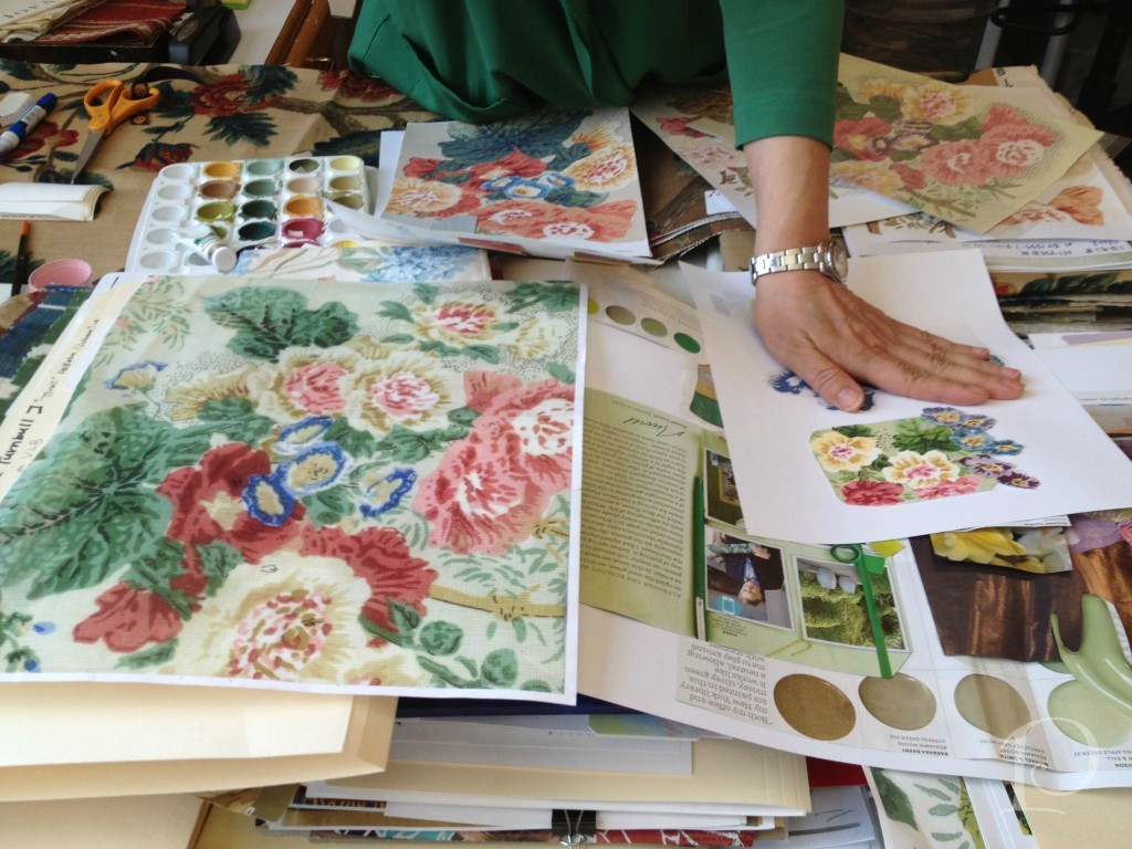
Her creative corner…
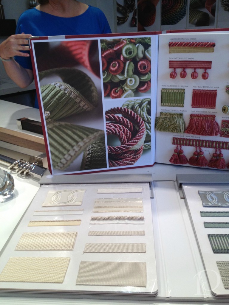
Finally, no fabric line would be complete without fabric trim. Luxurious trim is a favorite accessory of mine when creating pillows and other accessories. Take a peek at this sumptuous trim book:
As you can see, the two floors of the Kravet Studio are jam packed with talent and creativity. Having been treated to this incredible tour, I will certainly appreciate the beauty in every fabric and textile I touch more than ever. Above all, I will think of all the people I met who take such pride in their creation. Thank you!
xo,
Pamela
Contact me about Pamela Copeman Design Group services.
To follow me on Pinterest, click here.
To follow Pamela Copeman Design Group on Facebook, click here.
To follow me on Twitter, click here
Blogfest 2012: Designer Show House Trends
May 31 2012 ·0I’ve been back from New York City for a week now, but it seems I’m just beginning to process all of the amazing and inspiring things I experienced during Blogfest 2012. First off, I want to extend my sincere thanks to the entire Kravet team for a wonderful event. Beginning with the welcome from Cary Kravet at the opening night reception and throughout the jam-packed agenda of the following two days, this was a truly incredible gathering.
Today I wanted to share some of the trends I noted while touring not one, but two, designer show houses during Blogfest.
On Monday, Margaret Russell hosted the kickoff to Blogfest at the Kips Bay Boys and Girls Club Designer Show House. This year’s space featured two adjoining penthouse apartments on Manhattan’s West Side. Here, city chic and glamour ruled the day~right up my alley!
As I toured the rooms, the first trend that caught my eye (literally), was the abundance and variety of reflective and metallic surfaces.
This reflective table is a functional piece of contemporary art.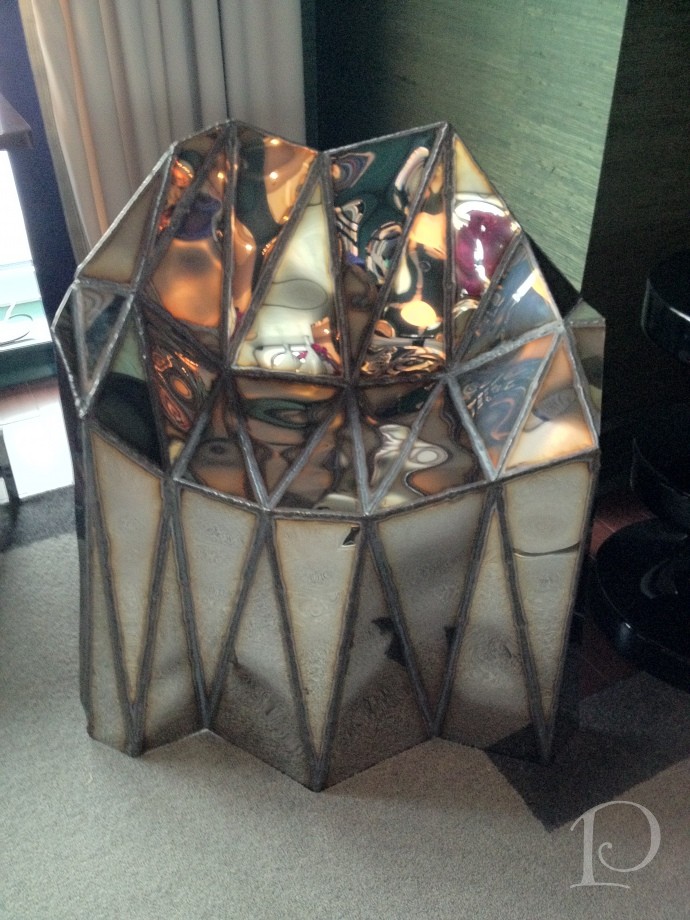
I love this shiny granite surface along with the trough-like sink and sleek faucet.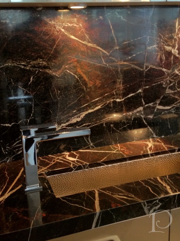
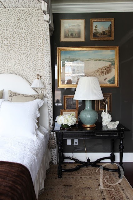
In the Alexa Hampton designed bedroom the walls were lacquered in Dragon’s Breath by Benjamin Moore.
The use of a reflective, hard surface on the wall, coupled with a silver ceiling, is an unexpected design choice in a bedroom, yet it turned out beautifully.
Even fabrics are part of the reflective trend! Here, metallic textiles cover a sofa and coordinating pillows. 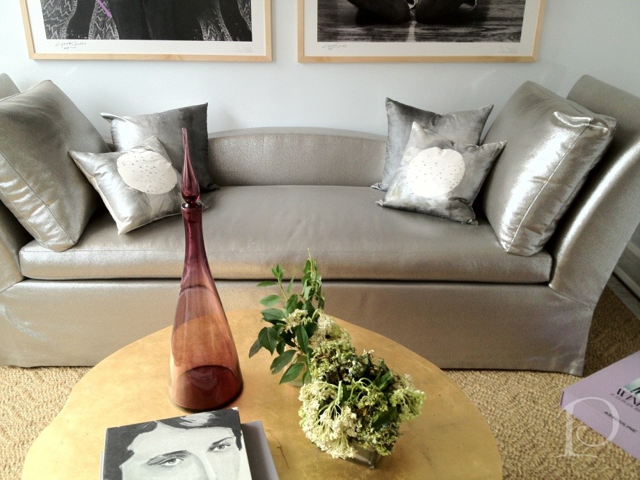
This intricate metallic wall art adds drama as light plays off its reflective surface.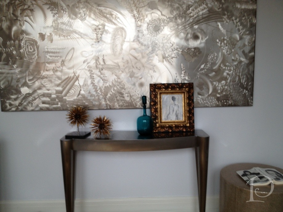
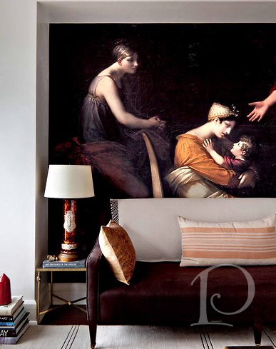
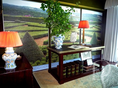
The other notable trend from the Kips Bay Show House was the creative use of digital imaging.
This digital image of a classic painting was blown up to mural size and fit perfectly into this niche. Surrounded by modern furnishings, it was striking and effective.
Across the room, this is an image the designer captured while in Europe. This touch is at once personal, unique and classic~a winning combination to be sure!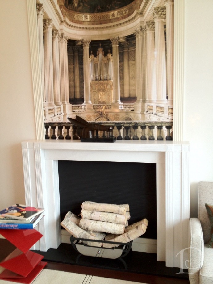
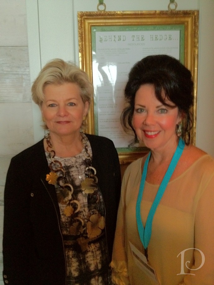
Charlotte Moss’ space was entitled Behind the Hedge and was filled with an abundance of creative ideas. My favorite detail in this space was once again the use of digital photography murals. Charlotte explained that this mural was made from photographs she had taken while traveling. Even the blue and white tile “baseboard” is digitally produced–amazing!
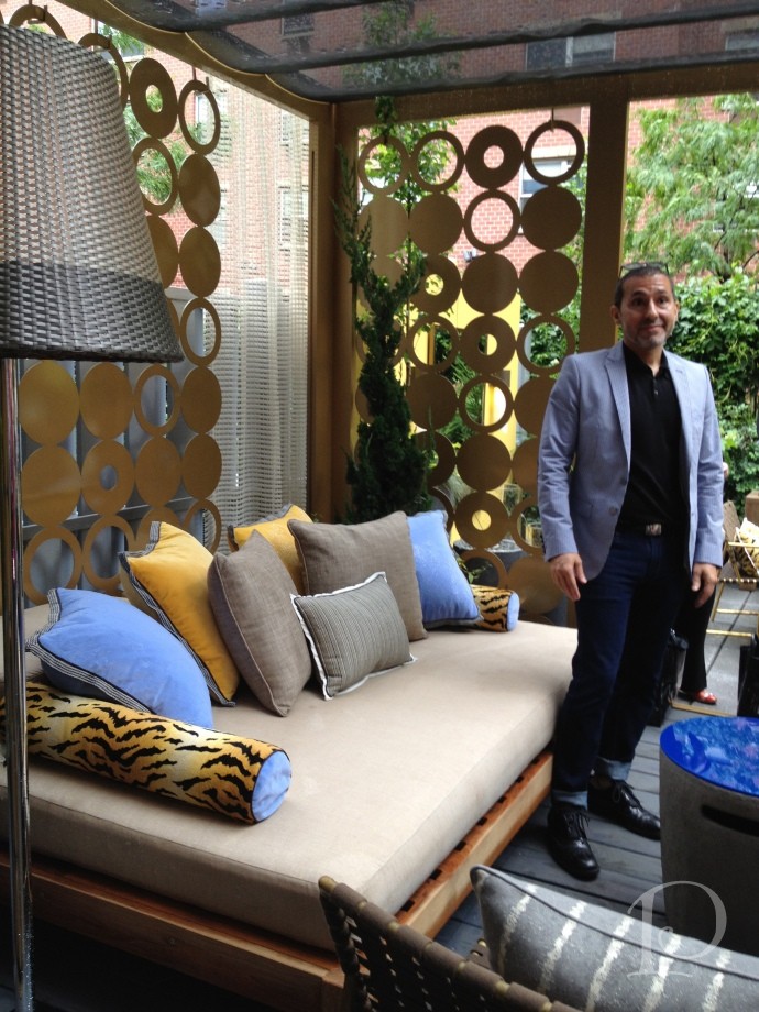
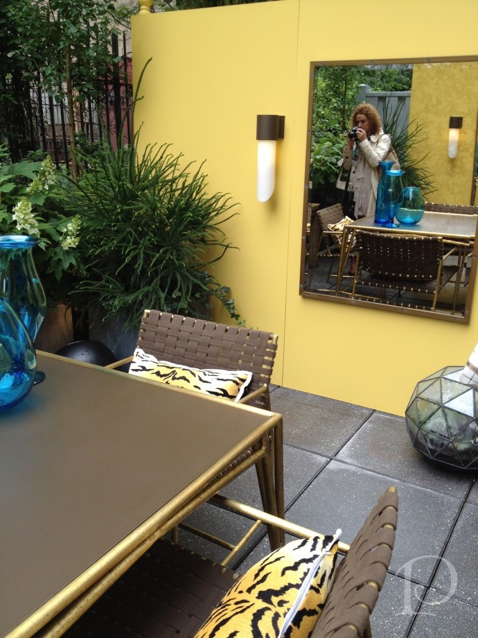
The trend spotting continued on Tuesday as we toured the Elle Decor Modern Concept House. While overall this space wasn’t as appealing to me as the Kips Bay house, I adored the terrace at the Modern Life house. Attention to detail and design and extending the living space of a home to the outdoor space is a trend I very much embrace.
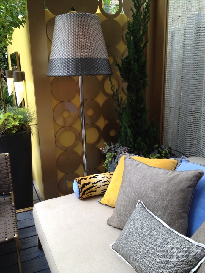
Despite persistent clouds and sprinkles, the terrace was sunny and bright~thanks in part to the dazzling metal circle screen panels. I love this idea and can think of a dozen ways to use it!
Designer Michael Tavano used screen material to drape over the sofa area to provide shelter and all of the fabrics are weather and sun resistant–including the animal print!
Another area of the compact terrace that is given depth by the use of the mirror. Using mirrors outside to reflect water views or to expand our spaces is something I’d love to see more of.
Overall I loved touring both of these fabulous show houses. I also love that the trends I highlighted are so versatile and easy to re-create. Incorporating reflective surfaces and metallics instantly provides contrast and brings a modern flair into a space. As for the digital photography murals–my mind is twirling with ideas! I can not wait to use this idea in my own home. I hope that you too can find an inspiring idea to use in your home or outdoor space.
Stay tuned for more inside scoop on my trip to Blogfest coming up soon!
xo,
Pamela
Contact me about Pamela Copeman Design Group services.
To follow me on Pinterest, click here.
To follow Pamela Copeman Design Group on Facebook, click here.
To follow me on Twitter, click here
