luxury
posts displayed by tag
Diary of an Interior Designer: Cape Cod Seaside Home, The Dining Room
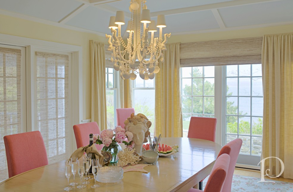
May 15 2013 ·1One of the best parts of having a spacious home with room for family and friends is sharing a meal. The Dining Room at our Cape Cod home is the perfect spot with room for everyone.
While I don’t have any before pictures to share, this room started off like so many of the other spaces in this home: a blank slate with lots of windows and a great water view. Once again we selected a color palette that would echo the landscape outside: sun, sea, sky and sand ~ with bright pops of color of course!…
Diary of an Interior Designer: Cape Cod Seaside Home, Master Bedroom Suite
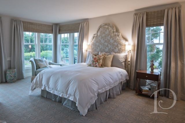
May 14 2013 ·0The Master Bedroom Suite, or Owner’s Retreat, is an increasingly popular space to lavish fabulous design on. To that point, Master Bedrooms are always among the most popular spaces in a Show House and clients are eager to have an interior designer work their magic in this space. The owners of this home were no exception.
This international couple wanted a soothing area away from the rest of the bedrooms. Well located on the first floor, just steps to the pool and with an inspiring ocean view, we had an ideal space to work with…
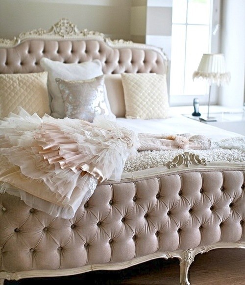
Posh Pinterest Board of the Week: Princess & the Pea Bedding
May 13 2013 ·2As you may recall, I Love My Bed, so it’s no surprise that I love luxurious, sumptuous bedding. What’s more inviting than a beautiful bed, piled high with pillows and well-appointed linens? This week’s Posh Pinterest board is my very own Princess & the Pea Bedding board which features a wide variety of amazing bed and bedding ideas.
Take a peek at a few of my favorites…
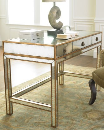
Pamela’s Posh Picks: Desks
May 09 2013 ·1Yesterday I shared the Home Office of the amazing Cape Cod seaside home I’ve been featuring. We were fortunate to have an existing wall of built-ins, including a desk, in the room when we started the design process. Of course this isn’t always the case. A desk is the workhorse of any workspace and a key opportunity to marry beauty and function. Let’s take a peek at this week’s Posh Picks for Desks…
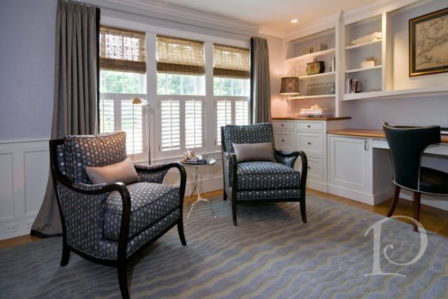
Diary of an Interior Designer: Cape Cod Seaside Home, Office, Foyer & Family Room
May 08 2013 ·1Continuing on with our tour of this lovely seaside home, today’s first stop is the Office. Located off the main Foyer, the Office is tucked behind French doors and is just far enough removed from the rest of the house to offer a quiet space to attend to business responsibilities.
This is the bland space that I viewed the first time I toured the house, rather sterile and not very inviting…
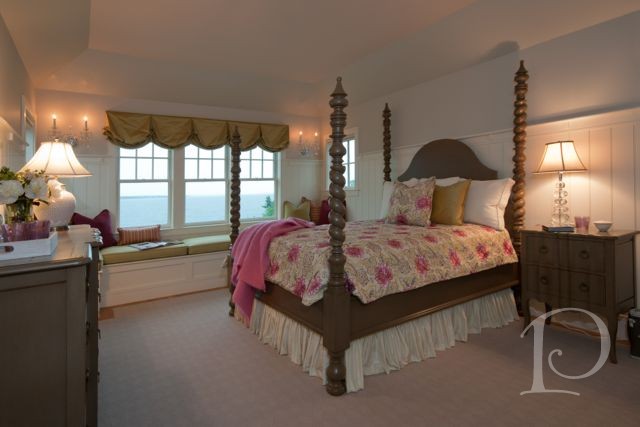
Diary of an Interior Designer: Cape Cod Seaside Home, The Guest Bedrooms
May 07 2013 ·1“The ornaments of your house will be the guests who frequent it”
~ Author Unknown
When we last checked in at our Cape Cod seaside home, I shared with you the transformation of the Children’s Suite. Well, this luxurious home boasts three additional guest rooms in the main house. Even though each bedroom has water views, we opted for a more sophisticated design that compliments the blue of the sky and the water with a reference to sand and seashells. Come take a peek…
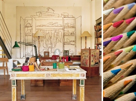
Posh Pinterest Board of the Week: Creative Working Spaces
May 06 2013 ·1When it’s time to get productive, nothing inspires me like a creative environment. This week’s Posh Pinterest board, Creative Working Spaces by user Ela Drumgoole, features loads of fabulous ideas for personalizing your workspace.
Take a peek at a few of my favorite pins…

Pamela’s Posh Picks: Hot Seats from Janus et Cie
May 02 2013 ·0It’s been a beautiful stretch of weather here in the Boston area which means I’m spending more and more time outside on my terrace. While I love all of my current outdoor seating, I can’t help but take a peek at the offerings from my favorite source for outdoor furniture: Janus et Cie. Janus et Cie is the premiere resource for outfitting your deck, terrace or patio. Their designs are contemporary, elegant, and…hot!
Here are this week’s Posh Picks for Hot Seats…
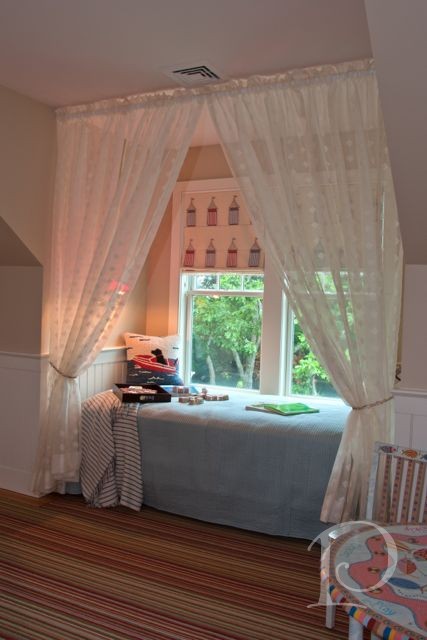
Diary of an Interior Designer: Cape Cod Seaside Home, The Children’s Suite
May 01 2013 ·0At nearly every Designer’s Show House I’ve attended, the Children’s Room is always among the favorite spaces. Designing children’s spaces presents the opportunity to incorporate whimsical touches, plenty of color and to think like a child again ~ how grand! The Children’s Suite in the Cape Cod retreat seems to me the perfect place to start our tour…
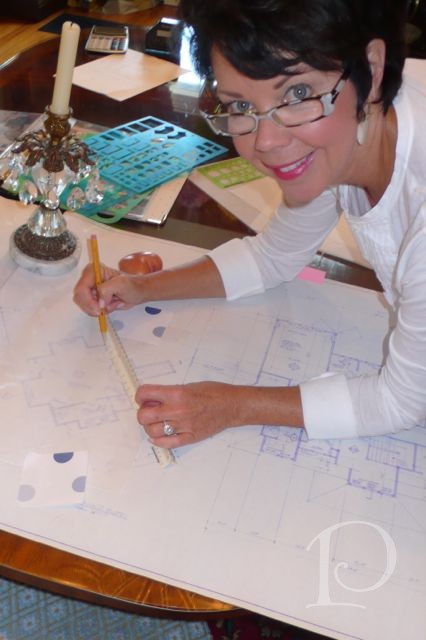
Diary of an Interior Designer: Seaside Home, Cape Cod, Part One
Apr 30 2013 ·1One of the luxuries of sharing a completed project is the ability to reflect and share the story behind the design: the ups and downs, the twists and turns and the knowledge that it all turned out beautifully in the end. As an interior designer my job is much like that of the Fairy Godmother in the story of Cinderella ~ I transform the drab to fab. As you will see however, it is not always as easy as waving a wand and saying ‘bibbity-bobbity-boo’. However, the end result is always magical…
Vine Video Friday: I Love My Magazines!
Apr 26 2013 ·0Oops, typo! RT @pamelacopeman: I Love My Magazines! @housebeautiful @traditionalhome xo vine.co/v/bxBY96mFxIB
— Pamela Copeman (@PamelaCopeman) April 26, 2013
xo,
Pamela

Pamela’s Posh Picks: Brizo Kitchen Faucets
Apr 25 2013 ·2During a renovation, particularly a kitchen project, both the client and interior designer invest a huge amount of time in making choices for the space. Cabinetry, flooring, appliances, textiles, pulls and knobs ~ the list goes on and on. One of the final details to be selected for a kitchen is often the faucet. While it can be tempting to skimp in this area, both in consideration and budget, I urge you not to. A faucet, whether SmartTouch or traditional, is a tactile element and can literally improve the quality of life of those who use it regularly by making mundane tasks easier and more beautiful. If you are planning a kitchen renovation, strongly consider making your faucet a featured design element ~ you won’t regret it!
This week’s Posh Picks are faucets from my favorite manufacturer: Brizo. No one combines form and function more beautifully than Brizo…
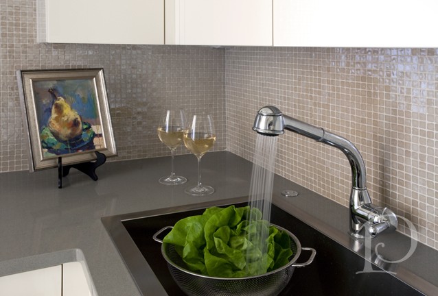
The Teeny, Tiny Kitchen in Boston’s Back Bay
Apr 23 2013 ·3As an interior designer, some of my most challenging projects have been jewel box size, most especially kitchens! Why so challenging? Because in a 10 foot space I have to place a full size stove and vent, a refrigerator, a dishwasher, a compactor and a microwave. Did I mention a sink and cabinets? And it has to be posh and inviting. This is the best kind of challenge for me and my team. To create the kitchen I’m featuring today, I collaborated with the best: Venegas and Company. Donna and her team represent the best in cabinetry and know how to work within a 1/16” of an inch. They are awesome!
First, a few before photos to give you a sense of the space…
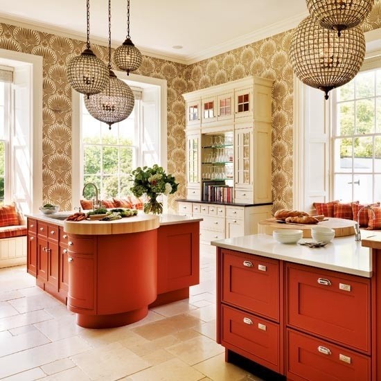
Posh Pinterest Board of the Week: Someone’s In the Kitchen…
Apr 22 2013 ·0They say the kitchen is the heart of the home. While this is surely true, I would also say the kitchen is a place to embrace color and sparkle. No need to cower to builder’s oak cabinets and plain white walls, let your kitchen show some personality! This week’s Posh Pinterest board, my Someone’s In the Kitchen, features plenty of fabulous, colorful, and of course posh, kitchens.
Here are a few of my favorites…
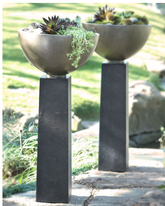
Pamela’s Posh Picks: Outdoor Planters
Apr 18 2013 ·2As Spring progresses, my terrace garden is beginning to reawaken with color and blooms. I have several containers that I use year after year but I am always looking to add to my collection. This week’s Posh Picks feature some fabulous options for Outdoor Planters if you’re looking to add some interest to your outdoor space. Unlike in the past, today’s outdoor planters are constructed using materials that are much more durable and weigh much less ~ a winning combination for sure!…

Pamela's Posh Picks: Victoria & Albert Tubs
Jul 27 2012 ·0Things have been moving right along in my latest project. In fact, this past week I was out shopping for tubs for the next phase which will include renovating the master bathroom.
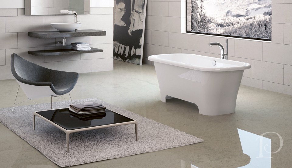
I just love tubs. To me they represent romance, relaxation and luxury. Some of my favorite tubs are from Victoria + Albert. Victoria + Albert tubs (or baths) are made with volcanic limestone mixed with resin to form a patented material called ENGLISHCAST. Replete with unique properties, ENGLISHCAST is the foundation of all of the beautiful Victoria + Albert baths.
Here are my Posh Picks from Victoria + Albert tubs…
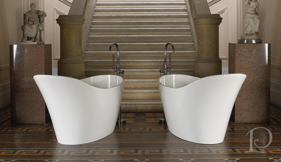 A slipper tub for the 21st century, the Amalfi transforms the period look into sexy sleekness
I think I would feel like a Roman goddess bathing in this tub!
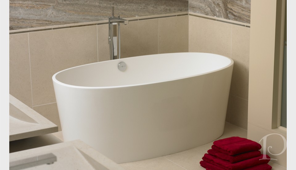
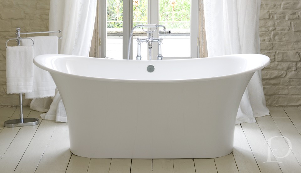 Bateau style freestanding design
I imagine a bath in this tub would transport you to the gently rolling seas…
 Big bath luxury in an amazingly compact design
Modern, sleek and contemporary. I love the clean lines and surprising capacity of this tub.
I love the detail of the cutaway base on this tub. So chic.
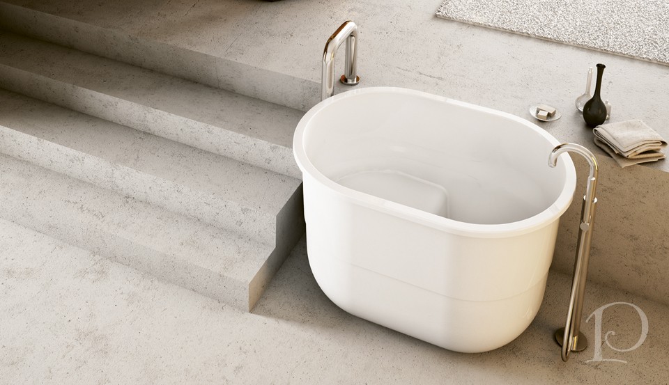 A modern sit tub, the bold Sorrento is designed for full immersion
The best part ~ it’s big enough for two!
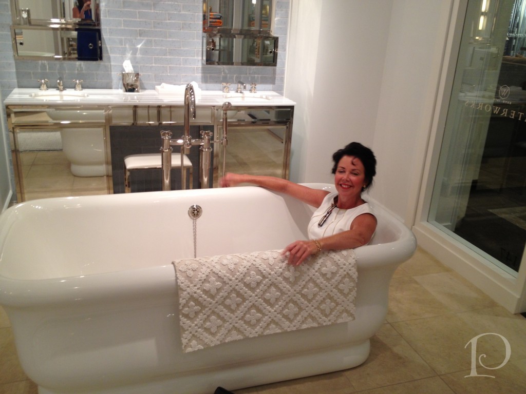
When selecting a tub for your luxurious bathroom, you certainly can’t go wrong with any of these stunners from Victoria + Albert. Of course, you shouldn’t choose a bath based on looks alone. You must consider how it feels and “fits”…
Oh, what I won’t do for my clients!
Finally, this week’s petite oil painting is a bit of pure summer:
 I had my first lobster this week at Jake’s Seafood Restaurant in Hull with my BFF Tina. It was so delicious, I can’t wait to have my next one. After all, it’s only summer here in New England once a year ~ it’s up to us to make the most of it!
xo,
Pamela
To receive new blog posts in your inbox, be sure to subscribe via email! Just click on the link in the right sidebar.
Contact me about Pamela Copeman Design Group services.
To follow me on Pinterest, click here.
To follow Pamela Copeman Design Group on Facebook, click here.
To follow me on Twitter, click here
A Golden Transformation
Mar 04 2012 ·0When I was growing up, the story of Cinderella was one of my favorite fairy tales. It never failed to enchant me when the Fairy Godmother appeared and magically transformed Cinderella’s tattered rags into a beautiful ball gown complete with glass slippers. I may not be a Fairy Godmother but I am an interior designer and I love transforming pale and boring spaces into jazzy, eye-catching jewels!
Today I want to share with you one of my more dramatic transformations. The project was a condo on Tremont Street in Boston and the space was a petite Foyer and Entrance Hall.
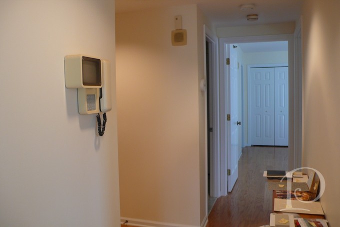
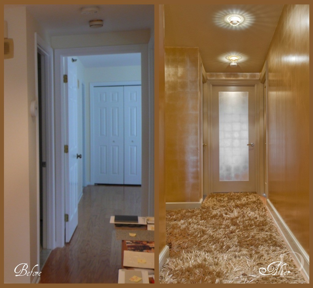
This before photo shows the Hallway that leads to the Master Bedroom. The space is boring, vanilla and dare I say, plain Jane.
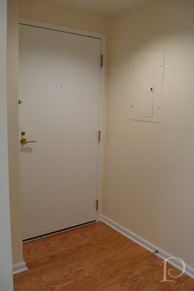
This is the interior shot of the Front Door. So boring, simply no personality at all.
I was determined, along with my client, to banish the boring and have her guests wowed as soon as they walked in the front door. Yes, this space was definitely in need of a touch of interior design “magic”. So I conjured up a dash of sparkle, a dose of glam, a whole lot of gold and… TA-DA:
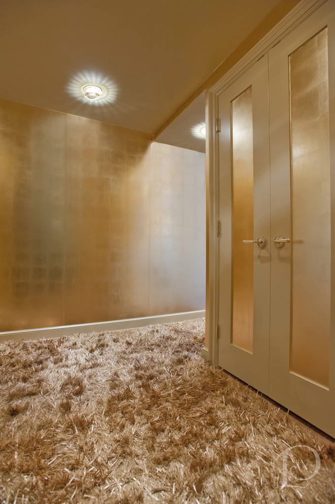
Can you believe this is the same space?? From the incredible Swarovski crystal inserts on the recessed lights (from Chimera) to the stunning metallic wall covering (Maya Romanoff, purchased at Donghia) right down to the amazing custom gold silken carpet (from Colony Rug) there’s no shortage of wow factor! I love how we carried the gold color palette through the entire Foyer using a variety of finishes. Instead of making visitors want to turn around and leave, now this beguiling space makes a statement that says: Do come in and prepare to be amazed!
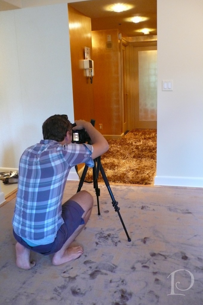
Here is the ‘after’ view of the hallway leading to the Master Bedroom. What a metamorphosis!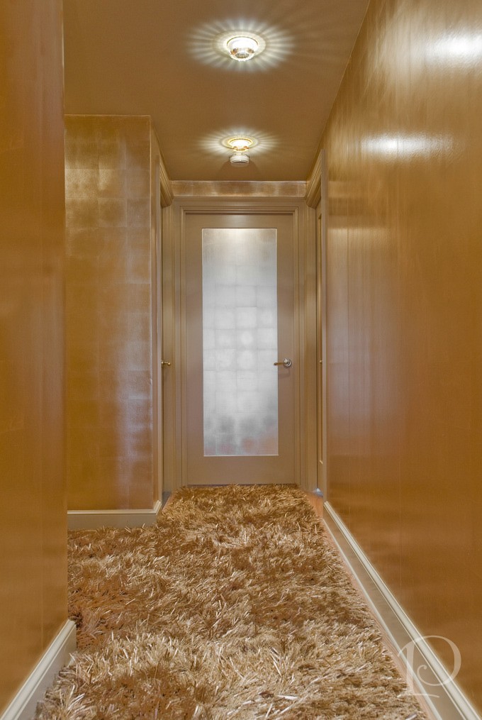 Of course all good interior designers have a fabulous team that helps them make the magic happen. Contractor John Horgan and Associates did a masterful job with the wallcovering and painting. The carpentry renovations (including sleek new doors) were done by the award winning S+H Construction. Randy Gross of Eric Levin Photography was a superstar during this shoot. He kept his good humor and smile despite the 90 degree heat, working with me to get “the” perfect shot.
I can’t resist showing you one more look at the Golden transformation~
I love this project and I hope you do too. What a wonderful reminder that even a small space can have a big personality so…think BIG!
“Live life big”
~Connie Hilner
xo,
Pamela
Contact me about Pamela Copeman Design Group services, including magical transformations!
To follow me on Pinterest, click here.
To follow Pamela Copeman Design Group on Facebook, click here.

