foyer
posts displayed by tag
Best of Posh Palettes: Cape Cod Seaside Home, Office, Foyer & Family Room
Apr 09 2014 ·1This week while I’m in Italy for BlogTour Milan (#BlogTourMilan and@pamelacopeman on Twitter), I’m reposting some of my favorite and most popular posts from the past. I hope you enjoy!
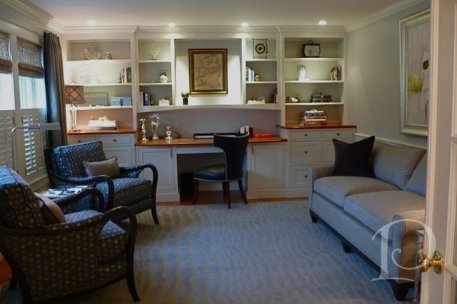
Continuing on with our tour of this lovely seaside home, today’s first stop is the Office. Located off the main Foyer, the Office is tucked behind French doors and is just far enough removed from the rest of the house to offer a quiet space to attend to business responsibilities.
This is the bland space that I viewed the first time I toured the house, rather sterile and not very inviting…
Diary of an Interior Designer: Cape Cod Seaside Home, Office, Foyer & Family Room
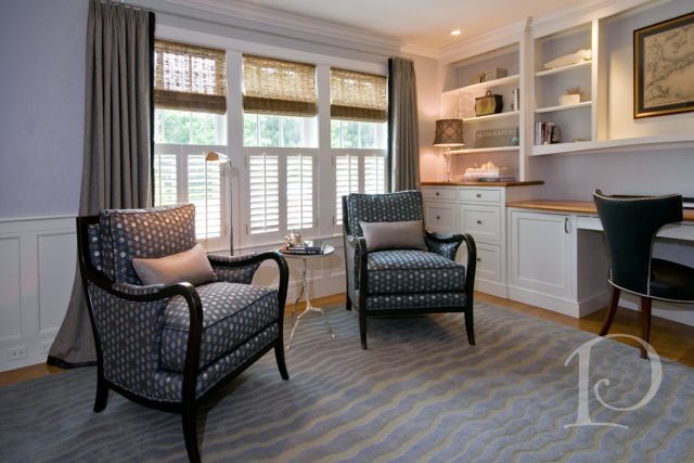
May 08 2013 ·1Continuing on with our tour of this lovely seaside home, today’s first stop is the Office. Located off the main Foyer, the Office is tucked behind French doors and is just far enough removed from the rest of the house to offer a quiet space to attend to business responsibilities.
This is the bland space that I viewed the first time I toured the house, rather sterile and not very inviting…
Pamela’s Posh Picks: Christopher Guy
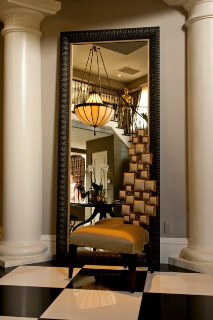
Apr 11 2013 ·2Christopher Guy, purveyor of “the world’s most fabulous lifestyles”, is the creator of truly amazing furniture pieces. The Christopher Guy look is described as “a contemporary mood with classic values”. I just adore so many of the amazing pieces in his various collections ~ especially the chairs! What better space to showcase a Christopher Guy chair than in an entry? Take a look at this week’s Posh Picks: Christopher Guy in the foyer!…

A Welcoming Golden Foyer
Apr 09 2013 ·1As a designer, one of the most thrilling aspects of my job is seeing a space totally transformed. Sometimes we are charged with refreshing a space that has good bones both architecturally and design-wise (see The Blitz video of Gina’s Living Room). Other times, we are starting from scratch and take a space all the way from drab to fab. Today I have one such transformation to share with you…
A Golden Transformation
Mar 04 2012 ·0When I was growing up, the story of Cinderella was one of my favorite fairy tales. It never failed to enchant me when the Fairy Godmother appeared and magically transformed Cinderella’s tattered rags into a beautiful ball gown complete with glass slippers. I may not be a Fairy Godmother but I am an interior designer and I love transforming pale and boring spaces into jazzy, eye-catching jewels!
Today I want to share with you one of my more dramatic transformations. The project was a condo on Tremont Street in Boston and the space was a petite Foyer and Entrance Hall.
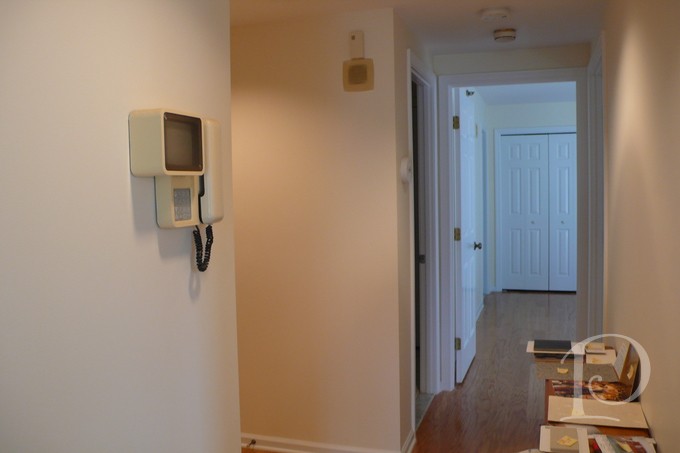
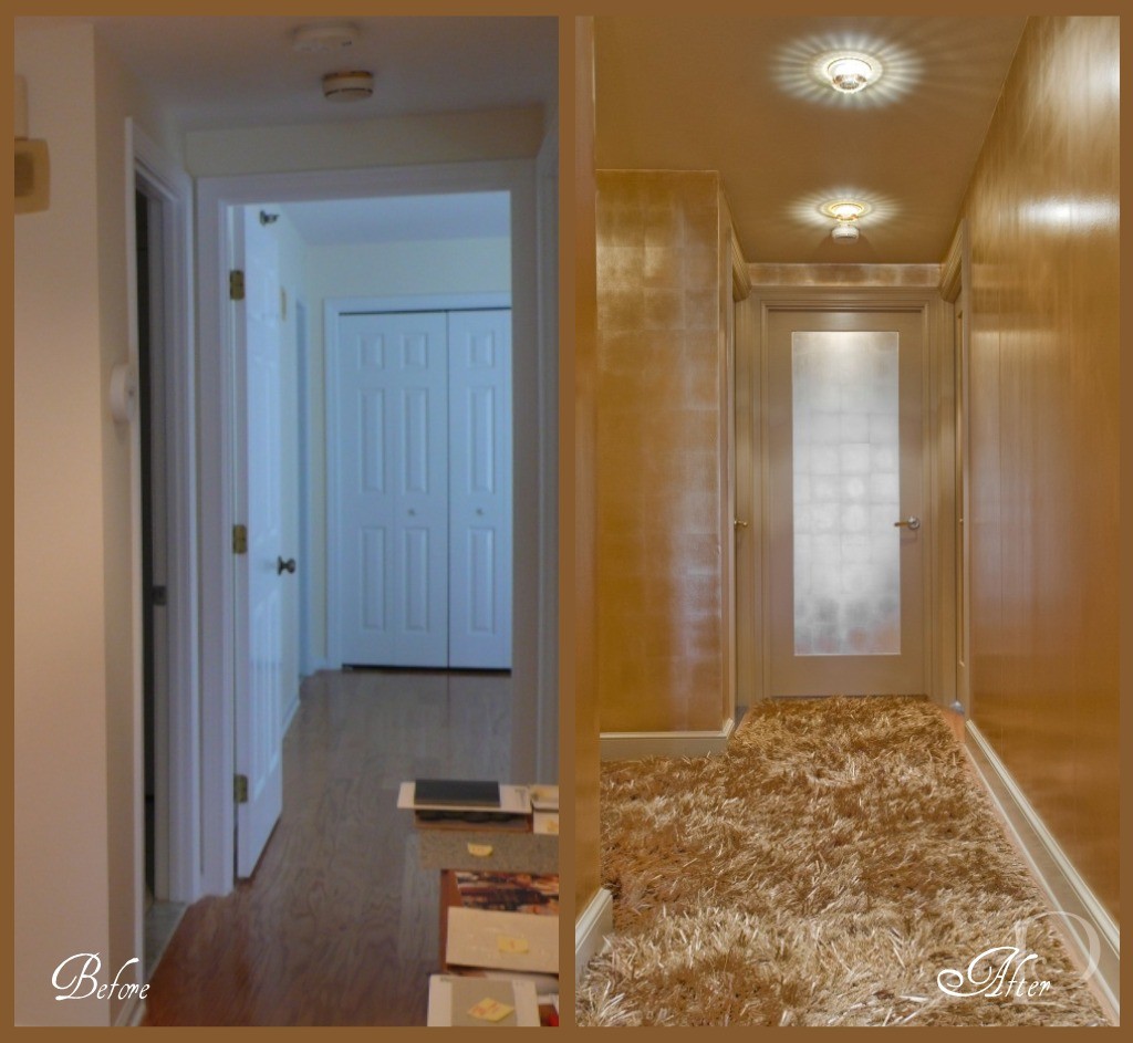
This before photo shows the Hallway that leads to the Master Bedroom. The space is boring, vanilla and dare I say, plain Jane.
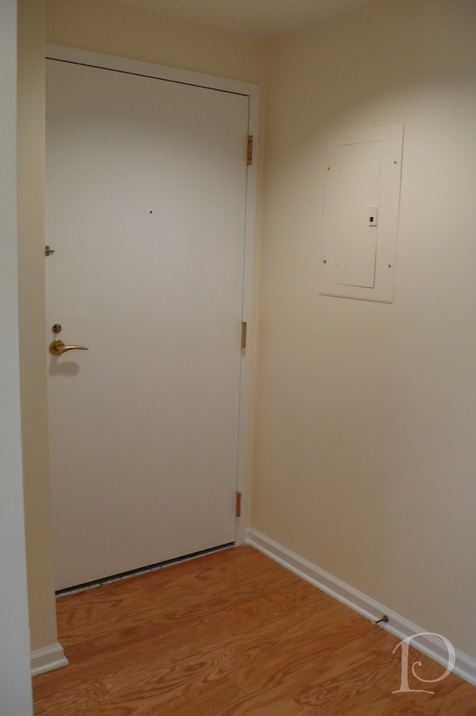
This is the interior shot of the Front Door. So boring, simply no personality at all.
I was determined, along with my client, to banish the boring and have her guests wowed as soon as they walked in the front door. Yes, this space was definitely in need of a touch of interior design “magic”. So I conjured up a dash of sparkle, a dose of glam, a whole lot of gold and… TA-DA:
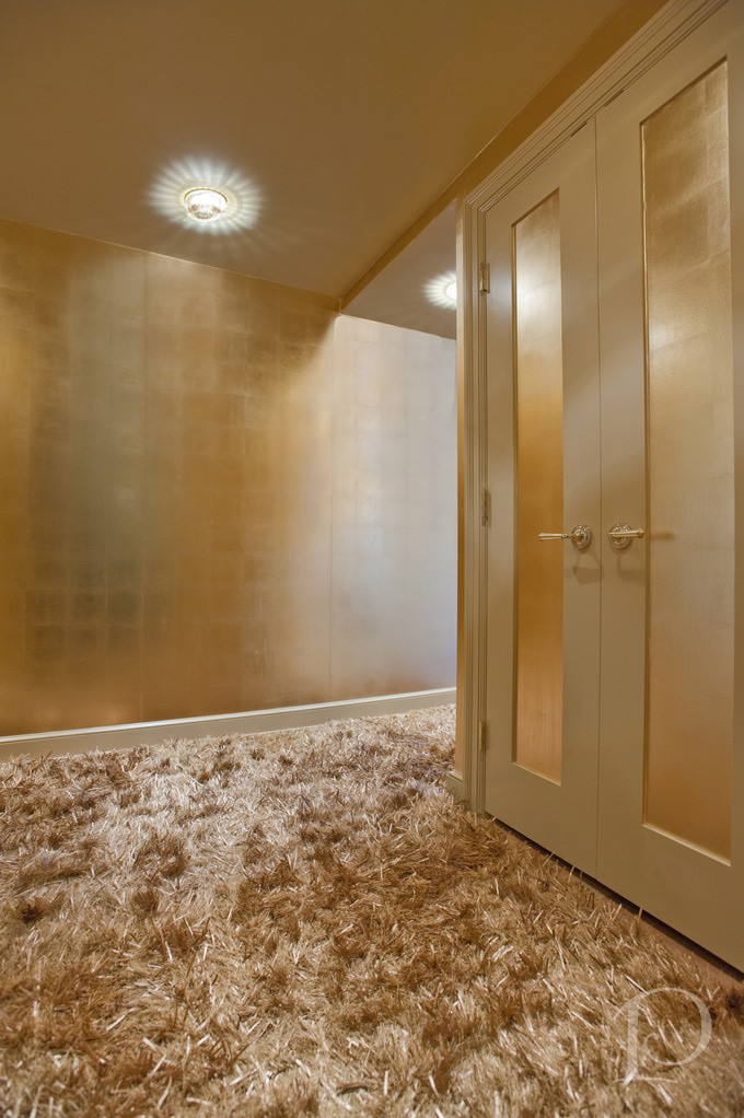
Can you believe this is the same space?? From the incredible Swarovski crystal inserts on the recessed lights (from Chimera) to the stunning metallic wall covering (Maya Romanoff, purchased at Donghia) right down to the amazing custom gold silken carpet (from Colony Rug) there’s no shortage of wow factor! I love how we carried the gold color palette through the entire Foyer using a variety of finishes. Instead of making visitors want to turn around and leave, now this beguiling space makes a statement that says: Do come in and prepare to be amazed!
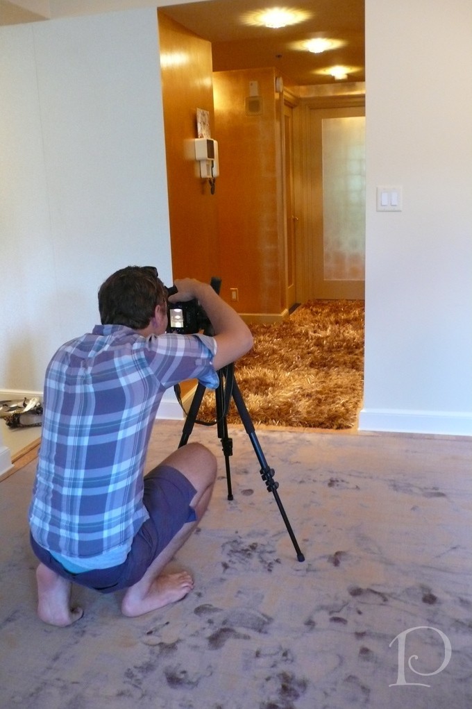
Here is the ‘after’ view of the hallway leading to the Master Bedroom. What a metamorphosis!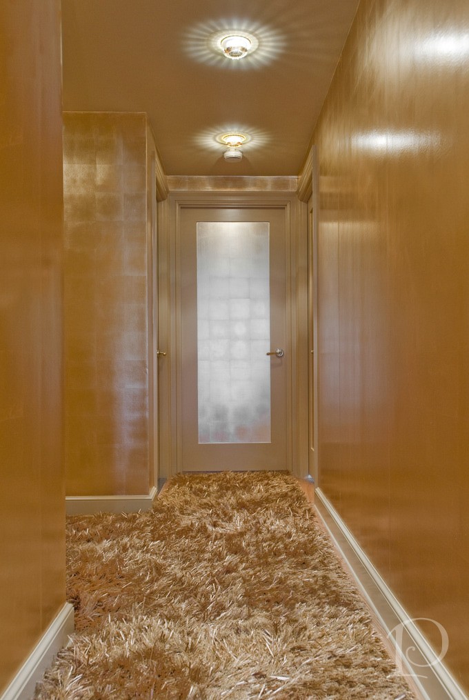 Of course all good interior designers have a fabulous team that helps them make the magic happen. Contractor John Horgan and Associates did a masterful job with the wallcovering and painting. The carpentry renovations (including sleek new doors) were done by the award winning S+H Construction. Randy Gross of Eric Levin Photography was a superstar during this shoot. He kept his good humor and smile despite the 90 degree heat, working with me to get “the” perfect shot.
I can’t resist showing you one more look at the Golden transformation~
I love this project and I hope you do too. What a wonderful reminder that even a small space can have a big personality so…think BIG!
“Live life big”
~Connie Hilner
xo,
Pamela
Contact me about Pamela Copeman Design Group services, including magical transformations!
To follow me on Pinterest, click here.
To follow Pamela Copeman Design Group on Facebook, click here.


