My Design Projects: Teen Bathroom
Jun 26 2012 · 0 comments · Behind the Design, Design Elements, My Designs ·0
A transformation is in the works!
I am excited to share with you one of several new projects that I am currently working on. You are in for a treat because I am able to show you the progression of this project in real time, as I am working on it. I hope you enjoy being along for the design journey!
Prioritized as the one of first spaces to be transformed in a larger project, this en suite bathroom for a teenage boy is quite small and ready for an update.
Here is the requisite “before” shot of the vanity in the existing bathroom:
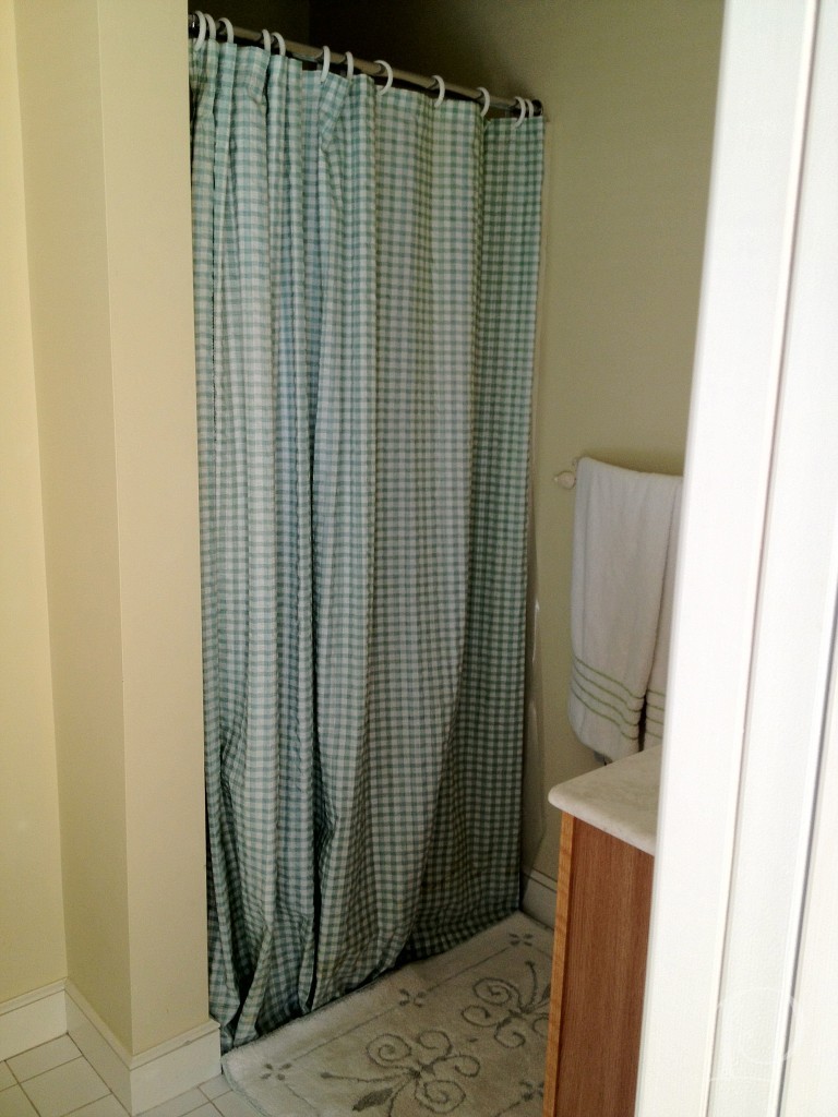
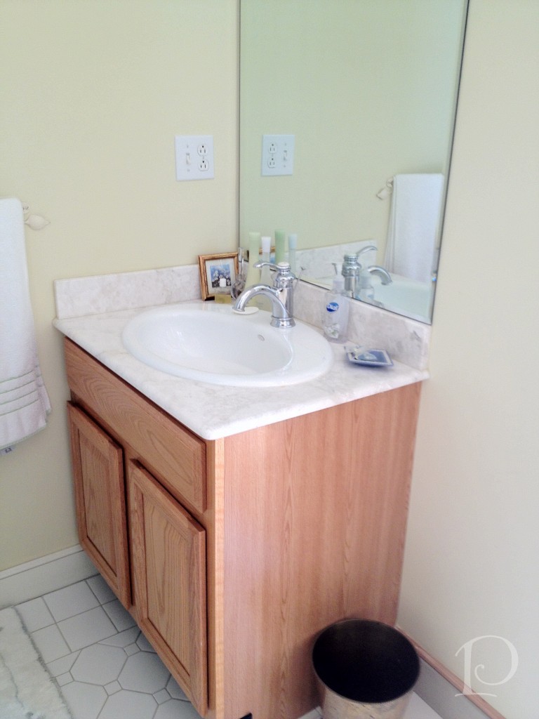 and the 1 piece shower:
While certainly functional, the space does not reflect the aesthetic of the teenage boy who lives here.
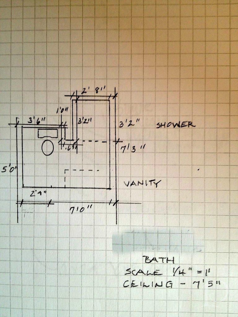
My first step was to draw up a floor plan, a must for planning the space and ordering materials.
While we knew this bathroom would need to coordinate with the adjoining bedroom, I was curious to see what ideas my young client had for the overall design. During our initial design meeting we discussed the function of the room (sleeping, studying, entertaining friends) and color preferences (red). I knew I was going to have a great time with this young man he likes the color red! After a bit more delving, he told me about some posters he collected last summer. The posters are sophisticated in shades of charcoal, reds and other vivid hues. What a great jumping off point for the design of our project! Every design has to have an inspiration and this young man’s poster collection is ours.
After our discussion, I wrote up my ideas and met with Christine at Tile Showcase at the Boston Design Center.
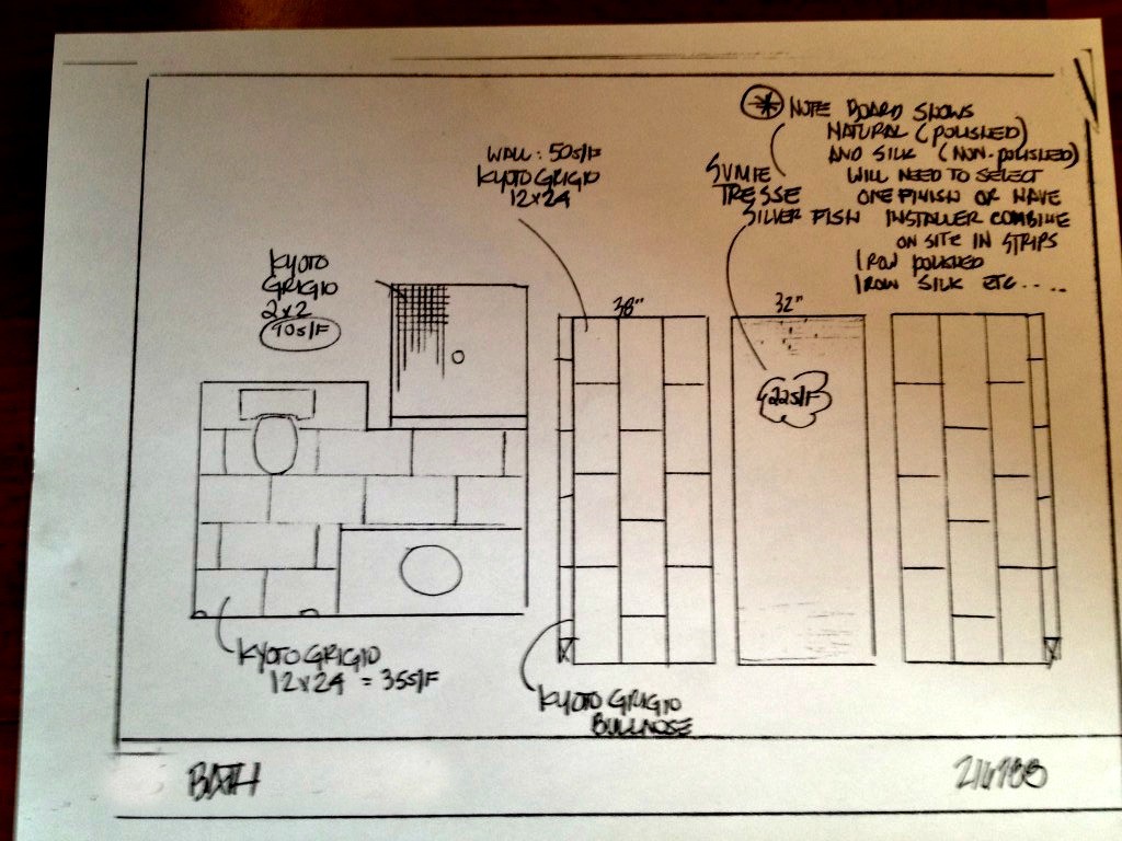
We found some wonderful tile selections and Christine sketched a quick plan:
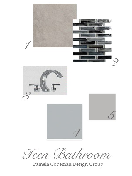
To make the plan come to life for you, I put together this mood board for the space:
Details:
1. Kyoto Grigio tile for the back wall
2. Sumi-e Tresse Silver Fish Natural glass mosaic tile for the side walls on the vertical and the floor ~ using the same tile on both surfaces will give the illusion of a larger space
3. Sigma Palermo faucet is one of the options for faucetry, I love the modern look of the polished chrome
Two of our options for wall color, both from Sherwin-Williams:
4. Monorail Silver
5. March Wind
Stay tuned to see progress, plus more on the bedroom design. I promise it is creative and amazing ~ and just wait until I show you the inspirational posters!
“Design is a constant challenge to balance comfort with luxe, the practical with the desirable”
~Donna Karan
xo,
Pamela
Contact me about Pamela Copeman Design Group services.
To follow me on Pinterest, click here.
To follow Pamela Copeman Design Group on Facebook, click here.
To follow me on Twitter, click here
0
