Meanderings
posts displayed by category
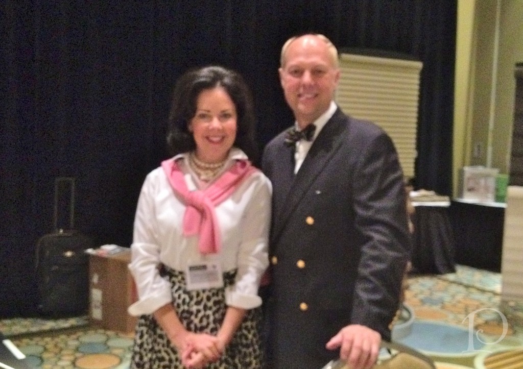
Mark Woodman, Color Marketing Group
Jun 04 2013 ·1At the ASID Fall Business Conference, Mark Woodman, from the Color Marketing Group (CMG) delivered the keynote address. Not only is Mark a dynamic designer, but he is also an outstanding and personable speaker.
The Color Marketing Group is a premier color and design forecasting organization. This non-profit brings designers, stylists, and marketers together to discuss the influences, indicators and directions of color in products and culture.
Here is a brief re-cap of Mark’s color projections for 2013 …
I think most of us remember being introduced to color via Crayola crayons, even Mark Woodman. 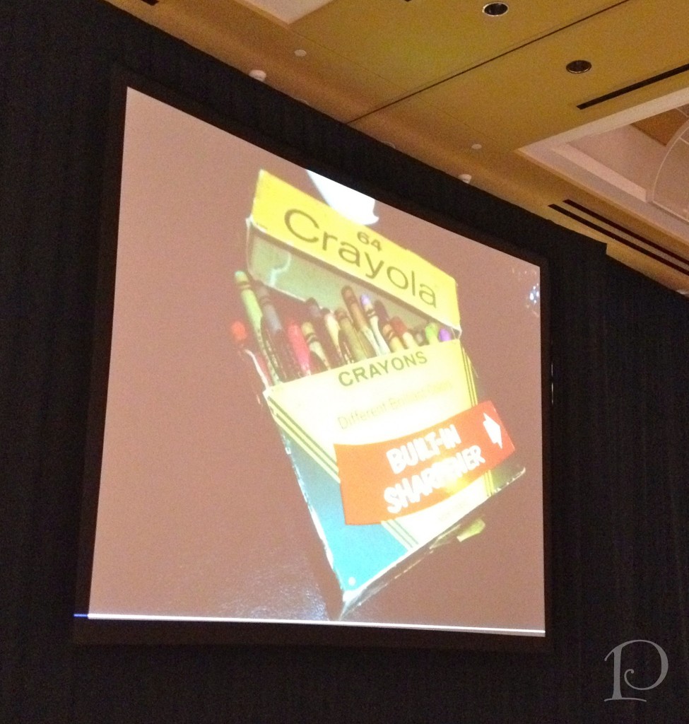 My memory is of the smell of the wax when you opened the top and peeling away the paper on my favorite colors (always in the red category). I usually had the box of eight crayons. However, one Christmas Mrs. Claus brought me a box of 64 with the sharpener just like this picture. That was when I first fell “head over heels” in love with the metallic colors of copper, gold and silvers. I slept with that box under my pillow for years. I loved it with my entire being. I guess I was always destined to work with color. I am so lucky!!!
This is the cover of the book Color in Small Spaces. The design featured on the cover is by Mark Woodman. 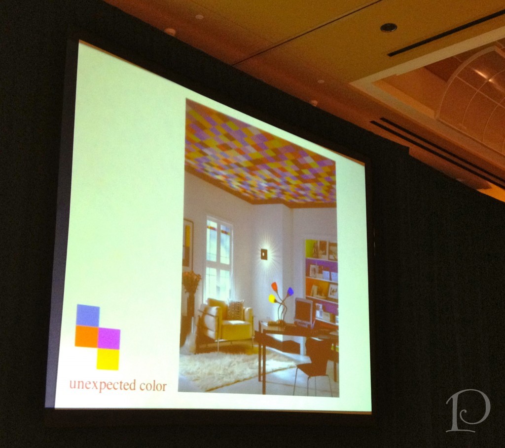
What makes this room jump out is the ceiling of course. Isn’t it just grand? If you cover the ceiling with a piece of paper the room height appears much shorter but with the Rubik’s Cube inspired ceiling, the walls are heightened and the overall look is much jazzier too!
Looking forward, Mark projects that color will be softer, lighter that air, soothing…
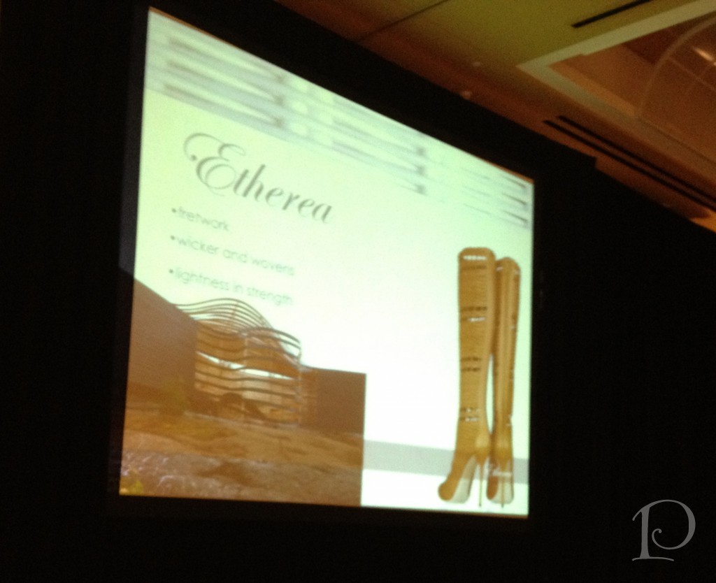 We will see fretwork and wicker in our furnishings and wovens in our fabrics. The finishes will be matte and edges will be rounded with softness. Materials may be frothy, wispy and have a glimmer. The colors will be muted earth tones ~ lots of browns with the appearance of having a sheer overlay of sorts. This is ETHEREA.
The next influence will be a sense of spirituality. Influenced by a rebirth of Spring, we will see fresh garden colors, and floral designs with lots of yellows, blues, violets and greens.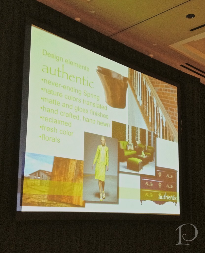
There is a feeling of home grown, home baked, hand crafted, passed down, re-thought, reclaimed, imperfect. This is AUTHENTIC.
This is urban living: the jet set, digital brights, high tech gloss, sports bright, futuristic lines, ombre, gadget inspiration… 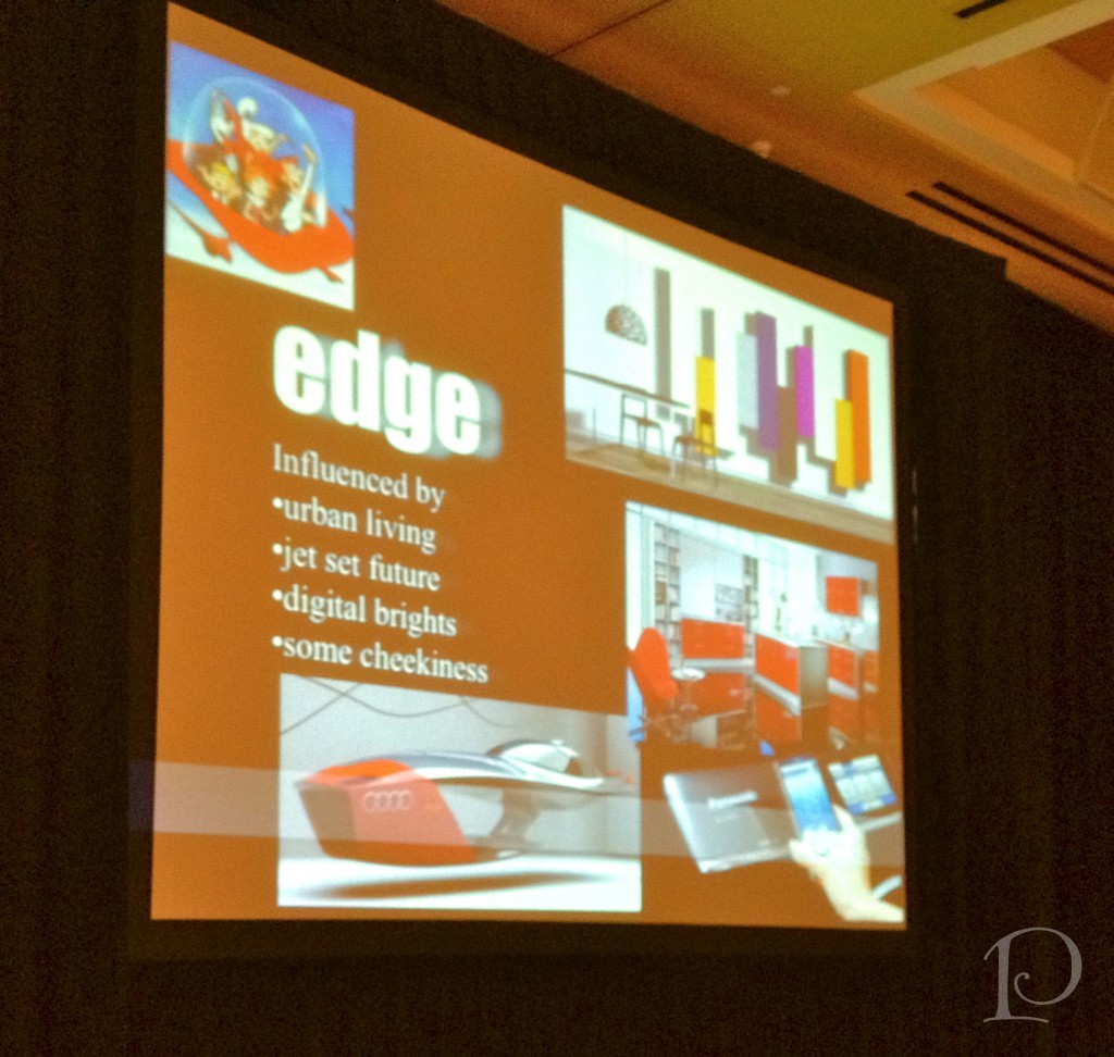 The colors are influenced by “blue tooth”, shiny happy future, superheroes, and Mad Men. These colors are also happy, art pop, shiny urban with metallic gleam blues in every hue with high gloss. This is EDGE.
This is classic design elements, a response to overly modern but definitely not simple.
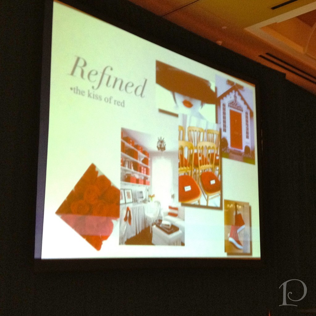 This is the classics revisited: a kiss of red, passion, blood running through our veins for our lifeline. A touch of gold in the warmth of 18k gold, icing embellishment colors in accented neutrals, blonde gold, neutral with a twist, along with rose and reds. This is REFINED.
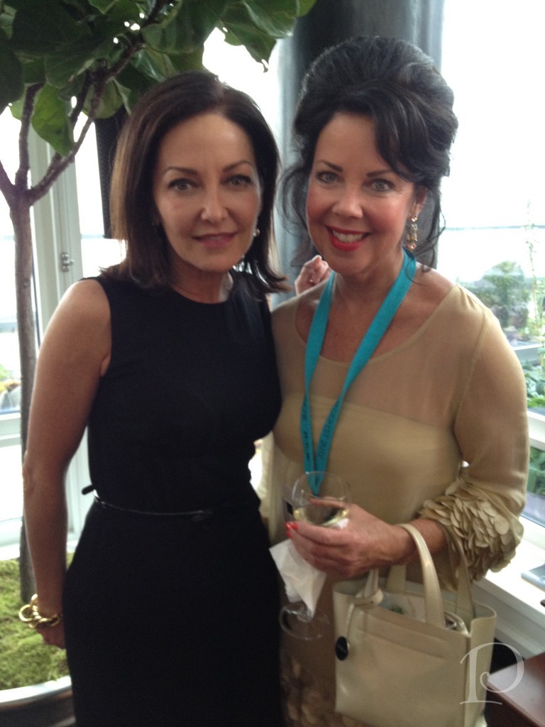
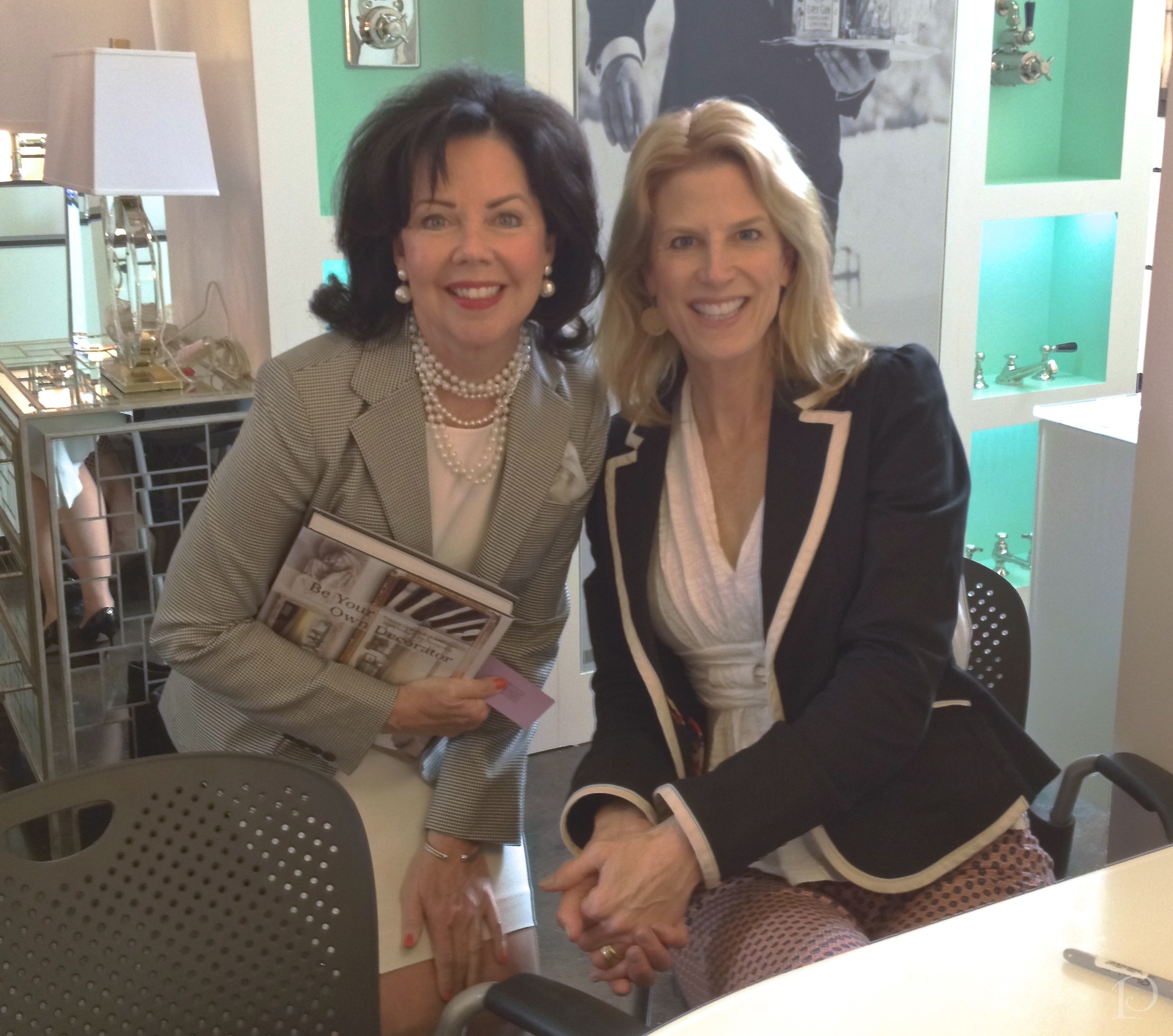
Mark Woodman and me
“There are times to be gentle with color, times to be brave, but never a time to be dull”
~Jane Faulkner
Speaking of color, thank you all SO MUCH for all your support with my Joss & Main Posh Palettes sale! I’ve gotten a lot of positive feedback and during this season of gratitude, I feel very blessed to have such wonderful friends and supporters!
xo,
Pamela

There’s Nothing Like a Junior League Show House!
Jun 04 2013 ·0“Our mission is to promote volunteerism, develop the potential of women, and improve the community through the effective action and leadership of trained volunteers.”
~Cynthia Reuter, President Jr. League of Boston
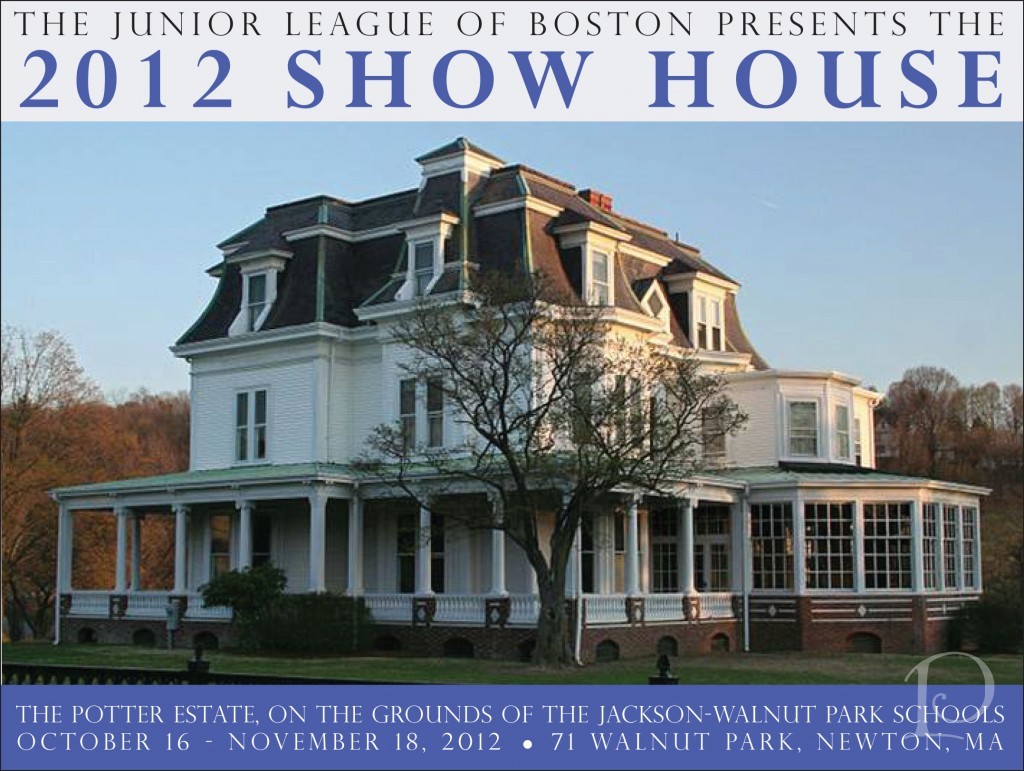 After a six-year hiatus, the Junior League of Boston Show House has returned! This year 35 talented designers have transformed the Potter Estate in Newton, MA. Located on the grounds of the Jackson-Walnut Park Schools, a ministry of the Sisters of St. Joseph of Boston, this 1867 Victorian mansion is an architectural gem.
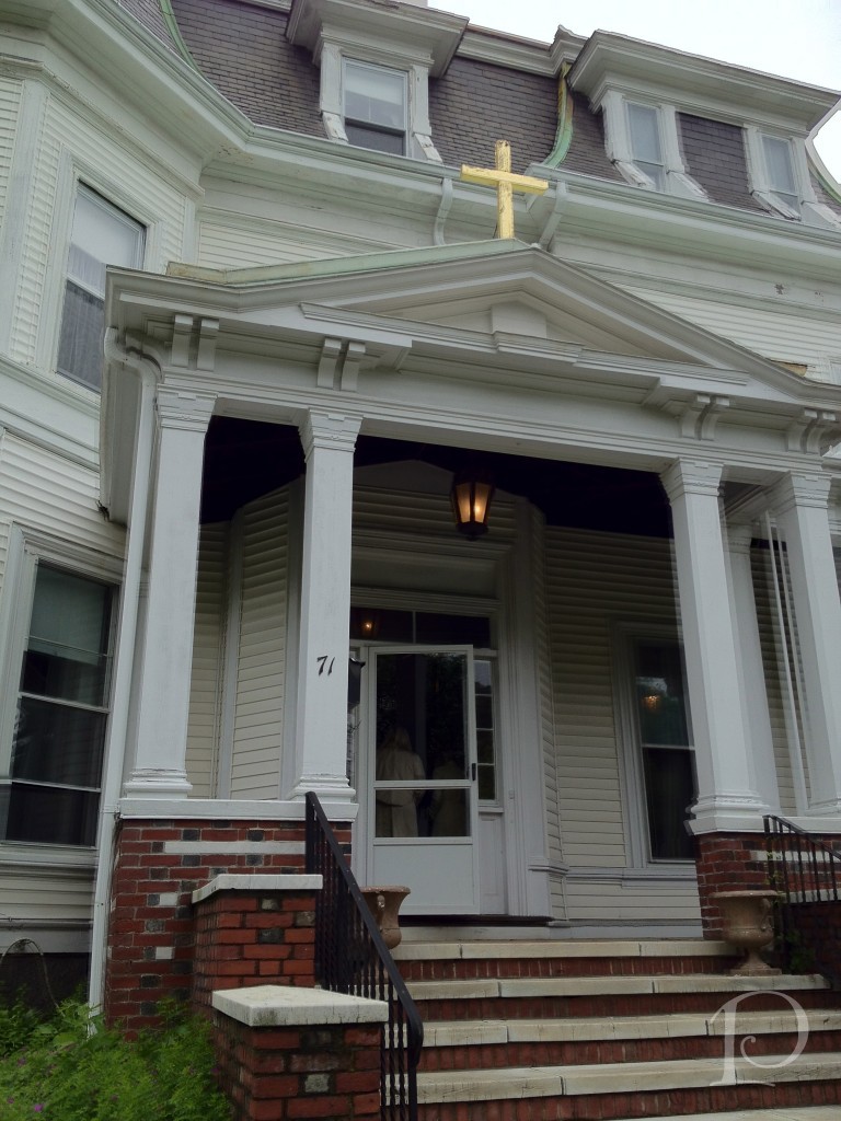 Back in June, I was invited to tour the house and consider making a bid to participate in this year’s Show House. For personal reasons, I chose not to but having toured the space in its ‘before’ state gave me a unique perspective when touring the impressive ‘afters’ during my visit this past weekend.
Here’s a peek at the space I was considering back in June. Slanted walls and a window without much of a view made for some very interesting challenges…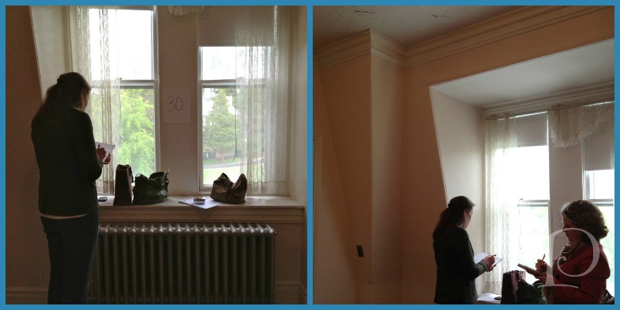 In the deft hands of designer extraordinaire Laurie Gorelick, this space has been transformed into The Inner Sanctum.
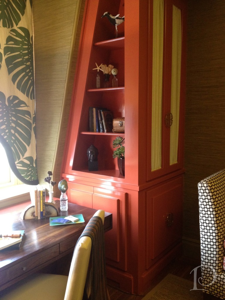 Now, it just so happens that Laurie is part of the Blogger19 group that I attended Brizo Fashion Week with in September. What could be better than seeing the space I found so intriguing transformed by a talented designer I have come to call a friend?
Designer Laurie Gorelick
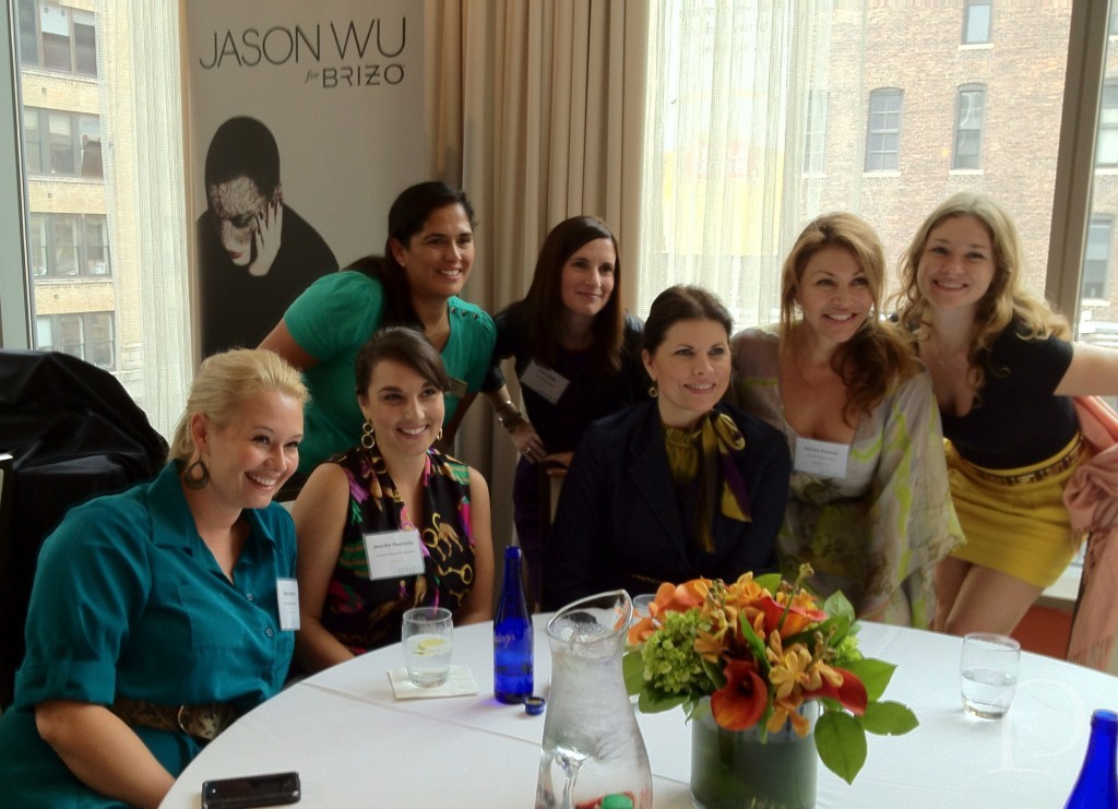
How about seeing that space with a whole bunch of designer friends including a mini Blogger19 reunion?!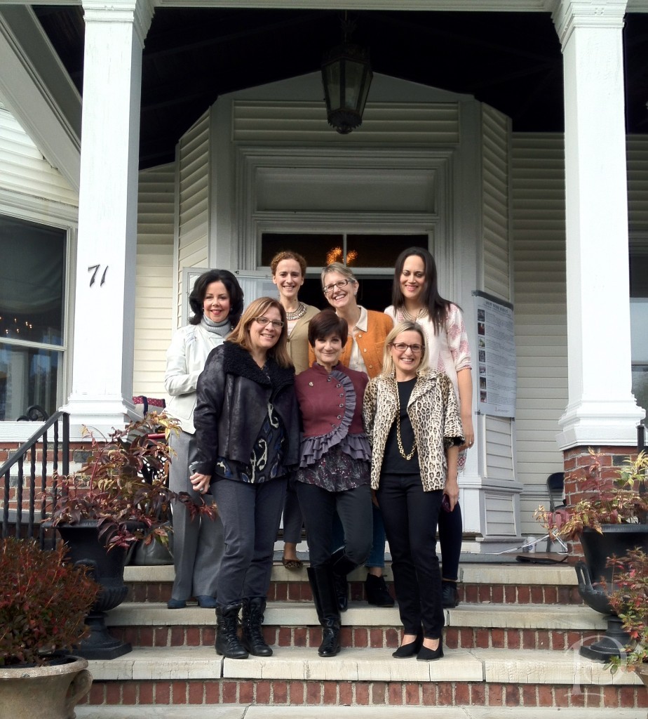 Front Row: Michelle Alfano, Laurie Gorelick, Kristen Rivoli Back Row: Moi, Jennifer Mehditash, Lynn Byrne, Sarah Sarna
Yes, these gals organized a Designer Caravan starting in NY to come and see our Show House! So much fun to see them again!
Back to Laurie’s space… When she named her space The Inner Sanctum, she envisioned it as “a haven to refresh the mind, body and soul”.
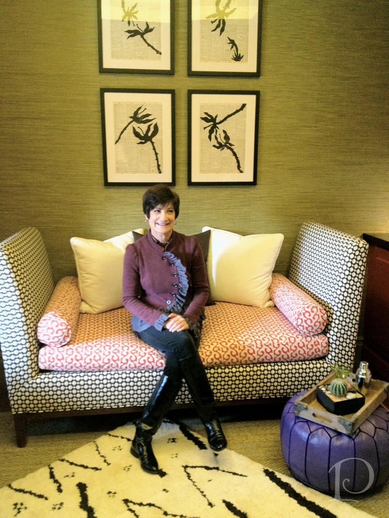
A wonderful spot for relaxing with a cup of tea
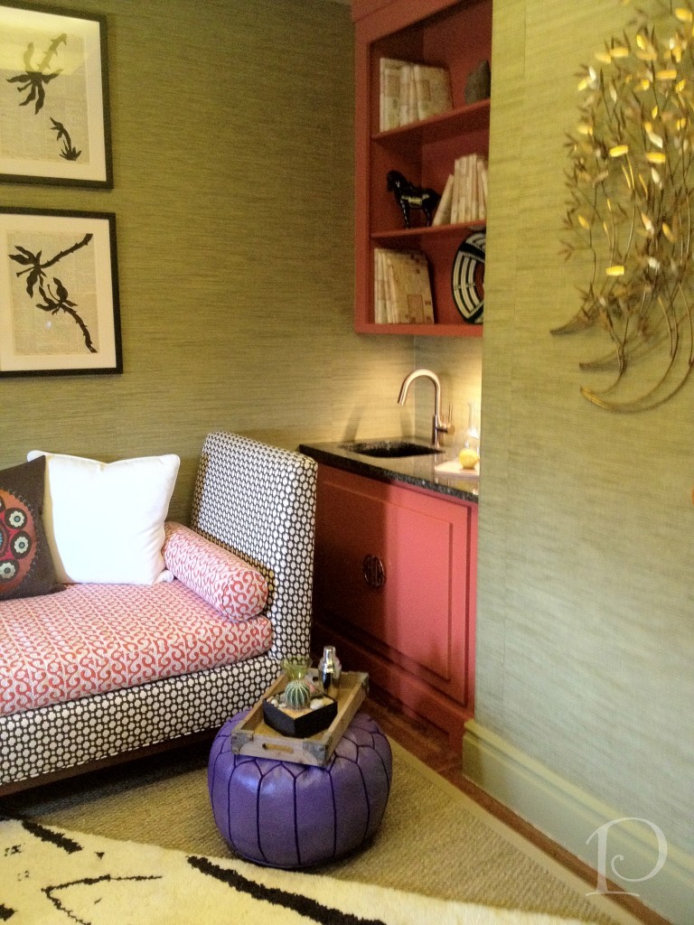
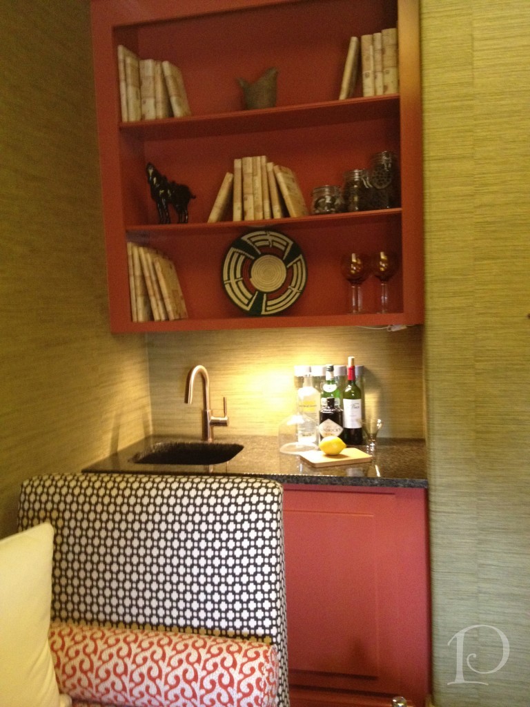
Beautiful built-in display shelving
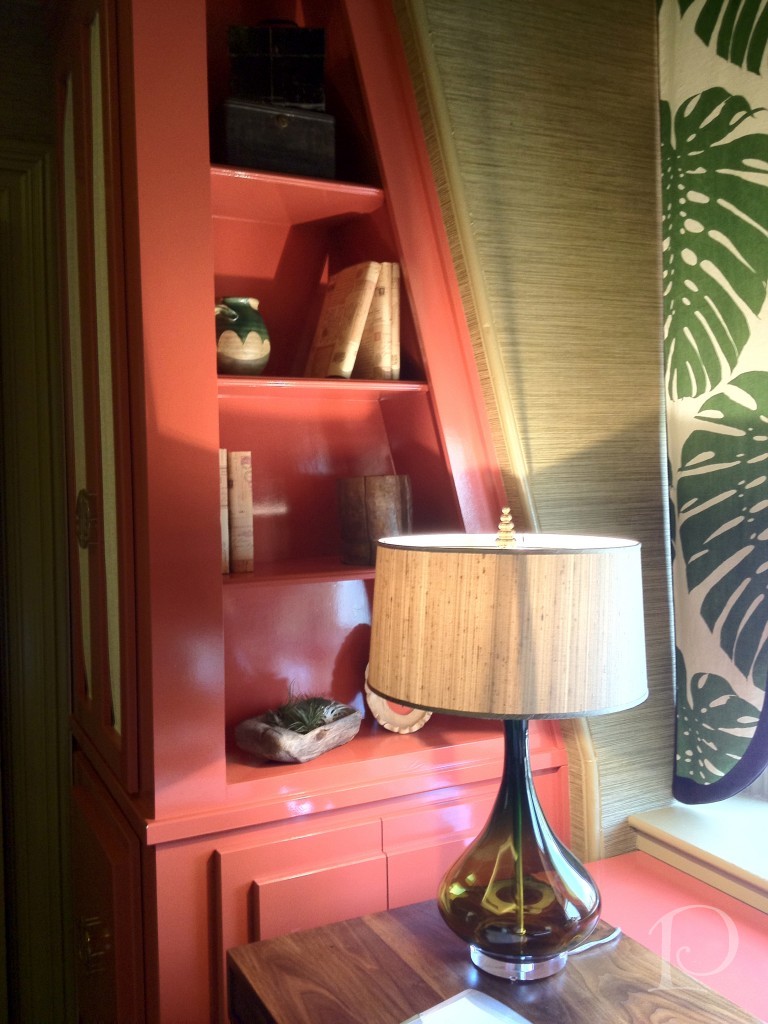
Perfect window creation for a spot with a less than ideal view
Note the elegant Brizo Smart Touch faucet
As we toured the Show House, there were several other rooms that made my highlight reel…
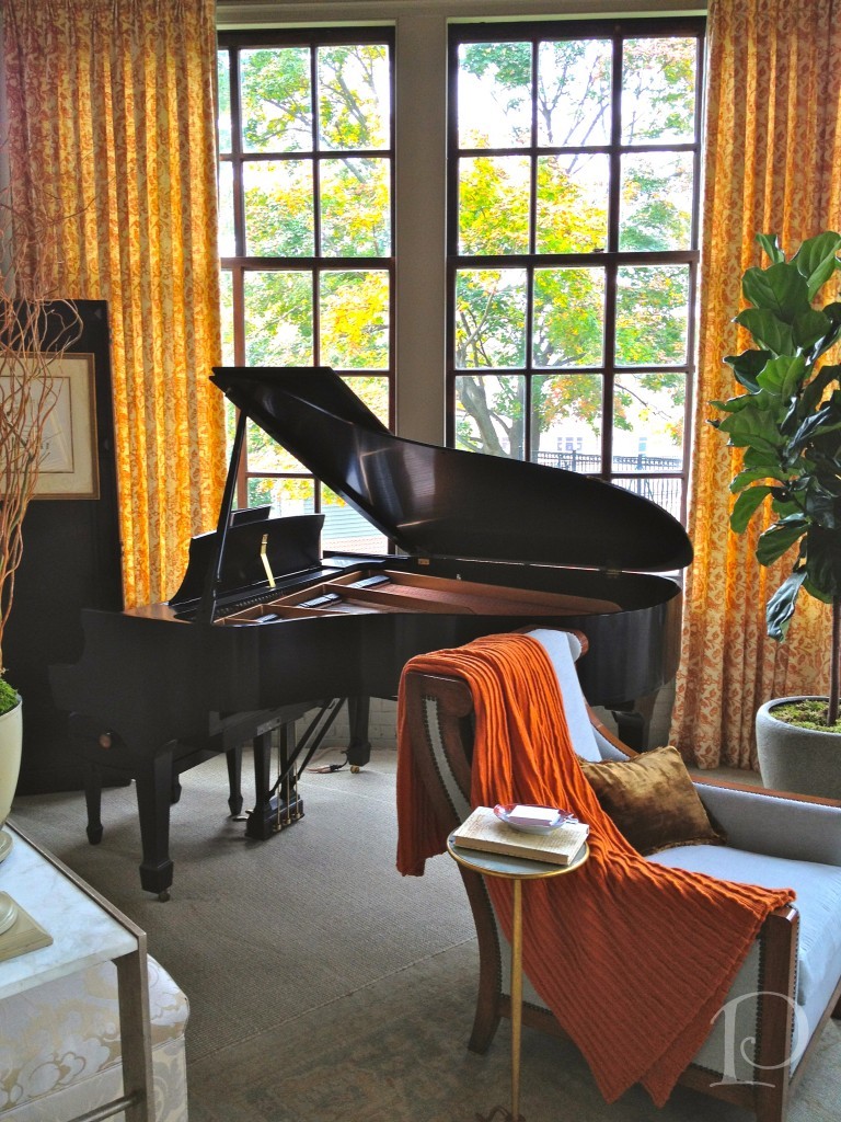
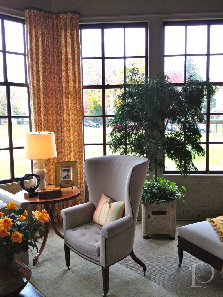
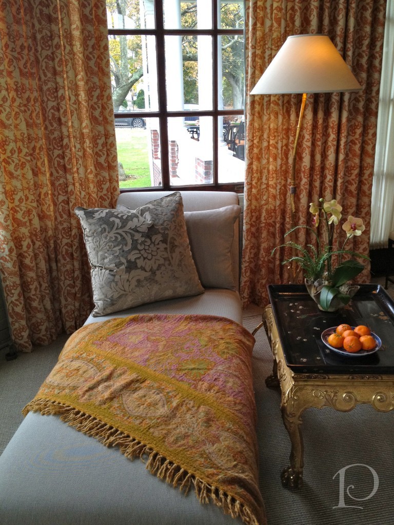
The Conservatory: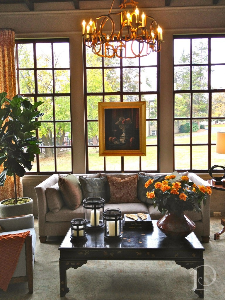 I love what Gerald Pomeroy did with this space. When I toured the house in June, it was full of dark stained wood. Now the neutral palette on the walls is the perfect backdrop for the glassed view of the autumn trees.
As you entered this space the piano was playing light music and every sense was catered to. I adore the chaise, in fact if I could make one Designer Wish it would be that every room have a chaise with a throw for lounging. Heavenly!
This original light fixture was spruced up with a bit of gold gild: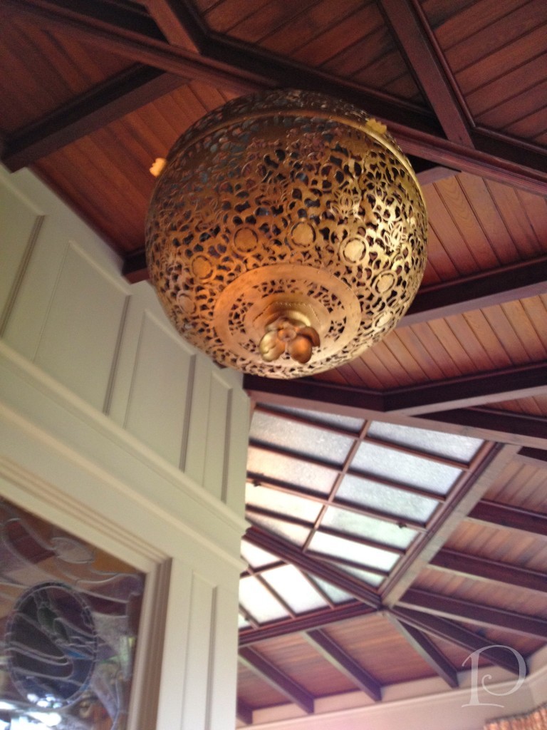
This sculpture welcomes you into the Gentleman’s Library ~ love it!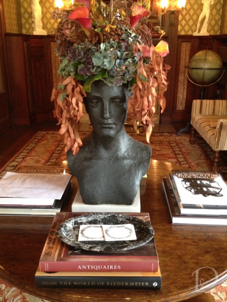
Amazing original stained glass windows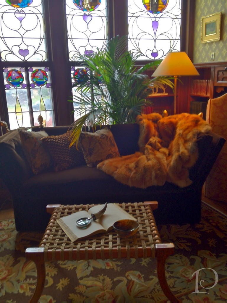
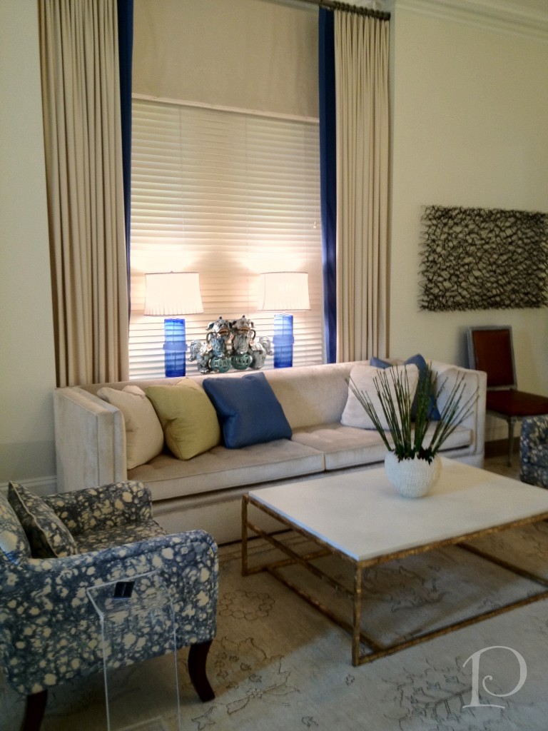
The Living Room is very cosmopolitan and modern
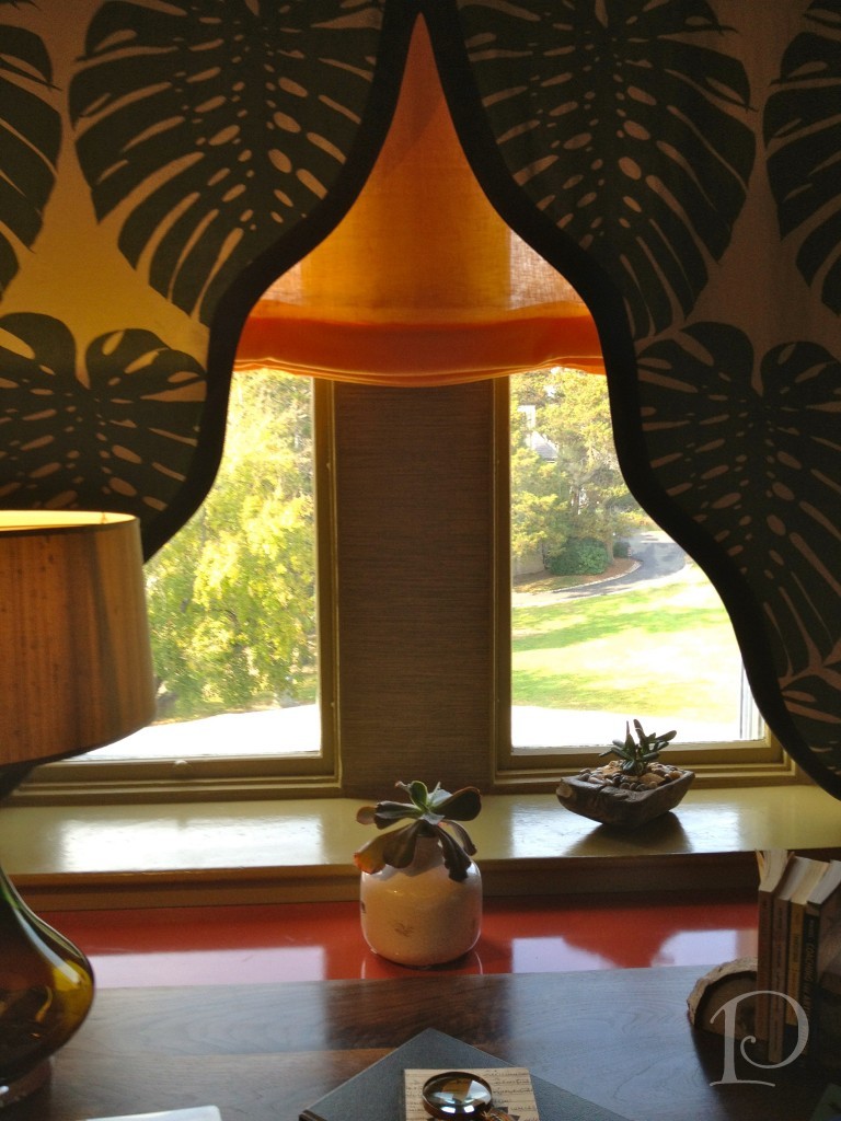
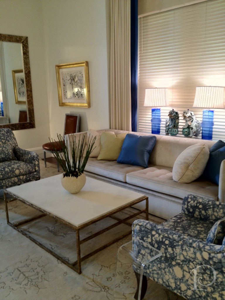 Believe it or not, when I viewed this room there was an altar in the space where the window is in the desk nook.
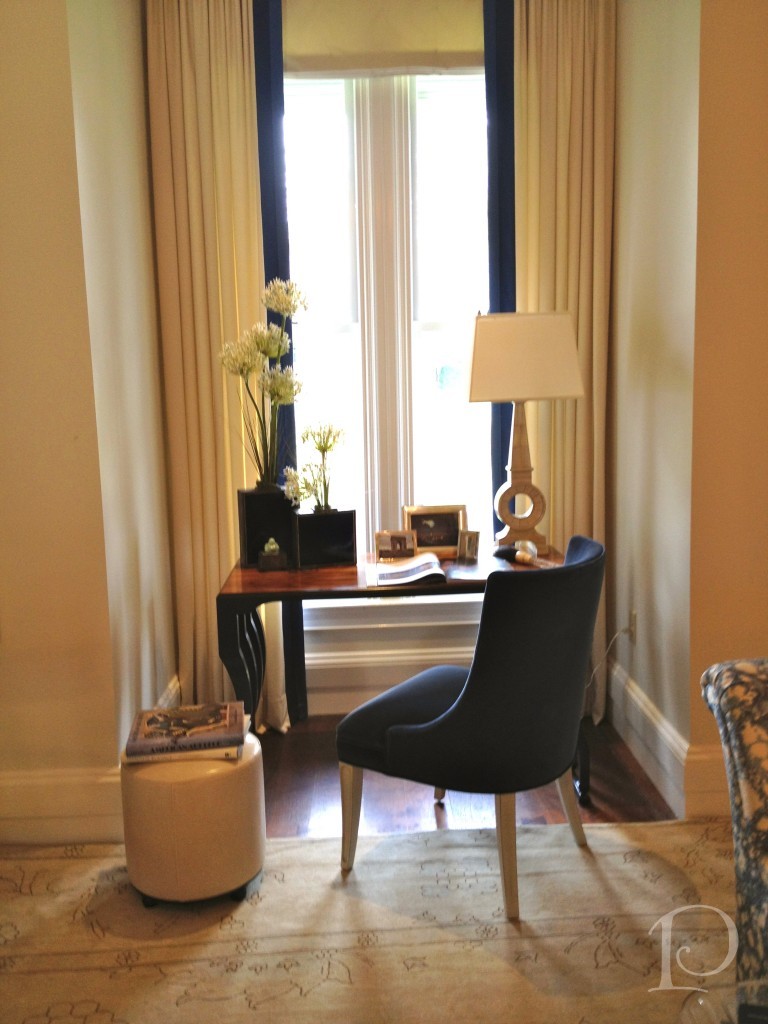 I learned that when the altar was removed during construction, the window was discovered. Also discovered were pipes that could not be removed so walls were created on either side to box in the space. The end result is a charming and useful nook.
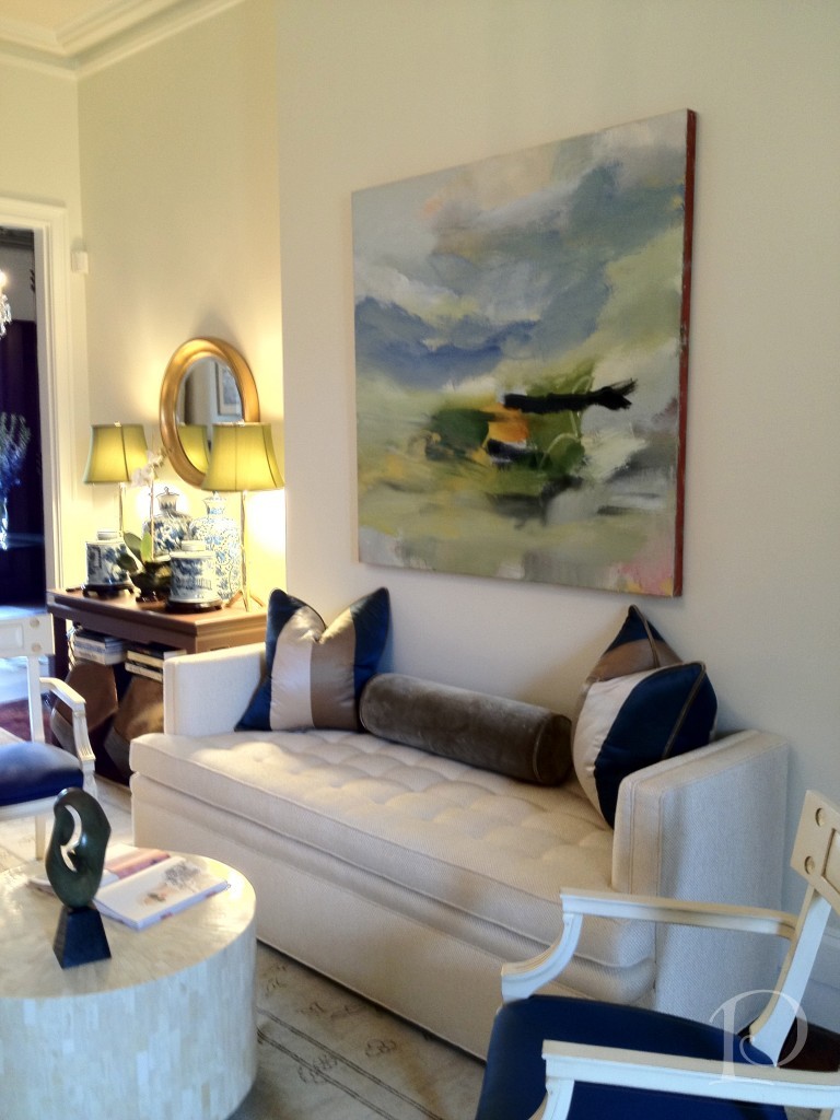 I love the colors and the artwork in the room, and all of the seating that just begs you to come and sit a while…
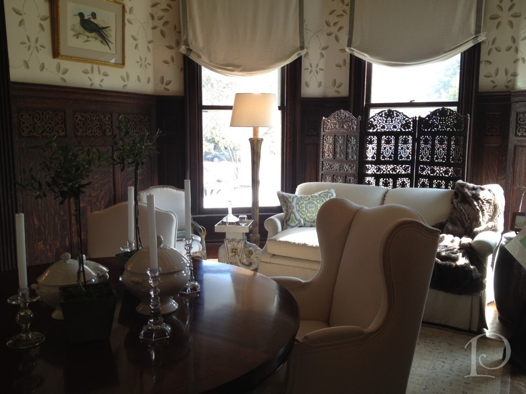
 The Dining Room featured a round table which I find to be the best for conversation and secrets:
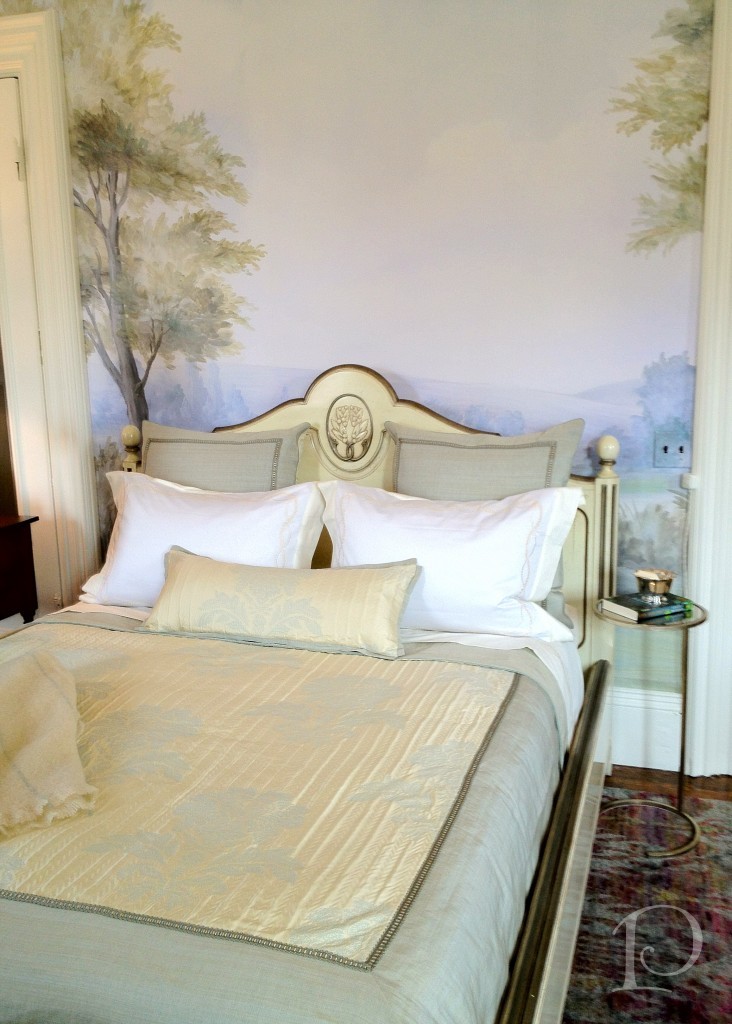
 The wallpaper mural in the Garden Guest Bedroom was so soft and inviting:
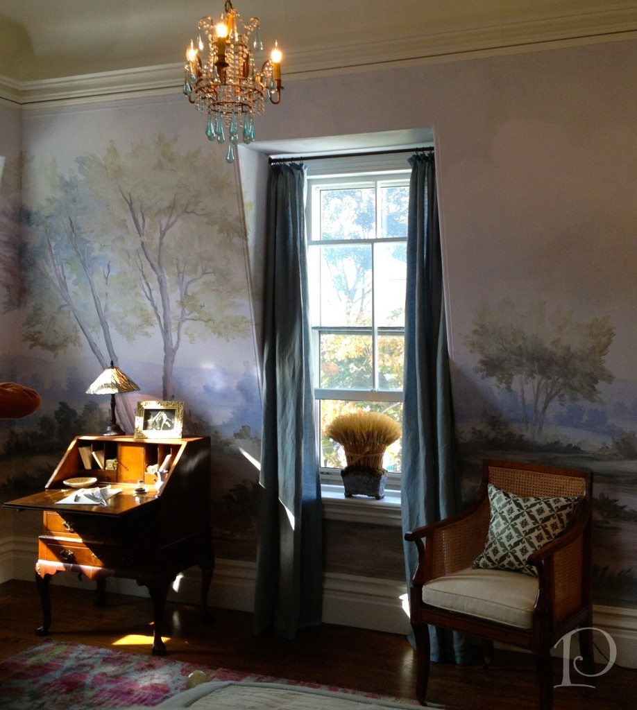
 The chandelier, chairs and perfect light in this space was enchanting…
 The Guest Bath was a great example of respecting the integrity of the space and adding contemporary elements.
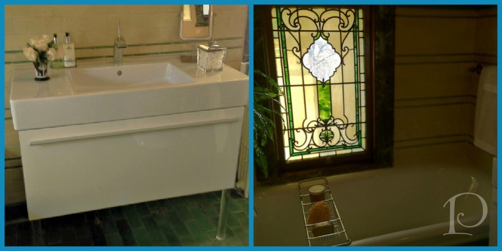 I love the juxtaposition of the stained glass windows with the modern acrylic leg sink.
The highlight of the room was certainly this incredible chandelier (inspired by Dale Chihuly as Jennifer would say …).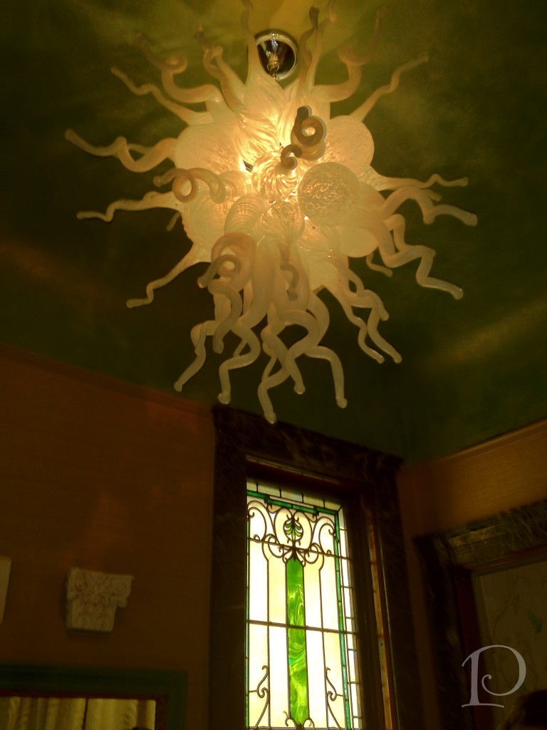
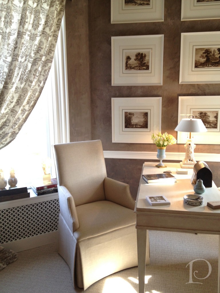
Frank’s Study by Frank Hodge was elegant and inviting.
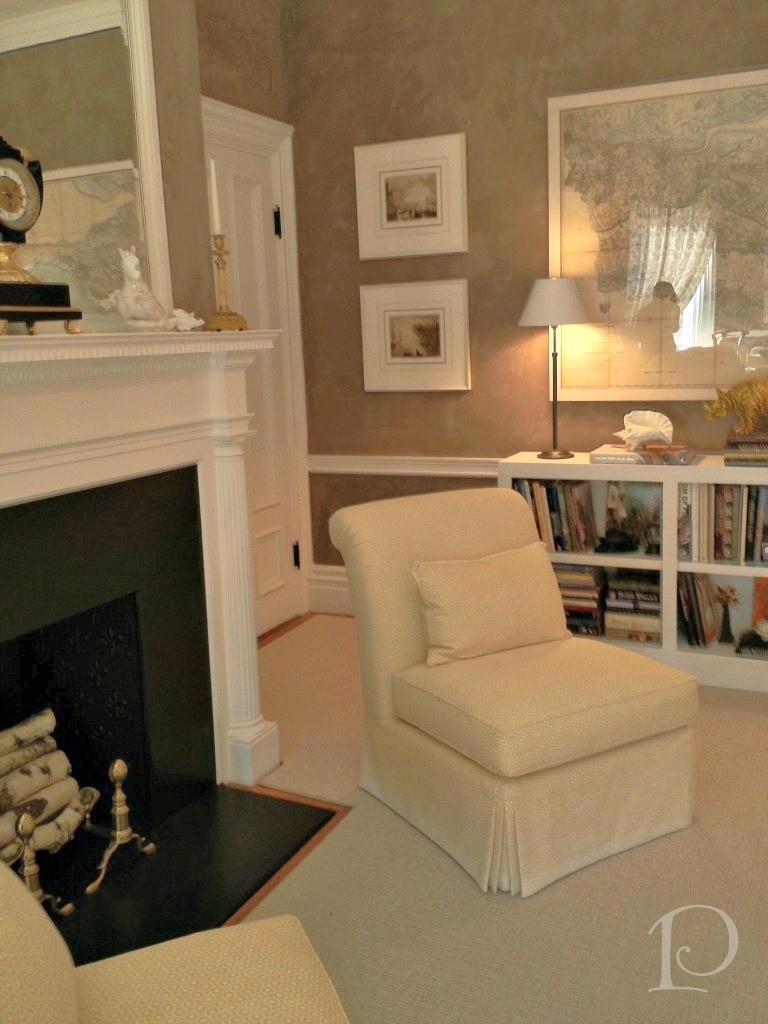
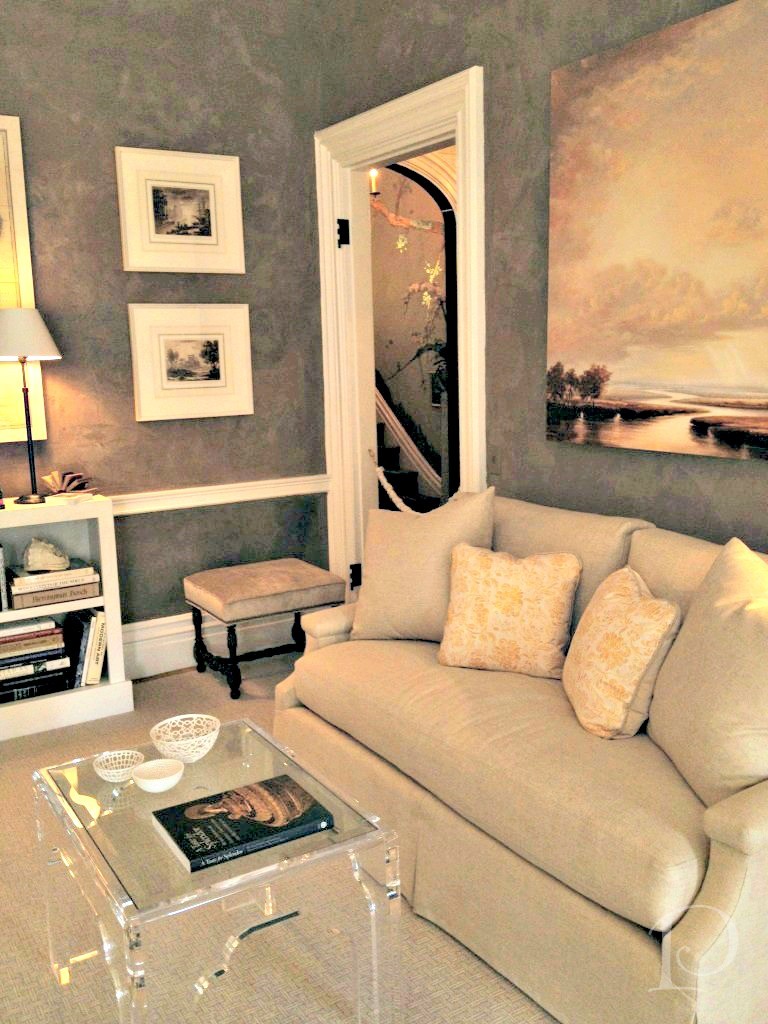 This desk beckoned to me; to write a note, to draw a floor plan, to paint a watercolor. Oh, the possibilities…
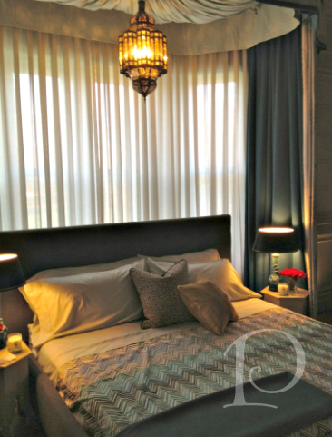
 The Master Bedroom design featured an eclectic mix of Moroccan and French influences ~ ooh la la
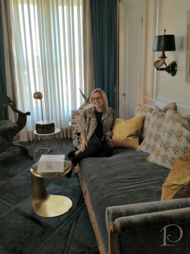
 Designer Kristin Rivoli in her fab space!
 Up on the Third Floor were these wonderful Foyer Lights.
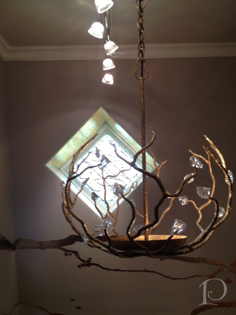 I love how the layering of light includes natural light as well.
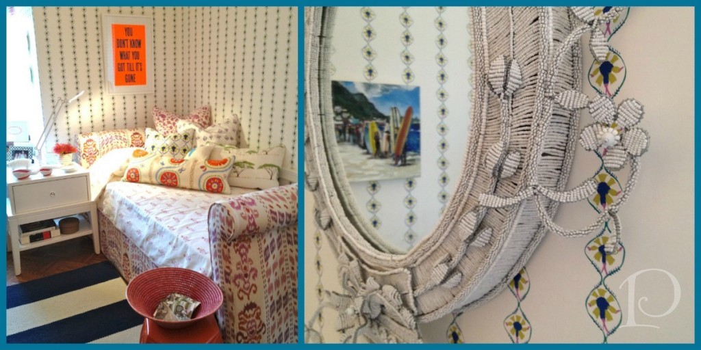
The Young Woman’s Bedroom featured classical style with a whimsical approach. The hand beaded South African mirror was a showpiece.
The Hideaway was one of the most imaginative spaces in the Show House.
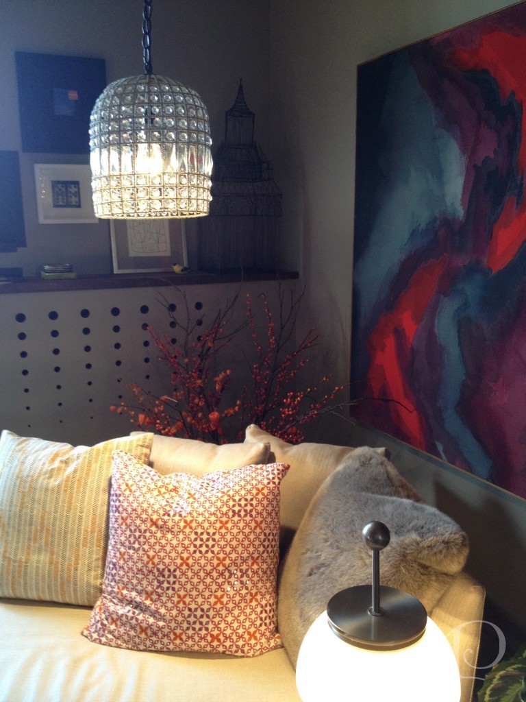
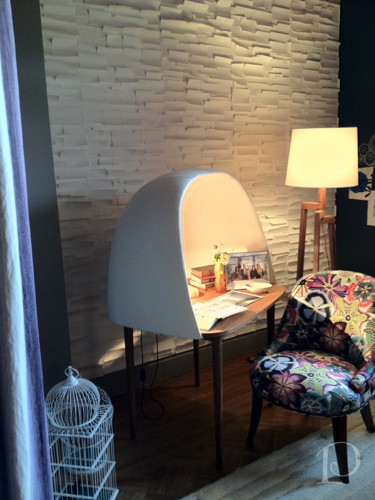 What a chaise! What a desk! Love it!
The colors used in the Kitchen included a strong chartreuse and a variety of watery blues ~ great combination!
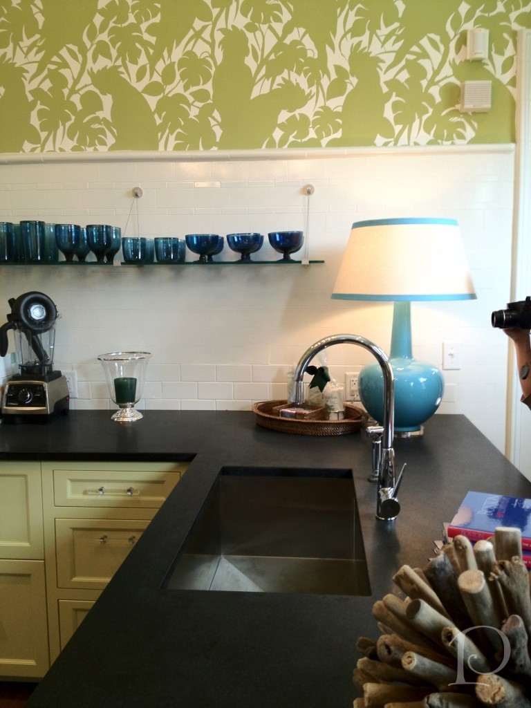 The drapery fabric provided the inspiration:
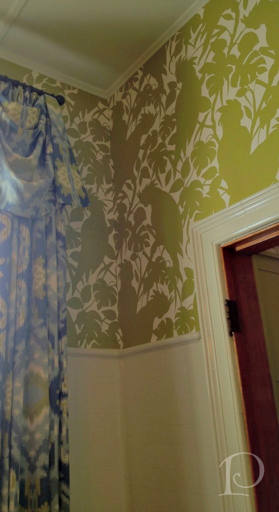 Finally, The Green Room by Elizabeth Benedict.
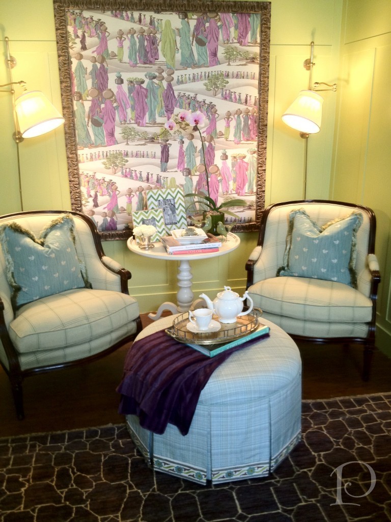 What a lovely way to wrap up our tour!
Once again, thank you so much to all my designer pals for making the trip to Newton. It was so special to see you all again ~ can’t wait for our next adventure!
xo,
Pamela

Charleston, Sweet Charleston
Jun 04 2013 ·0This past weekend I paid my first visit to Charleston, South Carolina, a true jewel of the South. My dear friend Tina and I attended Parents Weekend at the College of Charleston where her daughter, Olivia, attends the Honors College. When Tina’s husband Rich had to cancel at the last minute due to work obligations, I was more than happy to step in!
This city has is all: academia, history, beautiful homes, along with incredible dining, shopping and art. What more could a person ask for? Come and join me for a tour of the city, I’m guessing it will enchant and delight you just as it has me!
Our first evening we dined on the patio at The Macintosh, which was just named to Esquire’s list of 2012 Best New Restaurants. 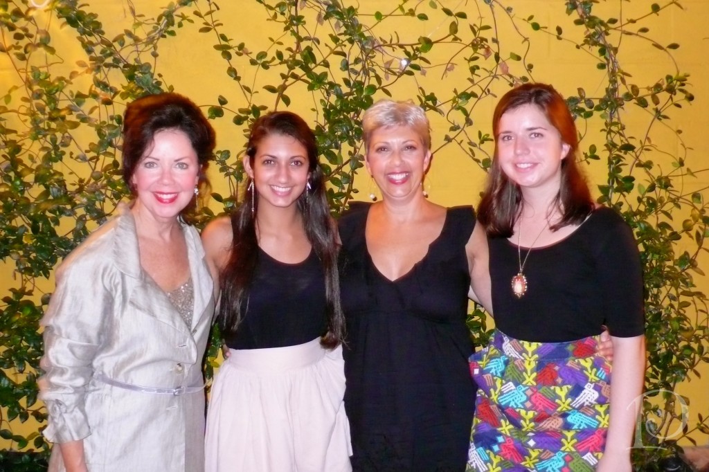 Here I am with Tina, Olivia and her roommate, Ellie (I was also a stand in for Ellie’s parents and I loved every minute). Ellie is from Mobile and she is just as sweet as the sweet tea she drank. I loved how she called me Miss Pam, so southern!
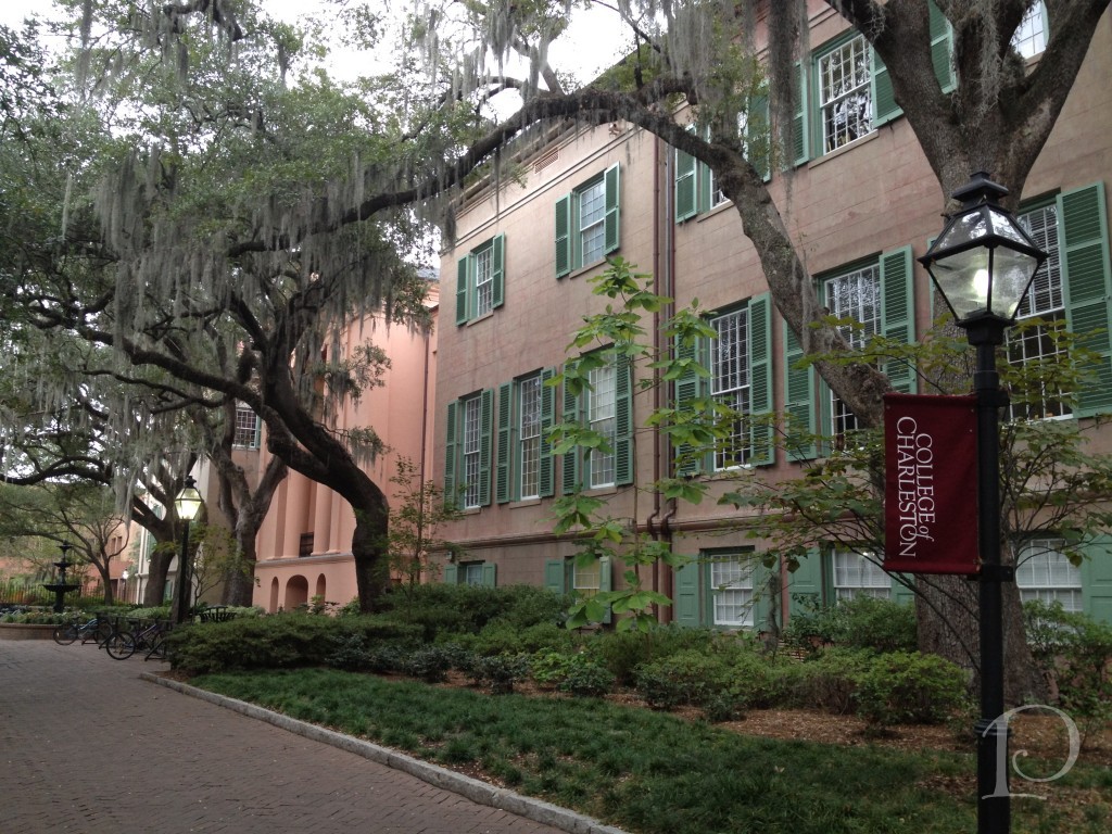
This is the beautiful College of Charleston, nestled into the cityscape.
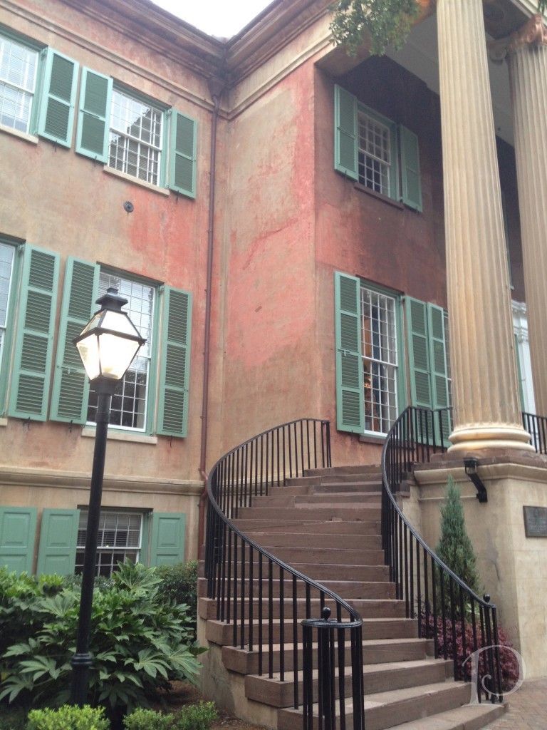 This classic Charleston home features a double Open Arms staircase, so gracious…
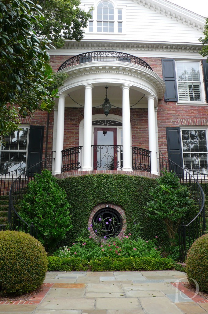 History says that the gents walked up the left side and the ladies the right so the men could catch a glimpse of the ladies’ ankles~ oh how things have changed!
Grand Mahogany Doors: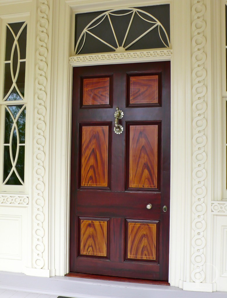 It was not unusual to glance down a path to see a what once was a “privy” now re-purposed, this one was converted to a darling garden house…
 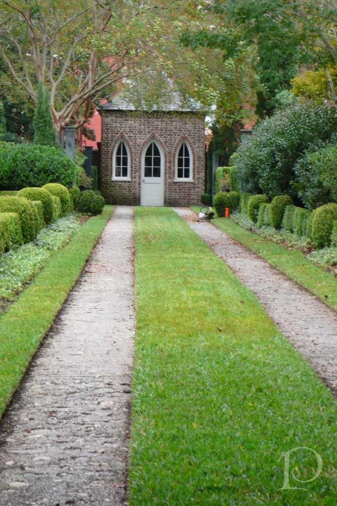 I am hoping to paint this…
Decorative ironwork can be seen all over Charleston, gracing balconies, gates, stair railings, vents, and decorative panels and finials. The city’s ironwork is certainly a great architectural treasure and truly stunning.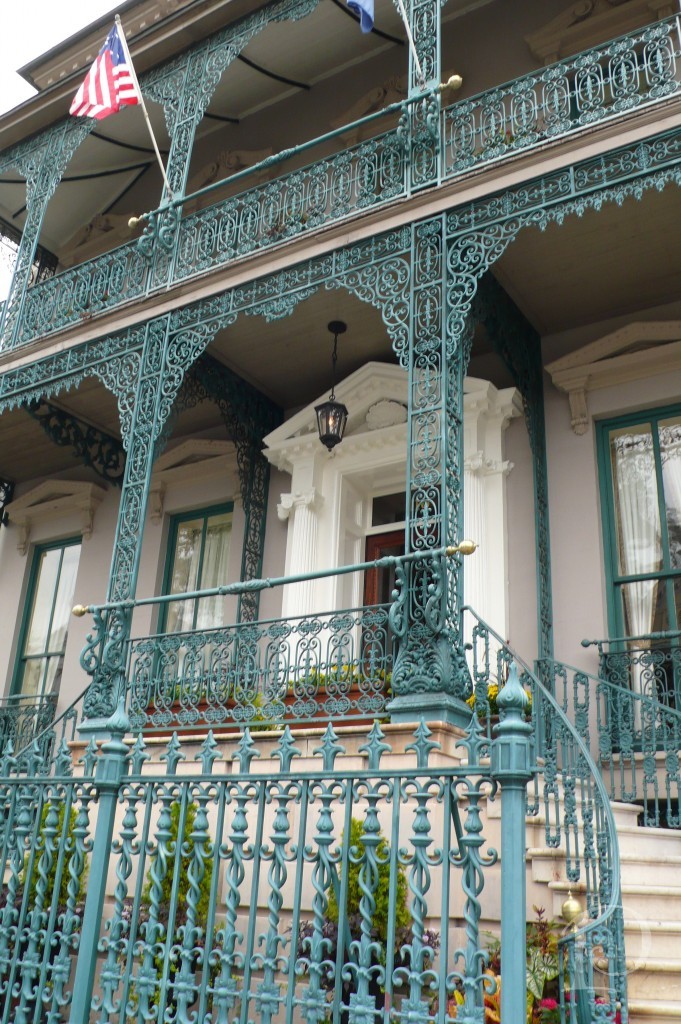 A variety of ornate architectural details can be seen on houses throughout the city, particularly in the historic section. Happy colors help to to show off these details. How I would love to live in a pink house once in my lifetime, oh yes ~
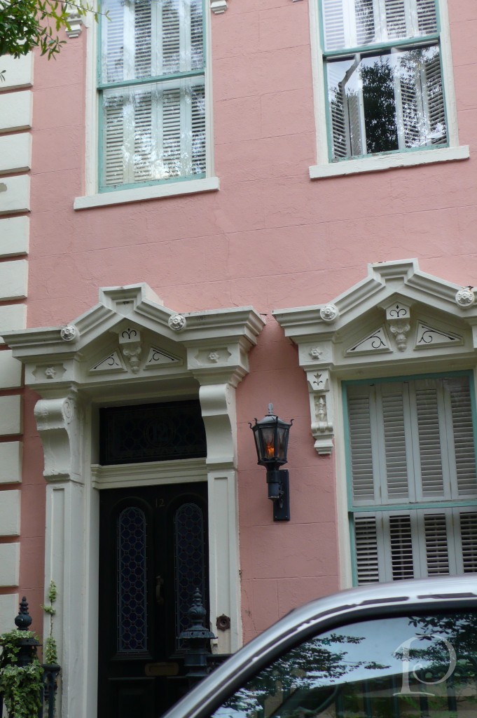
I could be very happy here too…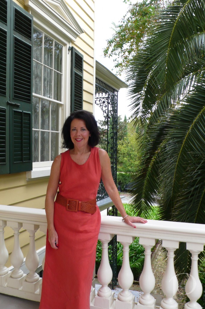
This garden was on the Preservation Society House Tour, I love the mirror detail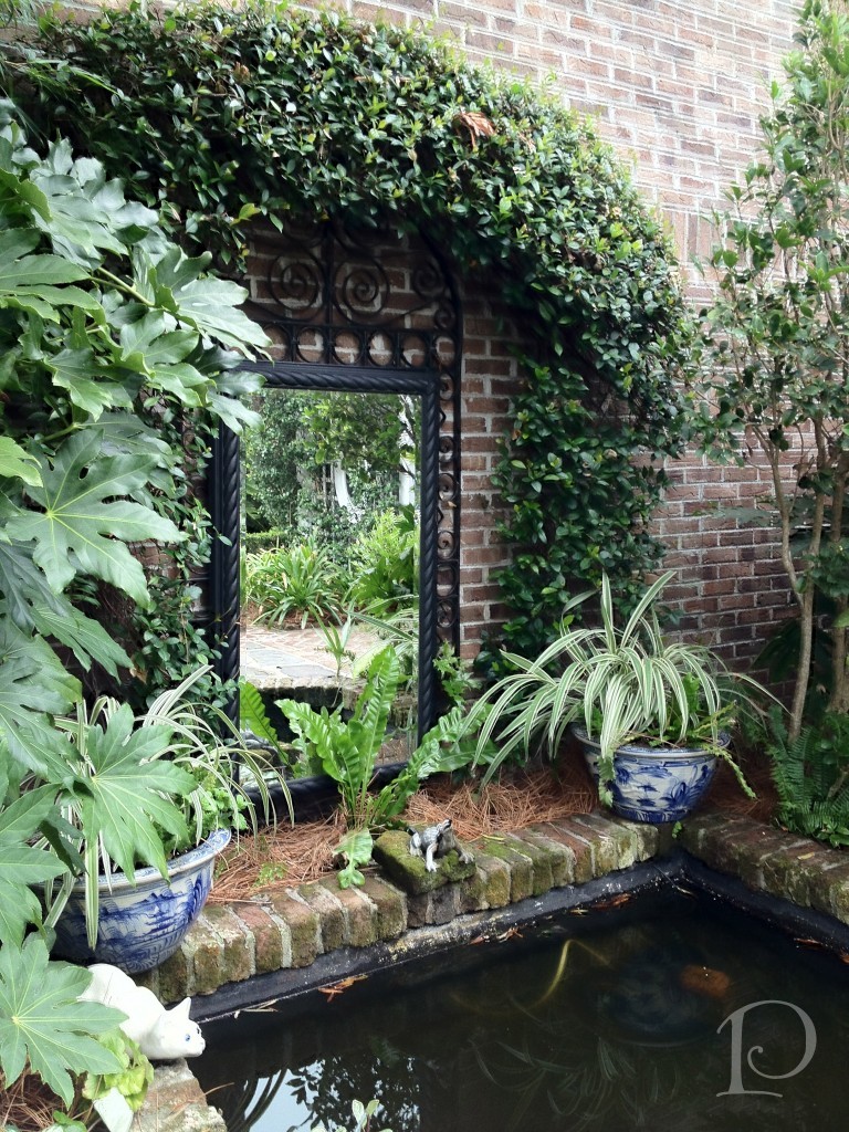
On this tour interior photos were discouraged but I just couldn’t resist sneaking a few shots of this outstanding Master Bedroom. The colors were soothing soft greys, so restful and oh so beautiful.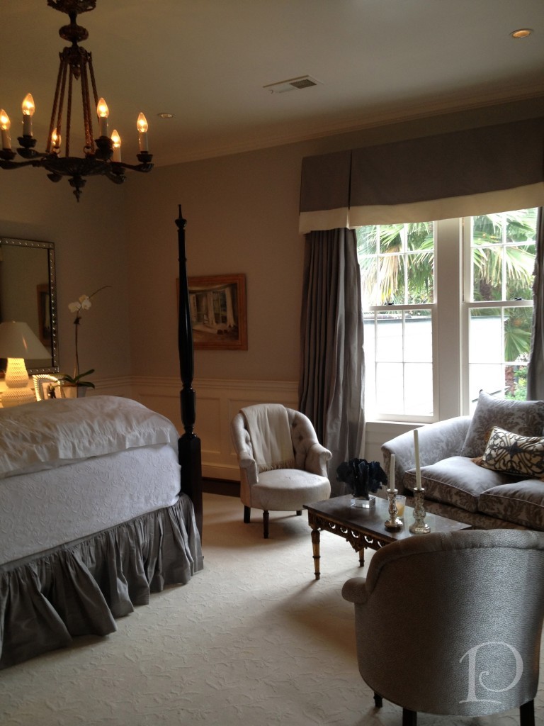 Another shot, just for you (shhhh…don’t tell)
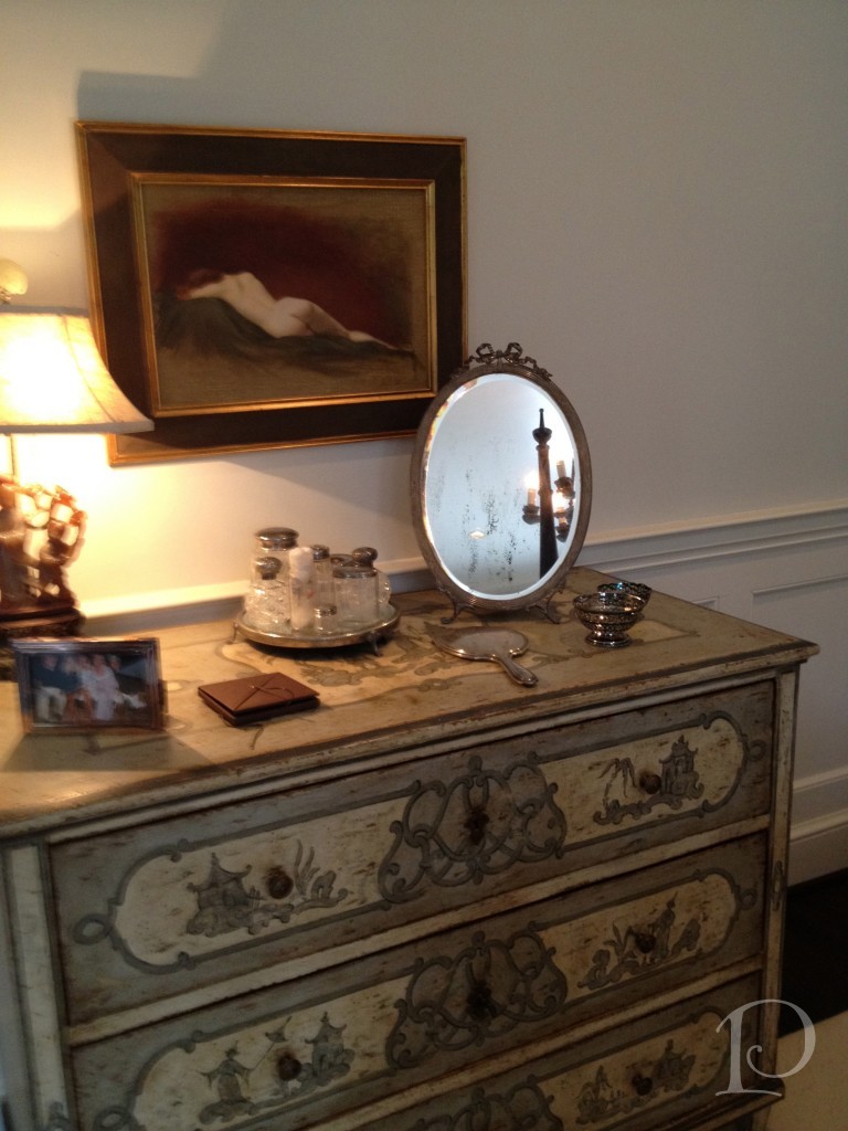
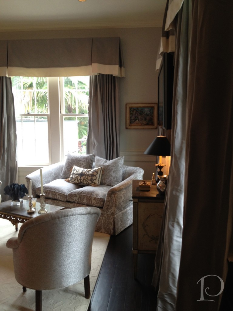 Love this vignette:
This outdoor mahogany bar spoke to me, I’m pretty sure it said, “Come, sit awhile …”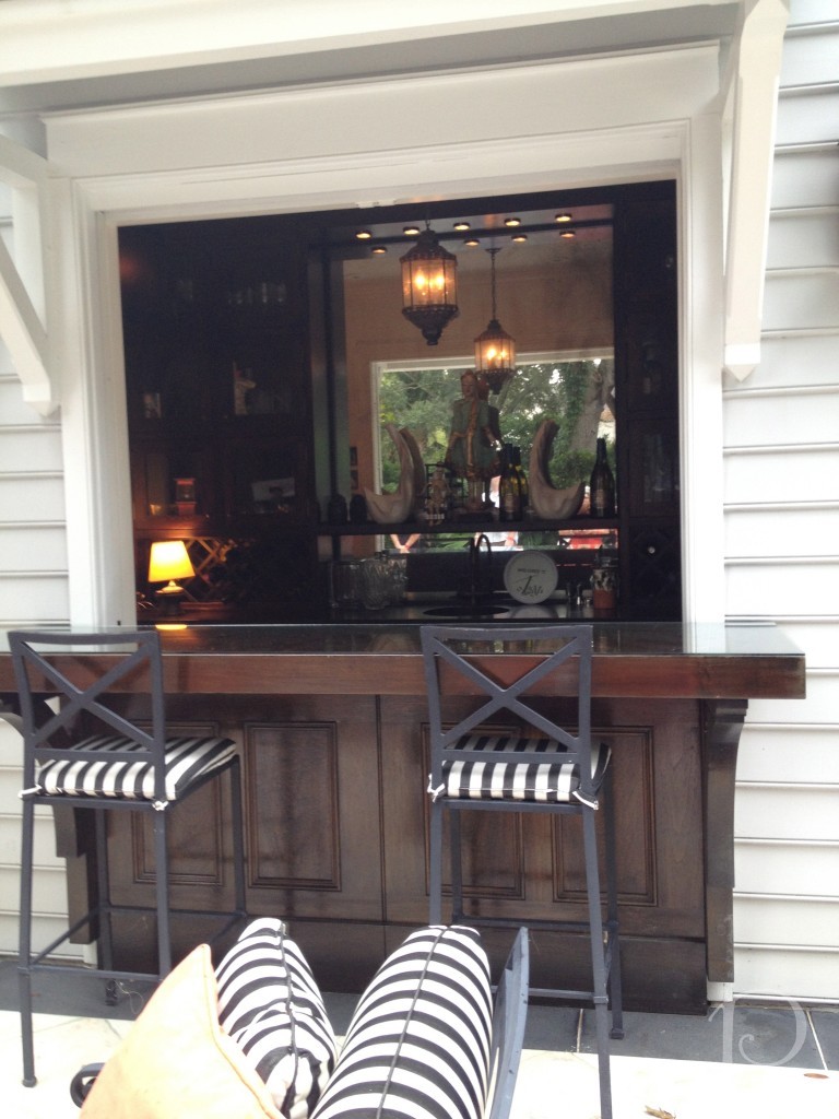 Did I mention that the shopping was excellent?
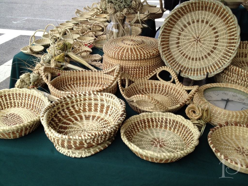 These iconic Sweetgrass baskets are handcrafted using local grasses. The baskets have been made by the descendants of slaves from West Africa living in the Charleston suburb of Mt. Pleasant for hundreds of years. Amazing!
Apparently “consignment shop” has a very different meaning in Charleston than in Boston. I visited The Trunk Show on Meeting Street and… wow! Very high end and filled with Couture and Designer clothing and accessories. While there I spied Prada, St. John’s and even some furs. 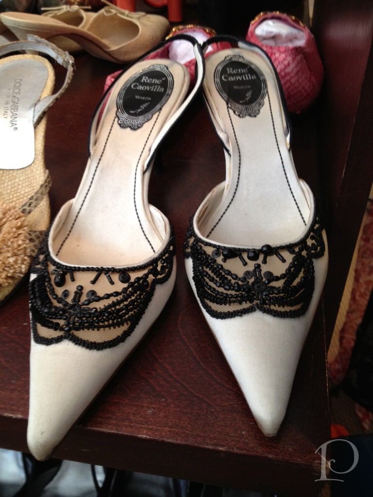 Unfortunately these shoes were a tad too big… darn!
If you can believe it, this chandelier is hanging in an old theater that is now an Anthropologie store. Incredible!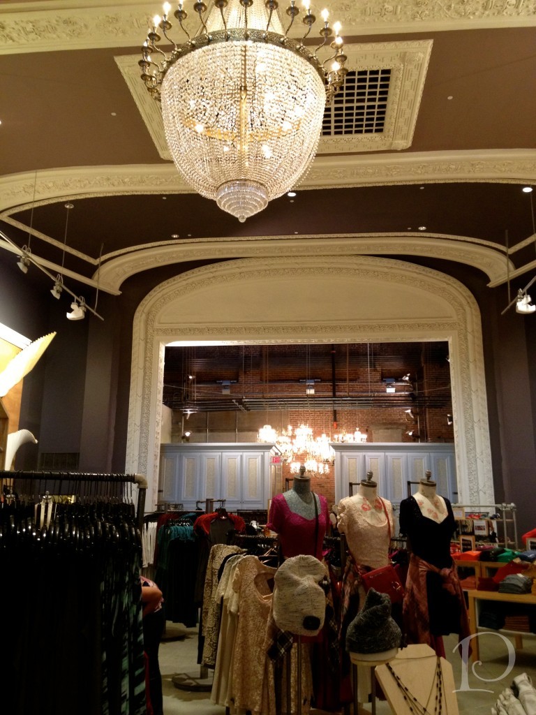
More amazing Anthropologie chandeliers ~ under this cluster, they were displays of black leather and jeans ~ so modern…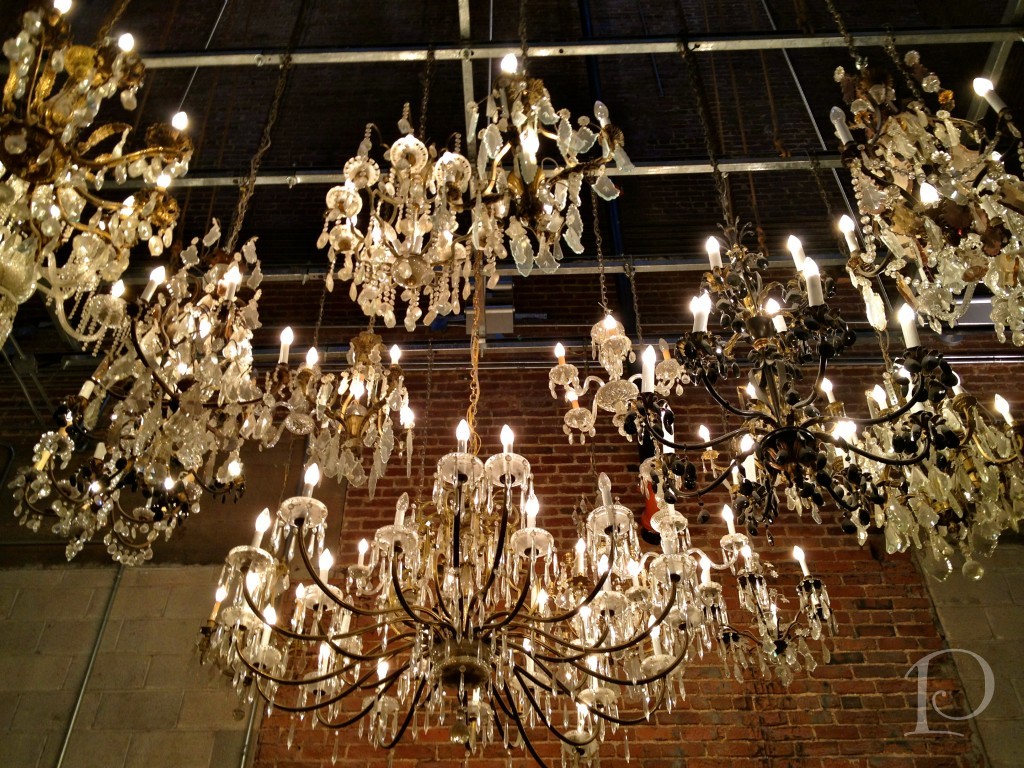 And again, ooooh, the restaurants! I had the most delicious meals ever! This photo was taken at Halls Chophouse~
 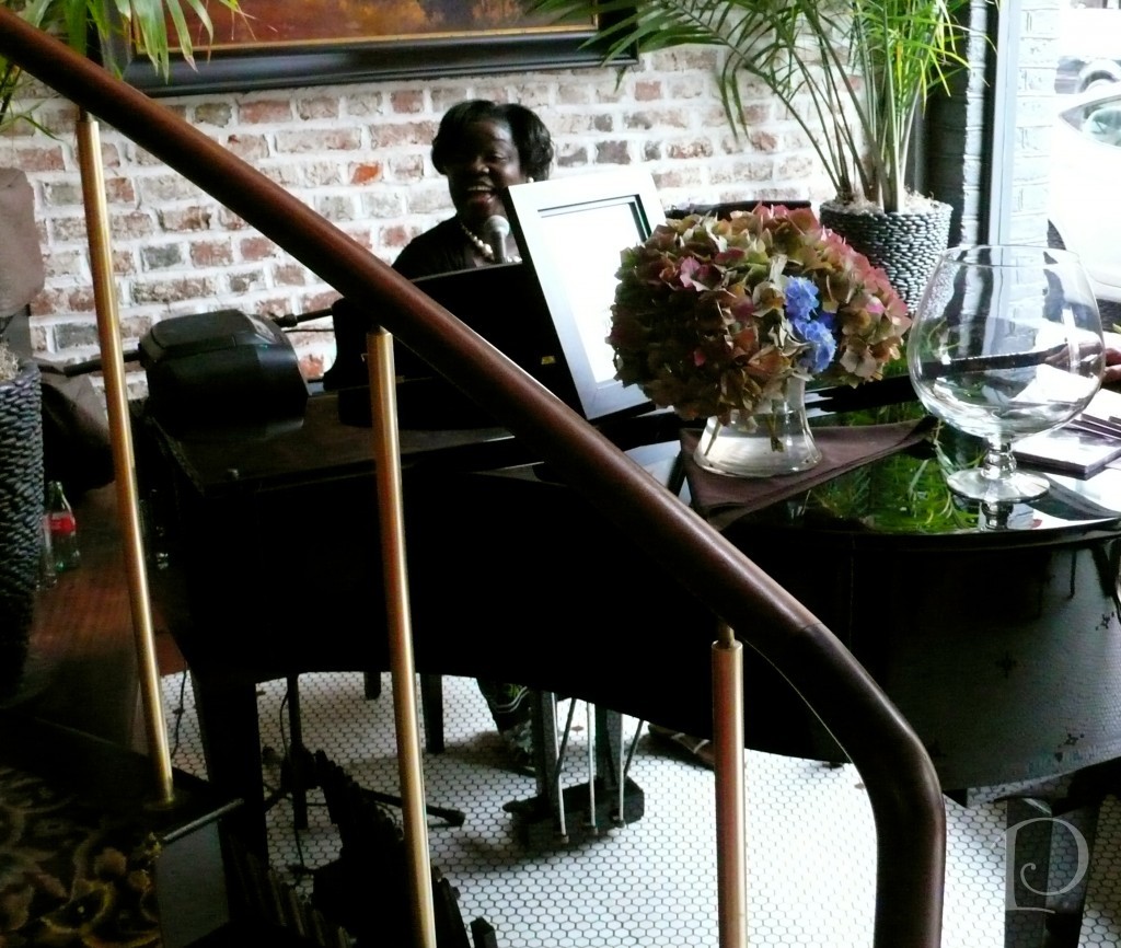 There we enjoyed a memorable Sunday Brunch ~ the singer was jazzy and smooth and the French toast was a religious experience. Yum!
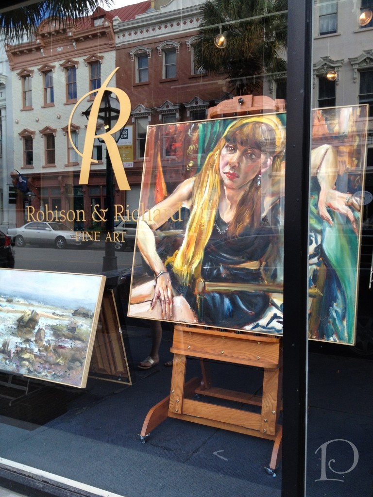
Charleston also has art of every style and for all tastes. Here, a glimpse at Gallery Row: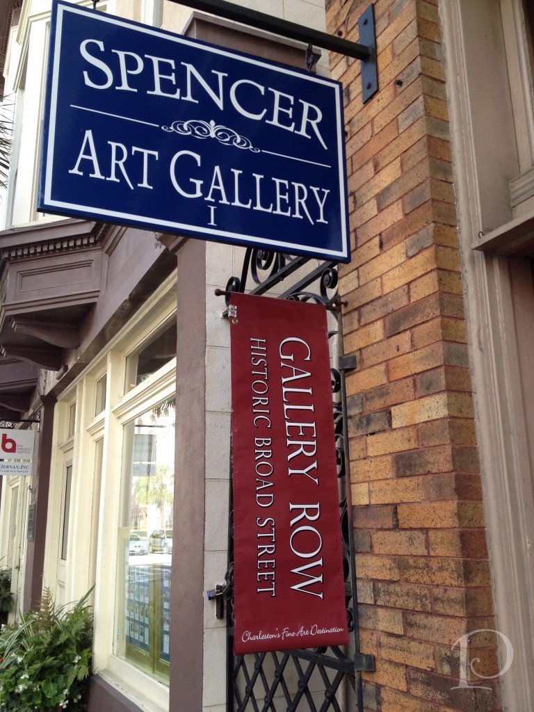
We had such an enjoyable stay, thanks in large part to the famous Kevin McQuade, concierge at the Marriott in the Historic District.  Kevin coordinated all of our tour plans, he has an uncanny ability to match the guest to the perfect activity, restaurant and transportation. His enthusiasm and bright smile had me at ‘Hi, welcome to Charleston!’. When you visit you must stay at this hotel just so you can work with Kevin!
Finally, a picture of Olivia, Ellie and their posse of outstanding friends from the Honors College at the College of Charleston. They are all so humorous, bright and outgoing. These young people are our future leaders and I just know they will do a great job!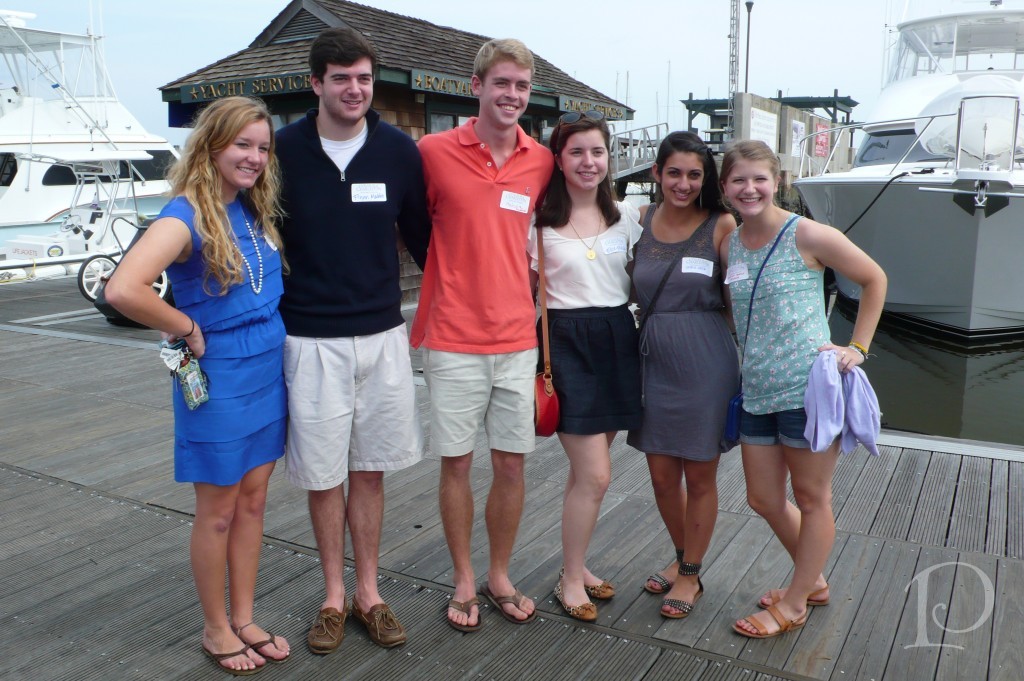 Thank you Tina and Rich for a great weekend!
“Charleston has a landscape that encourages intimacy and partisanship. I have heard it said that an inoculation to the sights and smells of the Carolina Lowcountry is an almost irreversible antidote to the charms of other landscapes. You can never completely escape the sensuous semi-tropical pull of Charleston and her marshes.”
~Pat Conroy, The Lords of Discipline
xo,
Pamela

Jason Wu Fashion Show, Spring 2013
Jun 04 2013 ·1I thought I’d wrap up this week of posts on the Brizo Fashion Week event by featuring some of my favorite looks from the Jason Wu Fashion Show showcasing his Spring 2013 collection.
Here are this week’s Posh Picks (it really was very hard to choose just five!)…
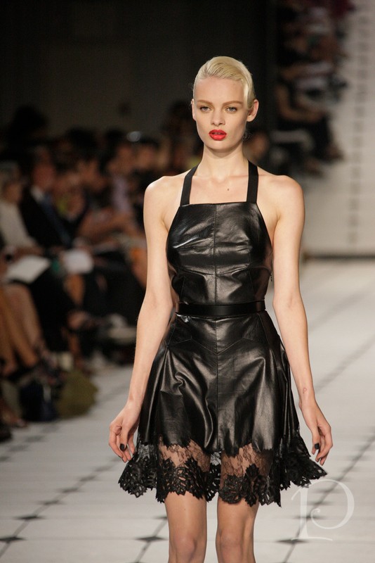 Leather and lace was a new theme for Jason Wu with this collection. Fresh and provocative, an intriguing, and in this design, winning, combination.
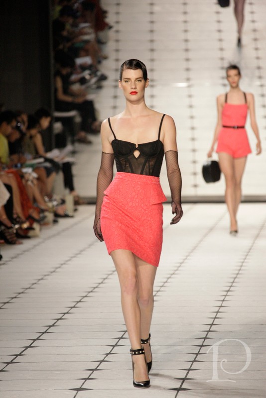 Two picks in one! Once again, I love the use of lace and sheer fabric. The minimalist peplum on the poppy colored lace skirt adds interest and pop. The studded ankle strap shoes add to the edgy look and play foil to the softness of the fabrics. I love the silhouette and color on the far model and her hatbox pocketbook provides another hard edged contrast.
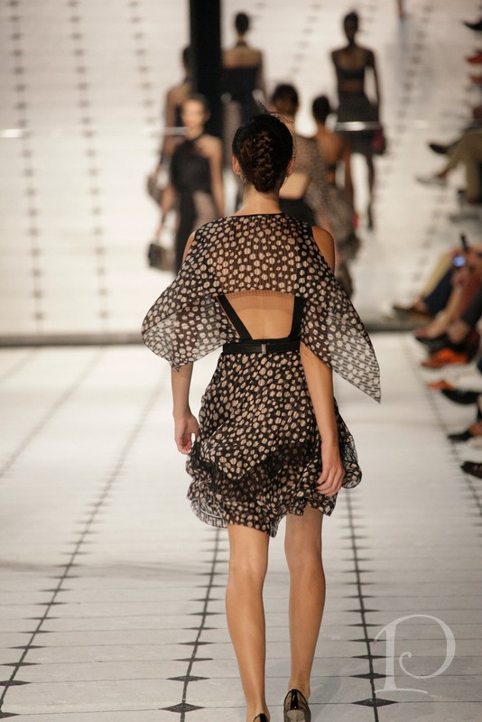 The tissue sheer polka dot fabric in this design made the mannequin-thin model appear to float down the runway. The capelet features cut-outs at the shoulders and the dress features leather harness strapping ~ another theme in the collection.
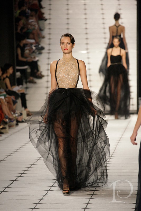 I absolutely love this dress! It features a beautiful combination of a nude colored beaded top and a tulle skirt over black tap pants. I love how the whole look comes together with the fresh make-up, bold lips and the model’s waved hair kept close to her head. Stunning!
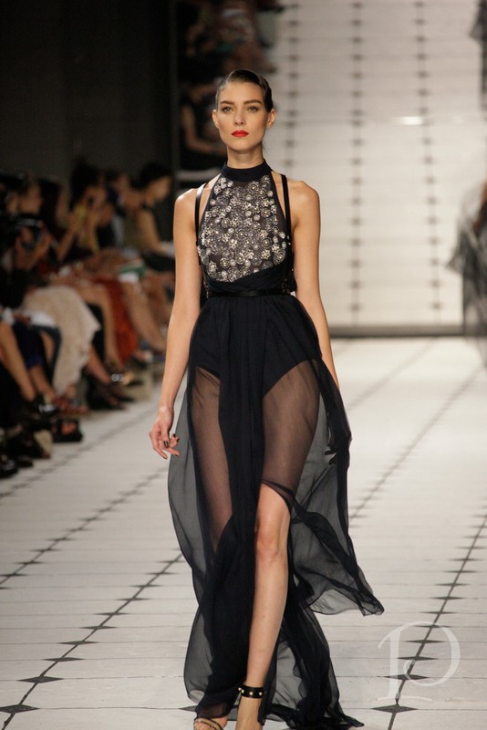 Another sheer and beaded combination with harness accents, this dress was part of the finale collection. The sweeping sheer skirt and beaded top with silver circles is even more beautiful in person.
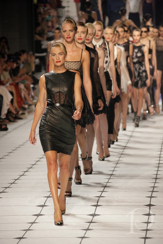 The parade of models at the end of the fashion show was a treat for the senses!
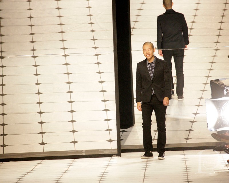
Finally, the designer himself, Jason Wu, came out on the runway to take a bow:
{photo credit to all of the fashion show shots goes to Jayme Thornton and of course to Brizo for inviting to this amazing all-expenses paid event!}
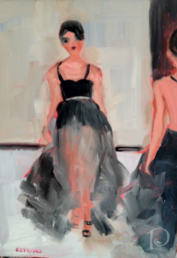
I think you’ll get a hint of how much I enjoyed the Jason Wu runway show when I show you this week’s petite oil painting…
xo,
Pamela

Brizo Fashion Week & Jason Wu
Jun 04 2013 ·0“ Style comes from imagination and creativity and willingness to take risks.”
~Jason Wu
While our workshops and brand immersion seminars during Brizo Fashion Week were both inspiring and educational, they were also intense ~ in the best possible way of course! Lucky us, the Brizo team also built in plenty of opportunities to explore the fashion side of Fashion Week in NYC. You won’t believe the fun we had, I’m still reliving it myself!
On Thursday we joined in New York’s celebration of Fashion’s Night Out (FNO). My posse and I began our journey at Bergdorf Goodman.
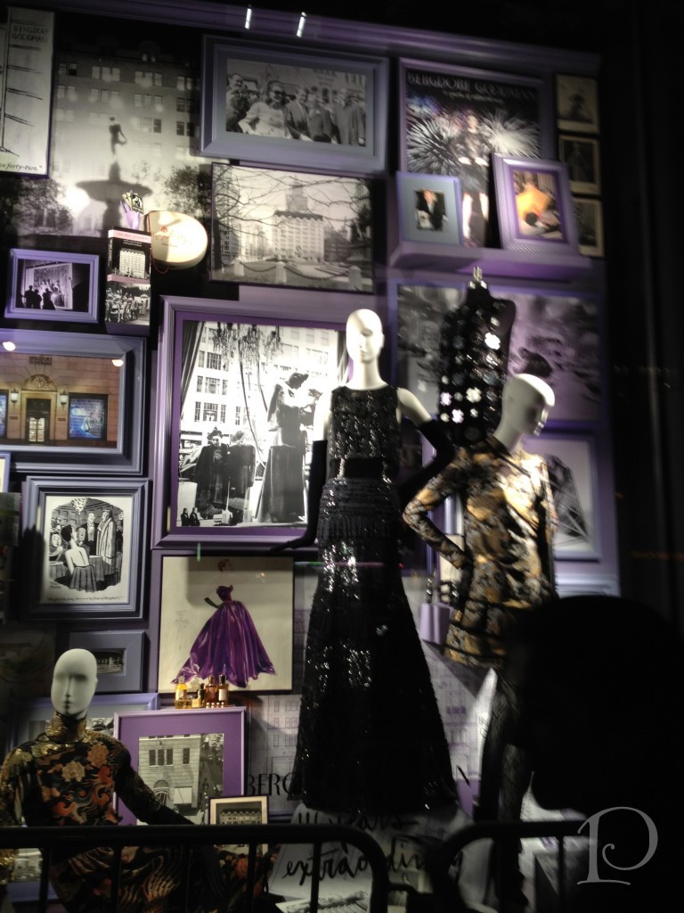
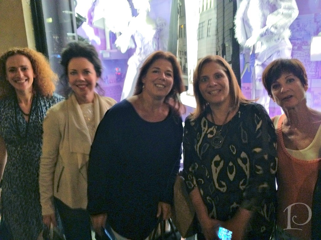 The store was dressed to impress from the windows outside…
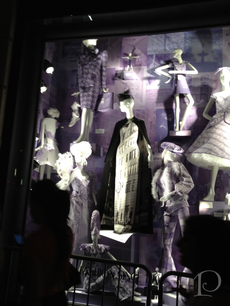 to each floor on the inside. As soon as we entered the energy was high and the music hot!
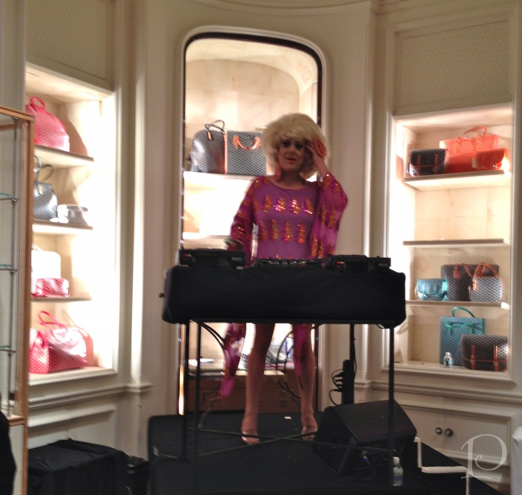
The Glam DJ!
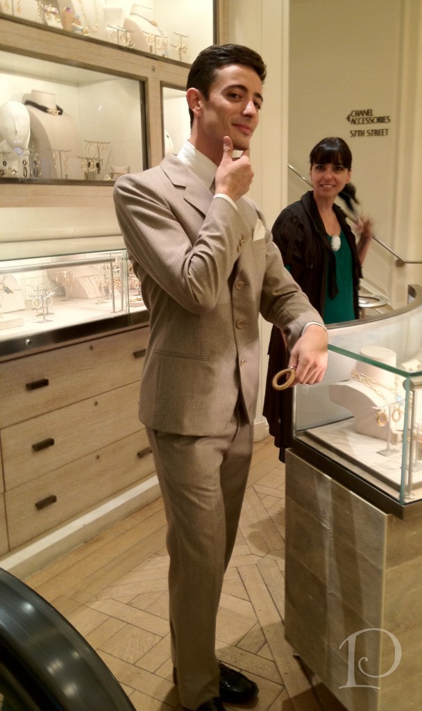
It is always fun to people watch in NYC, especially when they are watching you too…
 Don’t you j’adore these boots?
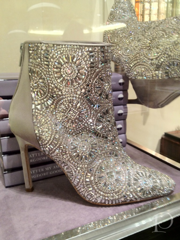 You may be wondering what you would wear them with. Well, if I owned them I would wear them everyday ~ I really think they are a basic!
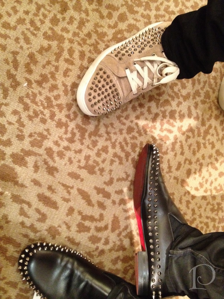
I’d be remiss if I didn’t mention the the stylin’ men. Check out these studded and red soled shoes, along with the not to be missed animal print carpet in the Bergdorf’s shoe salon!
Hey, wasn’t that Eddie Ross wearing those shoes?!
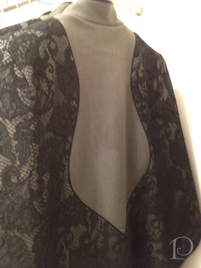
I love the inset on this Fall jacket from the current Jason Wu collection:
 FNO was definitely an unforgettable experience!
On Friday afternoon one of the highlights of the week: the Jason Wu Fashion Show!
Here I am on the runway, so excited for the show…. EEK!
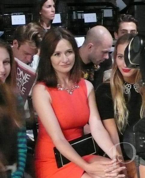
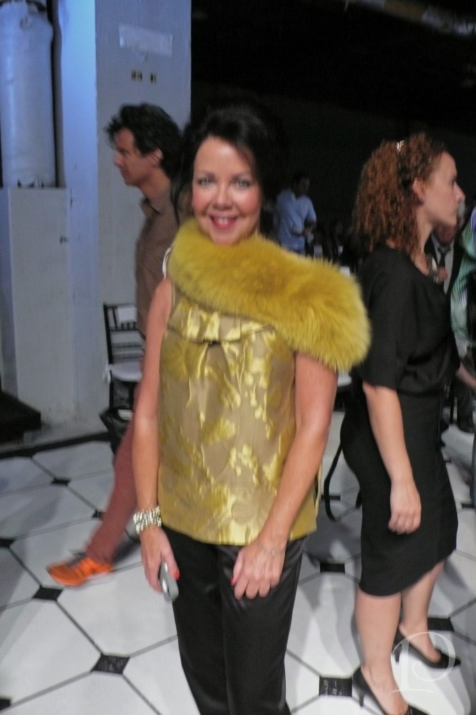 There were celebrities galore, does anyone recognize this star from Newsroom? She is gorgeous…
It’s Emily Mortimer!
In this shot the runway is filled with people being asked to take their seats… can you see me in the mirror?
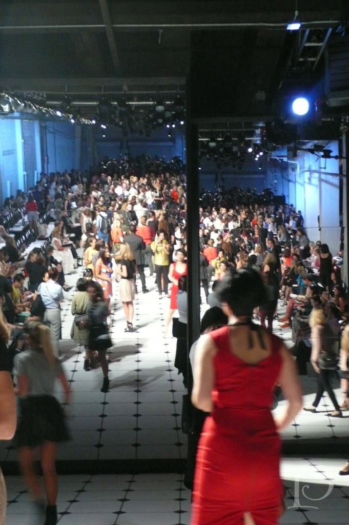 Finally, time for the start of the Jason Wu Fashion Collection for Spring 2013!
{Please excuse the quality of the pictures, they are my personal photos. I will share some professional shots tomorrow}
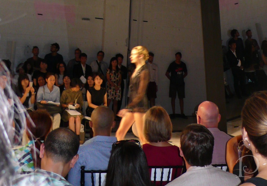
This model is wearing barely-there black leather shorts
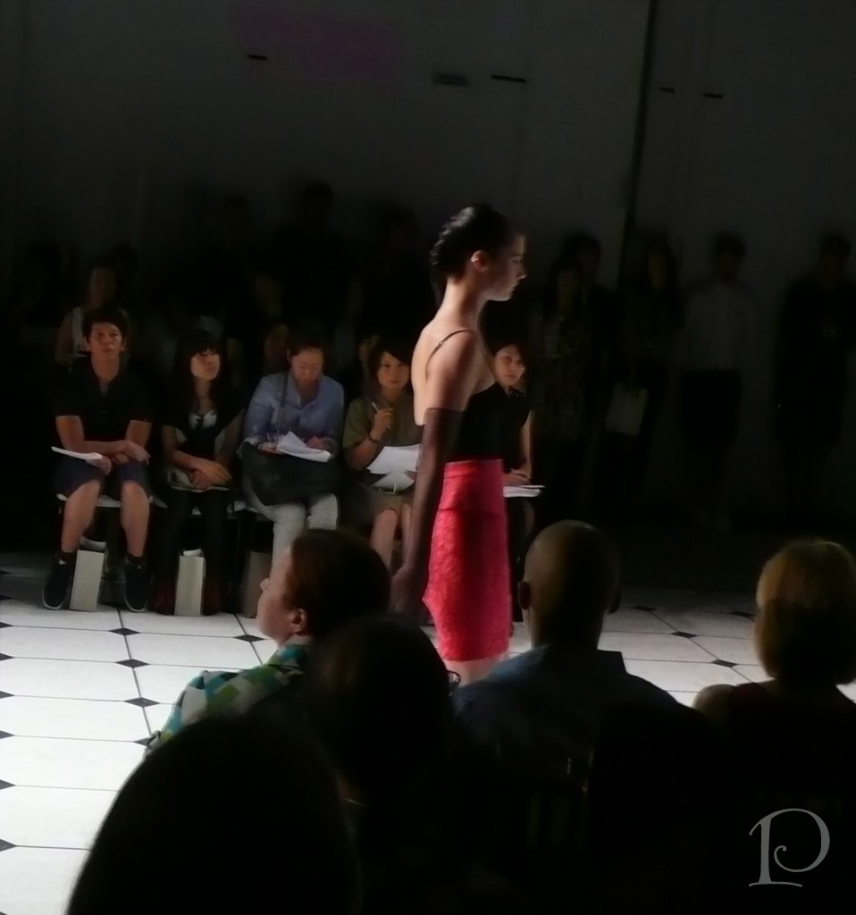
 The bright poppy lace pencil skirt is topped with a black corset-esque top, very seductive…
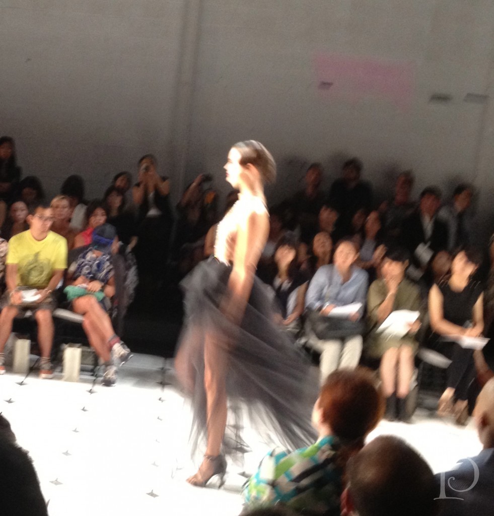
 I love this flowing dress. The flesh colored top is bottomed with a tulle black skirt that reveals a black tap pant. The model seemed to float down the runway in this piece…
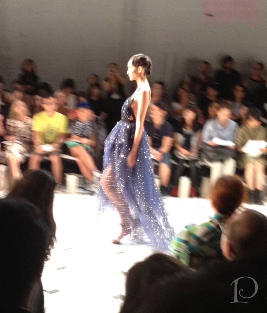
 Part of the color story of the Spring collection is Indigo blue. The hue is shown off in the finale gown, stitched with silver sparkle beads. The blur of the photo adds to the dreaminess of the gown, don’t you think??
 The grand finale of the show was a gathering of all the models on the runway and a final walk for one more glance at the Jason Wu collection.
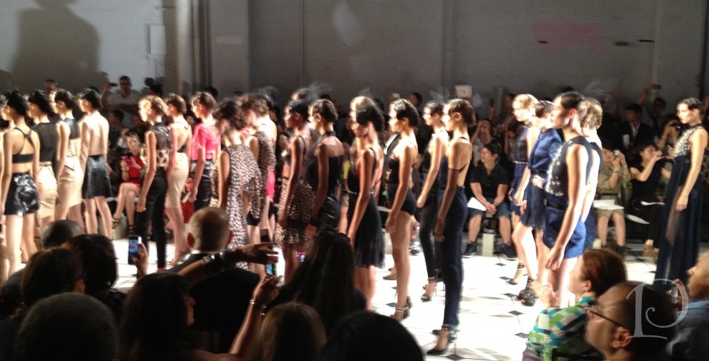 The entire Fashion Show took about 11 minutes ~ and it was worth every second! The music was perfect for each small collection within the larger one, the hair and make-up was romantic and fresh. The shoes were stunning and very fashion forward as well. It was just all too wonderful!
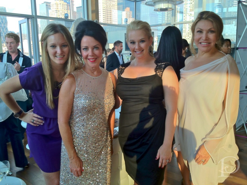
Following the Fashion Show we were treated to a cocktail party with Jason Wu. It was an intimate affair with the Brizo team and the Blogger 19 in attendance, held at a penthouse overlooking Manhattan.
 This gathering is actually the first time Jason Wu sees his fashion show.
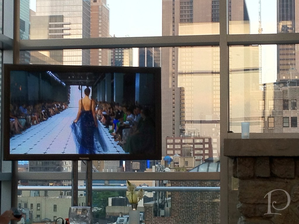 Of course during the live presentation he is backstage. When the video was shown we had front row seats to his reactions. He was very sweet, and humble.
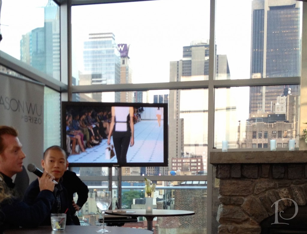 We all LOVED seeing the Fashion Show again as well ~
photo credit: Jayme Thornton
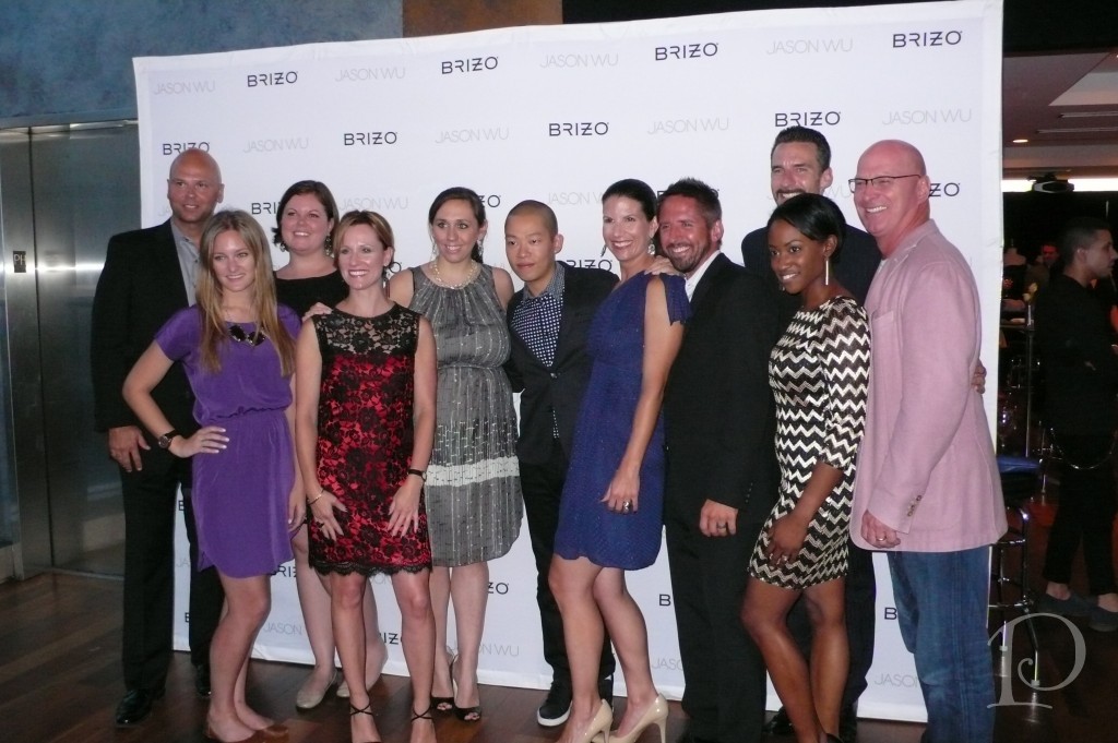
Love this photo of the Brizo Dream Team and Jason Wu, thank you all for a heavenly three days! xoxoo
photo credit: Jayme Thornton
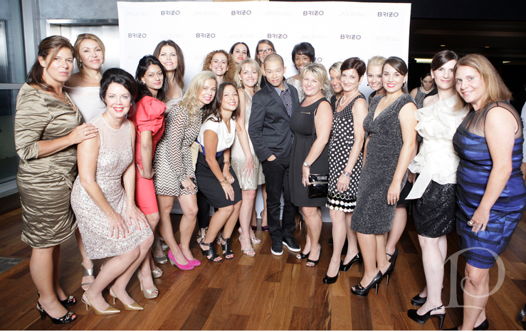
Finally, here we are, The Blogger 19:
photo credit: Jayme Thornton
You have all touched my heart, I miss you and wish you continued success and happiness! ~xxoo
Check back tomorrow for one more Brizo Fashion Week post with Pamela’s Posh Picks for my favorite fashions from Jason Wu’s collection ~ I’ll be sharing the professional photos and they are stunning!
*Brizo Fashion Week event was an all expenses paid event hosted by Brizo*
xo,
Pamela
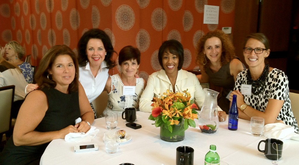
Brizo Blogger 19 in NYC
Jun 04 2013 ·0Most other designers follow trends, Jason Wu creates them.
This sentiment was expressed at the post-runway show cocktail party with Jason Wu last Friday during Brizo Fashion Week ~ and I couldn’t agree more! I am so proud and fortunate to count myself among the “Blogger 19″ for Fall 2012, what an incredible trip!
 Fellow Blogger 19 member Sarah Sarna did an excellent post introducing all of the interior designers that attended Brizo Fashion Week, read it on her blog
During the three day workshop, brand immersion, and networking experience sponsored by Brizo, our group became close very quickly. From the first sip of champagne on Wednesday night to the seminar room where we were introduced firsthand to the creative Brizo collections of faucets and accessories to our final cocktail party with Jason Wu we bonded over design and fashion. This Blogger 19 is certainly a group of the most outstanding, successful, bright, warm-hearted designers ~ who just so happen to be fashionistas in great shoes!
Additionally, the Brizo Team that hosted the event was truly a Dream Team. They called us by name and made us feel welcome from the moment we met them, making us feel like long lost friends. I found the Brizo Team to be so companionable with one another I just wanted to bask in their glow and drink in their positive spirit. Upon reflection I think it has to do with the fact that they work in the Midwest. The reputation of warmth and kindness really does shine through. Of course, I have to mention they are all passionate about Brizo and they all happen to be geniuses, definitely a winning combination!
Today I want to share a peek into the creative process that goes into the production of a designer faucet and accessory line.
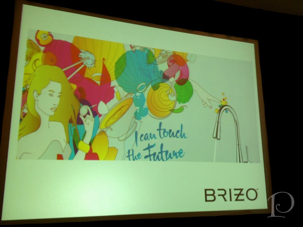
Looking into the future is definitely a theme for Brizo. They seem to have a crystal ball and are creating faucets with technology that will take all of us to the future. Brizo believes that luxury should not only be beautiful but sustainable as well.
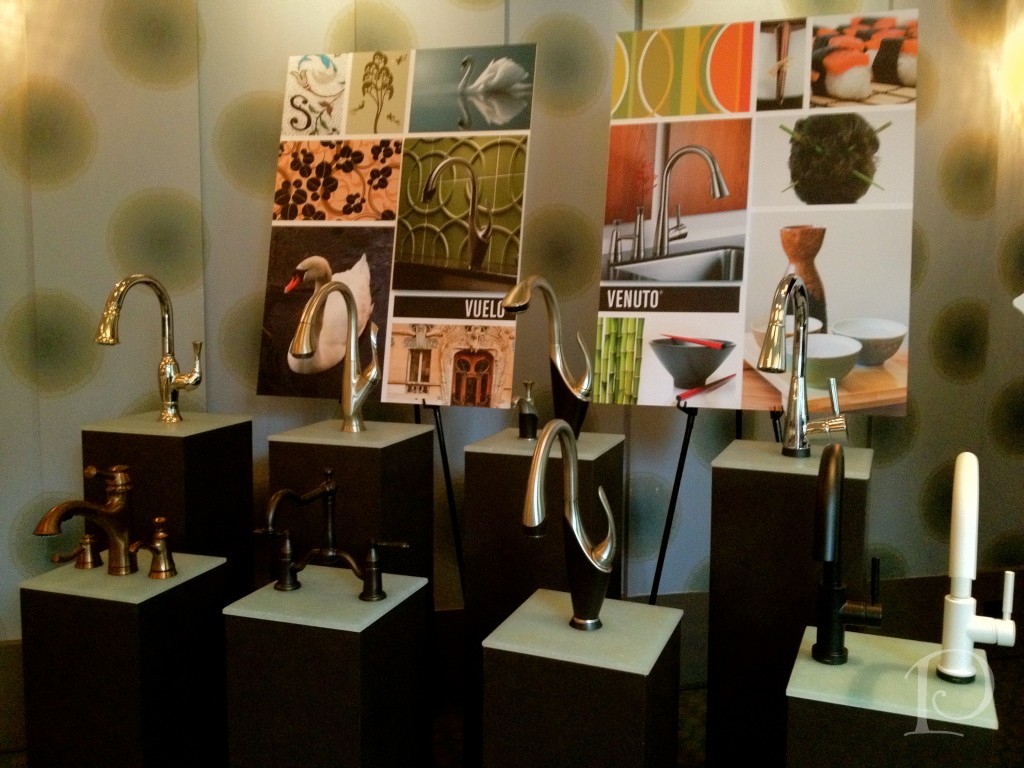 The seminar room had a beautiful display of Brizo faucets. When I first entered they appeared to be like sculptures to me. The curves of the designs were so striking and unique. Each faucet was a work of art, and these designs from Brizo are definitely museum worthy.
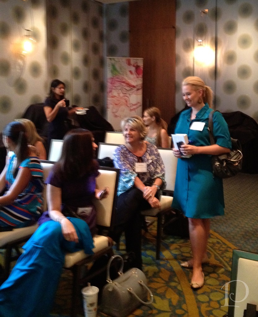
Some of the Blogger 19 taking their seats on day 1, aren’t they lovely?
This is Brian Nobbe, the Marketing Director of Brizo. Brian welcomed us to the more formal part of our event with his winning smile and spoke with pride about the company. Brian was so approachable throughout the entire 3 days, he even cooked with us at an after-hours event at Sur la Table!
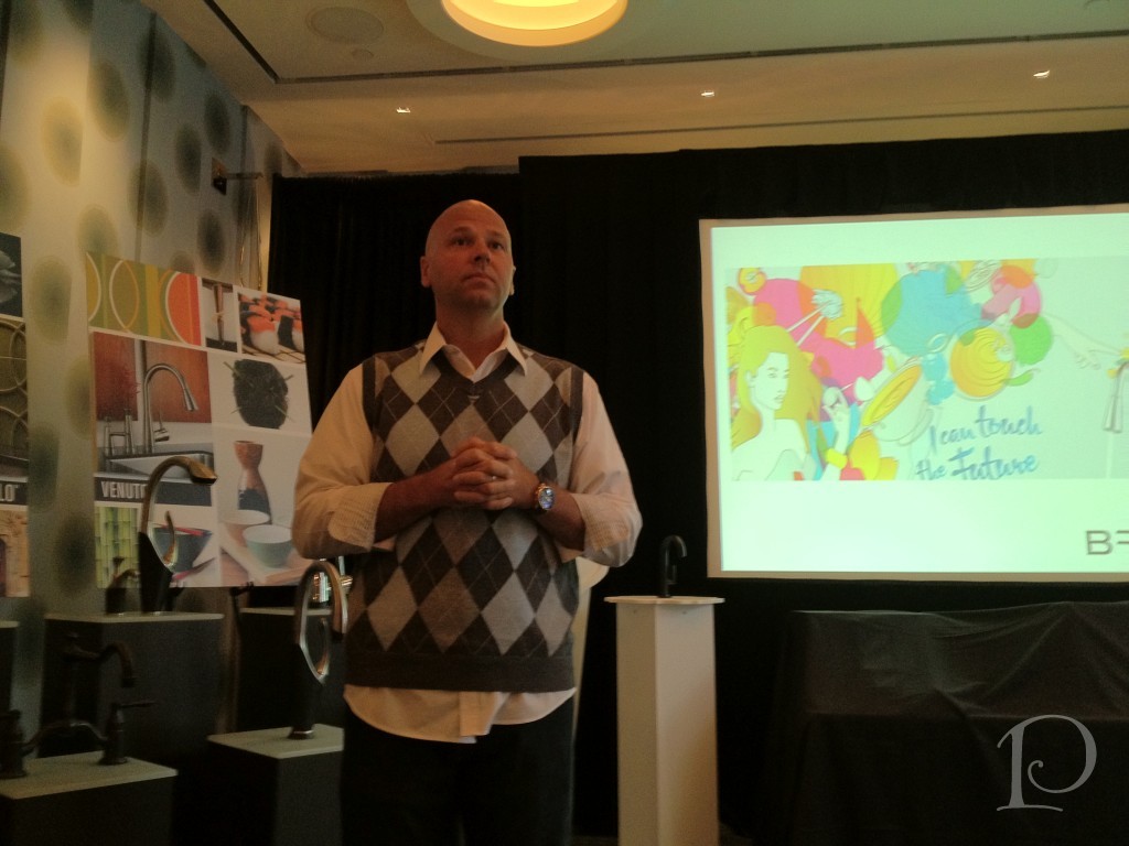
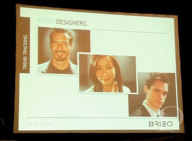 Pictured here: Judd Lord, Celine Kwok and Seth Fritz, designers for Brizo. This is a real trifecta of talent. We found out that Judd is also quite a comedian as well as a most informative and hilarious speaker. He won us over with his humor and his charm.
 Ahhhh, the Jason Wu collection for Brizo. I’ve highlighted this collection previously on the blog {here} and I loved hearing the story behind its creation ~ and it is a FAB story. Since 2006, Brizo has been the primary sponsor of Jason Wu fashion shows. In 2011, Jason Wu and Brizo came together to begin their collaboration on faucet and accessories, described below:
“Two young fashion brands. One shared aesthetic. A project cementing their relationship, merging design and technology. An ascending designer’s entrance into the world of interiors. The definitive statement on fashion for the home.”
Not long after the original partnership was forged, Michelle Obama wore a Jason Wu dress to the inaugural ball and the rest, as they say, is history.
But first, the evolution and inspiration of the Jason Wu for Brizo collection is what I find fascinating…
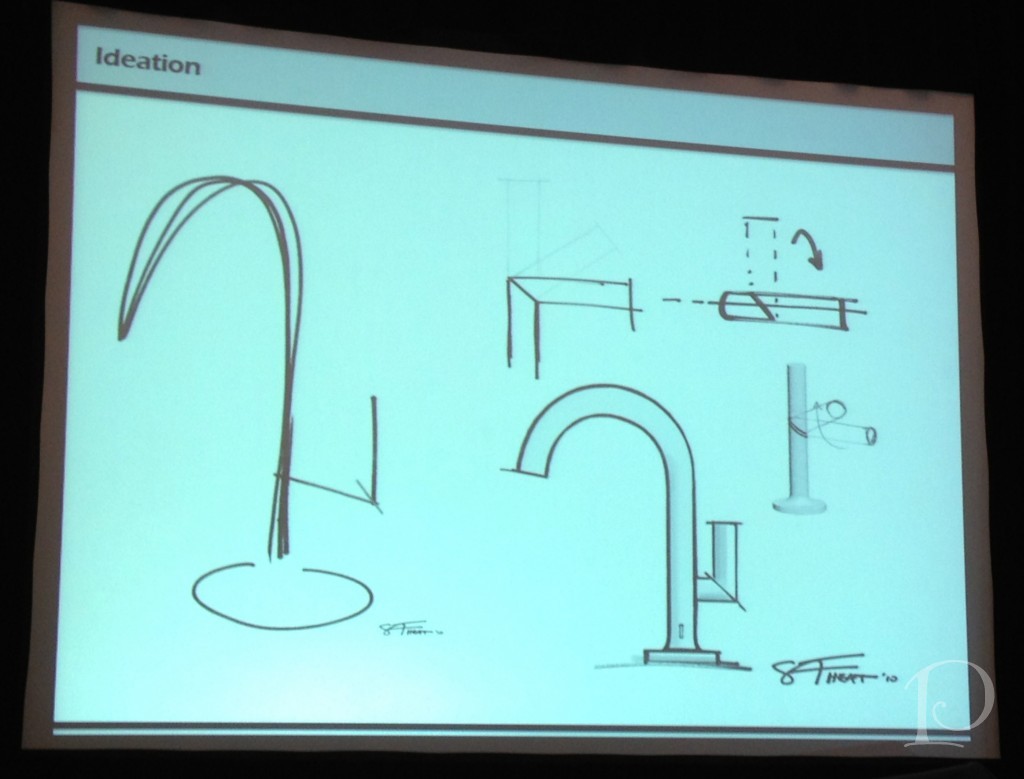
The story is that when Jason first met with the team of designers the one element he insisted on was a matte black finish for the faucet ~ unique and fashion forward to be sure. Pictured above is one of the first sketches of the Jason Wu faucet, born out of a collaboration between Wu and the Brizo design team. I loved seeing the rough rendering on the left and the more refined one on the right.
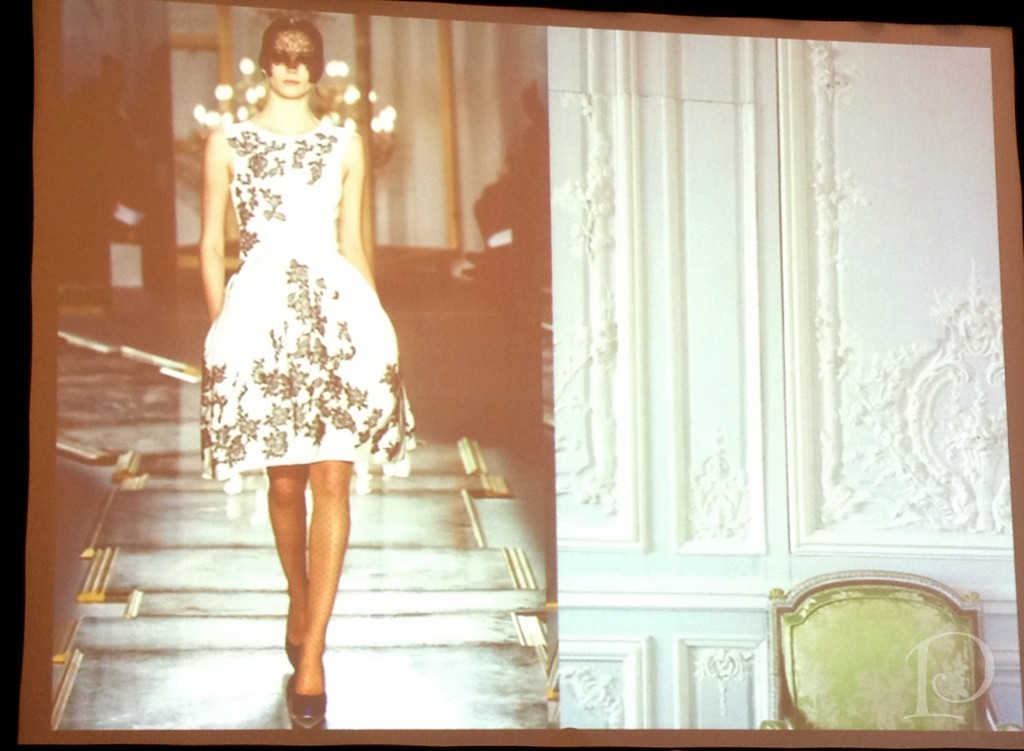
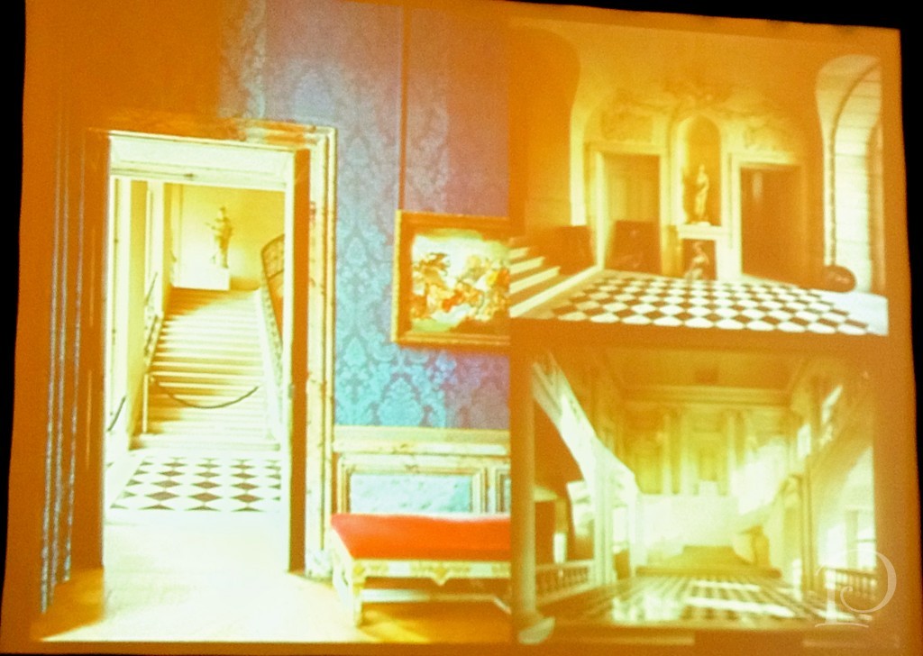 Now, once this very modern, sleek, and minimalist faucet was decided on, the Brizo team asked Jason for an inspiration board of ideas for the accessory part of the suite. Pictured above is some of what he provided for them: a board of European damasked walls, formal architecture and ornate interiors… seemingly quite a juxtaposition to the faucet design.
This was part of the fashion collection he introduced that year. I think you can see the influence of the curved interiors on the lines of the dress and the fabric design. But how would it all come together for the Brizo collection?
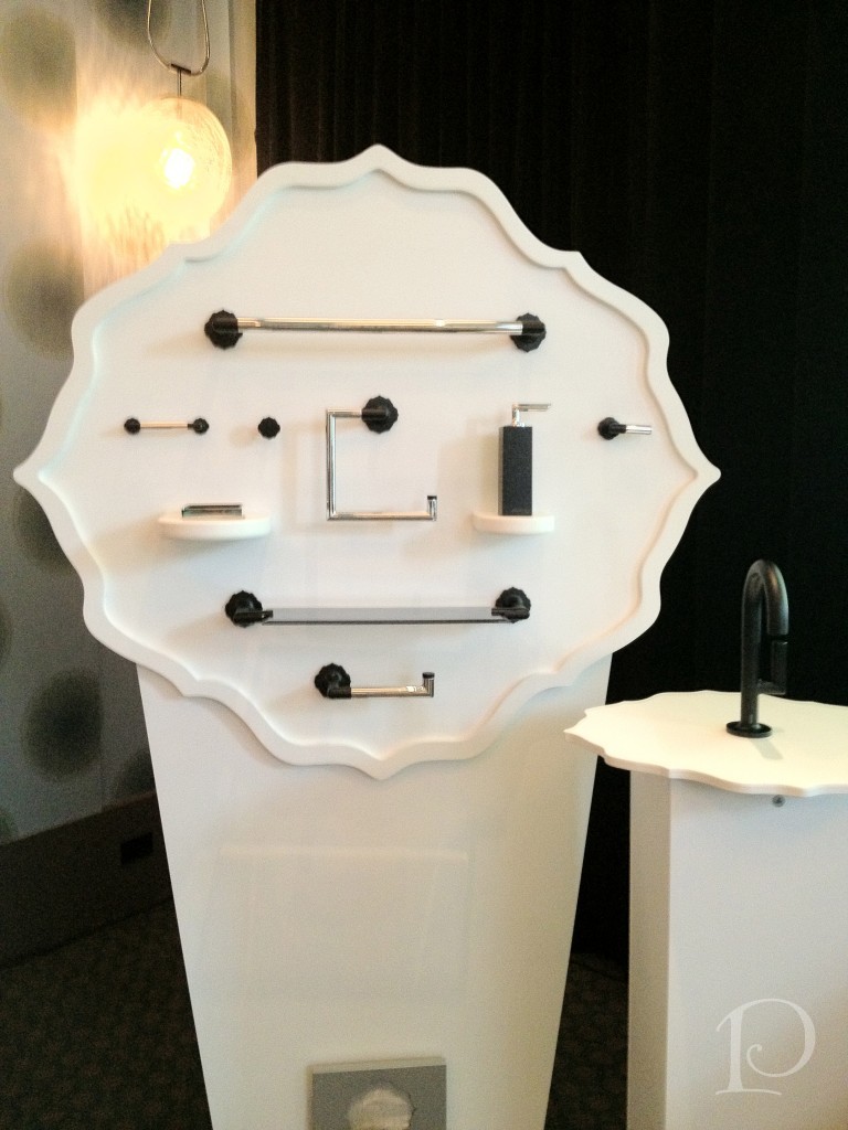
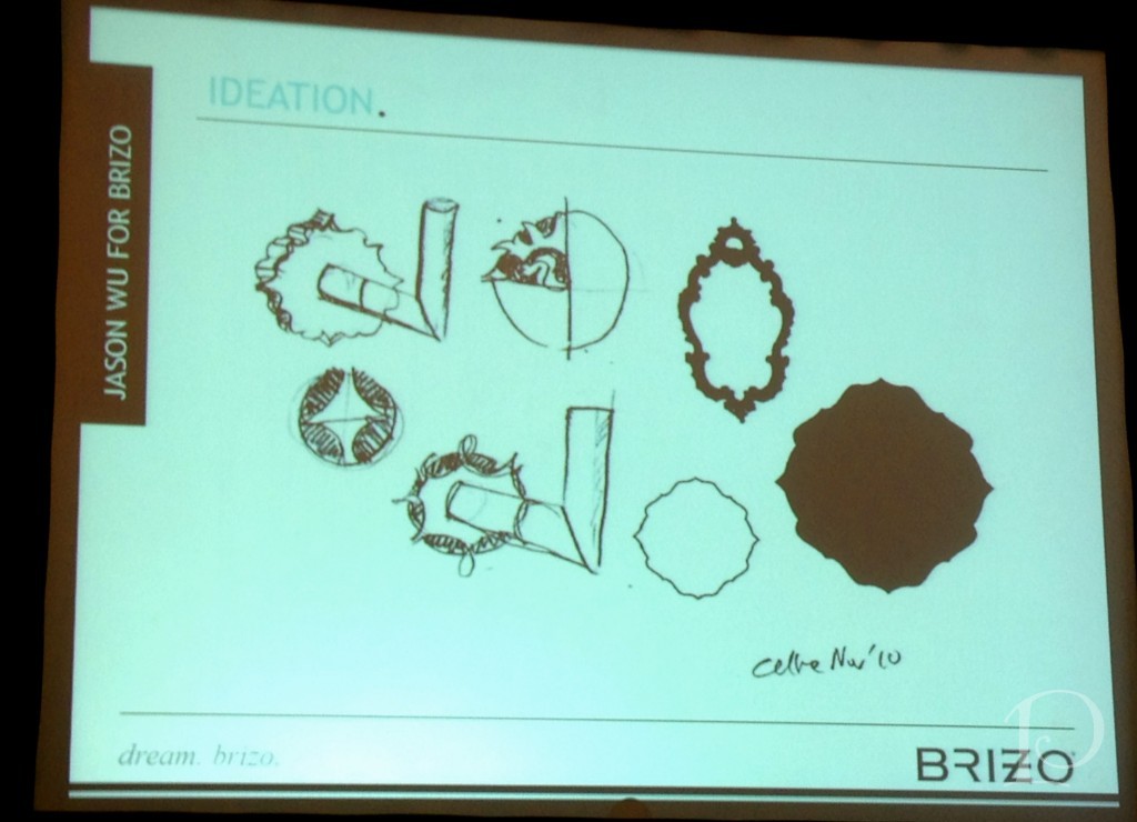 Voila, the Brizo team designed a backplate for the towels bars and other accessories The shape is remarkably similar to the wallcovering on Wu’s inspiration board. What an incredible collaboration!
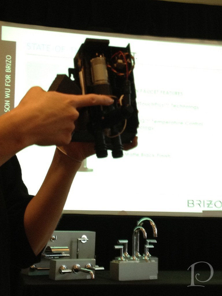 Perhaps the most amazing part of the Jason Wu collection and all of the Brizo faucets is something you don’t see: the technology inside of them. Thanks to Brizo team member Mandy’s introduction, I now have an understanding of this technology. The apparatus pictured above allows the user of Jason Wu’s faucet (as well as others in the Brizo line) to turn on the faucet without touching the handle — AT ALL! You simply pass your hand within 4 inches of the spout and the water comes on. No more worries about bacteria when you’re handling chicken!
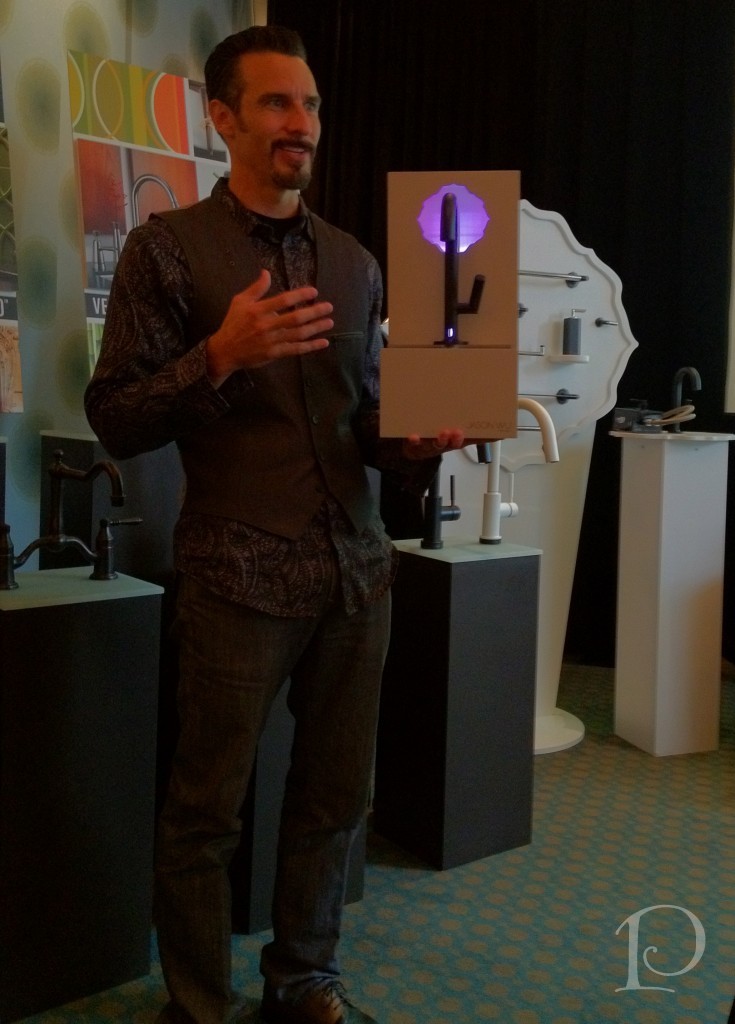 What about temperature control, you ask? Well, they’ve figured that out as well. Judd is holding a demo faucet that shows a temperature indicator displaying bright pink which signals hot and guess what, it gradually turns blue for a colder temp. Genius!
Brains and beauty in a faucet ~ excellent job, Brizo!
New friends (not all pictured), I miss you already…
Be sure to stop by later this week for another Brizo Fashion Week recap post highlighting the fashion portion of the week! In the meantime, stop by the Brizo website and check out their amazing products! I hope you’ll be as inspired as I was…
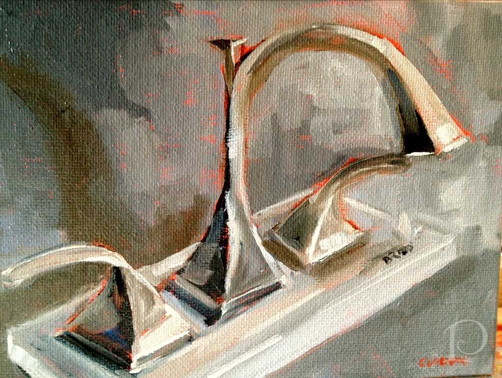
Brizo faucet oil painting by Pamela Copeman
xo,
Pamela
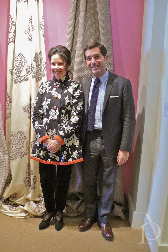
Philip Gorrivan
Jun 04 2013 ·0Last week I had the pleasure of attending a presentation by Philip Gorrivan at the Boston Design Center. Mr. Gorrivan was introducing his latest fabric line, Philip Gorrivan II for Highland Court at the Duralee Showroom.
Philip Gorrivan is an award winning designer with an extensive background in arts and antiques who is known for classic designs with a modern sensibility. Whether he is designing a New York City apartment or a country house on Long Island, Gorrivan designs for his clients, believing firmly that “lifestyle drives design”.
At the event, the designers in attendance were treated to a slide show presentation highlighting several outstanding Philip Gorrivan signature spaces, many of which have graced the pages of national magazines.
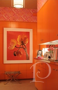
Gorrivan is known for his clever sense of color, which is well illustrated in this vibrant orange kitchen.
via philipgorrivan.com
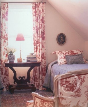
He sometimes takes a much more traditional approach to his projects such as in this ever-classic toile bedroom.
via philipgorrivan.com
Further demonstrating his adaptability, this chic, contemporary space with bold dashes of just the right amount of color.
via philipgorrivan.com
We viewed several diverse spaces during the presentation but what links Philip Gorrivan’s designs together is his attention to detail (particularly architectural details with special consideration to ceilings and moldings) and his grounded use of color, whether it is neutral or bright.
Throughout the presentation, Mr. Gorrivan spoke of his inspiration for his new fabric line. The pattern on the china of a beautifully set table, the shades in the stone sidewalks of Europe and New Orleans, and the wonders of Nature are all muses for Mr. Gorrivan’s designs.
This fabric, called ‘Cypress’ was influenced by a photo of tree bark. Can you see the hint of natural lines and shading?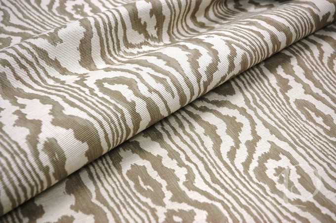
Reminiscent of the sun creating a pattern through the windows of St. Mark’s cathedral in Venice, this fabric is both classic and modern.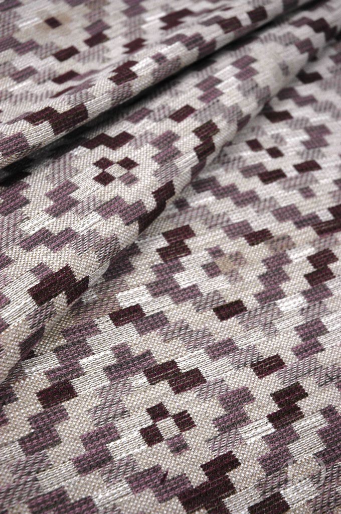
Philip Gorrivan’s presentation was at once insightful, educational and beautiful. He reminded us that inspiration is all around us, all we have to is be open to seeing it everyday.
“It is not what you look at that matters, it’s what you see”
~H.D. Thoreau
xo Pamela
Las Vegas Furniture Show
Jun 04 2013 ·0
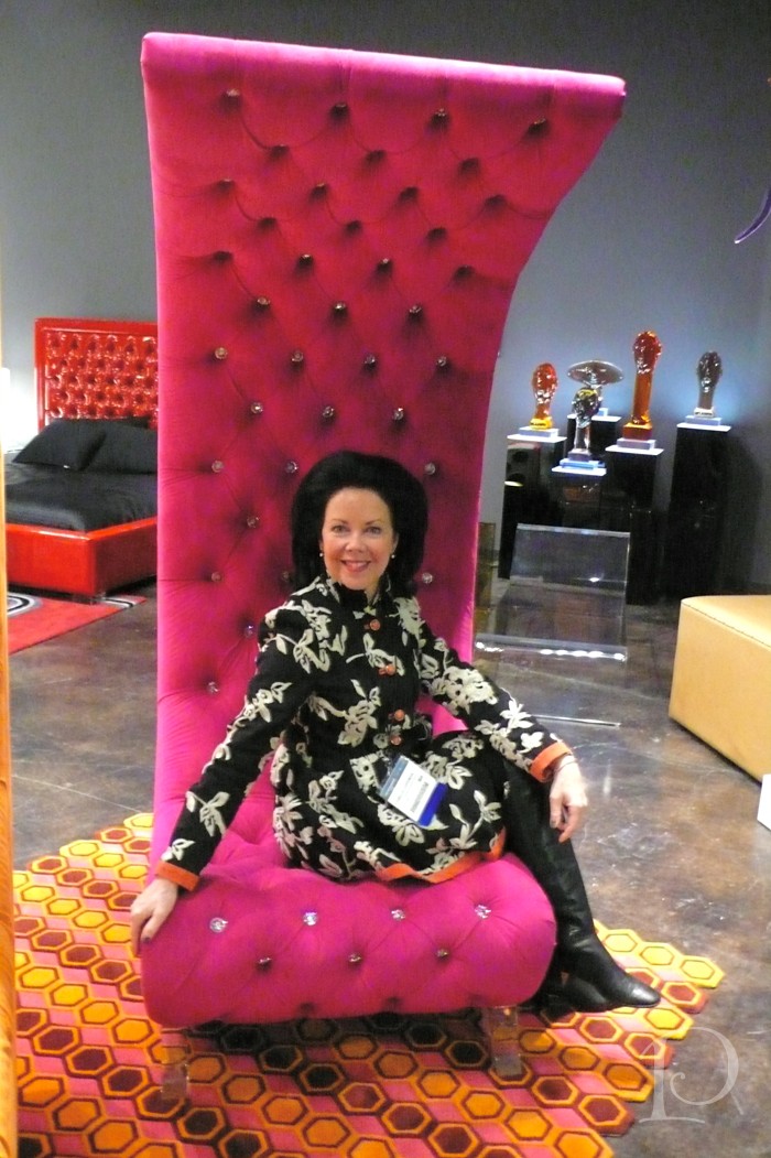
Goldilocks would definitely fall asleep in this FAB chair! It’s artful curve is comfortable and the Swarovski crystal tufts are glamorous against the poppy velvet. Such a conversation piece complete with lucite legs. This chair is created by HStudio.
