There’s Nothing Like a Junior League Show House!
Oct 31 2012 · 0 comments · Design Events, Meanderings ·0
“Our mission is to promote volunteerism, develop the potential of women, and improve the community through the effective action and leadership of trained volunteers.”
~Cynthia Reuter, President Jr. League of Boston
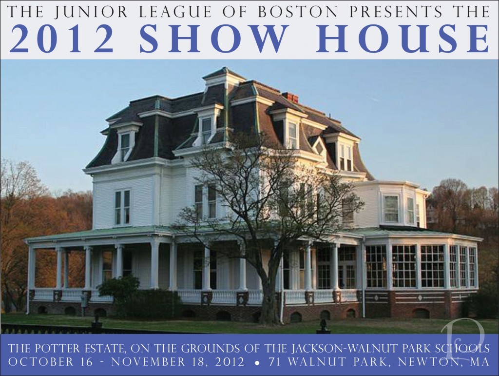 After a six-year hiatus, the Junior League of Boston Show House has returned! This year 35 talented designers have transformed the Potter Estate in Newton, MA. Located on the grounds of the Jackson-Walnut Park Schools, a ministry of the Sisters of St. Joseph of Boston, this 1867 Victorian mansion is an architectural gem.
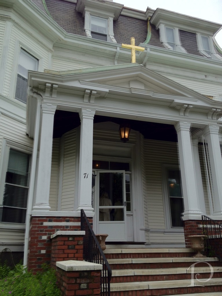 Back in June, I was invited to tour the house and consider making a bid to participate in this year’s Show House. For personal reasons, I chose not to but having toured the space in its ‘before’ state gave me a unique perspective when touring the impressive ‘afters’ during my visit this past weekend.
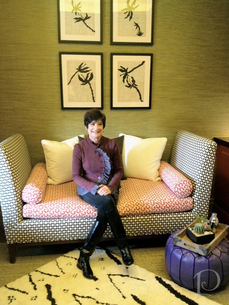
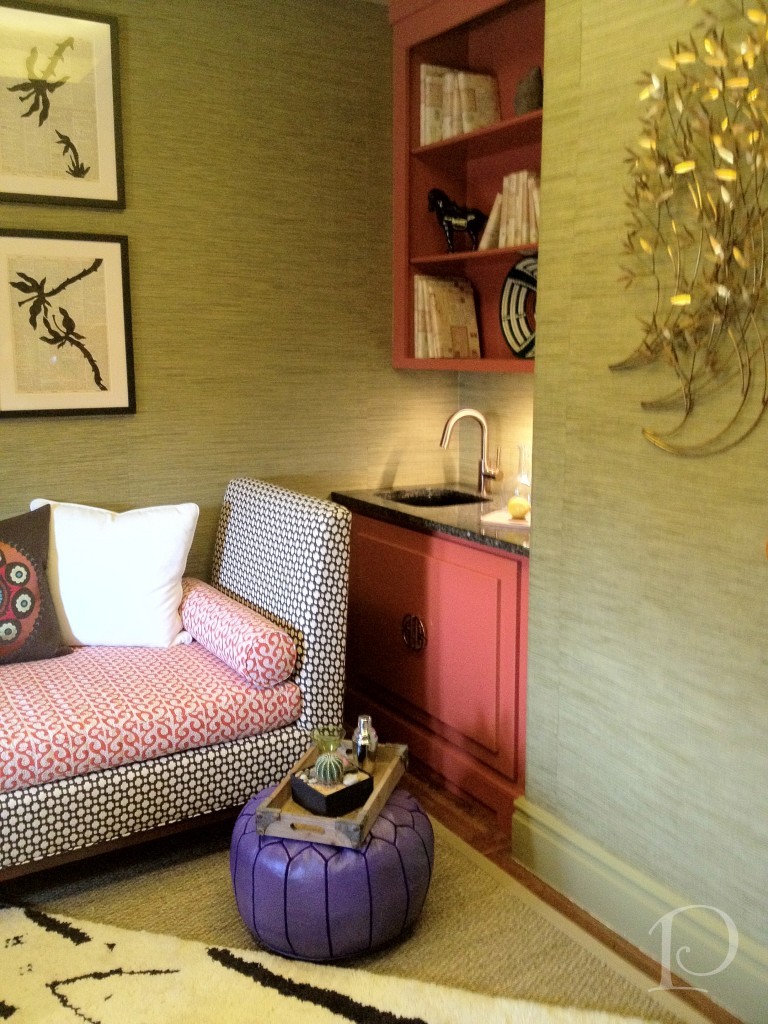
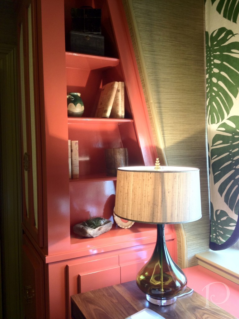
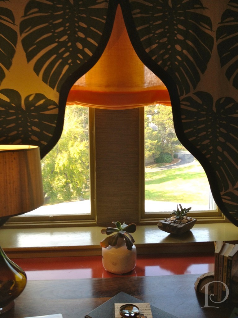
Here’s a peek at the space I was considering back in June. Slanted walls and a window without much of a view made for some very interesting challenges…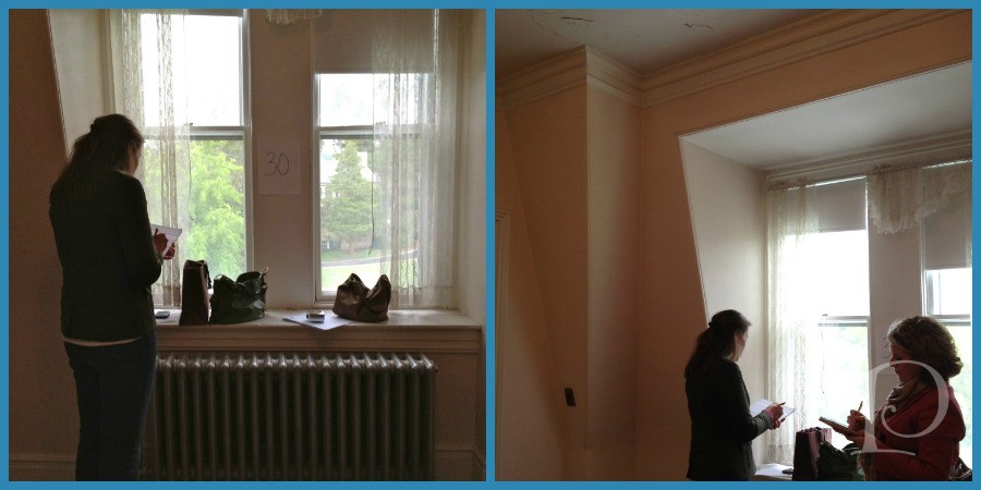 In the deft hands of designer extraordinaire Laurie Gorelick, this space has been transformed into The Inner Sanctum.
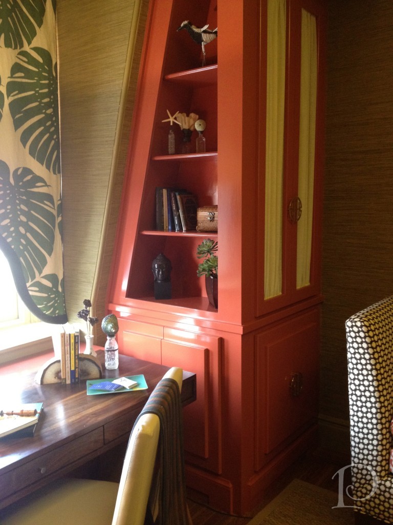 Now, it just so happens that Laurie is part of the Blogger19 group that I attended Brizo Fashion Week with in September. What could be better than seeing the space I found so intriguing transformed by a talented designer I have come to call a friend?
How about seeing that space with a whole bunch of designer friends including a mini Blogger19 reunion?!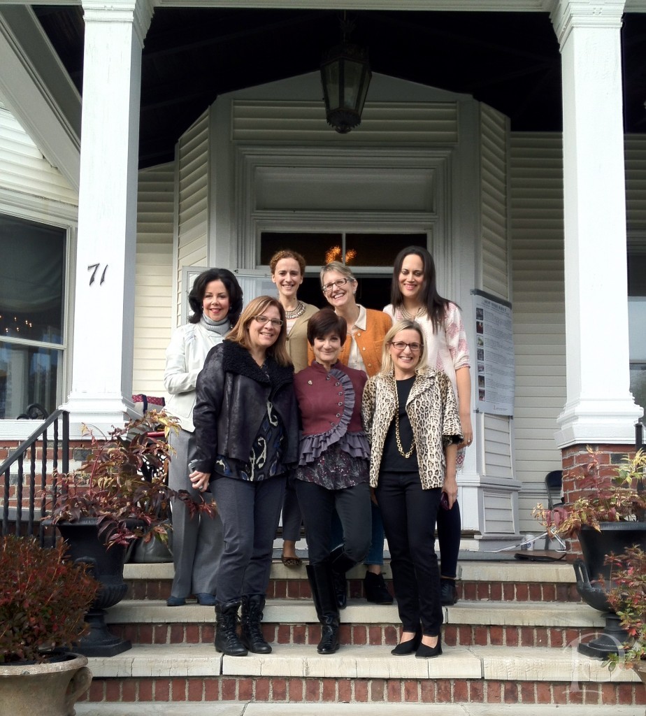 Front Row: Michelle Alfano, Laurie Gorelick, Kristen Rivoli Back Row: Moi, Jennifer Mehditash, Lynn Byrne, Sarah Sarna
Yes, these gals organized a Designer Caravan starting in NY to come and see our Show House! So much fun to see them again!
Back to Laurie’s space… When she named her space The Inner Sanctum, she envisioned it as “a haven to refresh the mind, body and soul”.
As we toured the Show House, there were several other rooms that made my highlight reel…
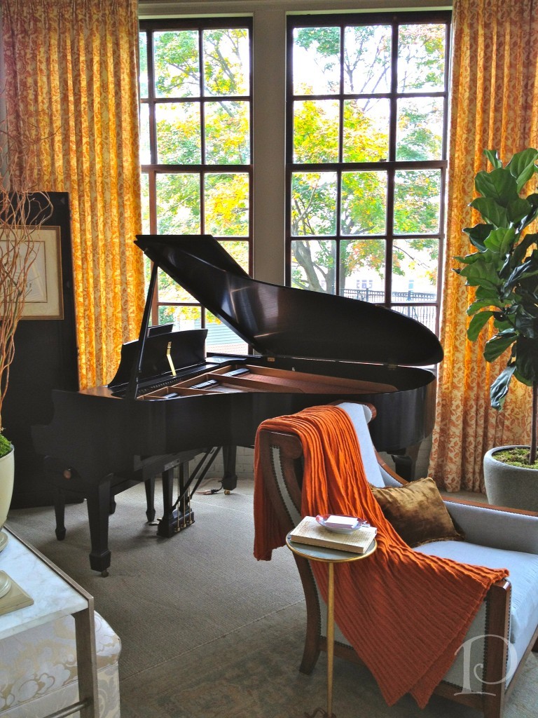
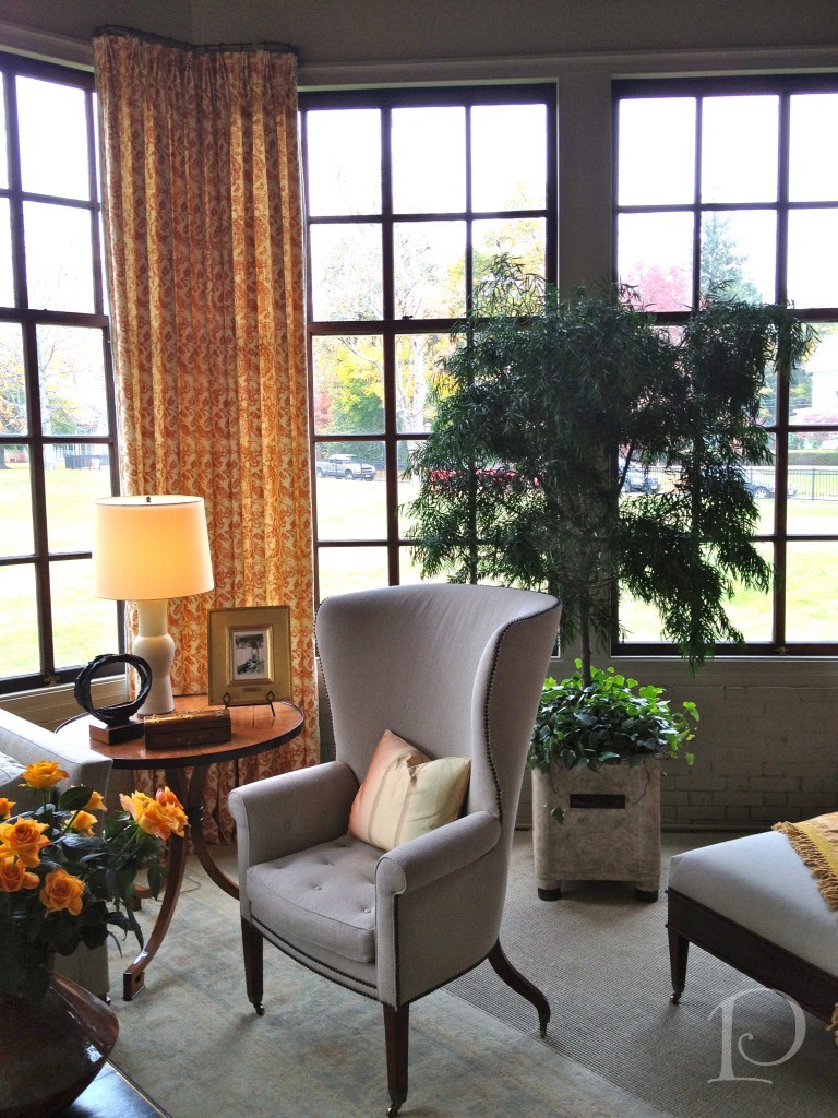
The Conservatory: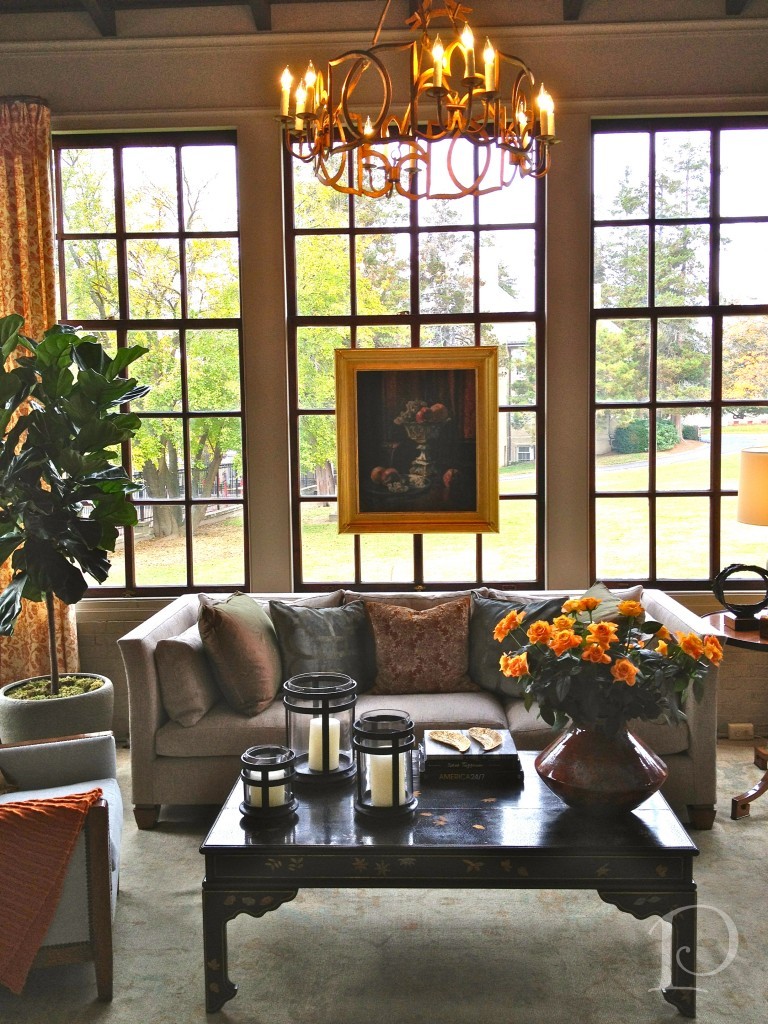 I love what Gerald Pomeroy did with this space. When I toured the house in June, it was full of dark stained wood. Now the neutral palette on the walls is the perfect backdrop for the glassed view of the autumn trees.
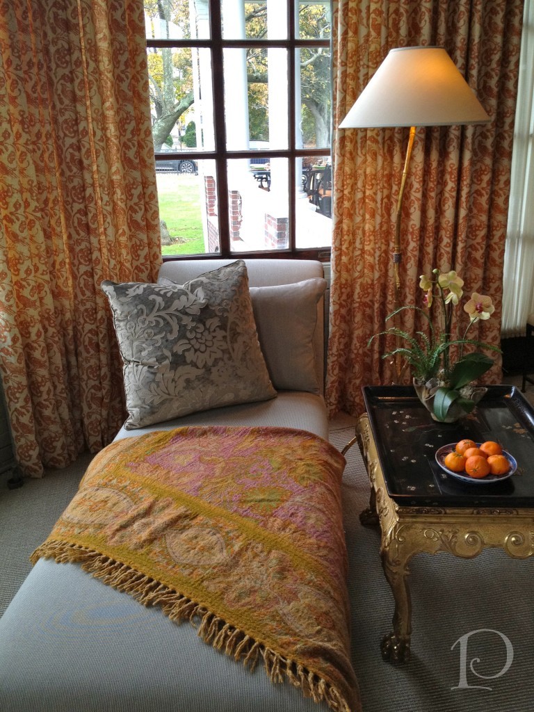
As you entered this space the piano was playing light music and every sense was catered to. I adore the chaise, in fact if I could make one Designer Wish it would be that every room have a chaise with a throw for lounging. Heavenly!
This original light fixture was spruced up with a bit of gold gild: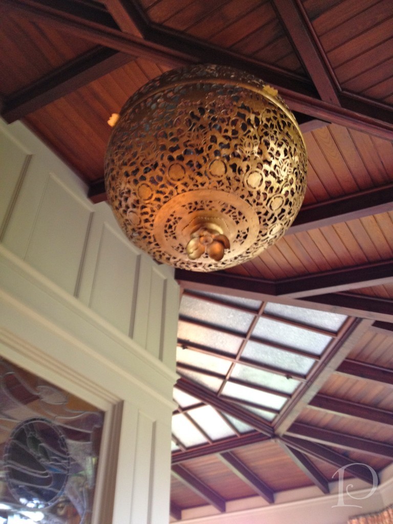
This sculpture welcomes you into the Gentleman’s Library ~ love it!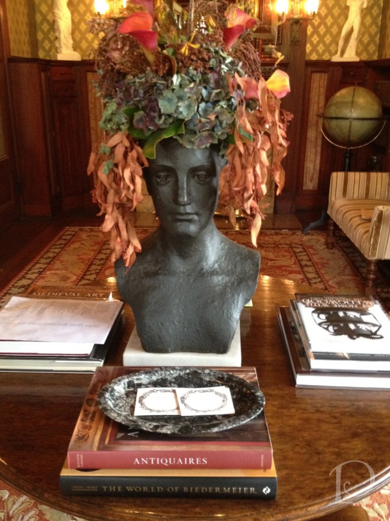
Amazing original stained glass windows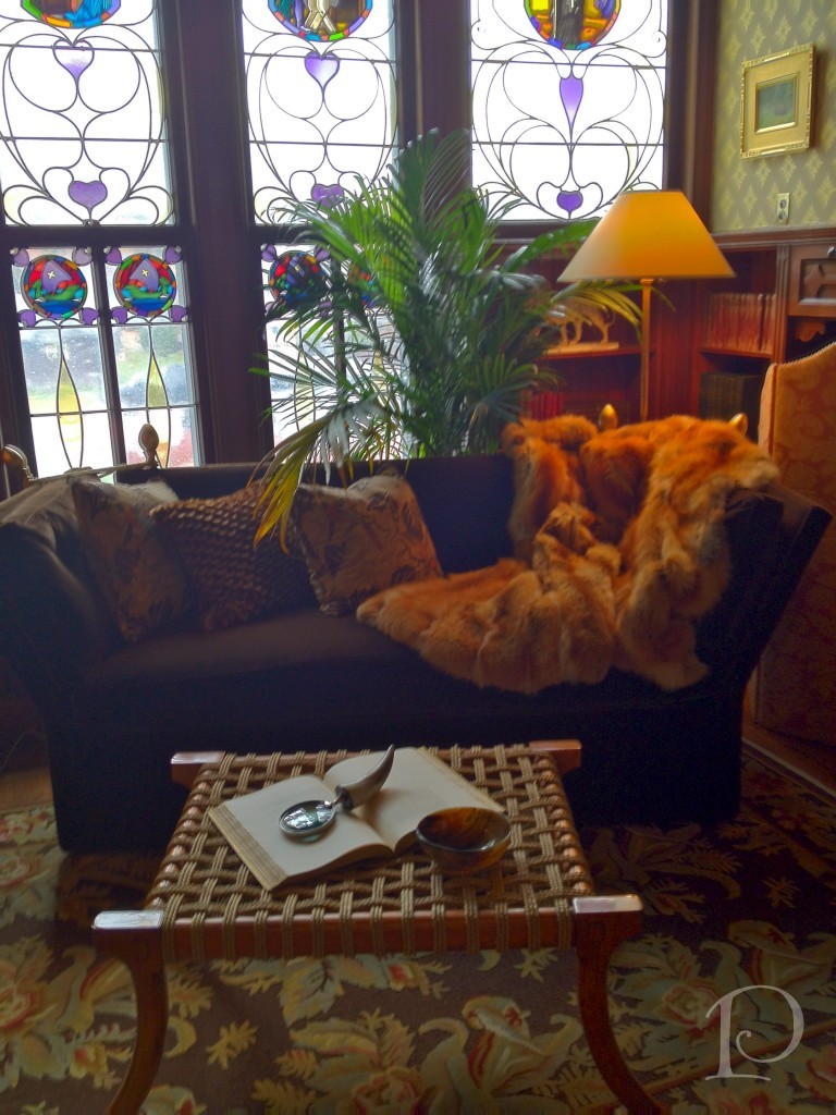
The Living Room is very cosmopolitan and modern
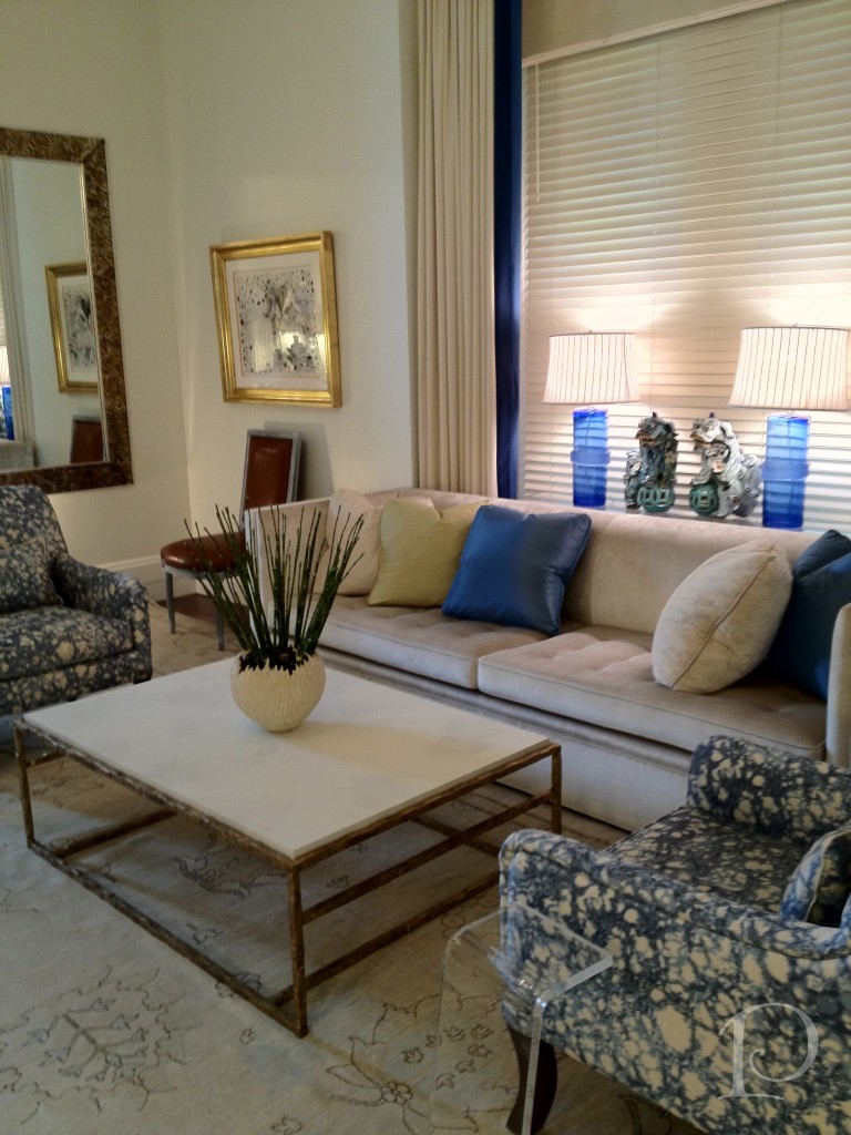 Believe it or not, when I viewed this room there was an altar in the space where the window is in the desk nook.
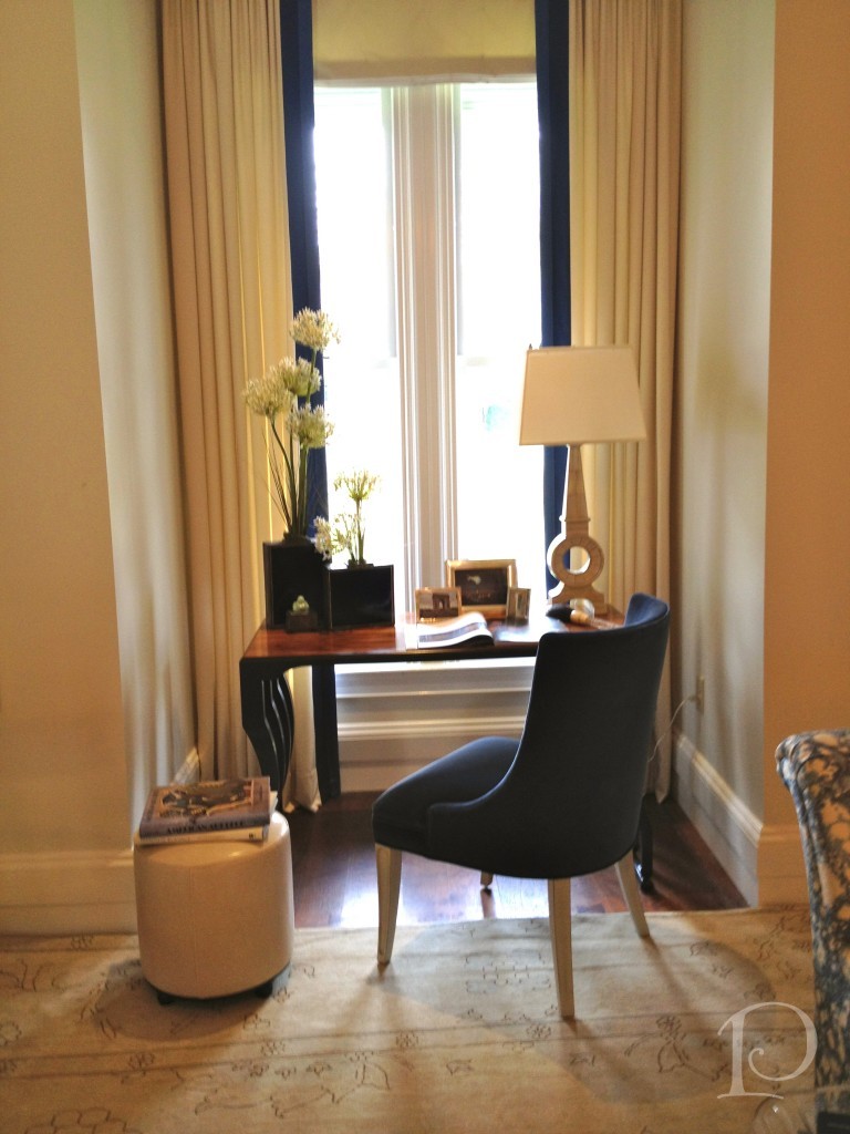 I learned that when the altar was removed during construction, the window was discovered. Also discovered were pipes that could not be removed so walls were created on either side to box in the space. The end result is a charming and useful nook.
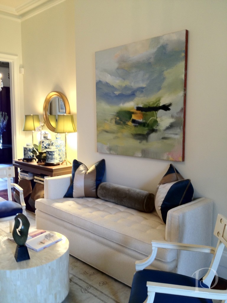 I love the colors and the artwork in the room, and all of the seating that just begs you to come and sit a while…
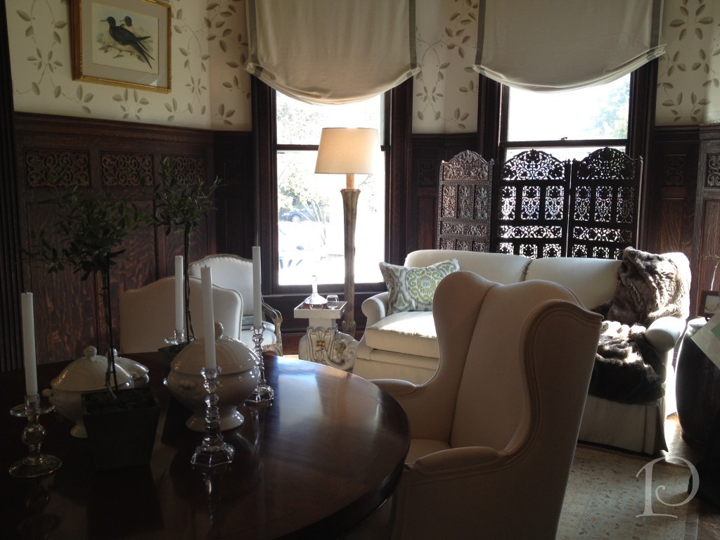
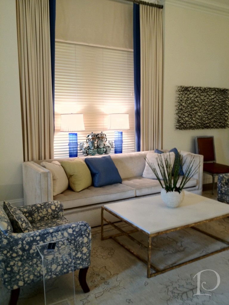 The Dining Room featured a round table which I find to be the best for conversation and secrets:
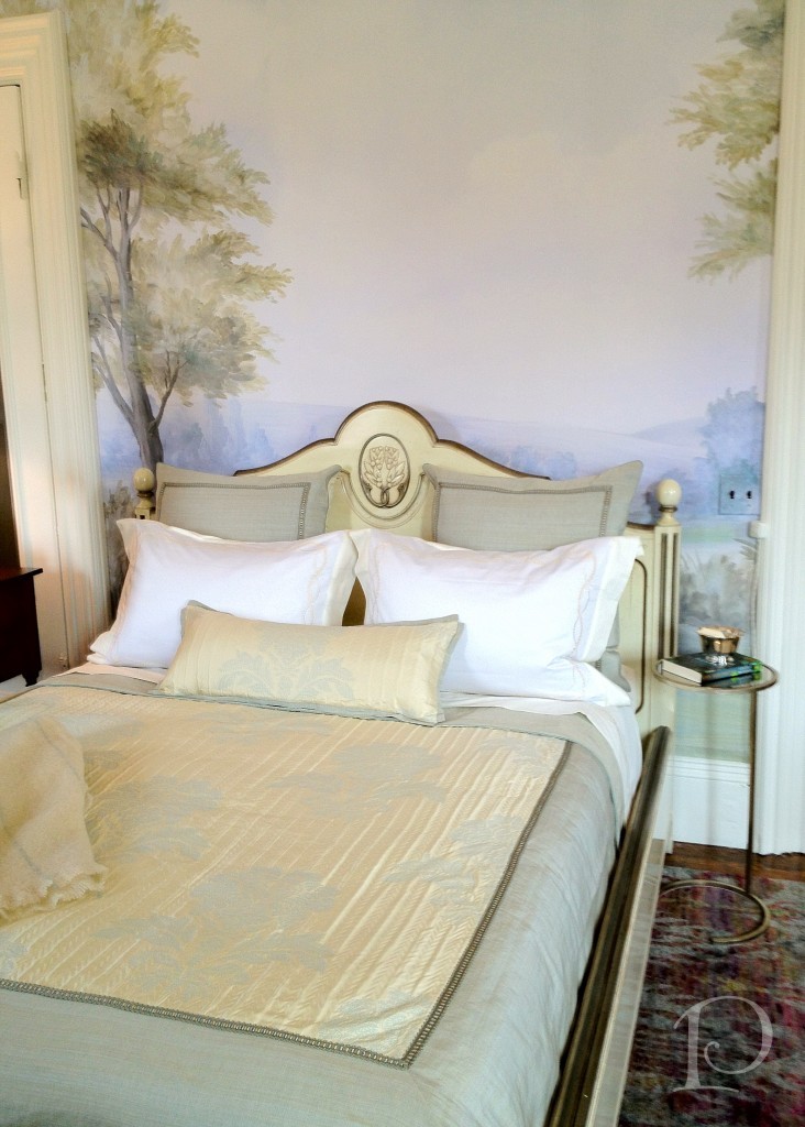
 The wallpaper mural in the Garden Guest Bedroom was so soft and inviting:
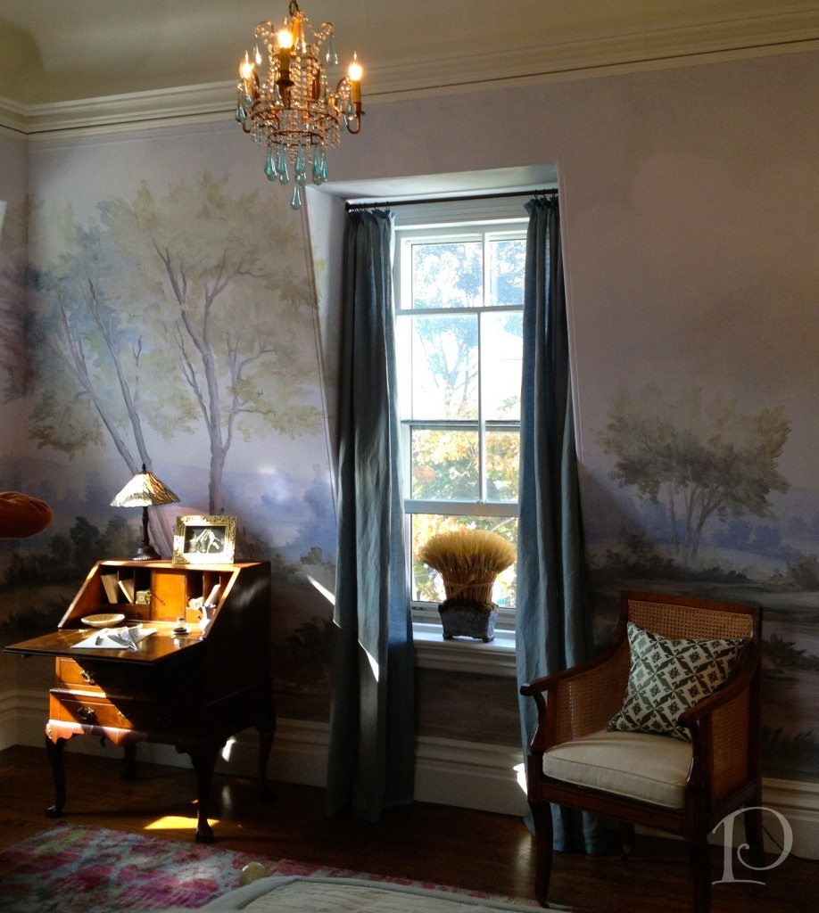
 The chandelier, chairs and perfect light in this space was enchanting…
 The Guest Bath was a great example of respecting the integrity of the space and adding contemporary elements.
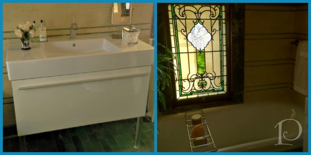 I love the juxtaposition of the stained glass windows with the modern acrylic leg sink.
The highlight of the room was certainly this incredible chandelier (inspired by Dale Chihuly as Jennifer would say …).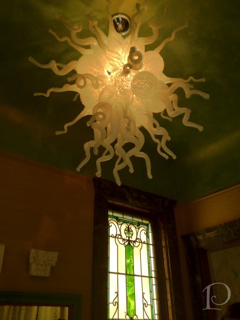
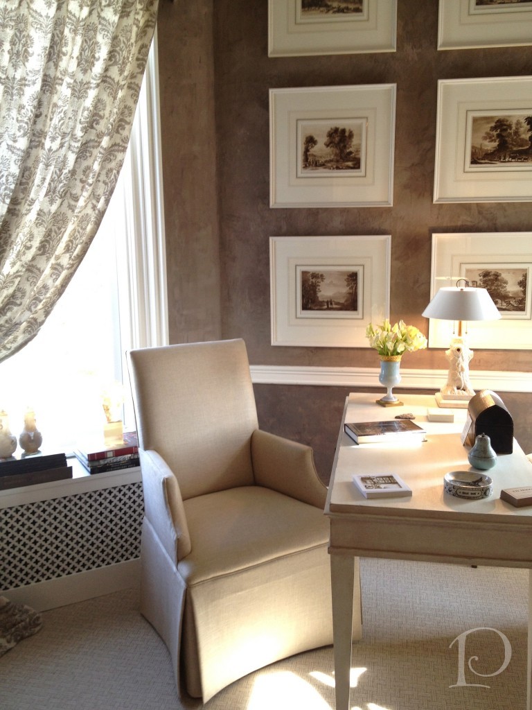
Frank’s Study by Frank Hodge was elegant and inviting.
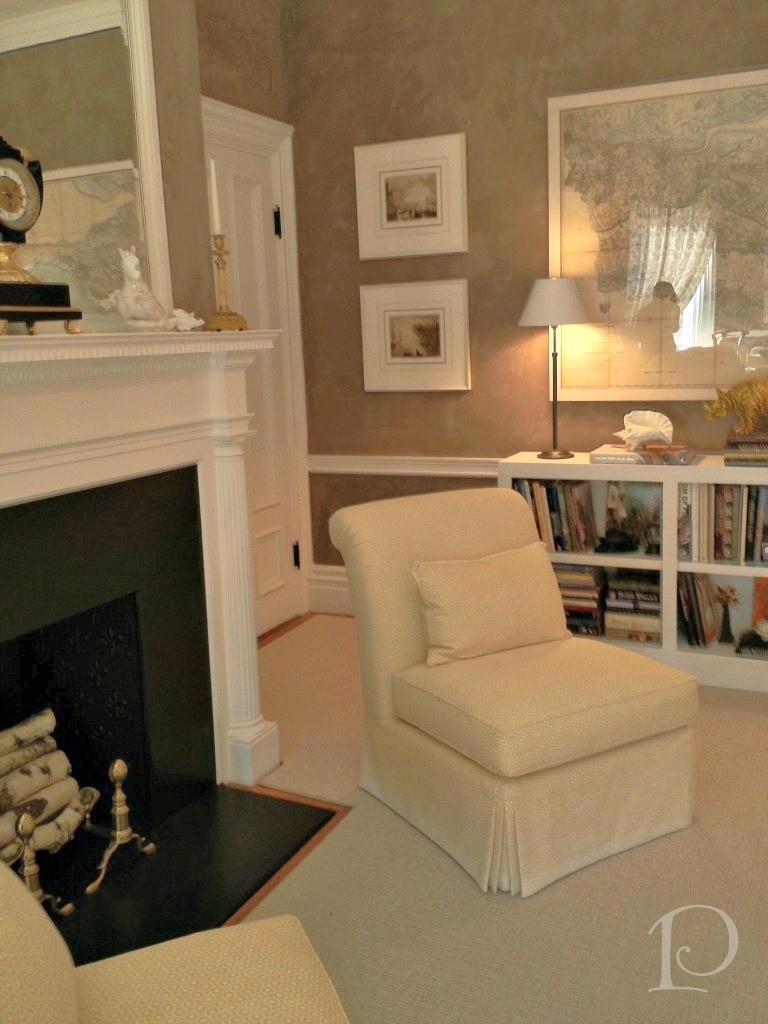
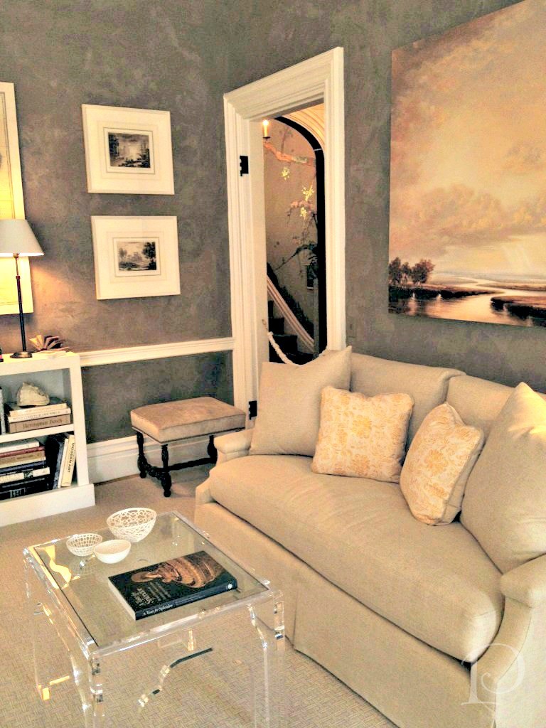 This desk beckoned to me; to write a note, to draw a floor plan, to paint a watercolor. Oh, the possibilities…
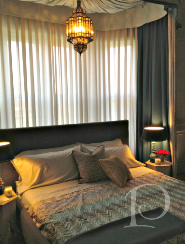
 The Master Bedroom design featured an eclectic mix of Moroccan and French influences ~ ooh la la
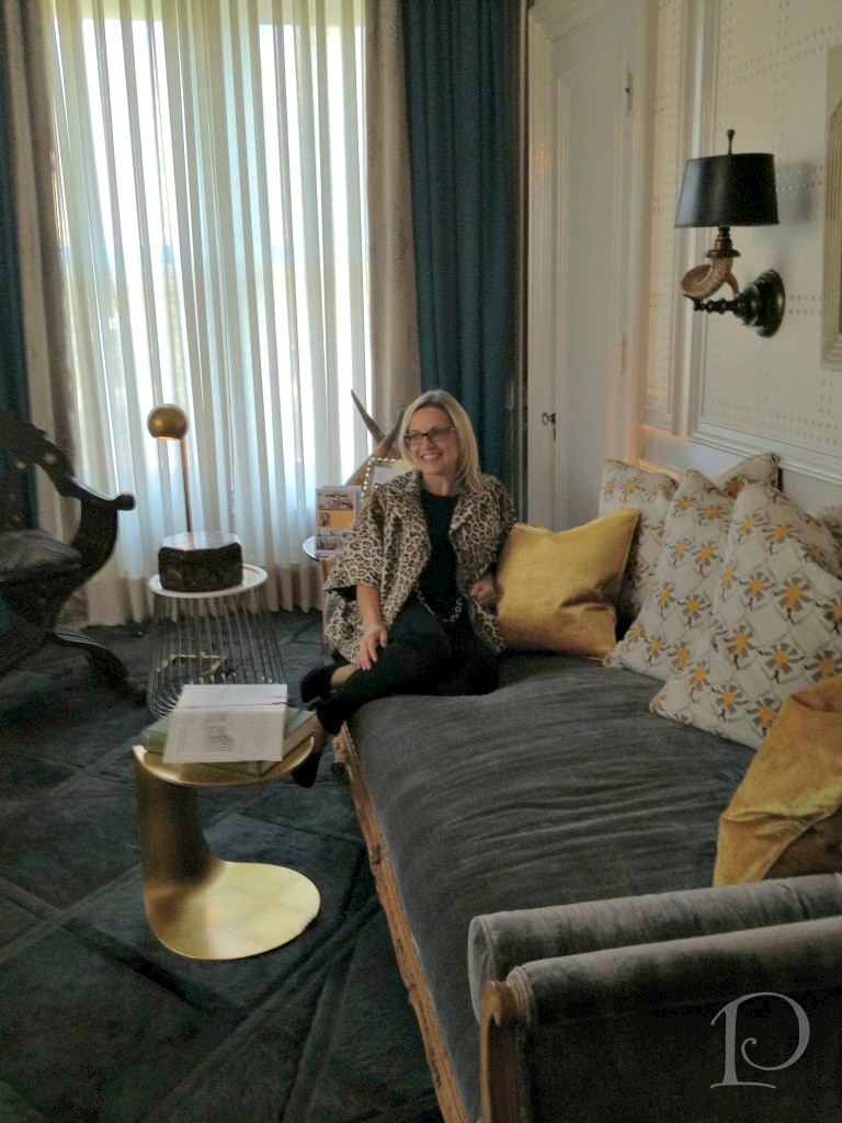
 Designer Kristin Rivoli in her fab space!
 Up on the Third Floor were these wonderful Foyer Lights.
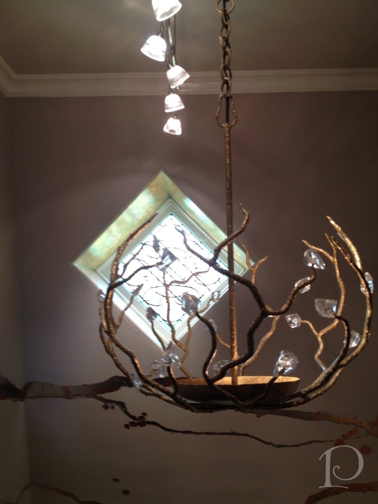 I love how the layering of light includes natural light as well.
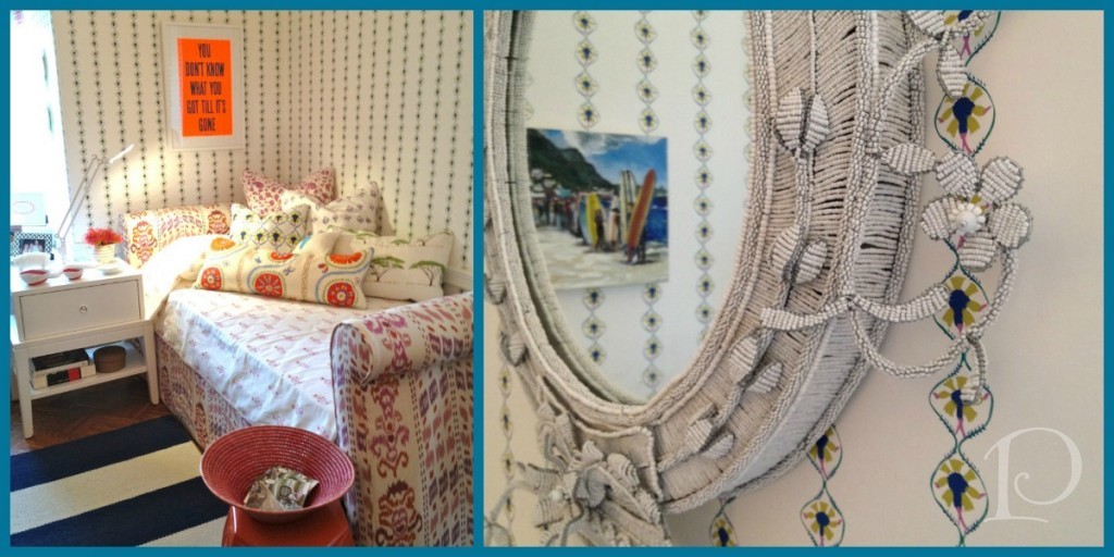
The Young Woman’s Bedroom featured classical style with a whimsical approach. The hand beaded South African mirror was a showpiece.
The Hideaway was one of the most imaginative spaces in the Show House.
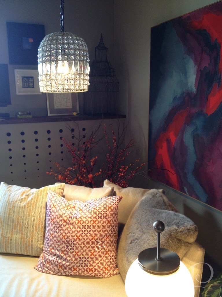
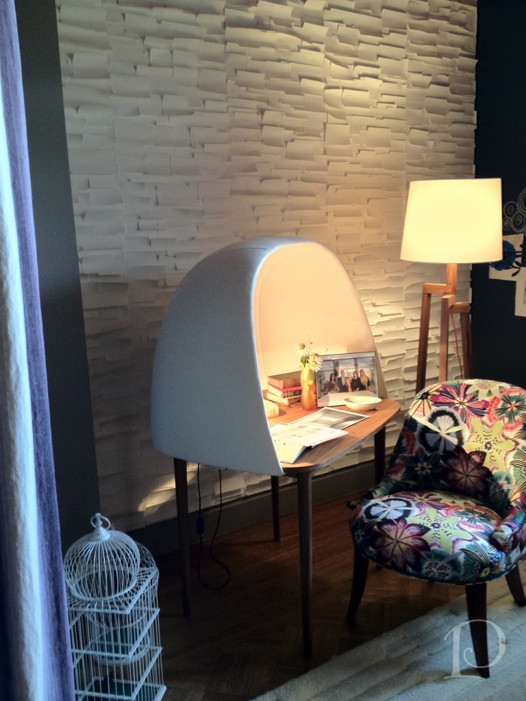 What a chaise! What a desk! Love it!
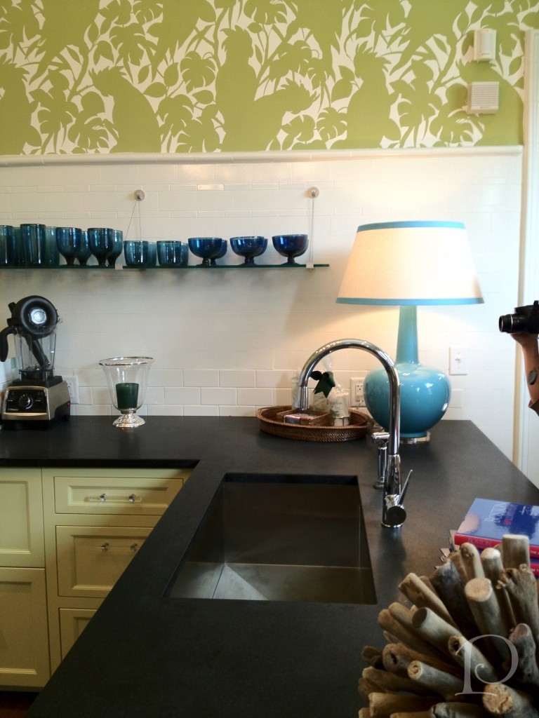
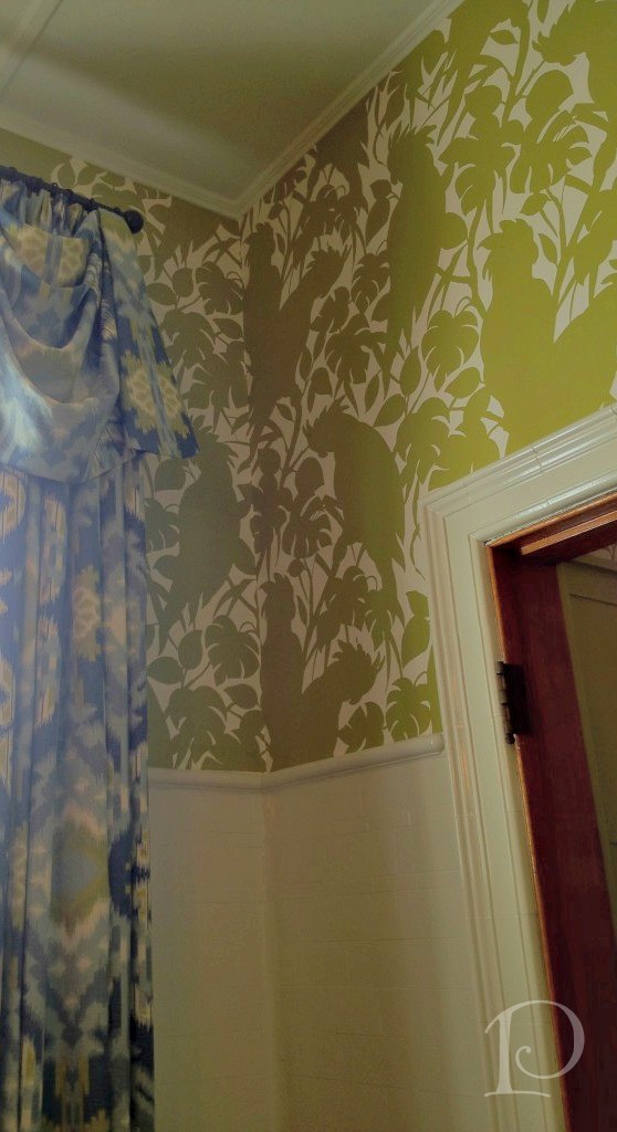
The colors used in the Kitchen included a strong chartreuse and a variety of watery blues ~ great combination!
 The drapery fabric provided the inspiration:
 Finally, The Green Room by Elizabeth Benedict.
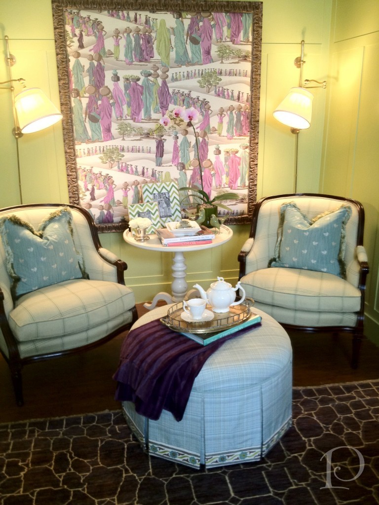 What a lovely way to wrap up our tour!
Once again, thank you so much to all my designer pals for making the trip to Newton. It was so special to see you all again ~ can’t wait for our next adventure!
xo,
Pamela
To receive new blog posts in your inbox, be sure to subscribe via email! Just click on the link in the right sidebar.
Contact me about Pamela Copeman Design Group services.
To follow me on Pinterest, click here.
To follow Pamela Copeman Design Group on Facebook, click here.
To follow me on Twitter, click here
0
