Historic Hingham Home: Media Room Update
Sep 22 2016 · 2 comments · My Designs ·0
Welcome back to the Historic Hingham Antique Colonial home I first shared with you last week. Previously, we toured the redesigned Family Room. Today we are moving to the front of the house and the Media Room. This room is where my client and her family entertain guests and have friends over to watch sporting events and the like. Once again they required ample seating, durable, stain-resistant fabrics and above all ~ comfort.
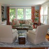
As you can see in these ‘Before’ photos, the room had some beautiful features (lots windows and detailed moldings) but there wasn’t enough seating and the furniture that was there wasn’t really in keeping with my client’s tailored aesthetic…
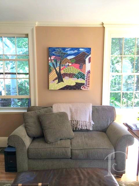
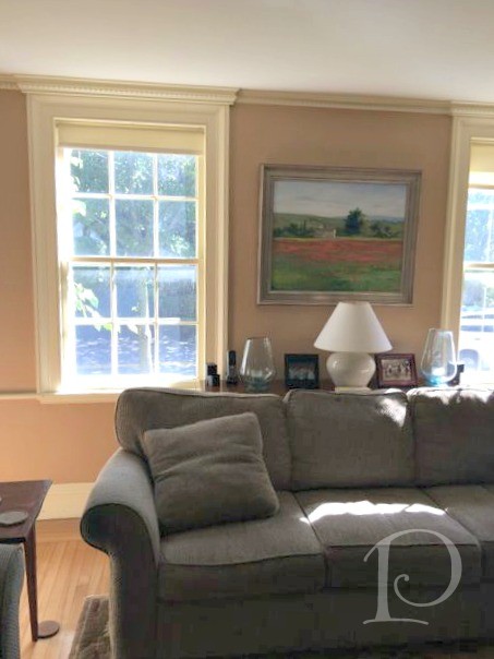
Once again I presented several options when it came to layout and fabric selection. Here is one of those sample boards:
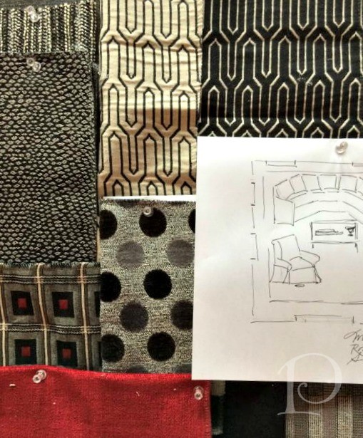
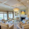
The color palette that we settled on features several shades of gray coupled with a punch of paprika and gold on the window and pillow fabrics.
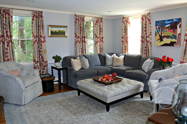
I love how the color really brings the design together, and how the client’s artwork “pops” against the neutral but contrasting backdrop.
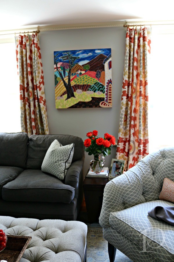
It is worth noting that we installed the fabulous artwork where my client’s wanted it, pieces were not chosen to match the fabrics. While the artwork within the room features contrasting styles, it all works well together. Once again, I believe it is important to have art in your home that speaks to you and makes your heart sing.
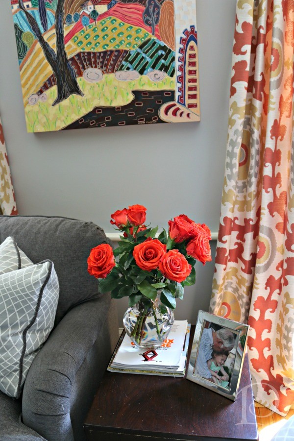
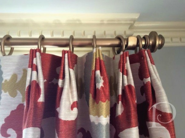
Next, I want to highlight the drapery hardware that we used in this space. We chose rods and finials from Lundy’s. They are wrought iron with beautiful details. The drapery fabric is from Kravet, the draperies themselves are tailored with a more modern approach to the pinch pleat ~ placed at the top of the panel instead of the more traditional location 3″ down.
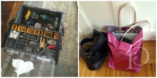
Sidenote: On the day of the install, Paul & I both brought our supplies ~ can you guess which one is mine?? 🙂
With the sectional (from Kravet) and two chairs, we incorporated lots of seating. Additionally, I love the flexibility of the custom upholstered ottoman which serves many functions including coffee table, footrest, and extra seating.
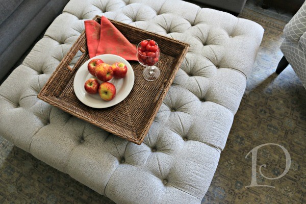
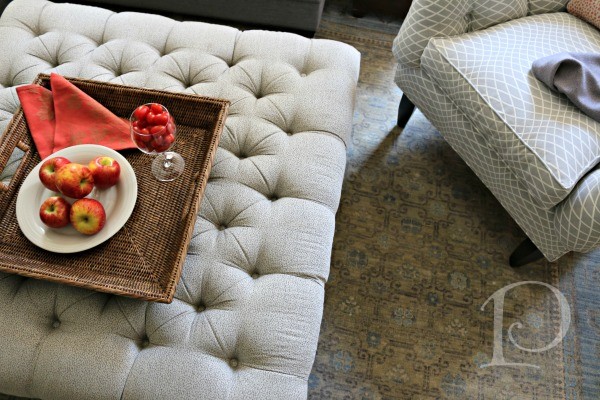
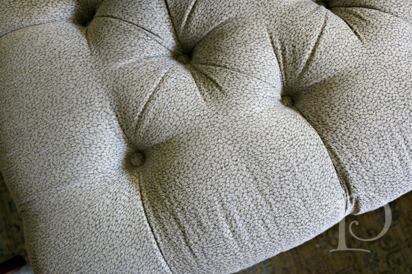
I love the subtle pattern of the Kravet fabric we used on the ottoman. And the tufting ~ to die for!
The two side chairs are actually the same Duralee chair but we treated them differently. The chair on the left is upholstered in an animal print fabric and skirted both to hide the practical (and fun) swivel feature and to add contrast. The chair on the right reads a bit more formal, with dark wooden legs and a geometric inspired fabric. It’s just amazing how a few simple touches can give each chair it’s own “personality”.

Along with the client’s artwork, we incorporated older pieces of furniture from the client’s home and it all works so well together. I think this makes the space feel more personal and collected, rather than a “straight from the showroom” feel. Overall, I am so pleased with how this Media Room came together. The room is vibrant, layered, stylish, and practical ~ a wonderful gathering spot!
xo,
Pamela
0

2 Comments
Ginny Ballou
On:
pcopeman
· author