Diary of an Interior Designer: Cape Cod Seaside Home, The Living Room
May 28 2013 · 0 comments · Artists, Behind the Design, Meet the Team, My Designs ·0
The Living Room is always the center of the home and a gathering place for family. It is a place to come together for celebrations, conversation and the making of memories. In this house the Living Room is literally and figuratively in the center of the home. The prime location means the space boasts breathtaking, panoramic views of the waterfront. This Living Room is also replete with character-building architectural details ~ which means we had another great starting point for our interior design. Come on in…
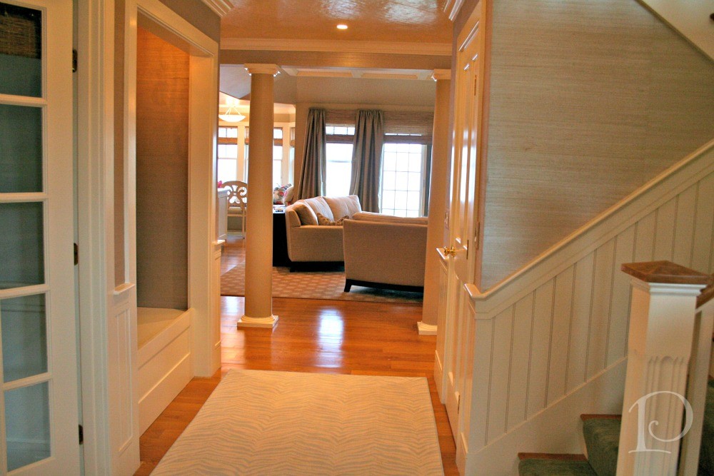
This room is located directly off the Foyer with a view that draws you in. The color palette was created to complement the sand and water with a soft sunset tone on the ceiling. Once again, the aim was to incorporate subtle references to the beach location.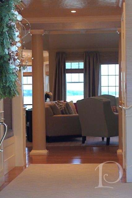
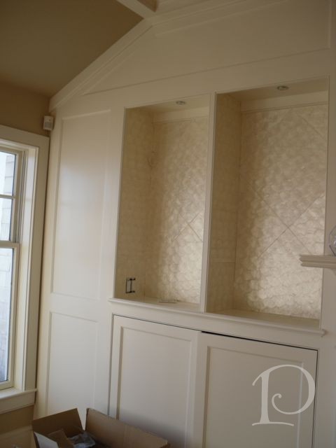
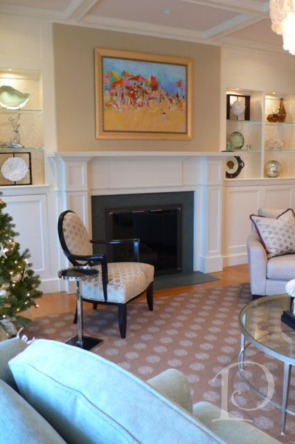
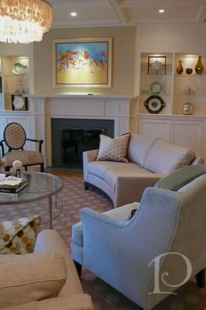
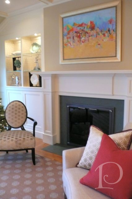
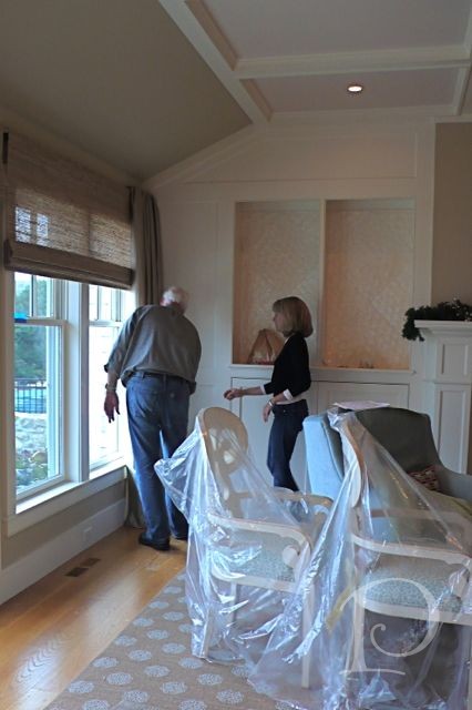
These built-in bookshelves flanking the fireplace were fairly standard issue when we started: all white with wooden shelves. Not for long…do you remember the shell tile wallpaper that was used on the Foyer ceiling? I repeated that element and used the same shell tiles to enliven the back of the bookcases. The wooden shelves were replaced with glass ones and small “puck” lights were added to illuminate the display pieces.
Love this concept and it works well in many areas, take a peek…
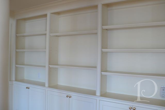
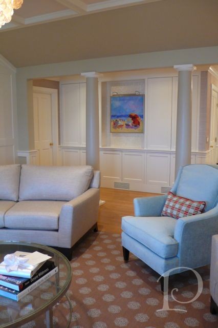
These open shelves on another wall of the Living Room screamed for a multitude of books and art pieces. Whereas this family has a primary residence off-Cape where most of their books are kept, we closed up most of the shelves with doors which adds interest and provides additional functional storage.
We left the center area open and again used the shell tile as a backer. The star of the niche is a beautiful beach painting by Sandy Welch. This painting was a perfect way to add color and pizazz to the neutral palette.
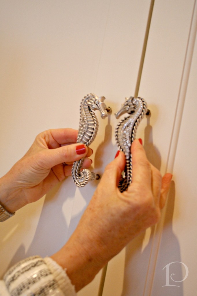
Of course I couldn’t resist adding just a bit more pizazz with these one of a kind jeweled seahorse pulls on the doors…
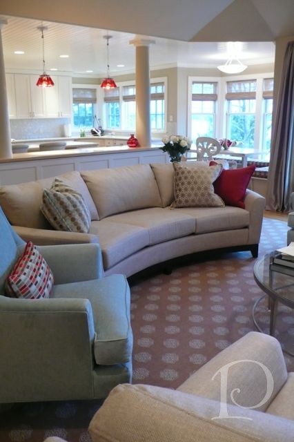
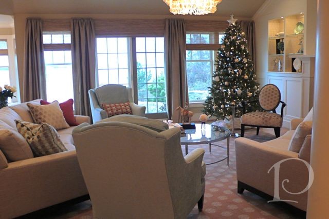
I love this view of the curved sofa. It seats at least six and is so appealing to the eye as it softens the rectangular lines of the windows and the coffered ceiling.
The arrangement of furniture illustrates how you can divide a room without walls simply by the placement of larger pieces and creating a traffic flow.
This view shows off the ceiling painted in a faint blush sunset color on the interior on the coffered ceiling with the dimensional area painted the trim color. We selected a tiered opalescent shell chandelier to hang over the coffee table… isn’t it divine? And yes, another painting by Connecticut artist Sandy Welch (love her!) hangs over the fireplace and embellishes the entire room with a lively beach scene.
We converted the wood burning fireplace to a gas fireplace ~ so much easier to operate and very functional.
Even though these transformations look like magic, there is a team that worked hard to make it all come together… bless you Jen and Paul!
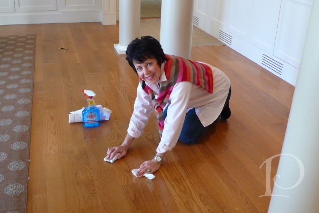
And yes, I do everything…whoever said being an interior designer is glamorous???
When the family arrived just in time for Christmas, the home was ready for Santa.
I’ll be wrapping up this series tomorrow with a peek at two final spaces: the kitchen and the powder room. I hope you’re enjoying these posts, I’d love to hear what you think of the Diary format!
xo,
Pamela
0

