Diary of an Interior Designer: Cape Cod Seaside Home, Kitchen and Powder Room
May 29 2013 · 0 comments · My Designs ·0
It’s finally time to wrap up this huge project!
Like the family room, the kitchen is a gathering place for families. You may be curious about the Kitchen in this retreat home: how does it accommodate the large family, the guests and all the cooks? In this case, very well indeed. The existing footprint for this space was perfect, open to the Living Room and outfitted with updated cabinetry. With no major construction necessary, I was able to concentrate my design for the space on the cosmetic changes that allow the Kitchen to work in harmony with the rest of the home and the views beyond. That meant new tile, new light fixtures, and paint for nearly every surface. We also created a spacious eating nook in a space that was undersized for the proportions of the home…
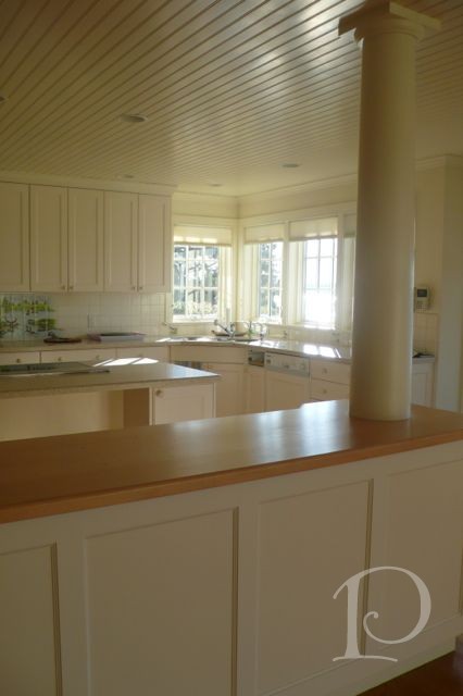
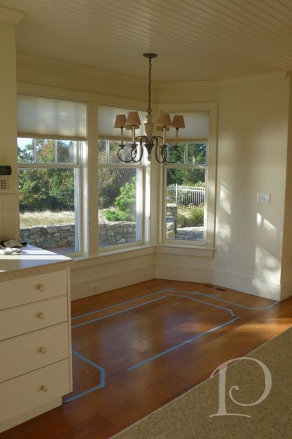
The before shot, rather bland don’t you think?
Note the tile backsplash mural: a marsh scene with cattails and birds. Pretty at one time, but now dated.
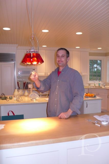
Now comes some magic…
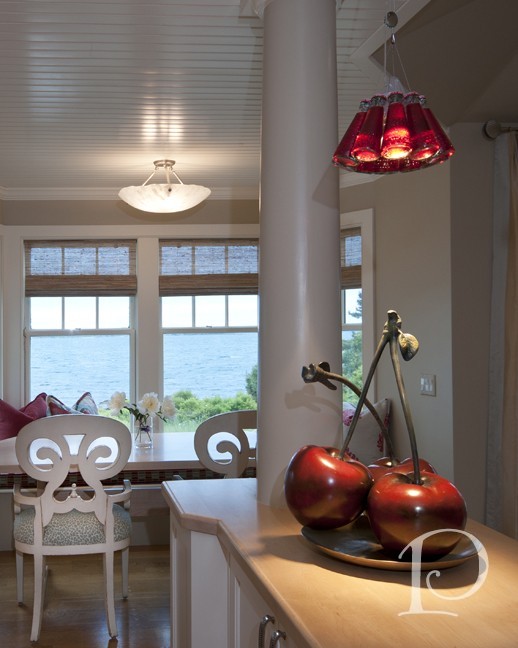
Calter is installing some pizzazz in the form of lighting. These Campari bottles from Italy (via Chimera Lighting Design) add a whimsical jolt of color.
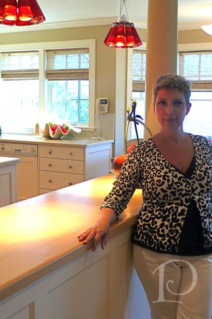
Close up of my team member Tina from Aphrotidy and the FAB lights
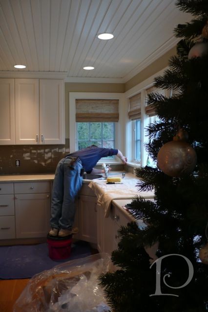
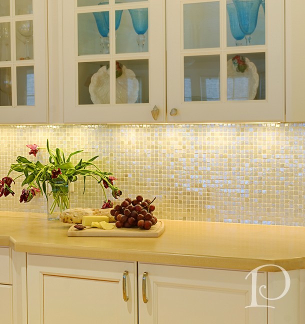
Gary is adding my favorite tile in the whole world, it is a mosaic 1” tile of iridescent pearl and ivory shades that complement the existing cabinetry and counter surfaces. When it catches the light it is heavenly ~
Take note of the tile and the woven wood shades (and my shorter hair!):
This is a view of the plan for the eat-in area, for those family members who opt not to eat at the large island area. We created a banquette that hugged the window and added an angled table that mimicked the shape of the window.
On the outside we added 2 curved chairs, believe it or not 6 family members can easily gather here for breakfast.
Now for the Powder Room! It is said that a powder room can be over the top and full of fantasy because your guests are behind closed doors and can inspect your designs up close and personal. Come take a look…
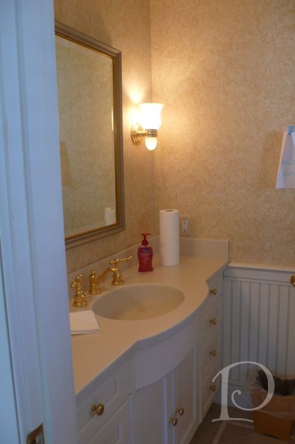
Before this bathroom is certainly functional (which is important!) but again, not noteworthy…
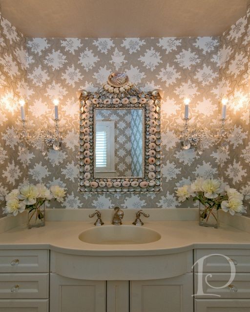
After, this is a space worth talking about:
Even the ceiling is glam, papered in a solid metallic silver…divine and posh.
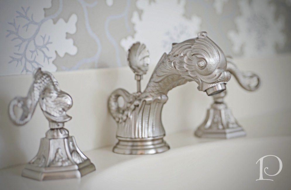
The faucet is a fantasy sea creature, of course, in silver…
If I were a guest, I would surely have to visit this Powder Room several times, it is just sooo beautiful!
Phew! I hope you’ve enjoying reading this Diary of a Designer blog series. Please let me know if you would like to see more entries highlighting different projects. It was like a walk down memory lane to relive all the highs (and yes some of the lows) of this project. But it was all worth it to hear that this family is enjoying their home so much!
Life is wide, limitless. There is no border, no frontier
~Bruce Lee
Here’s to sailing off on my next design adventure!
xo,
Pamela
0
