Behind the Design
Diary of an Interior Designer: Cape Cod Seaside Home, The Children’s Suite
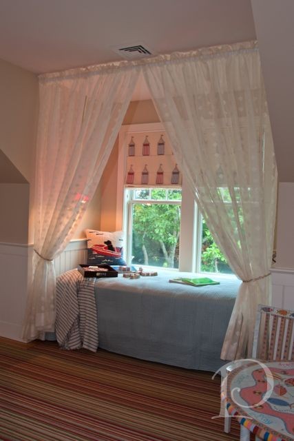
May 01 2013 ·0At nearly every Designer’s Show House I’ve attended, the Children’s Room is always among the favorite spaces. Designing children’s spaces presents the opportunity to incorporate whimsical touches, plenty of color and to think like a child again ~ how grand! The Children’s Suite in the Cape Cod retreat seems to me the perfect place to start our tour…
Diary of an Interior Designer: Seaside Home, Cape Cod, Part One
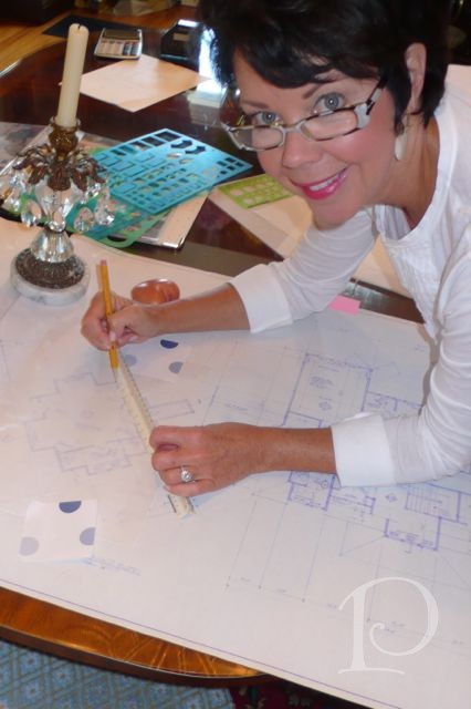
Apr 30 2013 ·1One of the luxuries of sharing a completed project is the ability to reflect and share the story behind the design: the ups and downs, the twists and turns and the knowledge that it all turned out beautifully in the end. As an interior designer my job is much like that of the Fairy Godmother in the story of Cinderella ~ I transform the drab to fab. As you will see however, it is not always as easy as waving a wand and saying ‘bibbity-bobbity-boo’. However, the end result is always magical…

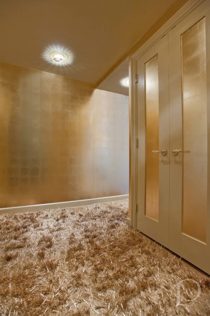
A Welcoming Golden Foyer
Apr 09 2013 ·1As a designer, one of the most thrilling aspects of my job is seeing a space totally transformed. Sometimes we are charged with refreshing a space that has good bones both architecturally and design-wise (see The Blitz video of Gina’s Living Room). Other times, we are starting from scratch and take a space all the way from drab to fab. Today I have one such transformation to share with you…
Our First Video: The Blitz
Mar 05 2013 ·4I am having an amazing time at the Design Bloggers Conference! So many incredible speakers with so much valuable information!
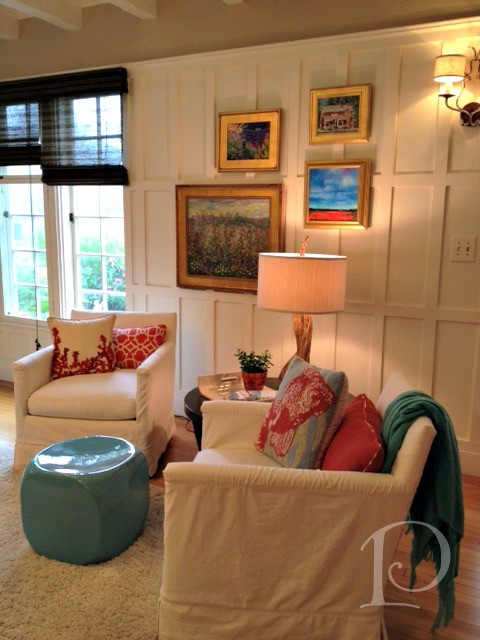
I am already taking much of what our wonderful speakers have shared to heart. There has been plenty of emphasis on being yourself and the use of video in blogging. It just so happens that I have a treat for you today that incorporates both…
Demolition Day
Jul 16 2012 ·0I LOVE Demolition Day! Demolition Day is truly a sign of progress, it means designs are moving forward and a big rush of adrenaline at the excitement of it all!
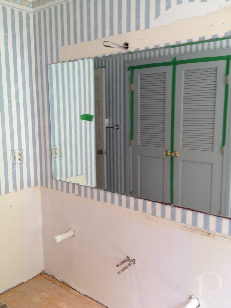
Last week it was time for Demolition Day on the bathroom portion of the Teenage Boy’s Domain project I’ve been chronicling on the blog. We are working with the award-winning S+H Construction firm of Cambridge. The entire team is professional, outstanding in their field and, so importantly, on time. All of this translates to a smooth Demolition Day.
They say a picture is worth a thousand words so here goes…
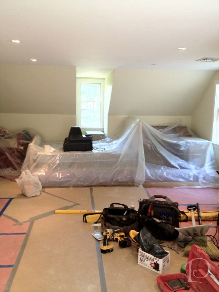 This is the perfectly prepped bedroom that is not being demo-ed. The space is totally protected, I love how they’ve covered the hard wood floors to the bathroom.
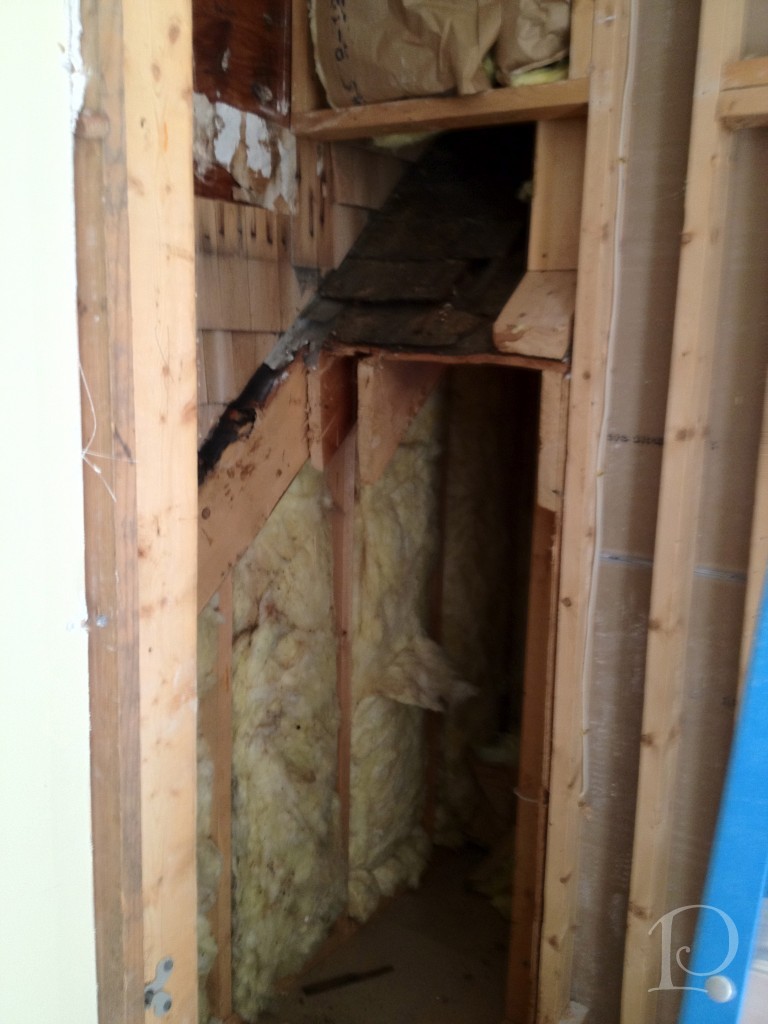 Here is the shower minus the inserted fiberglass unit ~ voila, an extra 3 feet of space! Ahhh, the secret discoveries of demolition!
Here we found some hidden exterior shingles. Why are they there? Who knows, but no worries.
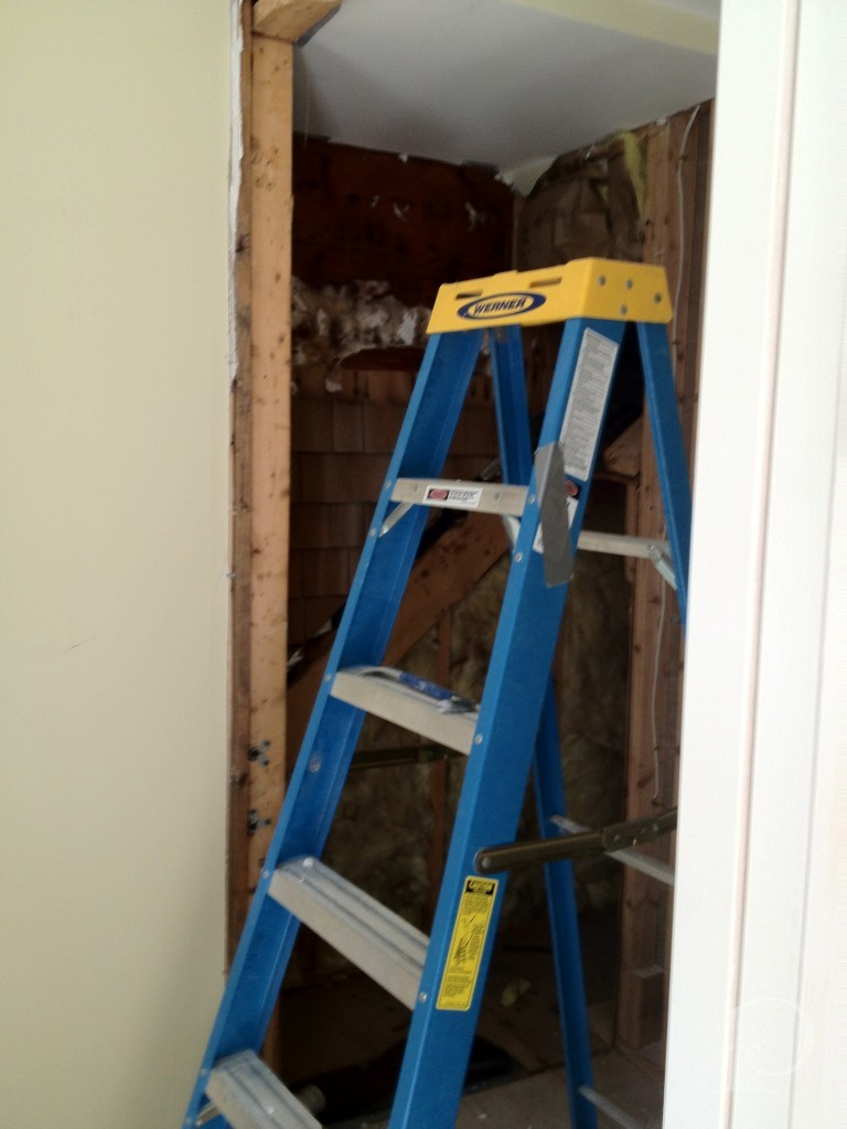 This space will house the new tiled shower with glass door, stay tuned…
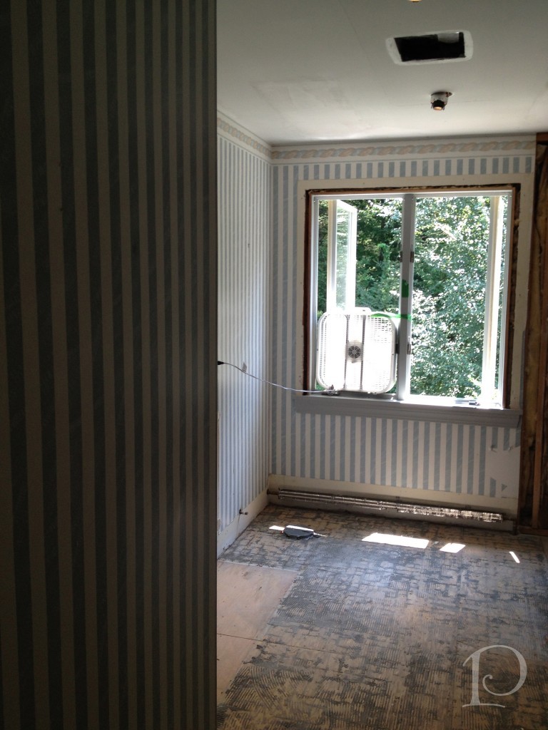
The demolition of the guest bathroom came with a LOT of noise. Getting those funky tiles up from the sub floor was not a quiet job! Look for this window to be replaced as well.
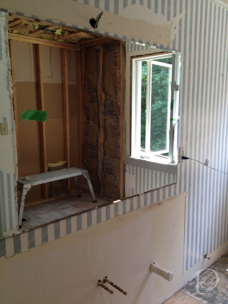 This view shows the bath/shower area as reflected in the soon to be replaced mirror.
 I can’t wait to share the custom vanity that is being designed for this bathroom. The space will be absolutely transformed, just you wait and see!
While these may not be the prettiest photos I’ve shared on the blog, when you see the finished project you’ll be amazed at how far we’ve come!
“An architect’s most useful tools are an eraser at the drafting board, and a wrecking ball at the site.”
~Frank Lloyd Wright
xo,
Pamela
Contact me about Pamela Copeman Design Group services.
To follow me on Pinterest, click here.
To follow Pamela Copeman Design Group on Facebook, click here.
To follow me on Twitter, click here
My Design Projects: Teen Bathroom
Jun 26 2012 ·0A transformation is in the works!
I am excited to share with you one of several new projects that I am currently working on. You are in for a treat because I am able to show you the progression of this project in real time, as I am working on it. I hope you enjoy being along for the design journey!
Prioritized as the one of first spaces to be transformed in a larger project, this en suite bathroom for a teenage boy is quite small and ready for an update.
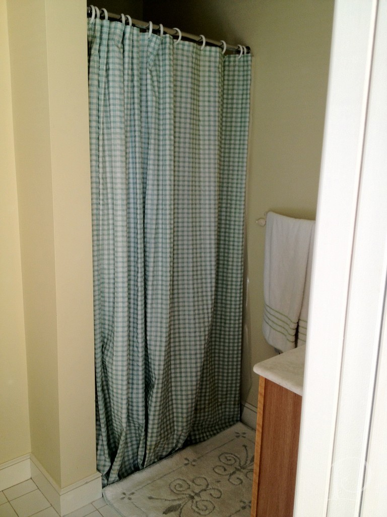
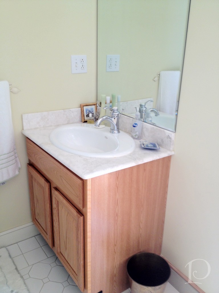
Here is the requisite “before” shot of the vanity in the existing bathroom:
 and the 1 piece shower:
While certainly functional, the space does not reflect the aesthetic of the teenage boy who lives here.
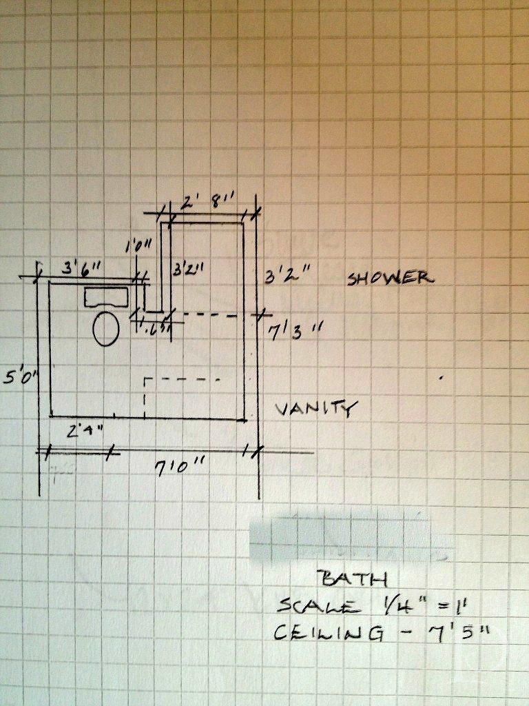
My first step was to draw up a floor plan, a must for planning the space and ordering materials.
While we knew this bathroom would need to coordinate with the adjoining bedroom, I was curious to see what ideas my young client had for the overall design. During our initial design meeting we discussed the function of the room (sleeping, studying, entertaining friends) and color preferences (red). I knew I was going to have a great time with this young man he likes the color red! After a bit more delving, he told me about some posters he collected last summer. The posters are sophisticated in shades of charcoal, reds and other vivid hues. What a great jumping off point for the design of our project! Every design has to have an inspiration and this young man’s poster collection is ours.
After our discussion, I wrote up my ideas and met with Christine at Tile Showcase at the Boston Design Center.
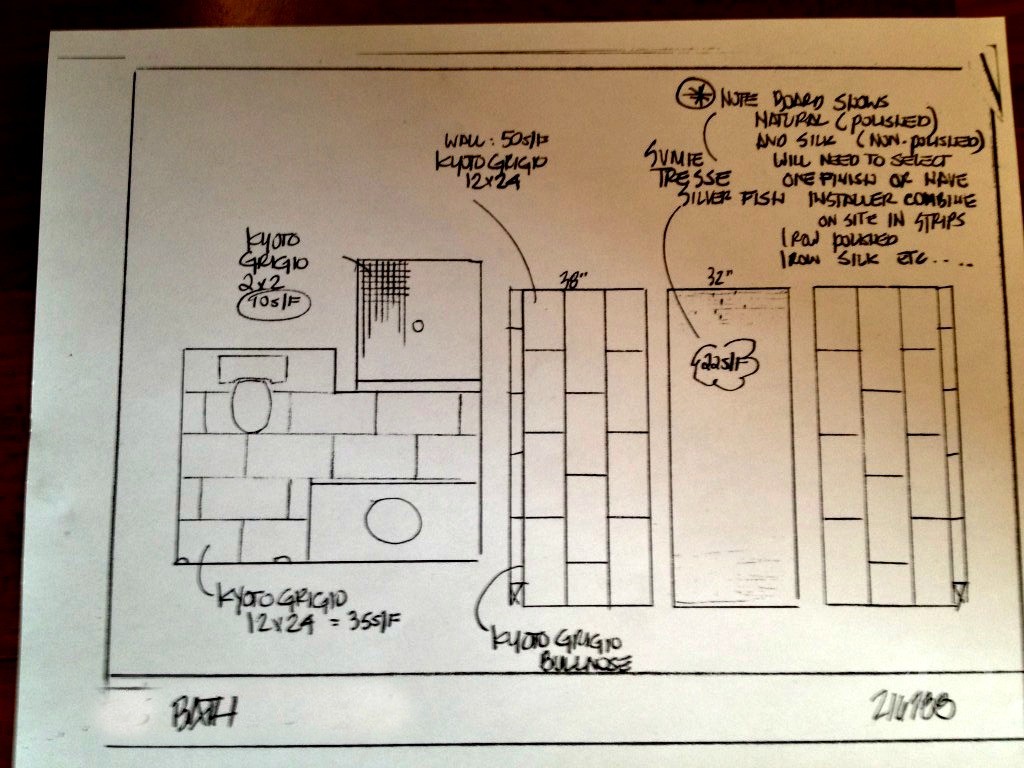
We found some wonderful tile selections and Christine sketched a quick plan:
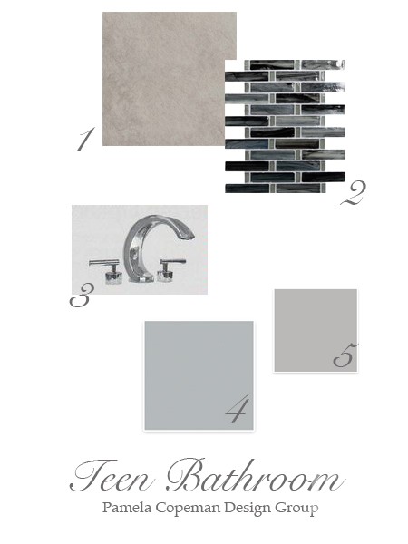
To make the plan come to life for you, I put together this mood board for the space:
Details:
1. Kyoto Grigio tile for the back wall
2. Sumi-e Tresse Silver Fish Natural glass mosaic tile for the side walls on the vertical and the floor ~ using the same tile on both surfaces will give the illusion of a larger space
3. Sigma Palermo faucet is one of the options for faucetry, I love the modern look of the polished chrome
Two of our options for wall color, both from Sherwin-Williams:
4. Monorail Silver
5. March Wind
Stay tuned to see progress, plus more on the bedroom design. I promise it is creative and amazing ~ and just wait until I show you the inspirational posters!
“Design is a constant challenge to balance comfort with luxe, the practical with the desirable”
~Donna Karan
xo,
Pamela
Contact me about Pamela Copeman Design Group services.
To follow me on Pinterest, click here.
To follow Pamela Copeman Design Group on Facebook, click here.
To follow me on Twitter, click here
Blogfest 2012: Kravet Studio Tour
Jun 07 2012 ·1“Creativity involves breaking out of established patterns in order to look at thing in a different way .”
~Edward de Bono
Without a doubt, the highlight of Blogfest 2012 in New York City for me was the Kravet Studio Tour. When I begin a design project I always start with fabrics for inspiration. Naturally, on the morning of the Kravet Studio Tour I was the first one to arrive and secure my place on the first tour of the day. You can imagine what a thrill it was for me to have a chance to get a behind-the-scenes look at the studio where so many of my favorite lines are created!
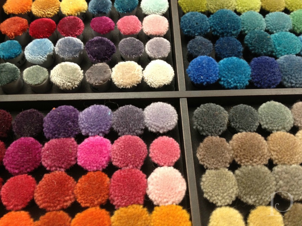
The first studio we visited was the carpet shop. Look at this array of wool yarns ~ the colors are so pure and glorious.
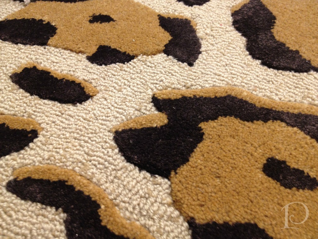
 This is a carpet sample that caught my eye~animal print of course. I can think of a dozen spaces this would be perfect in.
The next studio we visited displays Kravet fabrics that are available in showrooms across the country, I have used many of these and they are luxurious…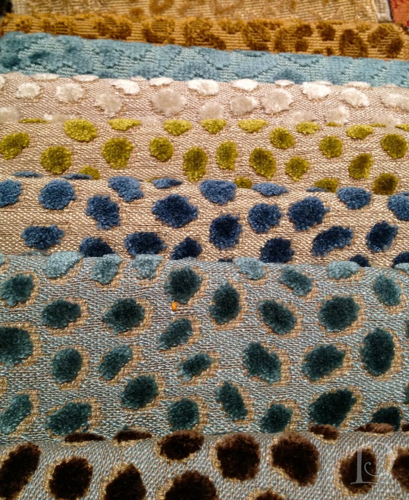 The next stop on our tour really captivated me. Here we got a peek at custom fabric design. The designer starts with original artwork, in this case a pencil drawing. Using a sophisticated scanning process to digitize the artwork, the design is then tweaked and reproduced on either cotton, linen or a leather-like fabric.
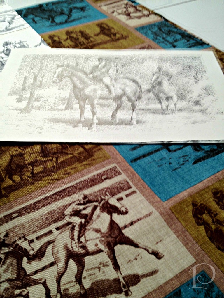
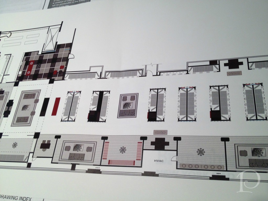
The designer extraordinaire has created this “racing” fabric from these original sketches, isn’t it amazing? He was so proud to share his story, can’t you see it in his smile?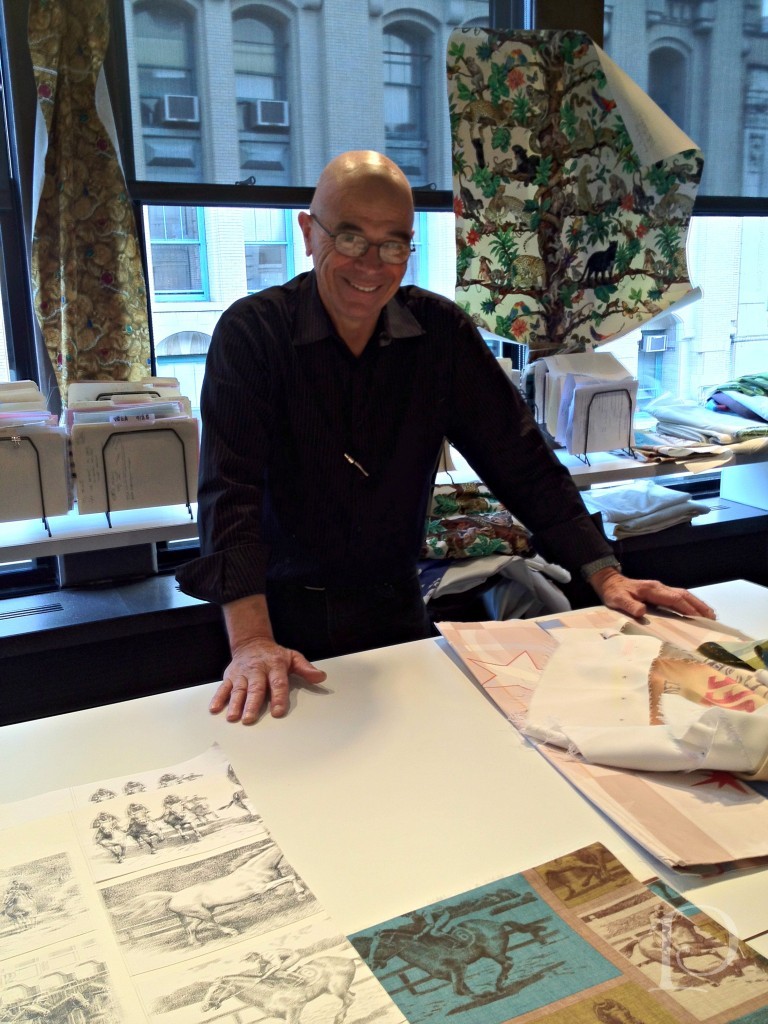 In the Brunschwig & Fils area we saw architectural plans for a brand new showroom.
Here is a Studio wall filled with colorful Brunschwig &Fils fabrics.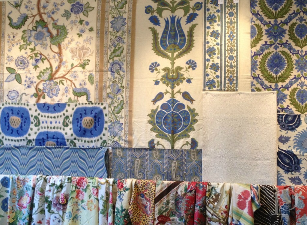
Can you believe that once upon a time, this wood block was used to print this Lee Jofa fabric? So interesting to get a glimpse into history.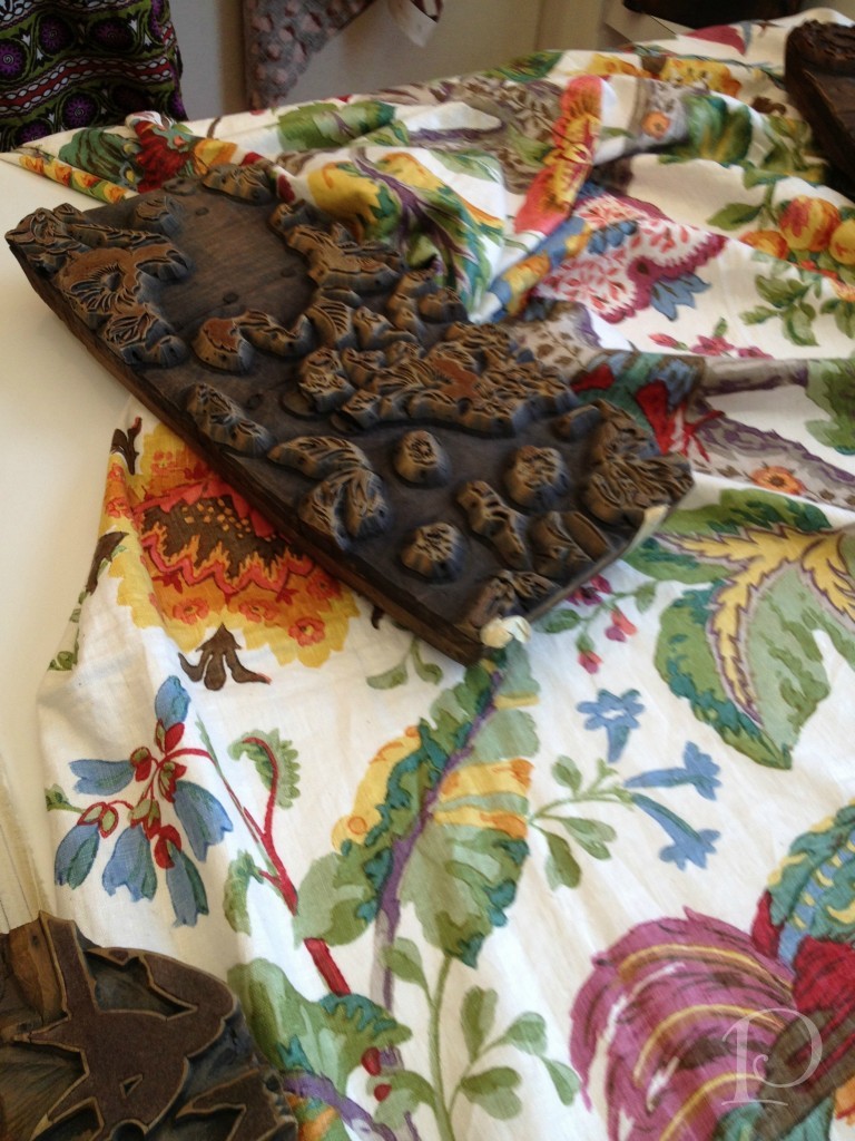
I felt right at home in this section of the studio. This small corner is where an artist paints designs for some of the fabrics. I would love to have this job for a week…or maybe even two??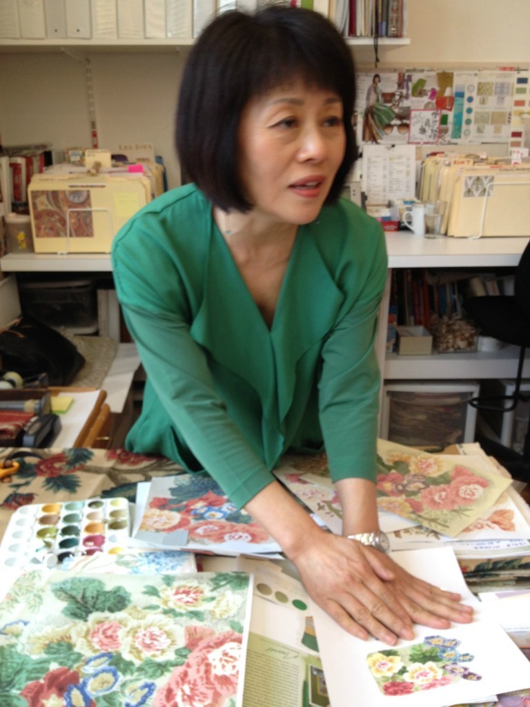
Her desk is quite petite but somehow she makes it all work, such a delightful jumble!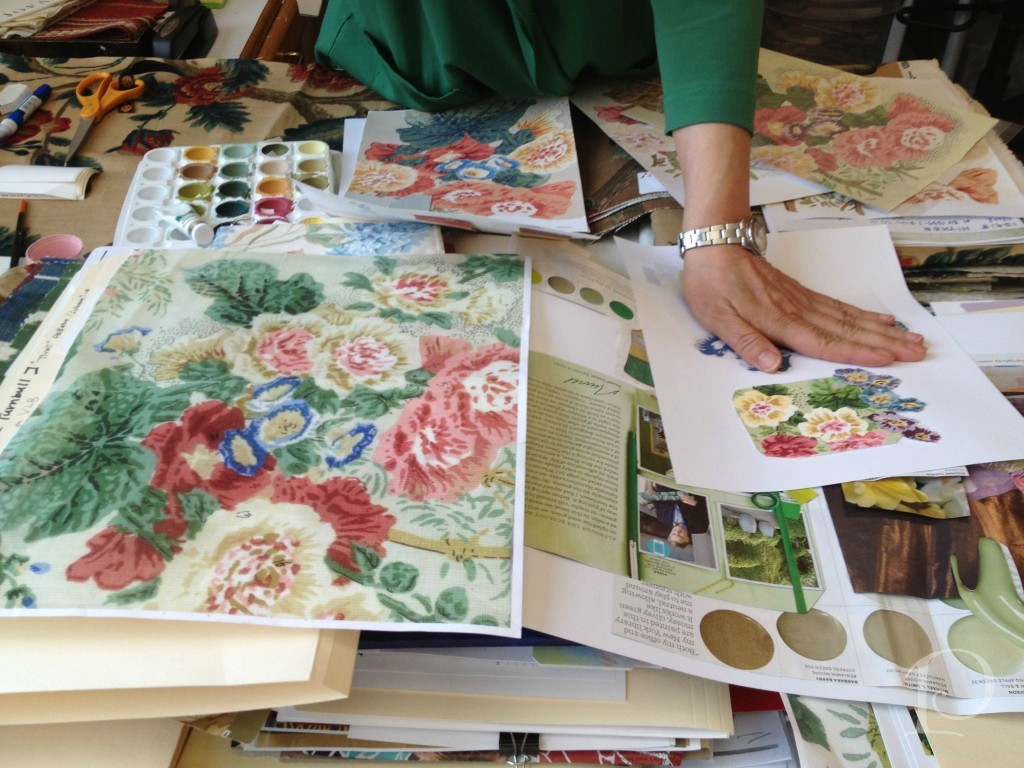
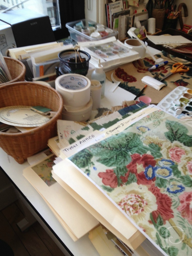
Her creative corner…
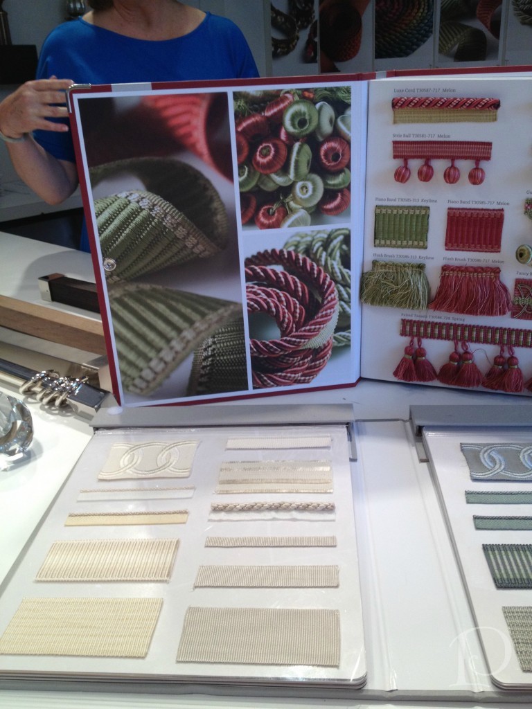
Finally, no fabric line would be complete without fabric trim. Luxurious trim is a favorite accessory of mine when creating pillows and other accessories. Take a peek at this sumptuous trim book:
As you can see, the two floors of the Kravet Studio are jam packed with talent and creativity. Having been treated to this incredible tour, I will certainly appreciate the beauty in every fabric and textile I touch more than ever. Above all, I will think of all the people I met who take such pride in their creation. Thank you!
xo,
Pamela
Contact me about Pamela Copeman Design Group services.
To follow me on Pinterest, click here.
To follow Pamela Copeman Design Group on Facebook, click here.
To follow me on Twitter, click here
One Stop Shopping for Inspiration: The Boston Design Center
Apr 24 2012 ·0The Boston Design Center is one of my favorite places on earth! It is just chock full of eye candy and inspiration. During my visit last week I decided to snap some photos with my new iPhone (love it) and take you on a virtual tour of some of the beautifully arranged windows and interior vignettes. I hope you too are inspired by these creative showrooms!
As I walk down the first floor hallway the first showroom to greet me is JANUS et Cie. I have always loved their signature golden topiary~especially as it is here: installed well above the round table. Do take note of the green hedge wall, another distinctive JANUS et Cie trademark.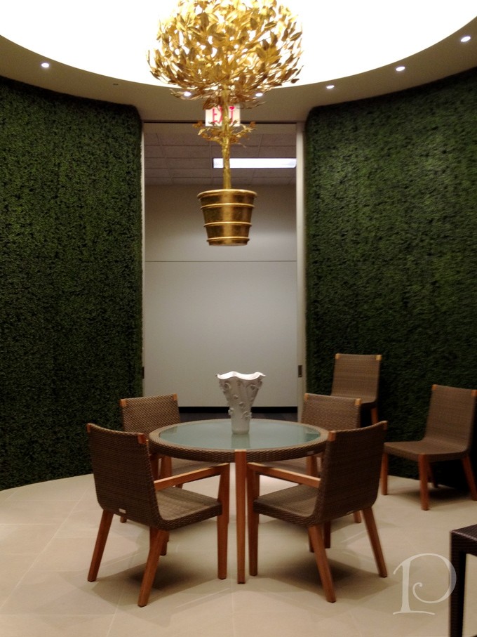
Isn’t this umbrella covered white sectional oh-so inviting? 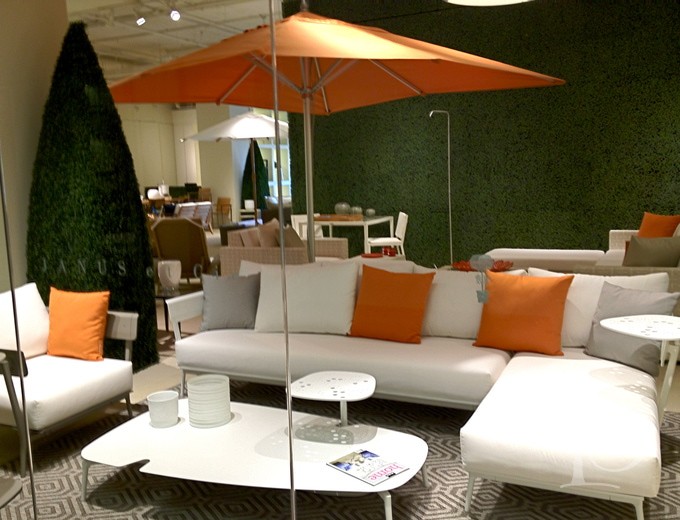 Just think of the guests you could seat here and the conversations you could share…
Further on, I spied these cross leg tables from the Lee Jofa showroom. These are favorites of mine and can be used alone or in multiples~ tres chic.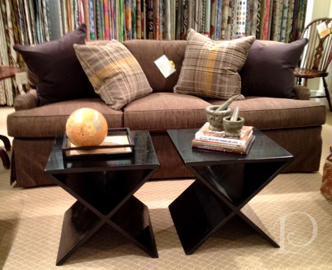
At FDO (For Designers Only) they offer a treasure trove of accent pieces perfect for completing a design. The only danger here? With so many possibilities, don’t forget to edit.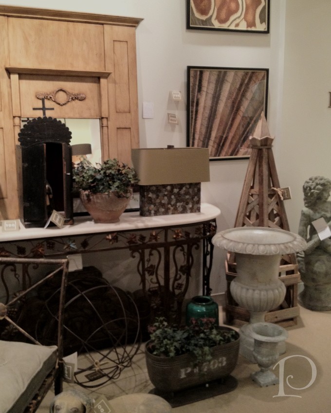
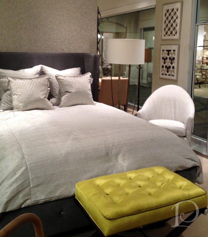
Grange Furniture offers the most unusual tables. Cup of tea ma’am?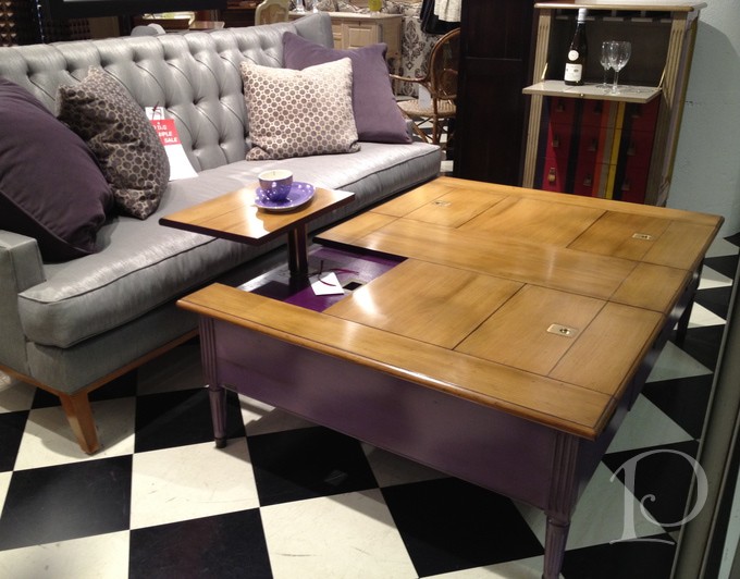 Kravet Fabrics wins my awards for Most Cutting Edge and Most Frequently Updated Showroom Designs thanks to Bill Elinoff and his design team. I love the layered nuances of this tranquil bed setting. At first blush it appears to be a tailored glam look, but upon closer inspection you also discover the mica wall covering, custom silk duvet and chartreuse velvet bench that add that extra pizzazz. Oh, how sexy!
Of course Kravet’s Main Street Window is perfect as always ~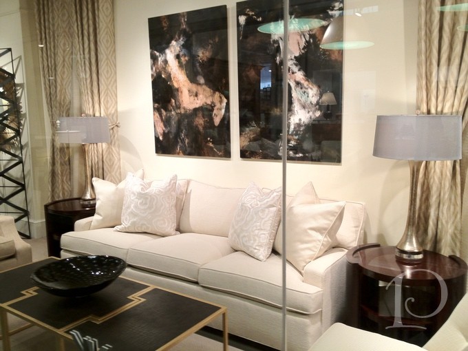
A peek into Charles Spada is truly a treat for the senses. This showroom is full of unique antique pieces that tell a story and lend a patina of history and romance to any design.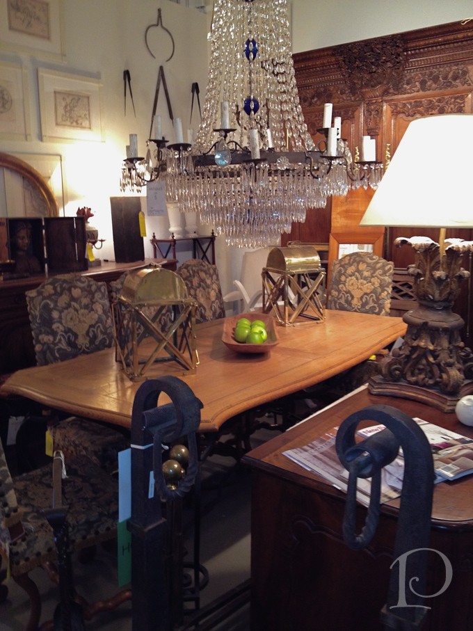
The new window at Webster & Company is perfect for Spring with a dazzling new wallpaper mural in pale pink… what do you think?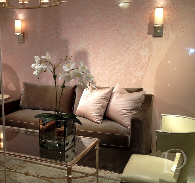
The Boston Design Center is known for its extensive selection of fine fabrics and each showroom displays them in very interesting ways~
Don’t you love the way Lee Jofa has showcased the new Kelly Wearstler line?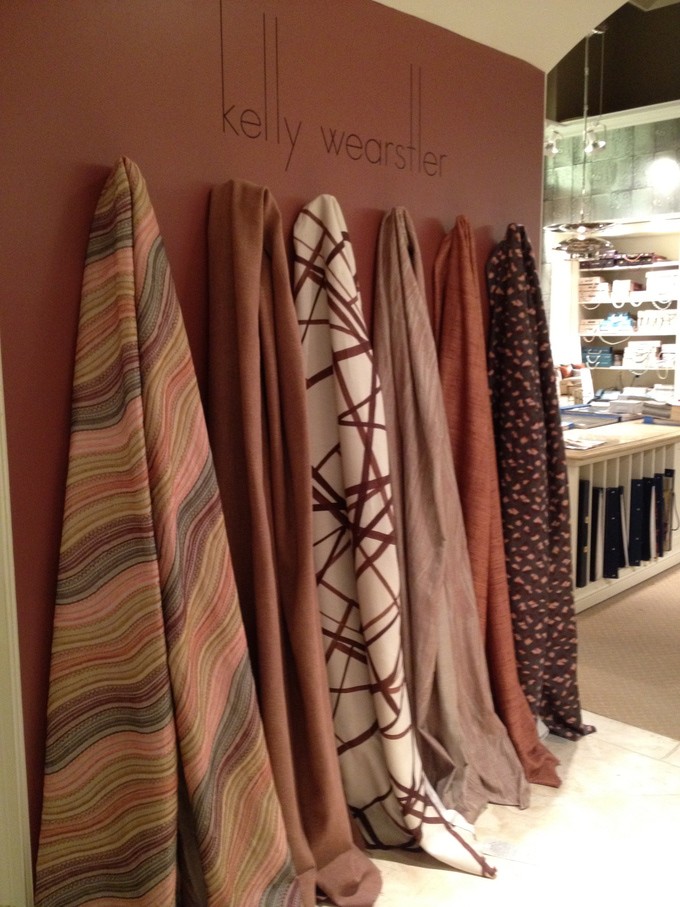
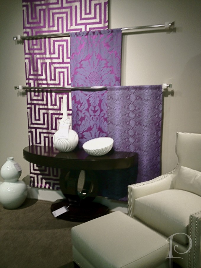
Duralee has chosen to cascade their fabrics down a wall. I love how this method highlights the bright colors and vibrant patterns on the fabrics. 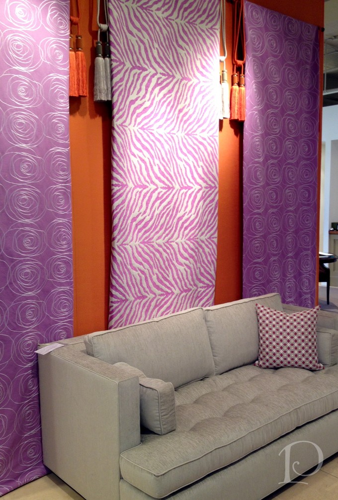
Beacon Hill has a very contemporary way to showcase their beautiful materials.
I am so lucky to walk the halls of the Boston Design Center and hand pick the best elements for my client’s projects. If you would like to see these and other displays at the BDC contact me for a custom tour and inspiration galore!
xo,
Pamela
Contact me about Pamela Copeman Design Group services.
To follow me on Pinterest, click here.
To follow Pamela Copeman Design Group on Facebook, click here.

Stylin' at Rolf Benz
Apr 03 2012 ·0In a recent Pamela’s Posh Picks blog post, I introduced you to the versatile German-made furniture line by Rolf Benz. Available now at the Boston Design Center, the ROLF BENZ Studio showroom also features offerings from TEAM 7 and Draenert. When I last visited the showroom and my dear friend and showroom manager Gary Riegel, the team was still getting settled in their new space. Last week however, I had the pleasure of helping Gary style his new showroom for its official opening soiree.
Styling, not to be confused with “blitzing” (another design term, I’ll talk about at a later date), is one of my favorite parts of my job as a designer. When you style a space you enhance all of the hard work invested in the project to date. Successful styling really makes a space shine.
Come take a peek at some of the styling we did at the Rolf Benz showroom…
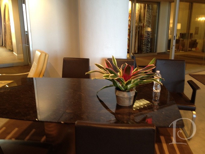
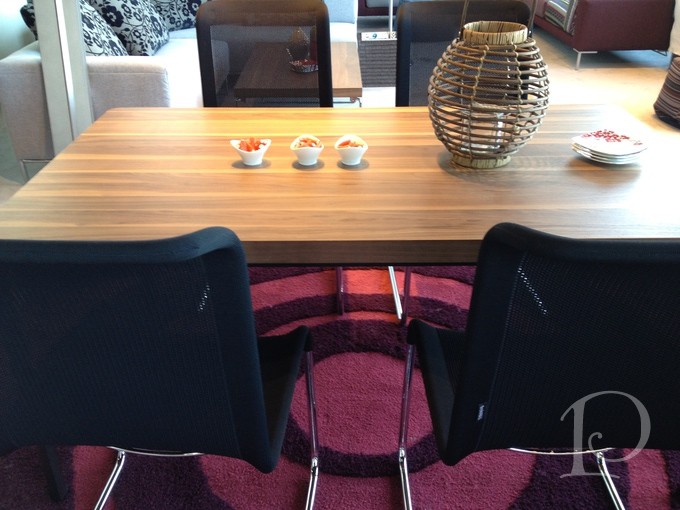
Before styling, this table is a bit stark:
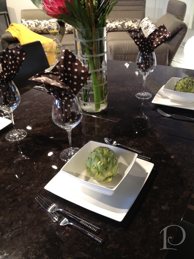
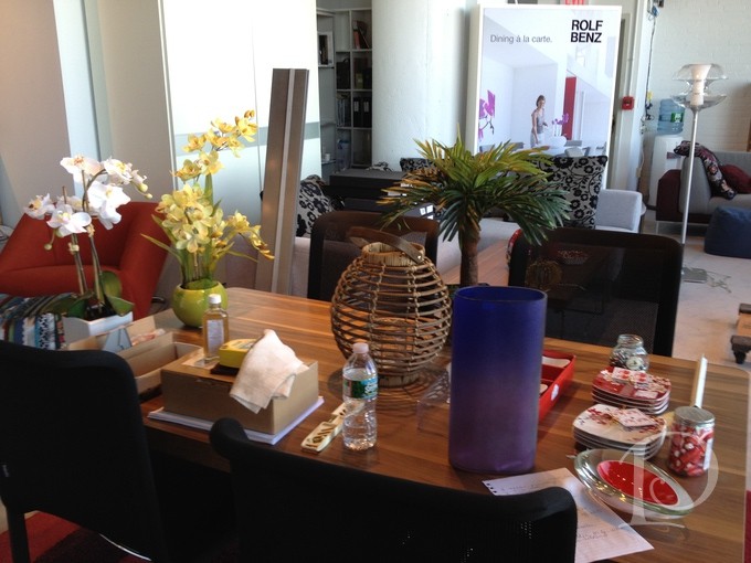
And after styling, looks much more inviting, doesn’t it?
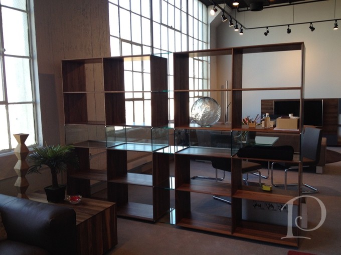
This Team 7 Free standing wall unit with glass partitions is so unique. I just love the versatility.
The storage and display options are endless. The glass pieces we chose to highlight in this piece look amazing–even more so in person with the light streaming through!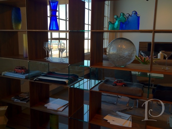
These 3 graceful vases mimic the curves of this sofa.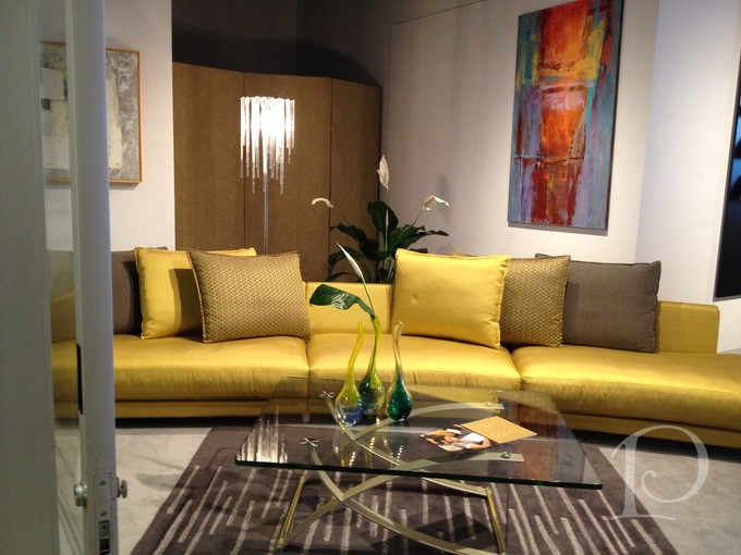
I love the simplicity of this coffee table display. Sometimes less is more…
Especially when there are lots of options:
No worries, we edited things down beautifully…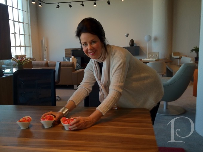
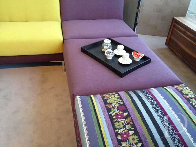
The Freistal line from Rolf Benz is more casual yet still modern. The mix of fabrics reminds me of an Anthropologie-esque vibe. Definitely fun to style!
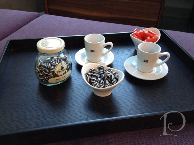
Why yes, I coordinated the candies to the furniture! Doesn’t everyone? 😉
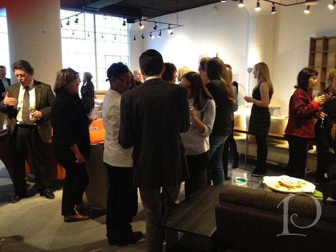
All of this styling and primping was in anticipation of the Opening Night festivities. Here’s a glimpse into the showroom before the guests arrive… 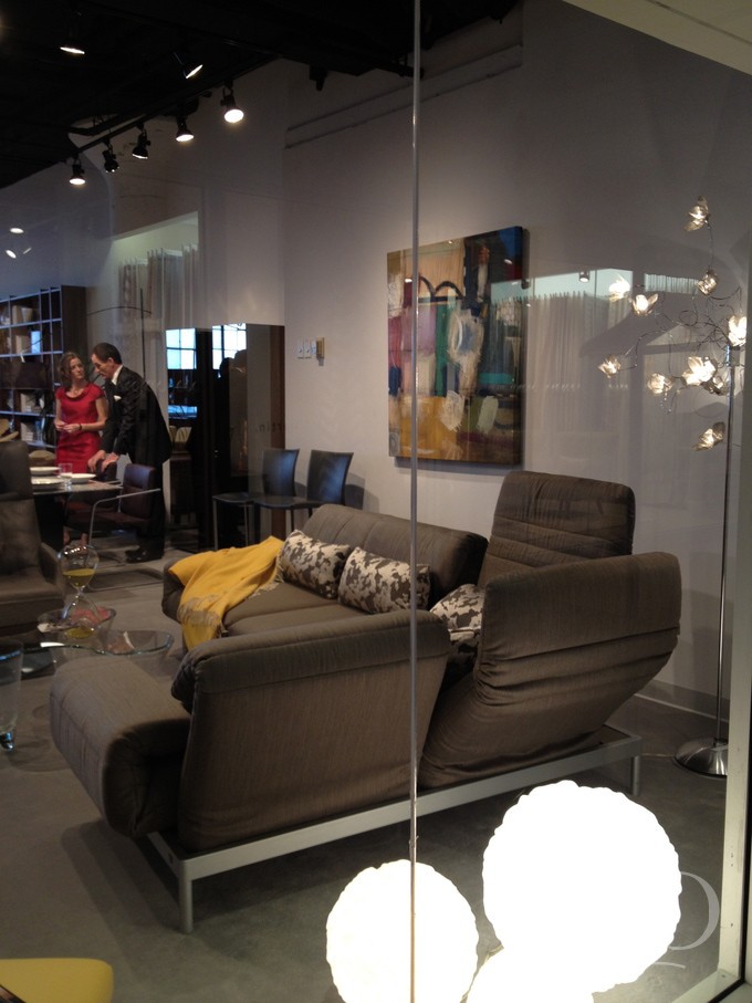 Gary and Desa Facey discussing last minute details
With the arrival of the Jazz Band, the party was in full swing: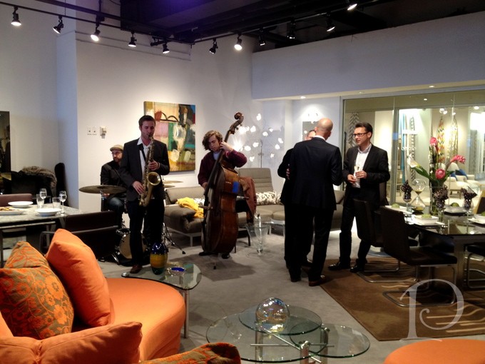
The German guests (and I thought I traveled the farthest from the South Shore!): Stefanie Geiger of Rolf Benz, Robert Schmid of Draenert and Oliver Bayeri, Team 7
My dear Gary Riegel and moi ~ Congratulations on a successful opening!
It was a week to remember and I can’t wait to present these stunning lines to my clients!
Please keep me in mind the next time you want someone to STYLE your home for a new fresh look, it can make all the difference…
xo,
Pamela
Contact me about Pamela Copeman Design Group services.
To follow me on Pinterest, click here.
To follow Pamela Copeman Design Group on Facebook, click here.
The Votes Are In…
Mar 12 2012 ·0A while back I shared with you my process for selecting a frame to highlight the star piece of artwork for my foyer, a lively and colorful beach scene by my friend, artist Sandy Welch. With the help of Kate from South Street Gallery, we picked out a beautiful, contemporary frame. The question then became to filet or not to filet? That’s where you my dear readers and friends came in. Your votes and comments encouraged me to go for it and to add the filet to the frame! Without further ado, here is the result:
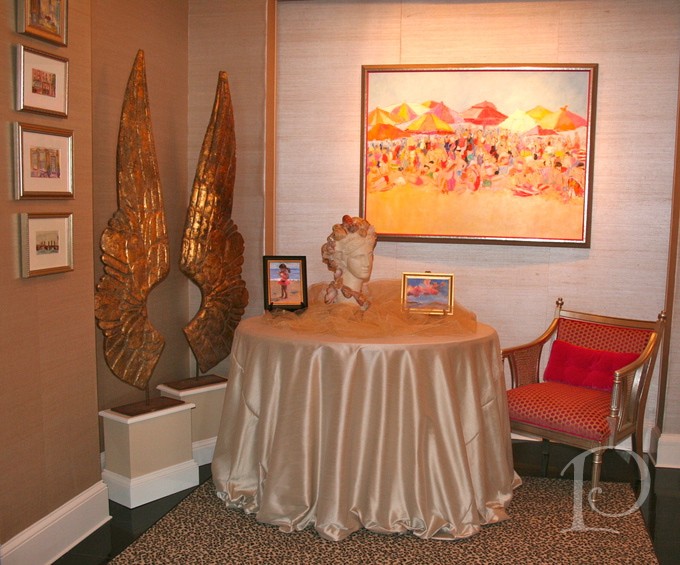
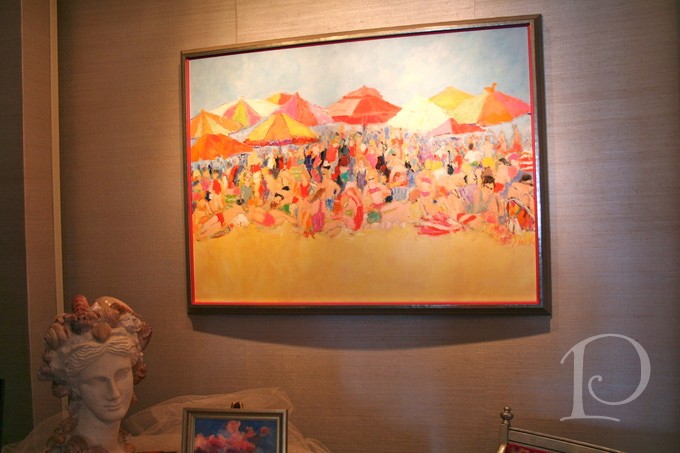
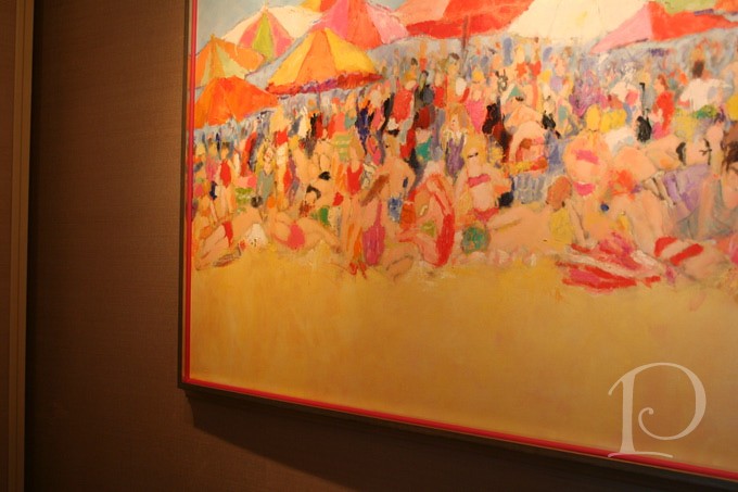
The champagne finish frame adds polish and the poppy colored filet adds “punch”.
Adding the filet was definitely a risk but I am thrilled I took it! I think it gave this large frame the pizazz it needed to balance the color of the painting and set the tone for my home on the ocean.
You may notice a few other updates to the space. 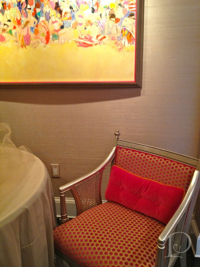 This newly upholstered french antique chair with the magenta dots against the silvered grey background lends a subtle compliment to the painting and frame.
 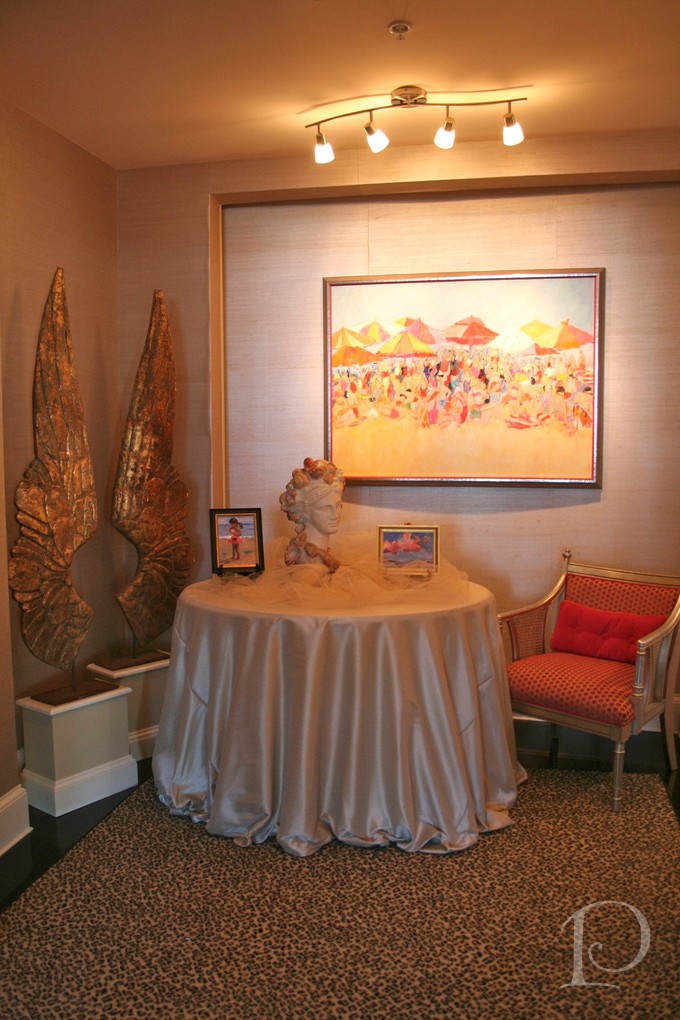 Coupled with the freshly dressed table and new lighting, I’m loving this welcoming entrance. Thank for participating in the first Posh Palettes vote ever!
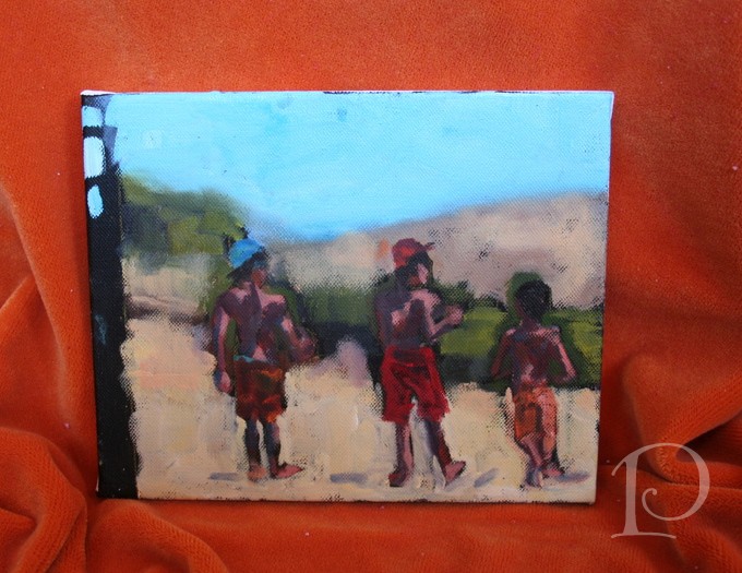
Speaking of painting, this past week I participated in a 2 day painting workshop with Kelley MacDonald at her studio in Warren RI. What a treat. Not only is she one of my favorite artists but she is an intuitive instructor and these 2 days with her were outstanding! During the workshop we practiced several techniques in oil painting.
We worked on value studies (ugh, not my favorite although very necessary). 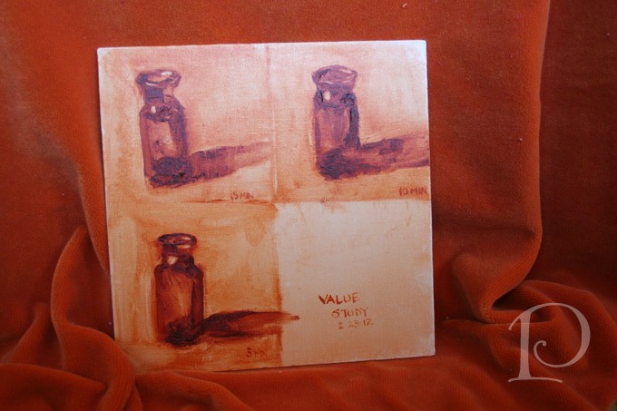 We had 5, 10 and then 15 minutes to complete our work.

Kelley also had us do timed paintings with other still life subjects.
We had 10 minutes to paint 3 lemon sections– wait, REEEALLY??
Finally we did a graph painting of 3 forms in 30 minutes.
 I was amazed at the paintings I produced and even more amazed at what I learned. Thank you Kelley for an incredible 2 days of inspiration and art!
“Art enables us to find ourselves and lose ourselves at the same time.”
~Thomas Menton
xo,
Pamela
Contact me about Pamela Copeman Design Group services.
To follow me on Pinterest, click here.
To follow Pamela Copeman Design Group on Facebook, click here.
A Golden Transformation
Mar 04 2012 ·0When I was growing up, the story of Cinderella was one of my favorite fairy tales. It never failed to enchant me when the Fairy Godmother appeared and magically transformed Cinderella’s tattered rags into a beautiful ball gown complete with glass slippers. I may not be a Fairy Godmother but I am an interior designer and I love transforming pale and boring spaces into jazzy, eye-catching jewels!
Today I want to share with you one of my more dramatic transformations. The project was a condo on Tremont Street in Boston and the space was a petite Foyer and Entrance Hall.
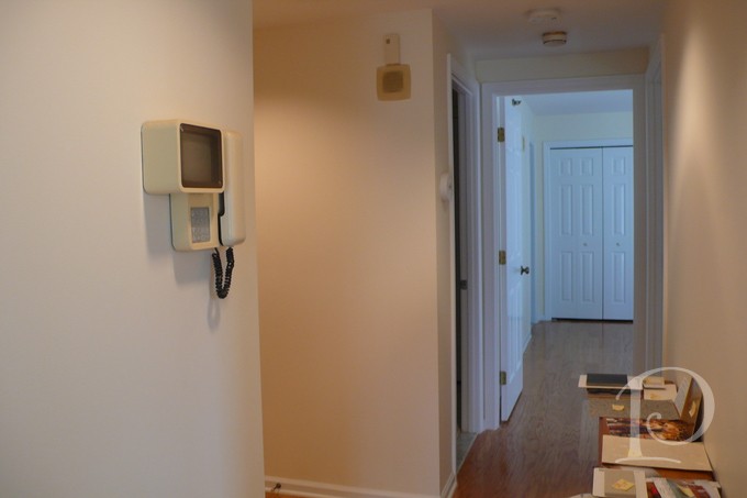
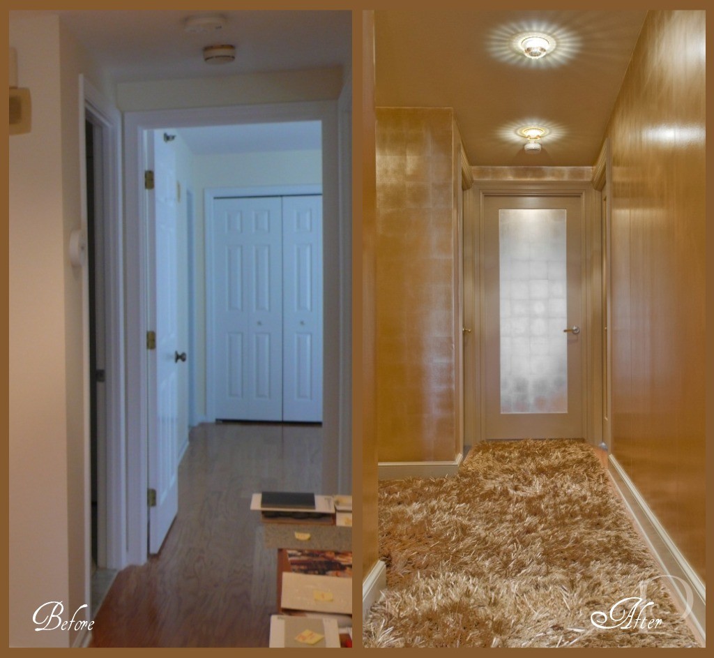
This before photo shows the Hallway that leads to the Master Bedroom. The space is boring, vanilla and dare I say, plain Jane.
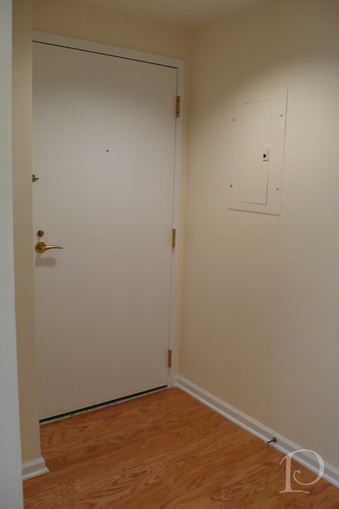
This is the interior shot of the Front Door. So boring, simply no personality at all.
I was determined, along with my client, to banish the boring and have her guests wowed as soon as they walked in the front door. Yes, this space was definitely in need of a touch of interior design “magic”. So I conjured up a dash of sparkle, a dose of glam, a whole lot of gold and… TA-DA:
Can you believe this is the same space?? From the incredible Swarovski crystal inserts on the recessed lights (from Chimera) to the stunning metallic wall covering (Maya Romanoff, purchased at Donghia) right down to the amazing custom gold silken carpet (from Colony Rug) there’s no shortage of wow factor! I love how we carried the gold color palette through the entire Foyer using a variety of finishes. Instead of making visitors want to turn around and leave, now this beguiling space makes a statement that says: Do come in and prepare to be amazed!
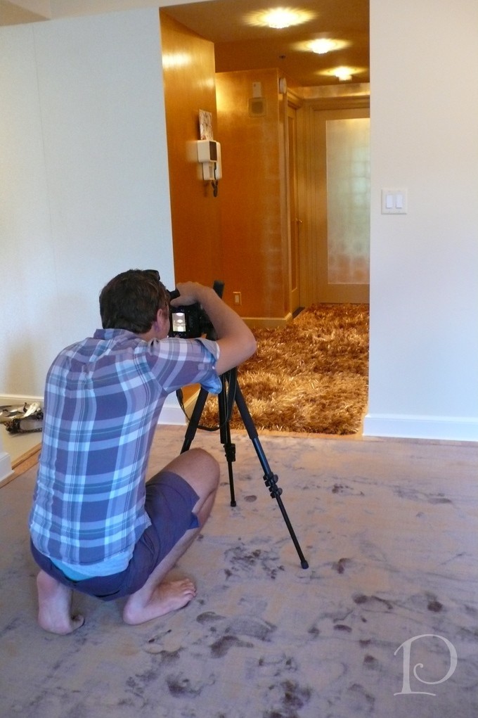
Here is the ‘after’ view of the hallway leading to the Master Bedroom. What a metamorphosis!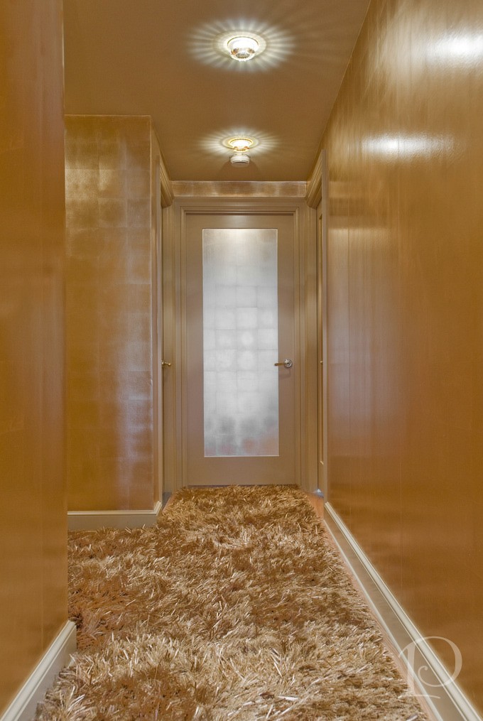 Of course all good interior designers have a fabulous team that helps them make the magic happen. Contractor John Horgan and Associates did a masterful job with the wallcovering and painting. The carpentry renovations (including sleek new doors) were done by the award winning S+H Construction. Randy Gross of Eric Levin Photography was a superstar during this shoot. He kept his good humor and smile despite the 90 degree heat, working with me to get “the” perfect shot.
I can’t resist showing you one more look at the Golden transformation~
I love this project and I hope you do too. What a wonderful reminder that even a small space can have a big personality so…think BIG!
“Live life big”
~Connie Hilner
xo,
Pamela
Contact me about Pamela Copeman Design Group services, including magical transformations!
To follow me on Pinterest, click here.
To follow Pamela Copeman Design Group on Facebook, click here.
It's a Frame Up!
Jan 24 2012 ·0“You have it in you to give that extra little bit. You know that you could add that finishing touch. You know you can take that extra step.”
~Marilyn Moats Kennedy
By now you know the importance I place on original art in an interior space. From its transformative properties to the pure joy and beauty that art brings to a room and the viewer, a wonderful painting (or any piece of art, really) can be the centerpiece of an entire room.
Equally important though not equally discussed, is the value of a custom frame for your prized artwork. That extra step, that finishing touch. That’s why today I’d like you to accompany me on a trip to my fabulous local frame shop, South Street Gallery in Hingham, MA. I’m going to take you through, step-by-step, my process as I select a frame for one of my most favorite pieces of art in my home.
First let me show you the painting we’ll be working with. It’s a colorful beach scene by renowned artist and my dear friend Sandy Welch. Don’t you just love this? I can feel the sun shine when I look at this painting!
The painting hangs in the Foyer of my home, setting the tone for my waterfront abode with its glorious color and seaside scene.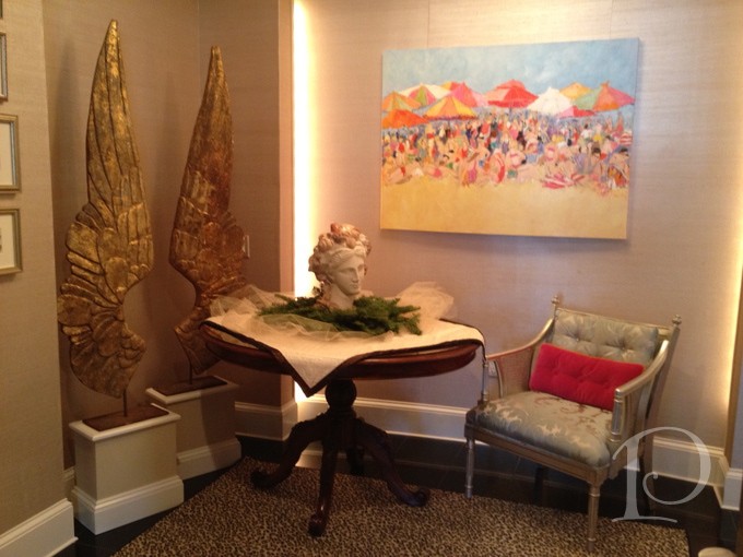
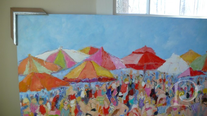
Notice that this painting was created on a deep, finished canvas. The artist continued the painting around the edges giving you the option of hanging it without a frame. 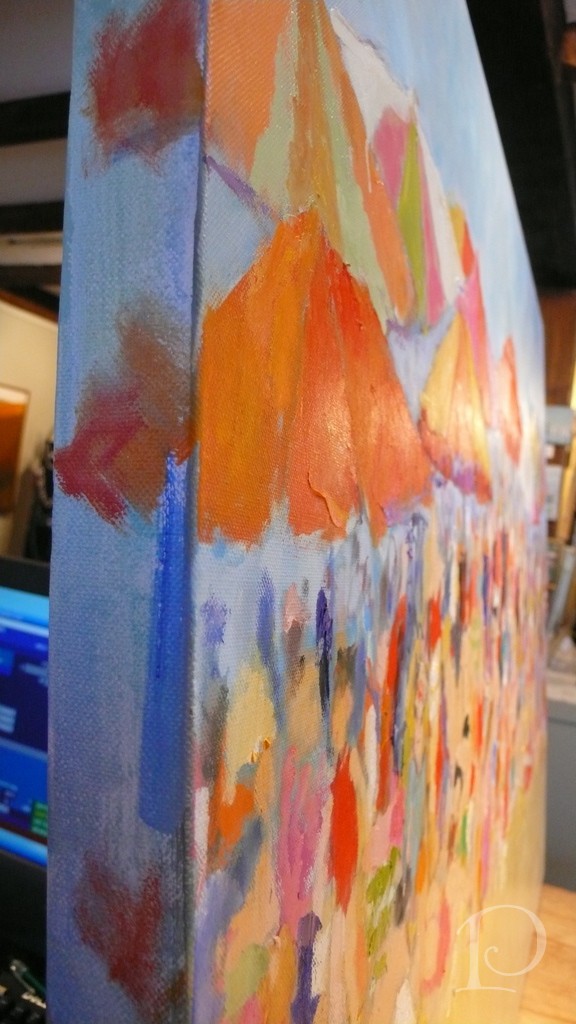 I prefer a more traditional and opulent approach however, so off we go to the frame shop!
The best frame shop to seek out is not only one with an outstanding selection but a proprietor who has an artist’s eye and can help you with your options.
Meet Kate, from South Street Gallery. My personal framing consultant (she could be yours, too!).
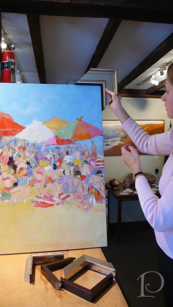
Here, Kate is holding up a frame with a “fillet”, a small piece of mulling which fits inside a larger frame for decorative purposes. 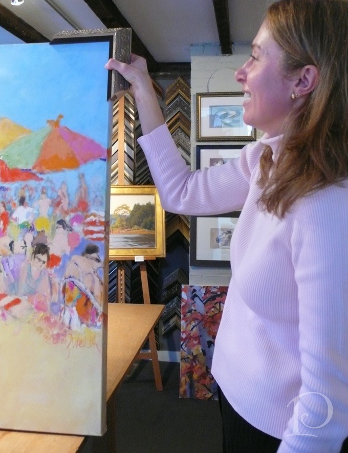
I like the fillet but I think this frame is far too ornate for this painting. While I liked the frame sample on the wall, the only way to discover how it will look with your artwork is to place it on all 4 corners and try to visualize it around the entire piece. The frame should complement the artwork, not compete with it. It is also important to keep in the mind the style of the piece and where it will be installed.
Let’s go back to the drawing board for more selections.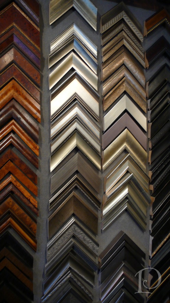
When selecting a frame, keep in mind that the depth of the canvas is critical.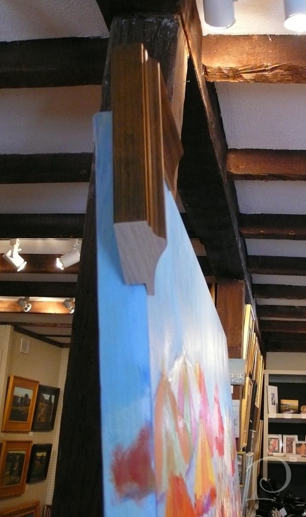
As you can see here, this frame leaves some of the painting exposed. While this would not be an issue if the painting is installed in a space where no view would be seen on either side, I’m going to select a deeper frame.
This is an option:
This is one of my favorite contemporary frames
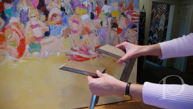 It doesn’t distract from the painting but adds a posh polish. Which finish is best next to the sand? Both work well with the blue sky~ hmmm…
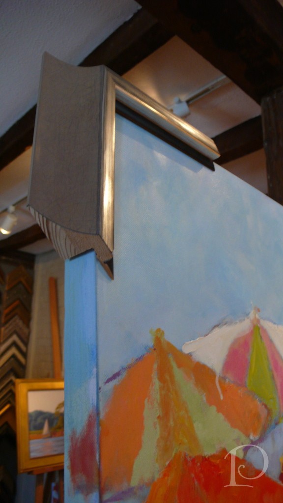 Should we add a dark brown fillet for contrast and a peek of drama? Or will this create a “coloring book” effect when surrounding the entire painting?
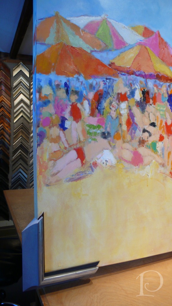
Wait a minute, what’s this? Fillets in color??
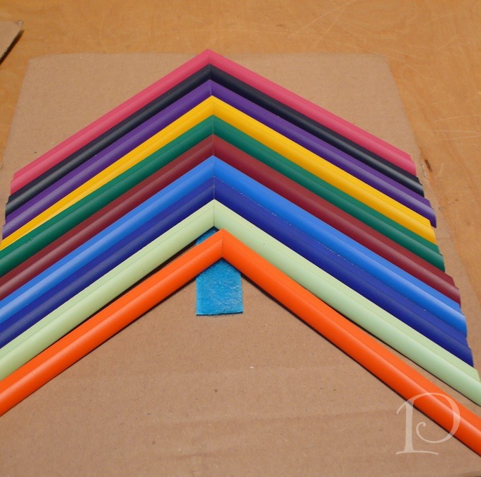 Kate have you been holding out on me?? What about the poppy colored one that would draw in the poppy wall from the Living Room? Oh, this could be just perfect!
What do you think?
It seems I’m at a crossroads. I love the painting with just the large frame but oh, the pop of color from the poppy fillet ~ I love that too! What’s a designer to do?
Here’s where you step in dear readers and friends.
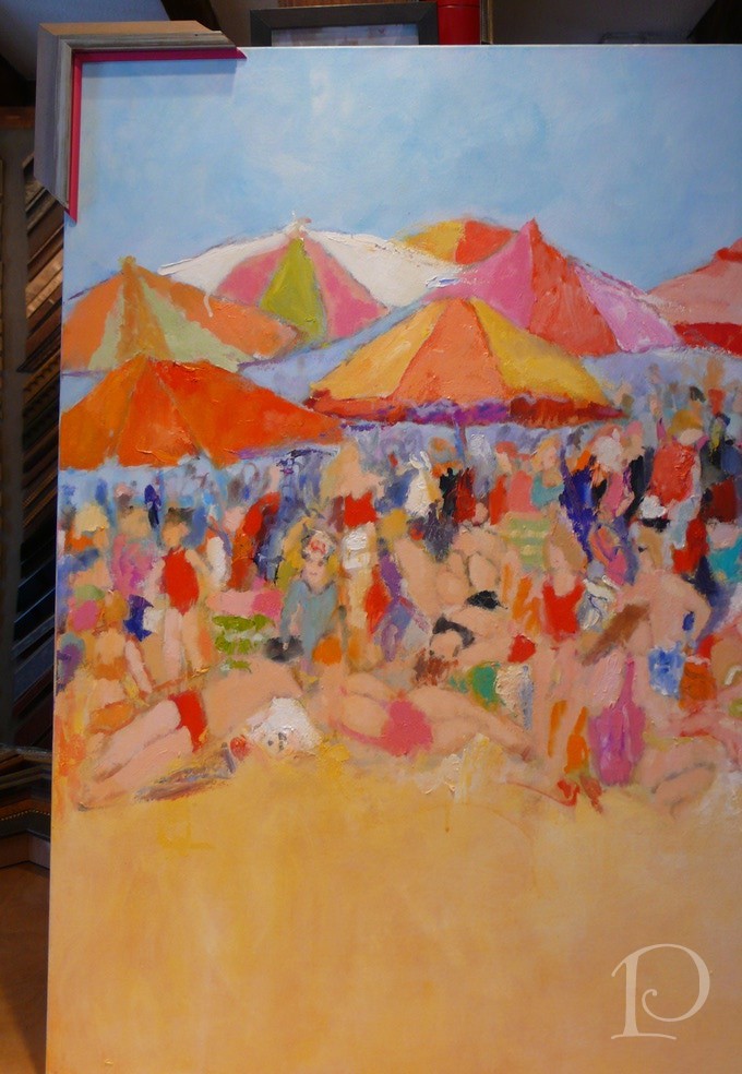
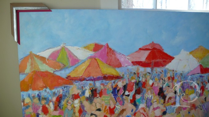
Should I frame it with the poppy fillet~
or the larger frame only?
(Note: photos taken in natural light)
Please vote this week in the comments section! I will post the winning result soon and then frame my beloved beach painting. Of course I’ll share the new space with you as soon as the framed painting is installed.
Thank you, kind and loyal readers, for participating in my first poll!
xo,
Pamela
Contact me about Pamela Copeman Design Group services.
To follow me on Pinterest, click here.
To follow Pamela Copeman Design Group on Facebook, click here.
It's All In The Details
Nov 14 2011 ·0“Details create the big picture.”
~Sanford I. Weill
When planning a new project, I always start with the “big picture”. Space planning and furniture pieces along with paint colors and fabrics create the outline of a space and give us a road map to guide us to a finished room. Of course the fun really begins when we select the all-important details: the jewelry of a space that adds sparkle, polish and personality.
Here are a few of my favorite details from past projects.
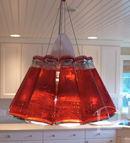
This light fixture adds quite a punch of red as well as a conversation piece over a kitchen island , can you tell it is made of bottles of Campari sparkling soda from Italy?
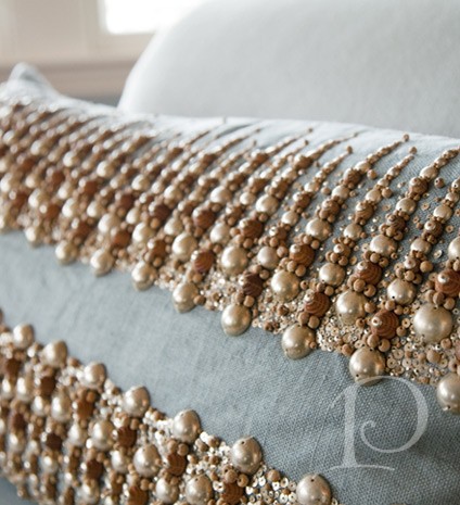 This hand beaded sequined beaded pillow adds pizzazz to any sofa or chair, don’t you agree?
 The design of a backsplash is a true highlight of the kitchen counter area because it is a vertical plane. Make it command attention with sparkling tile combinations as I’ve done here.
 Crystal jewels on a chandelier catch the light during the day and night and create beautiful patterns and intricate shadows on the walls and ceiling.
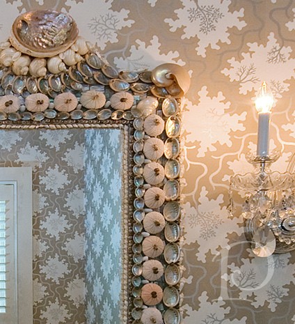 Mirrors come in all shapes and sizes, be sure the reflection is worth the view. This shell encrusted showstopper is right at home in a seaside abode.
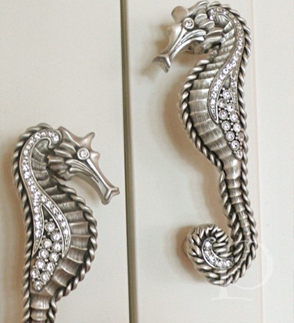
 Every time you grasp a handle to open a cabinet be sure it fits your hand comfortably–and is a bit of eye candy too!
Selecting unique details to finish a room is one of my favorite parts of designing a space. I love seeing a vision come beautifully together, filled with memorable, personalized details!
xo,
Pamela
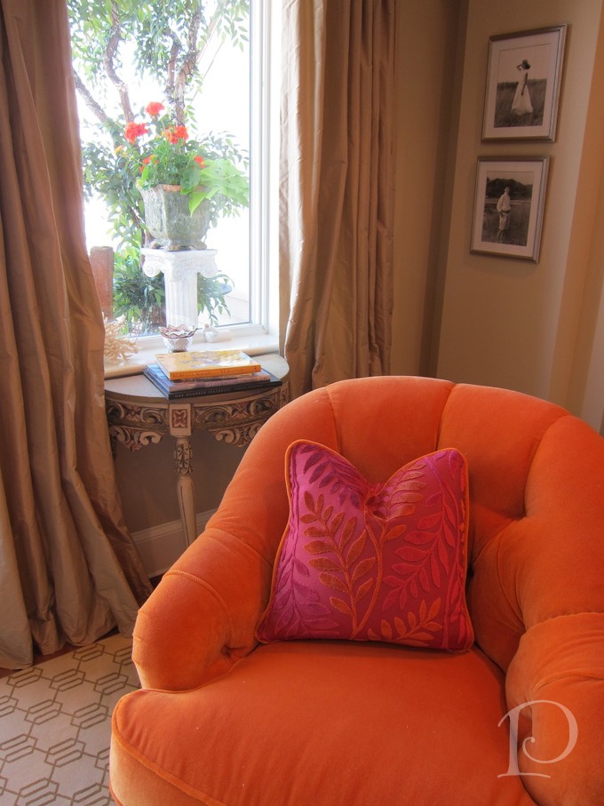
Posh Palettes Presentation Panel: Fiery Sunset
Jul 03 2011 ·0“The whole world, as we experience it visually, comes to us through the mystic realm of color.”
~Hans Hoffman
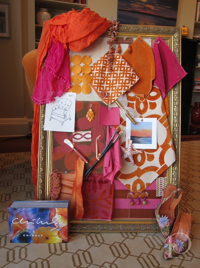
Today I’d like to introduce the Posh Palettes Presentation Panel. Every design project that I undertake begins with an inspiration board. After an initial meeting with the client, I set about pulling together fabric, wallpaper, trims and other objects that will set the mood for the space. Just as importantly, my goal is for the Presentation Panel to evoke an emotional response from the client. Each board is reflective not only of my vision for the design of the space, but of the personality of the people who will be living in that space.
I put together this Presentation Panel for the living room of a waterside condo. The orange and poppy colors are pulled directly from nature and the stunning sunsets that are visible from several rooms in the home. The woman who lives here is an artist, loves travel and the beach and has a flair for glamour. As a designer, it is my job to integrate all of these elements into the space and it begins with the inspiration board.
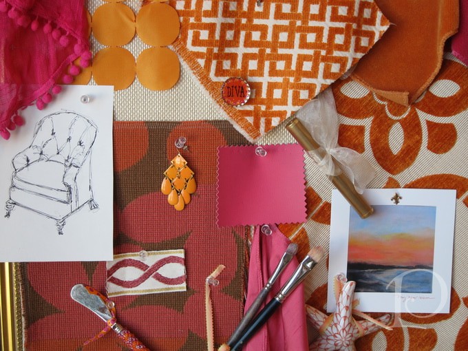
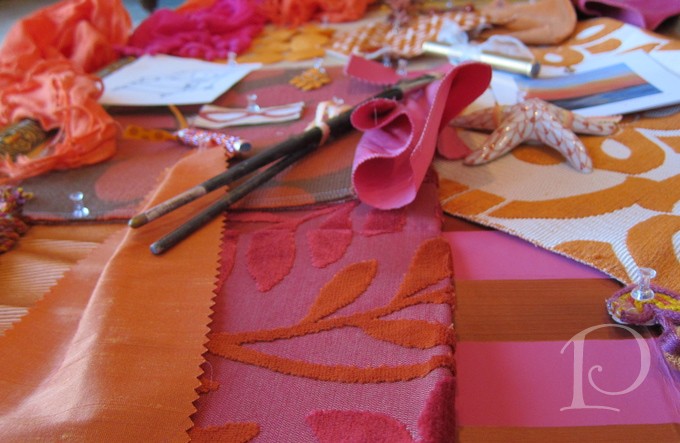
While all elements on a board won't make it into the final design, they contribute to the mood of the space
The vibrant sunset colors are luxurious but not fluorescent. The fabrics are tactile and lush despite being used in a contemporary design.
In the before shot of the living room, you can see that the space lacks definition. 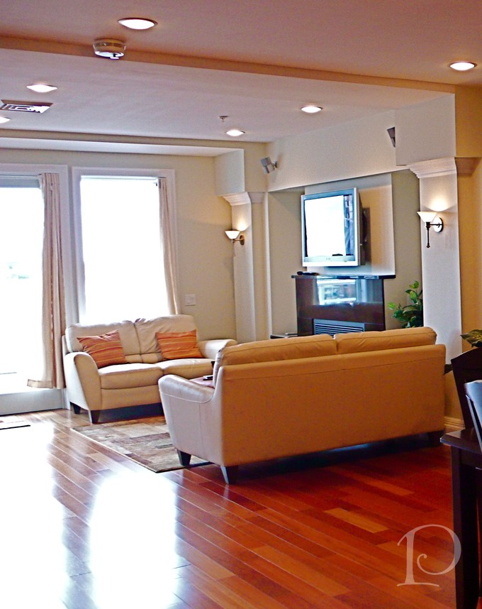
To address this problem, we created two partial walls that serve to define the room while still leaving it open to the rest of the space.
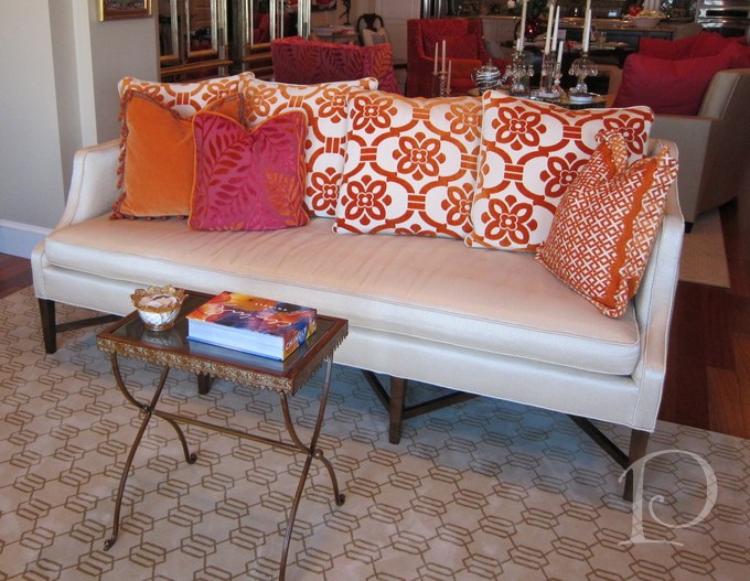
The orange and poppy colors are juicy, vibrant colors, that provide punch in the space. These “pop” colors are set against a neutral, sand colored background. The net result is to ground the space visually with the sand colored sofa and carpet. This strategy also makes it far more practical should the homeowner wish to change the room in the future. Swapping out pillows and accent pieces? Easy, breezy. Re-upholstering a sofa? Much more involved–though I’d be more than happy to oblige!
Finally, in this shot we can see a glimpse of the outdoor space that is visible from the living room. The colors of the blooms outdoors have been carefully coordinated with the design inside the home. Carrying the orange and poppy scheme beyond the room and into the adjoining outdoor space creates a seamless and beautiful transition. A perfect illustration that even what’s outside your windows counts in interior design.
Hope you’ve enjoyed this peek at a Posh Palette Presentation Panel!
xo,
Pamela
Professional Interior Images
May 12 2011 ·0As an interior designer and an artist, much of my work involves telling a story. In interior design, storytelling connects people to spaces and objects, helping unite the overall vision for the project. One often overlooked aspect of many interior design projects is preserving the finished space in photographs. While I often take pictures myself of a space in progress, one of my most important partners is Eric Roth, my go-to photographer for completed projects. I wrote about Eric recently and gave you a behind the scenes glimpse at what goes into taking professional interior photographs. While I still can’t show pictures from that shoot, I do have another project to share.
Welcome to Otis Hill Road, a lovely early 20th century home overlooking a picturesque harbor on the South Shore. This is one of my favorite projects and I love how Eric captured the beauty and essence of the space. When I work with Eric it is always a cooperative effort, which is wonderful for a designer. Eric collaborates but does not dictate. He is easy to work with, listens to suggestions and ideas and has a wealth of experience and professionalism that he brings to each job.
Let’s take a peek at the space, shall we?
First, the foyer. At Eric’s suggestion, we moved the slipper chairs to a different angle at the table. With this small change, Eric was able to present the space to its best advantage in a memorable and striking photograph.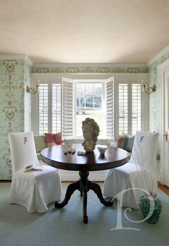 These next photographs show the living room which is open to the formal dining room. Eric shows a beautiful wide shot, highlighting the interior space, the ceiling and light fixture as well as the seaside sunset view.
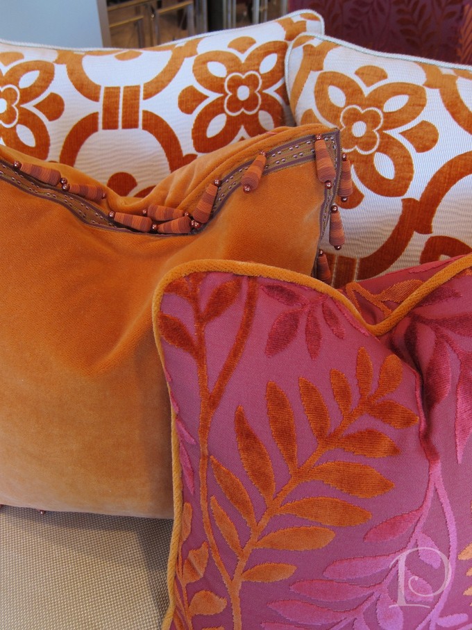
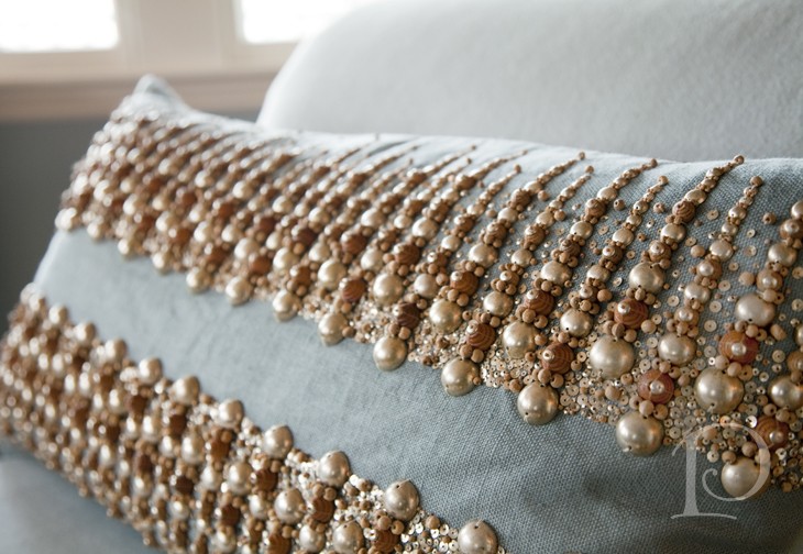
 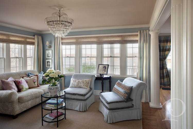 In addition, Eric takes care to feature the subtleties of the space as well. This shot of one of the custom pillows not only provides a nice contrast to the wide shot, but also highlights the luscious trim of the pillow. Trims are one of my signature details and this thoughtful inclusion serves to reinforce my design aesthetic.
In the dining room, the table is set for a birthday party. I love the details that we added: festive dishes, a petite cupcake painting and a simple pot of flowers with a pop of color. All of these elements serve to reinforce the story and continuity of the space.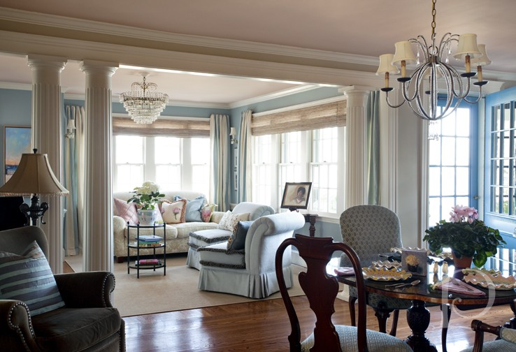 Moving into the kitchen, another story is being told.
 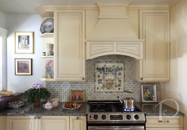 The stove is lit with the kettle set to boil and the coffee cake is cut. Rather than feeling contrived, the image invites the viewer in, just in time for breakfast while also highlighting the custom cabinets, tile work and granite countertops.
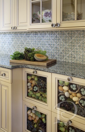
 Another kitchen photograph shows the decorative drawers dressed for Spring, complete with eggs and nests. On the counter, lettuce and cantaloupe waiting to be enjoyed.
What’s wonderful about working with Eric is his ability to compose a shot and work cooperatively to style a photo. The details and props thus serve to enhance the story and the space, not distract from it. Eric’s interior photographs invite the viewer into the space with their composition, and then to linger over the details and the story.
As a designer, when I work with Eric Roth I feel secure in knowing that my projects and my hard work will be preserved in the most beautiful and professional manner. This allows me to not only build my portfolio and client base, but also to present projects for publication and industry recognition. Eric’s professionalism, warmth and sense of humor are a wonderful compliment to my skills and vision. At the end of a shoot with Eric and his team, no matter how long the day has been, we always leave knowing we have great photographs and just as importantly, smiles on our faces.
“You don’t take a photograph, you make it”
~Ansel Adams
xo,
Pamela

The Photo Shoot behind the Shoot
Apr 08 2011 ·0Last week I finished an interior design in Boston. One of the best parts of wrapping up a project is styling the space for professional photographs. For photographs of this project I joined forces with the brilliant Eric Roth.
The space itself is doll house size which made the shoot extremely challenging. I thought you might enjoy seeing some of what goes into getting the best images of an interior. Take a peek!
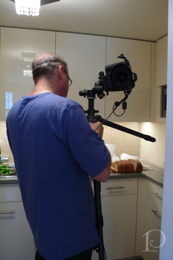
The pro at work~ Eric setting up his equipment
Can you see the red light inside the dryer? Anything for the perfect shot~
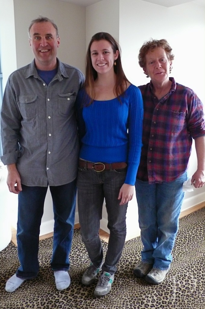
It took a great team for this photo shoot Eric, Kate and Eileen
Checking the cornered mirror reflection in a very teeny, tiny bathroom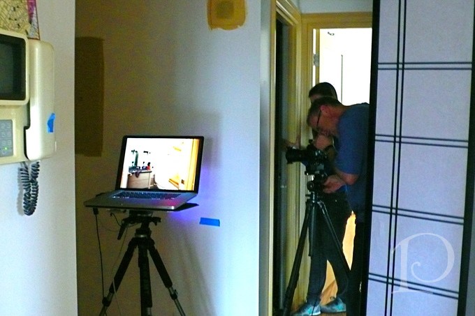
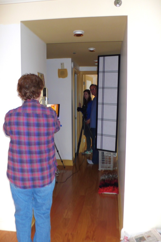
Interesting tripod placement, don’t you think?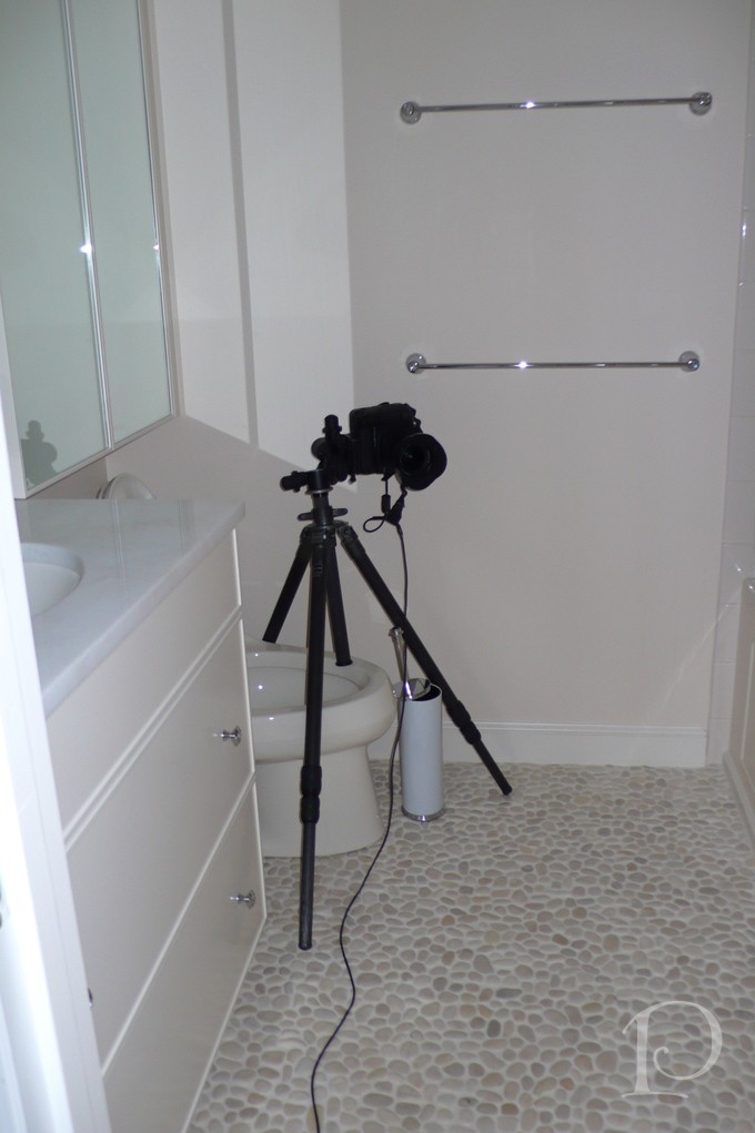
After a long shoot, the team is still smiling ~ Eric, Kate and Eileen, we had a great day
A happy designer and a happy photographer!
I am so happy with both the project and Eric’s photos and can’t wait to share them with you. I have my fingers crossed that the project will be published, I’ll be sure to keep you updated!
