Blogfest 2012: Designer Show House Trends
May 31 2012 · 0 comments · Design Events ·0
I’ve been back from New York City for a week now, but it seems I’m just beginning to process all of the amazing and inspiring things I experienced during Blogfest 2012. First off, I want to extend my sincere thanks to the entire Kravet team for a wonderful event. Beginning with the welcome from Cary Kravet at the opening night reception and throughout the jam-packed agenda of the following two days, this was a truly incredible gathering.
Today I wanted to share some of the trends I noted while touring not one, but two, designer show houses during Blogfest.
On Monday, Margaret Russell hosted the kickoff to Blogfest at the Kips Bay Boys and Girls Club Designer Show House. This year’s space featured two adjoining penthouse apartments on Manhattan’s West Side. Here, city chic and glamour ruled the day~right up my alley!
As I toured the rooms, the first trend that caught my eye (literally), was the abundance and variety of reflective and metallic surfaces.
This reflective table is a functional piece of contemporary art.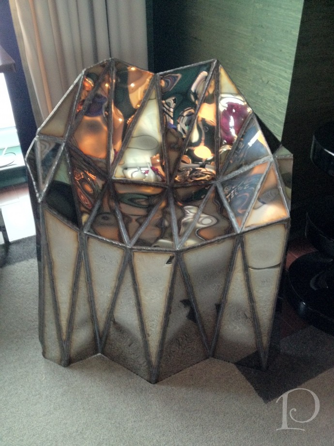
I love this shiny granite surface along with the trough-like sink and sleek faucet.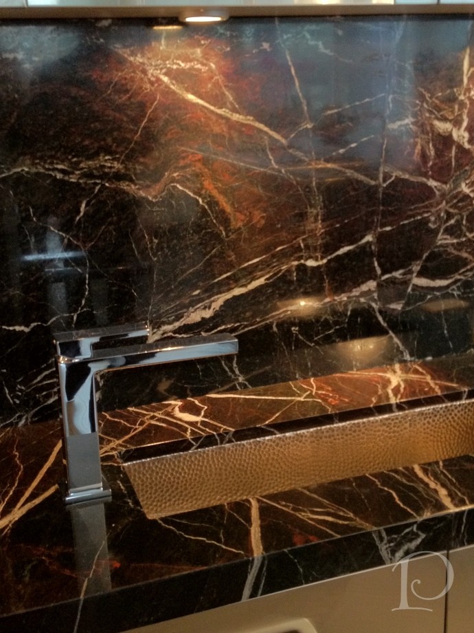
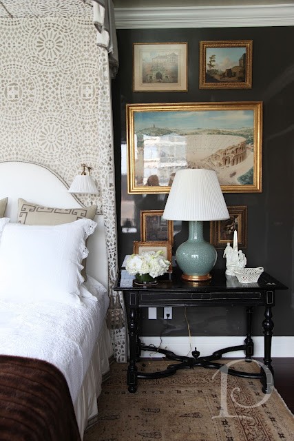
In the Alexa Hampton designed bedroom the walls were lacquered in Dragon’s Breath by Benjamin Moore.
The use of a reflective, hard surface on the wall, coupled with a silver ceiling, is an unexpected design choice in a bedroom, yet it turned out beautifully.
Even fabrics are part of the reflective trend! Here, metallic textiles cover a sofa and coordinating pillows. 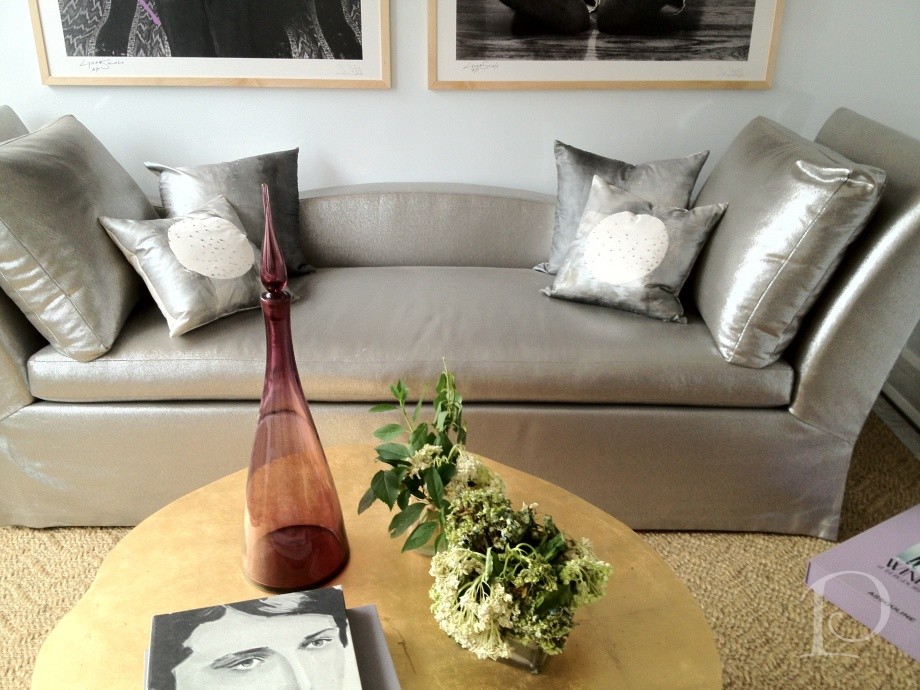
This intricate metallic wall art adds drama as light plays off its reflective surface.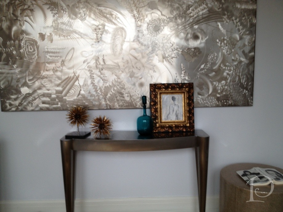
The other notable trend from the Kips Bay Show House was the creative use of digital imaging.
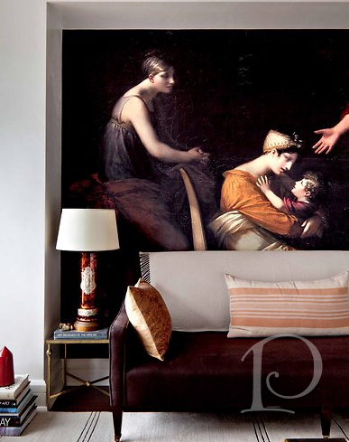
This digital image of a classic painting was blown up to mural size and fit perfectly into this niche. Surrounded by modern furnishings, it was striking and effective.
Across the room, this is an image the designer captured while in Europe. This touch is at once personal, unique and classic~a winning combination to be sure!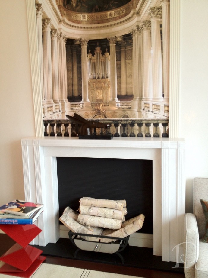
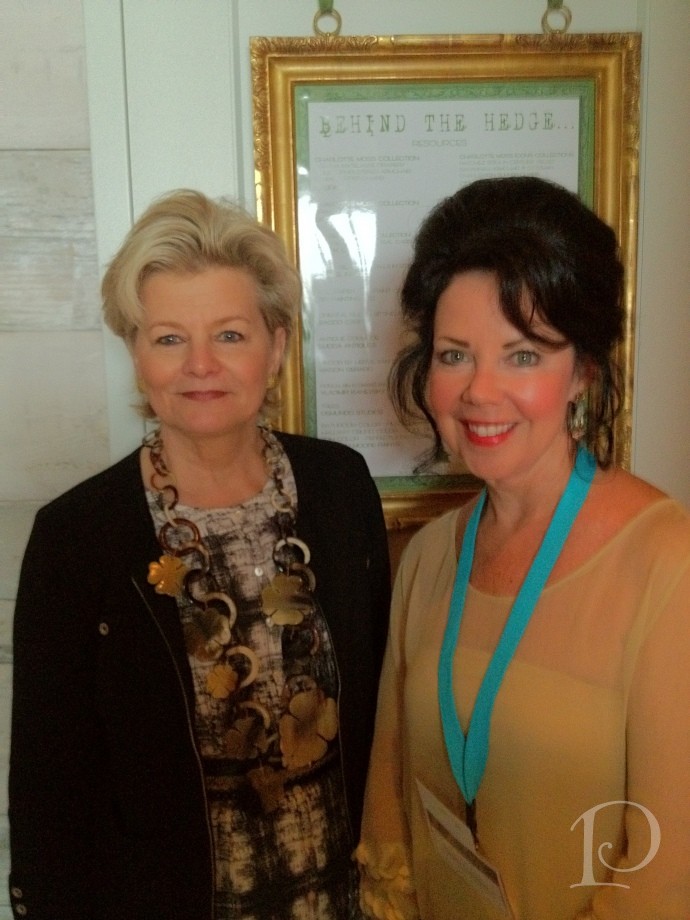
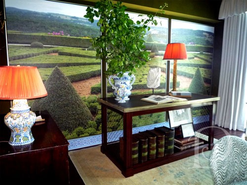
Charlotte Moss’ space was entitled Behind the Hedge and was filled with an abundance of creative ideas. My favorite detail in this space was once again the use of digital photography murals. Charlotte explained that this mural was made from photographs she had taken while traveling. Even the blue and white tile “baseboard” is digitally produced–amazing!
The trend spotting continued on Tuesday as we toured the Elle Decor Modern Concept House. While overall this space wasn’t as appealing to me as the Kips Bay house, I adored the terrace at the Modern Life house. Attention to detail and design and extending the living space of a home to the outdoor space is a trend I very much embrace.
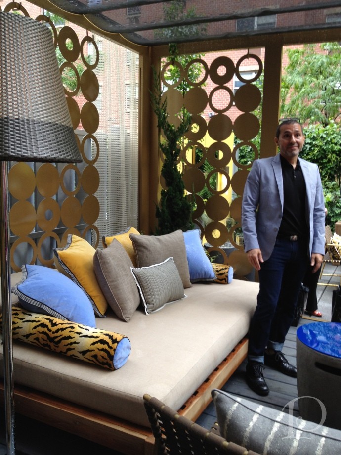
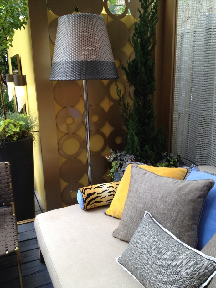
Despite persistent clouds and sprinkles, the terrace was sunny and bright~thanks in part to the dazzling metal circle screen panels. I love this idea and can think of a dozen ways to use it!
Designer Michael Tavano used screen material to drape over the sofa area to provide shelter and all of the fabrics are weather and sun resistant–including the animal print!
Another area of the compact terrace that is given depth by the use of the mirror. Using mirrors outside to reflect water views or to expand our spaces is something I’d love to see more of.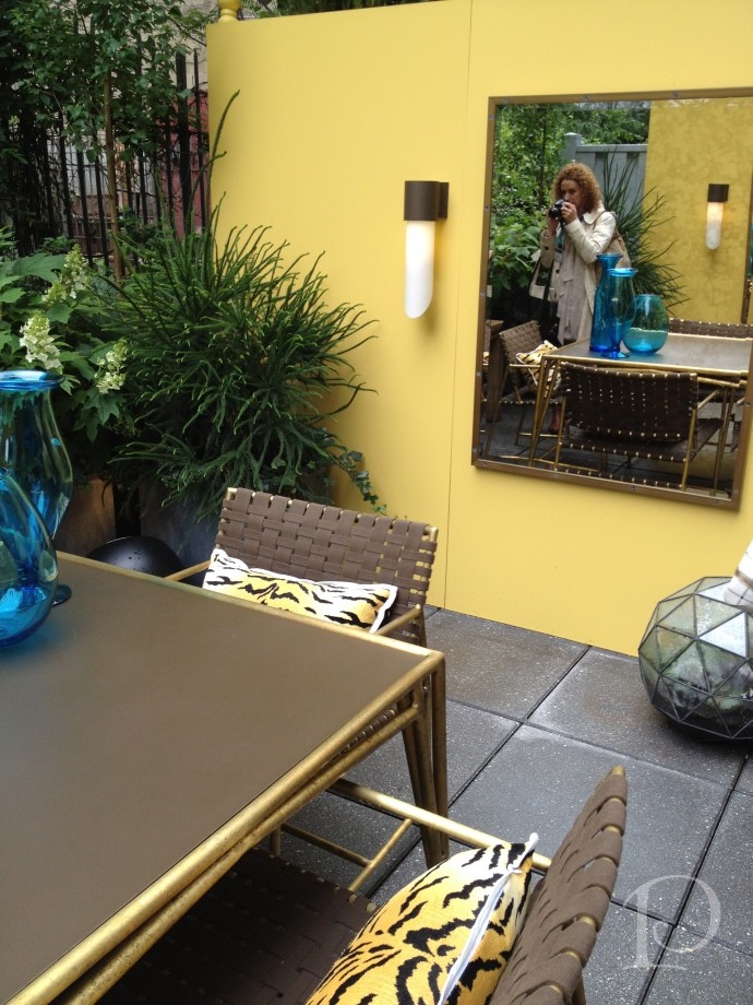
Overall I loved touring both of these fabulous show houses. I also love that the trends I highlighted are so versatile and easy to re-create. Incorporating reflective surfaces and metallics instantly provides contrast and brings a modern flair into a space. As for the digital photography murals–my mind is twirling with ideas! I can not wait to use this idea in my own home. I hope that you too can find an inspiring idea to use in your home or outdoor space.
Stay tuned for more inside scoop on my trip to Blogfest coming up soon!
xo,
Pamela
Contact me about Pamela Copeman Design Group services.
To follow me on Pinterest, click here.
To follow Pamela Copeman Design Group on Facebook, click here.
To follow me on Twitter, click here
0
