Taupe, Beige, & Black Guest Bath Transformation
Aug 05 2014 · 3 comments · My Designs ·1
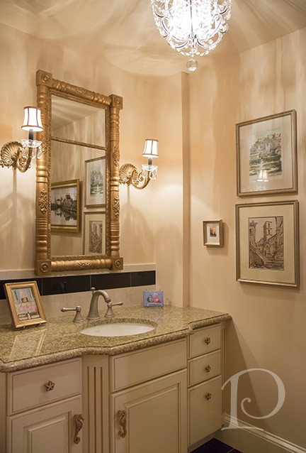
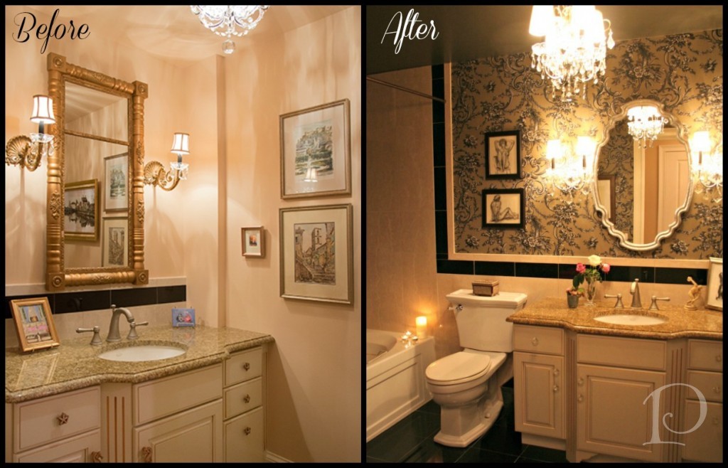
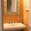
This is a “Before” shot of my Guest Bath:
As you can see, the design was fairly traditional. There was a loose Travel theme, as I had on display my collection of watercolors from all the European cities I had visited.
After 4 years in the space, I wanted something with more drama (of course!).
When quotes for changing the tile came in, I made the decision to work with what I had which meant a color palette of Taupe, Beige and Black ~ certainly not my usual colors.
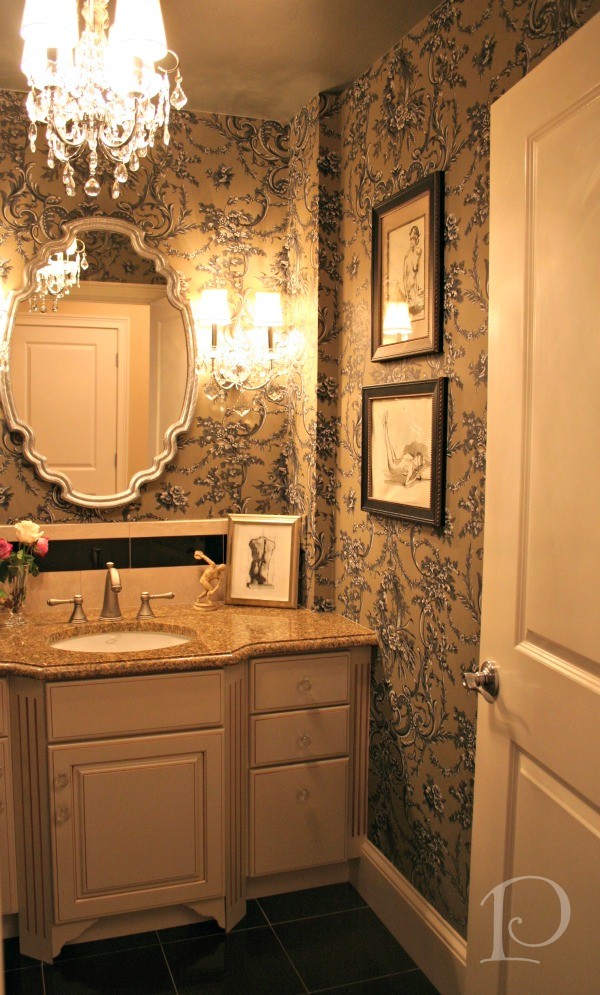
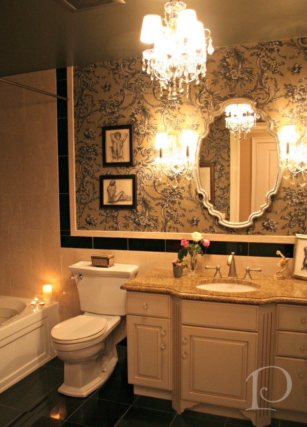
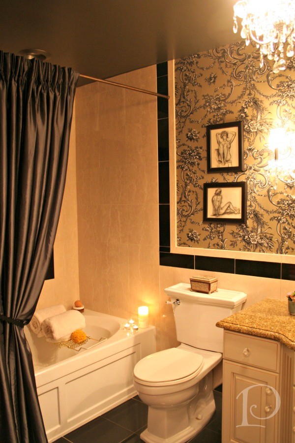
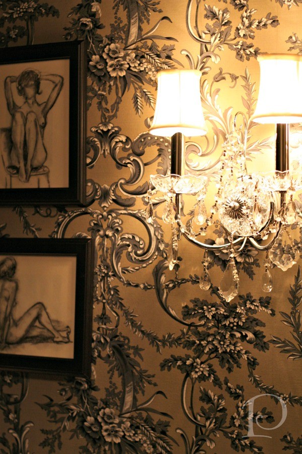
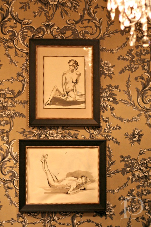
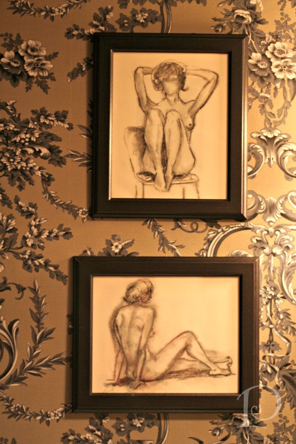
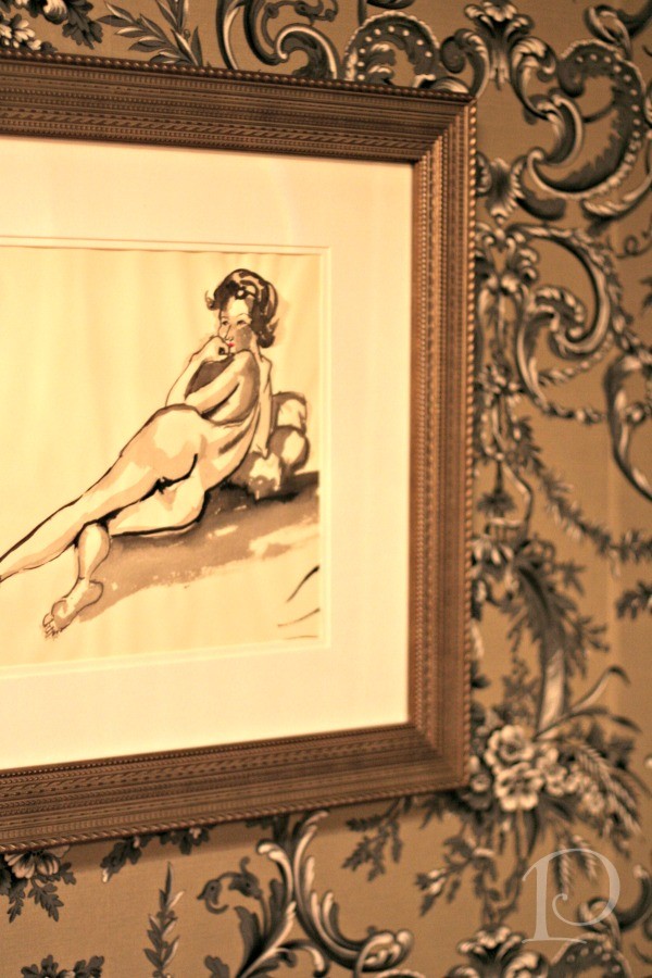
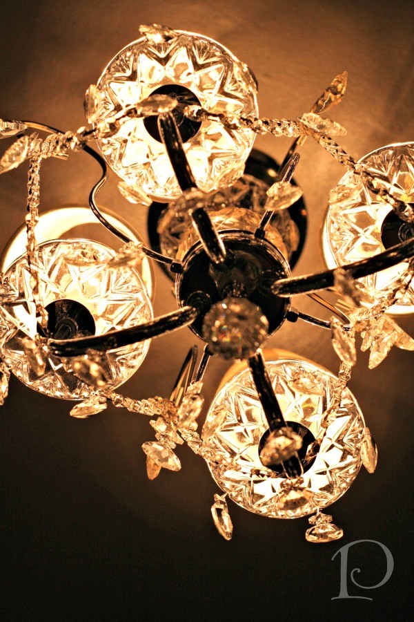
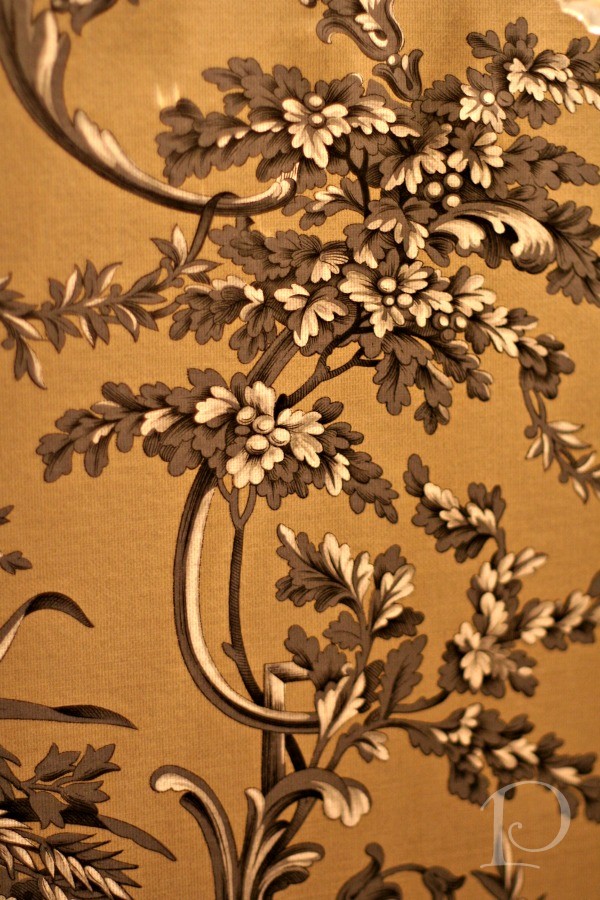
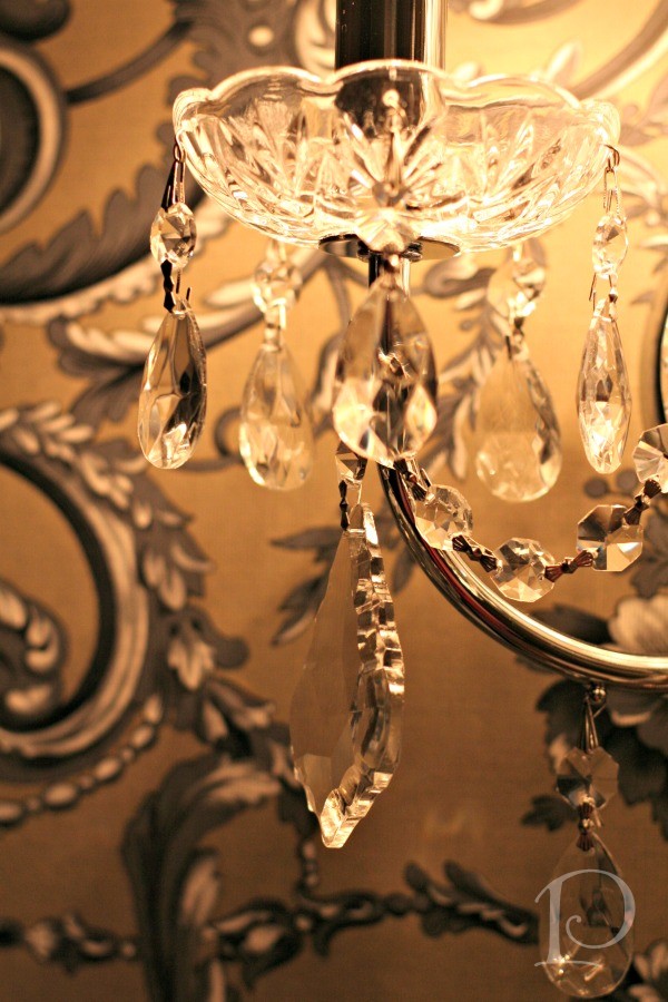
Once I made the decision to keep the existing tile, I determined that I would embrace the drama of the Black in the new design. I selected a classic French wall covering with charcoal and black and used this as the backdrop for some vintage nude studio sketches and watercolors I purchased last year in Maine. I added a few pops of pink~red for a subtle punch of color. With the addition of crystal sconces, a petite chandelier and silkesque drapes this small space has become quite dramatic and theatrical.
Let’s take a peek at the transformation in my Guest Bath…
A closer look…
Note the pink lips…
More details…
A quick reminder of the transformation:
Source notes: Ceiling paint is Benjamin Moore Liquid Mercury, PT-350 from the Studio Finish Collection. Wall covering is Manuel Canovas Design, La Verrerie, color: Noir. All photographs by Jen Bowles for Pamela Copeman Design, except as noted
It was a challenge to step out of my Design comfort zone ~ especially in my own home! I am loving the result though, and hope that my guests (and readers) will as well! I’d love to hear what you think!
xo,
Pamela
1






3 Comments
Zach
On:
pcopeman
· author
pcopeman
· author