Best of Posh Palettes: Cape Cod Seaside Home, Office, Foyer & Family Room
Apr 09 2014 · 2 comments · Behind the Design, My Designs ·1
This week while I’m in Italy for BlogTour Milan (#BlogTourMilan and@pamelacopeman on Twitter), I’m reposting some of my favorite and most popular posts from the past. I hope you enjoy!
Continuing on with our tour of this lovely seaside home, today’s first stop is the Office. Located off the main Foyer, the Office is tucked behind French doors and is just far enough removed from the rest of the house to offer a quiet space to attend to business responsibilities.
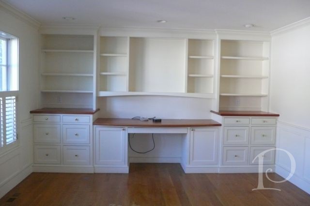
This is the bland space that I viewed the first time I toured the house, rather sterile and not very inviting…
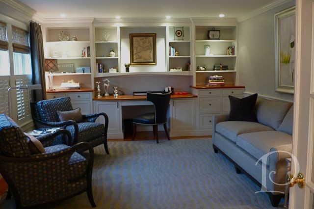
And here is the same view after we waved our magic wand!
I particularly fell in love with the carpet by Colony Rug, I love the pattern: a subtle look and feel of rippling waves that suggest low tide.
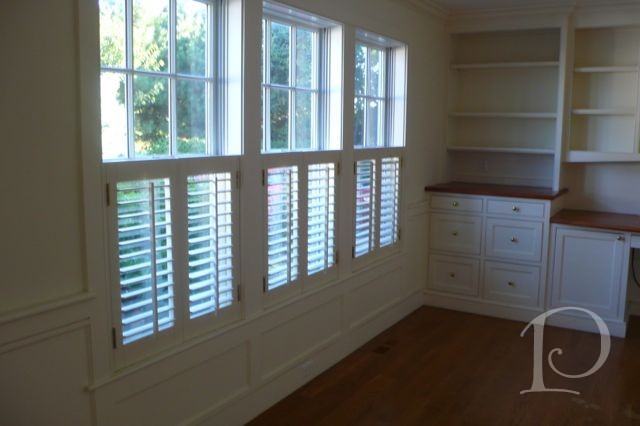
Before shot of the bank of windows at the front of the house:
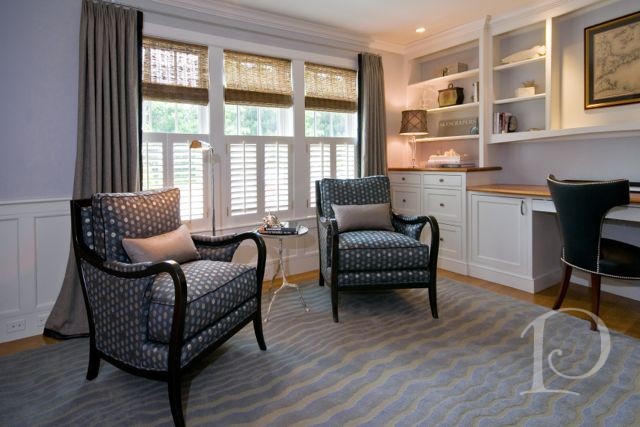
After, a comfortable spot for a contract negotiation or a cup of coffee while reading Barron’s on a Sunday morning.
Note the layered window treatment: plantation shutters for privacy, woven wood roman blinds for texture, and dead panel drapes for softness. All of the furnishings are in shades typical man’s suit~ charcoal of course ~ with texture and a hint of a metallic thread to make it posh.
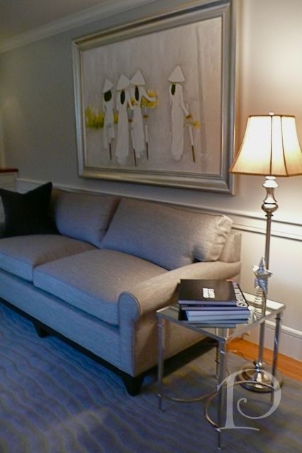
On the opposite wall we placed a pull-out sofa (just in case all of the guest bedrooms are filled) underneath a beautiful painting the owners acquired on a trip to Vietnam.
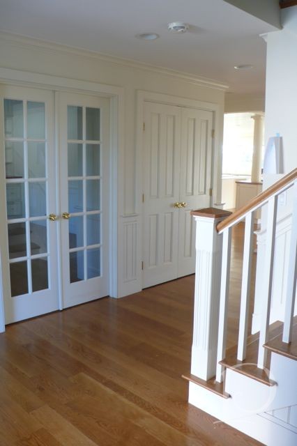
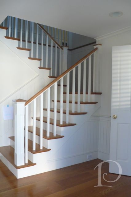
Outside the Office is the main Foyer. While this home is large and sprawling, on its own the Foyer is understated and lacked focus. The space was confusing with far too many doors and little design impact.
Do all these doors lead down a rabbit hole??
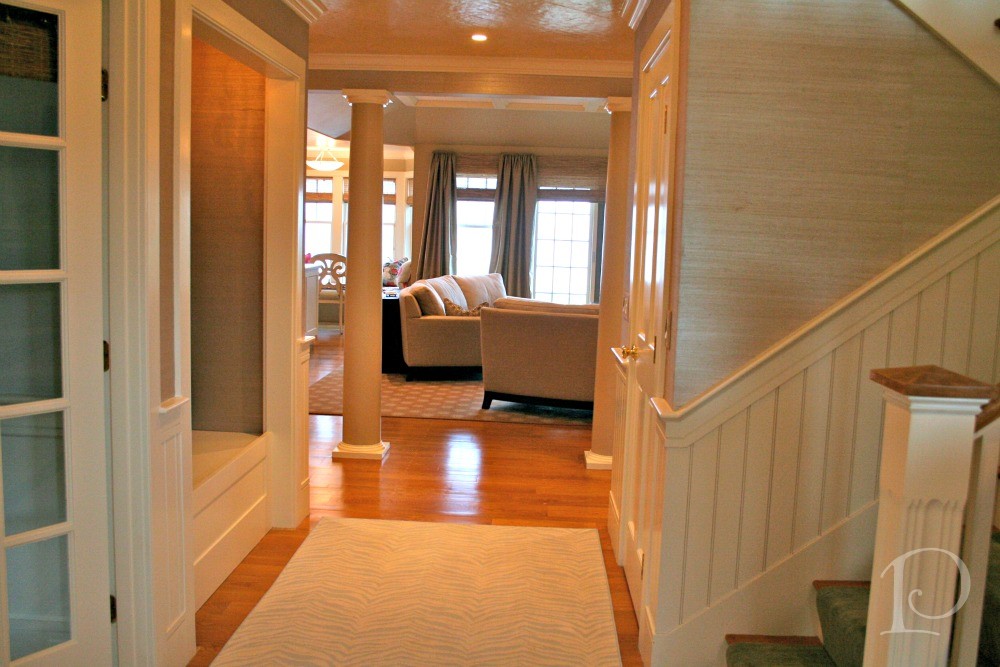
While formulating my design I was guided by two goals: to add drama and significance to this interior space while leading the eye to the view beyond…
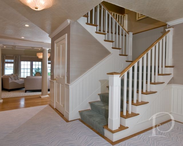
I’d say we succeeded! The ‘After’ features a number of design details that really dial up the impact.
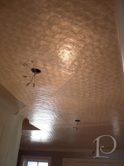
On the ceiling, my incredible installer John installed a Mother of Pearl-esque tile. Positioned on the diagonal, it subtly points you toward the water view as you end the home. I thought that was pretty cool, I really tried to think of everything (and never slept) but I loved every minute!. Whereas the ceiling is not vaulted, we opted for a semi-flush mounted light. The reflective surface of the fixture works in concert with the pearl finish of the ceiling treatment to create a magical glow.
This detail shot of the ceiling installation in progress gives you an even better idea of the sheen of the tiles…
The carpet is a soft ivory and pale blue zebra print. Every home has to have an animal print ~that is my mantra!
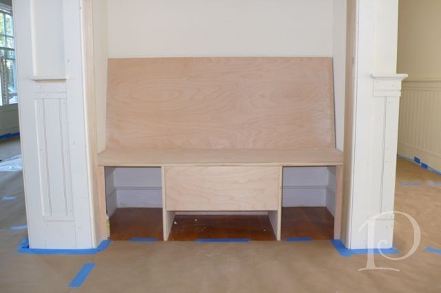
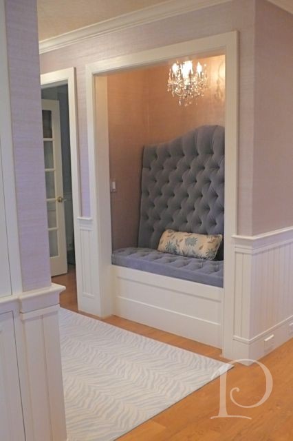
See the alcove on the left in the photo above? Originally, this was a closet with double doors. My interior designer’s eye saw it as a great opportunity to get creative with the space ~ why not take those doors out and create a dramatic, unique nook? Voila~
We came a long way from this….
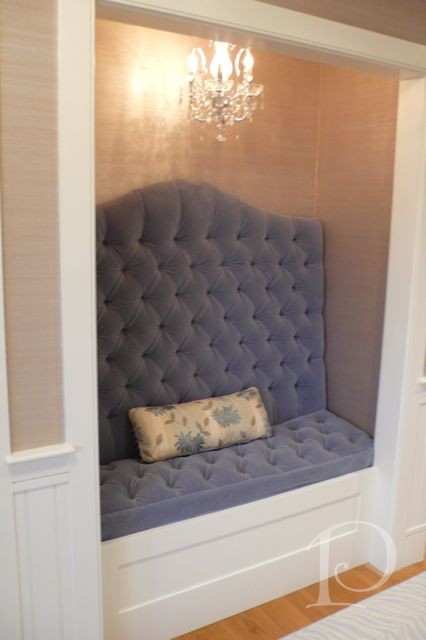
to this…
I love the richness of the tufted fabric, the subtle glam of the wallcovering and of course the sparkle of the petite chandelier. We wanted drama and here it is!
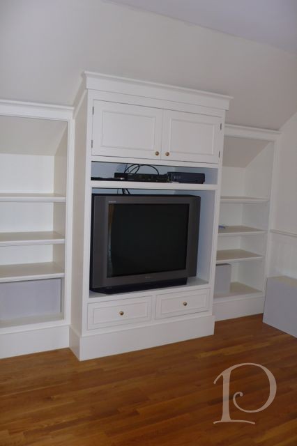
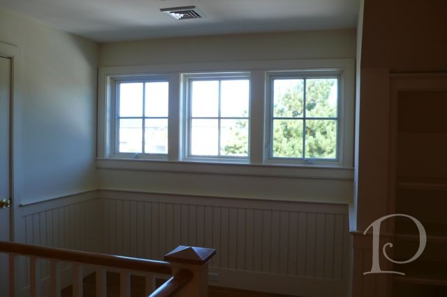
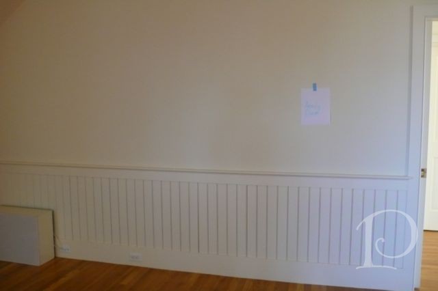
The final space I’m sharing today is the Family Room. Located up the turned staircase on the second floor, this space is easily accessible from the guest bedrooms. The Before photos show that the room is a bit “chopped up” and not a large space compared to other rooms in the home.
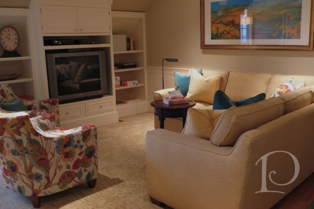
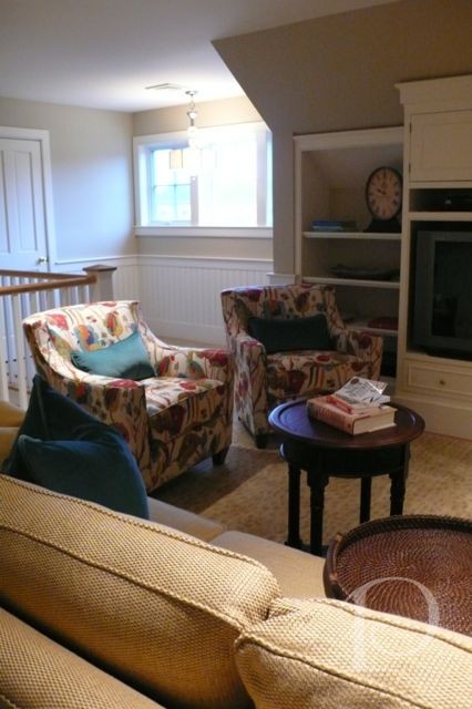
After implementing my design, this space is comfortable, functional and stylish. The built-ins accommodate the television, games and accessories and there is plenty of seating thanks to a sectional sofa and two colorful chairs. You can see that it is a cozy space, my floor plans were essential when I ordered the sectional!
The overall color scheme is calming with the print on the chairs adding just the right amount of punch. The homeowner fell in love with the fabric at the Boston Design Center and just had to have it, she was right! The painting over the sectional is from China and further personalizes the space.
The open niche in the background even has room for a game table and 4 chairs ~ perfect for a Family Room.
Whew! I think I may be making this incredible project look too easy… unfortunately I don’t have any photos of me tearing my hair out but I will double check my digital library for next week ![]()
xo,
Pamela
1





2 Comments
cynthia
On:
pcopeman
· author