Mark Woodman, Color Marketing Group
Jun 04 2013 · Meanderings ·1
At the ASID Fall Business Conference, Mark Woodman, from the Color Marketing Group (CMG) delivered the keynote address. Not only is Mark a dynamic designer, but he is also an outstanding and personable speaker.
The Color Marketing Group is a premier color and design forecasting organization. This non-profit brings designers, stylists, and marketers together to discuss the influences, indicators and directions of color in products and culture.
Here is a brief re-cap of Mark’s color projections for 2013 …
I think most of us remember being introduced to color via Crayola crayons, even Mark Woodman. 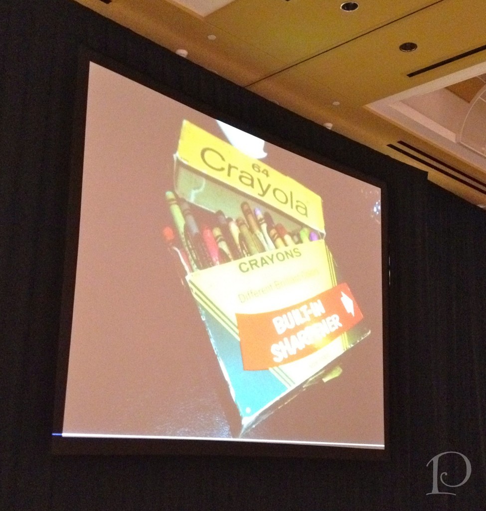 My memory is of the smell of the wax when you opened the top and peeling away the paper on my favorite colors (always in the red category). I usually had the box of eight crayons. However, one Christmas Mrs. Claus brought me a box of 64 with the sharpener just like this picture. That was when I first fell “head over heels” in love with the metallic colors of copper, gold and silvers. I slept with that box under my pillow for years. I loved it with my entire being. I guess I was always destined to work with color. I am so lucky!!!
This is the cover of the book Color in Small Spaces. The design featured on the cover is by Mark Woodman. 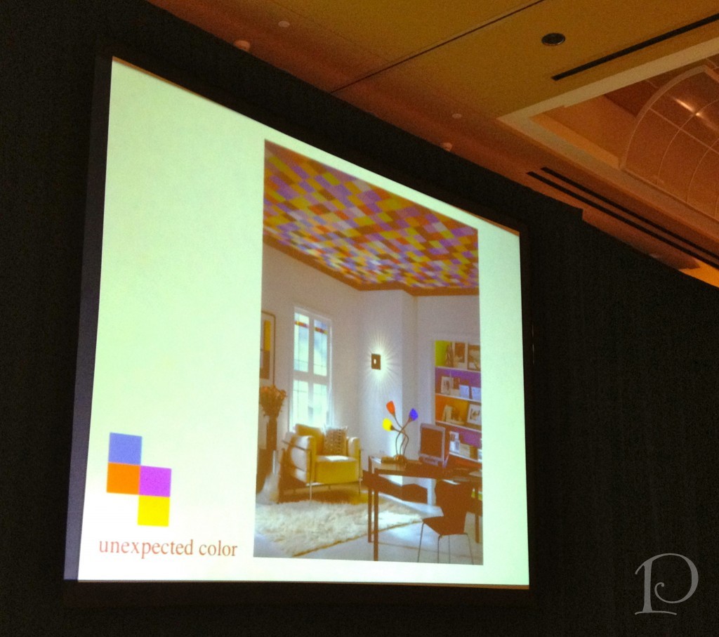
What makes this room jump out is the ceiling of course. Isn’t it just grand? If you cover the ceiling with a piece of paper the room height appears much shorter but with the Rubik’s Cube inspired ceiling, the walls are heightened and the overall look is much jazzier too!
Looking forward, Mark projects that color will be softer, lighter that air, soothing…
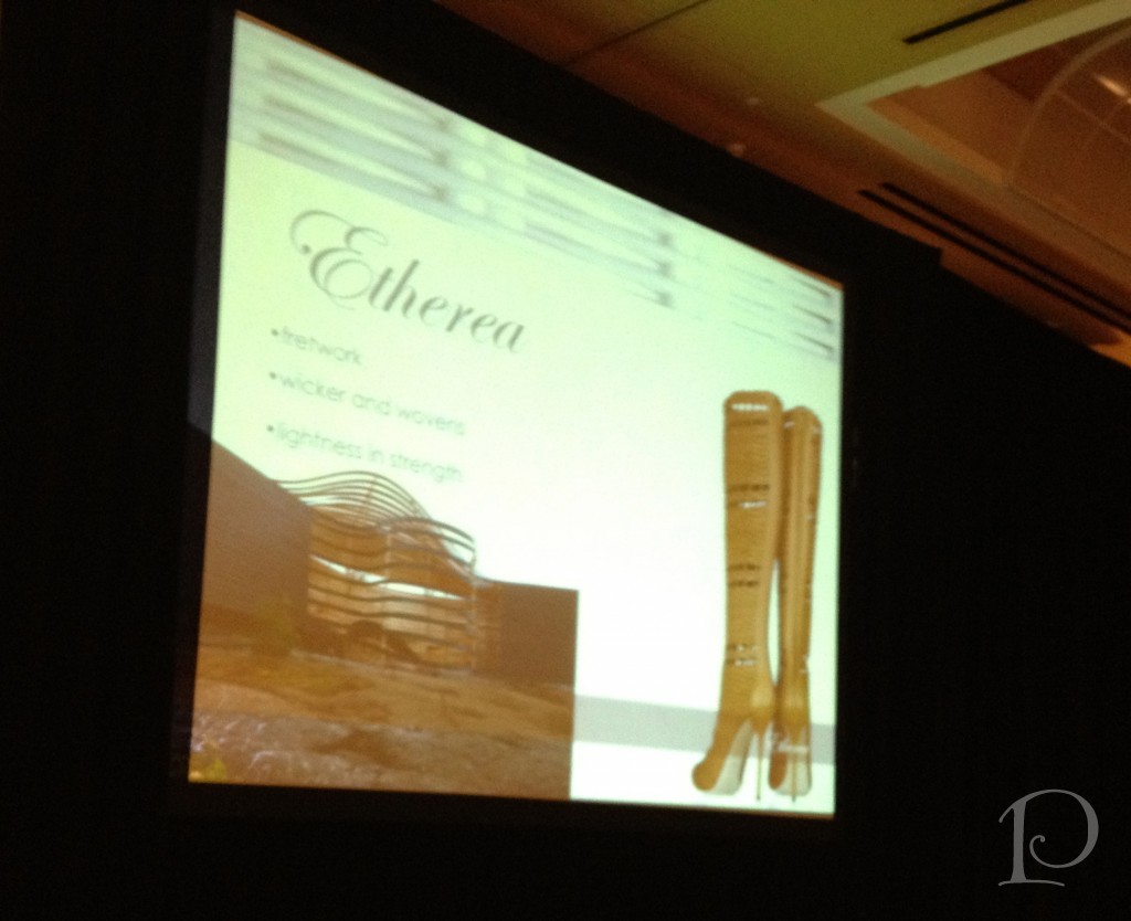 We will see fretwork and wicker in our furnishings and wovens in our fabrics. The finishes will be matte and edges will be rounded with softness. Materials may be frothy, wispy and have a glimmer. The colors will be muted earth tones ~ lots of browns with the appearance of having a sheer overlay of sorts. This is ETHEREA.
The next influence will be a sense of spirituality. Influenced by a rebirth of Spring, we will see fresh garden colors, and floral designs with lots of yellows, blues, violets and greens.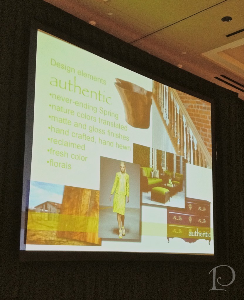
There is a feeling of home grown, home baked, hand crafted, passed down, re-thought, reclaimed, imperfect. This is AUTHENTIC.
This is urban living: the jet set, digital brights, high tech gloss, sports bright, futuristic lines, ombre, gadget inspiration… 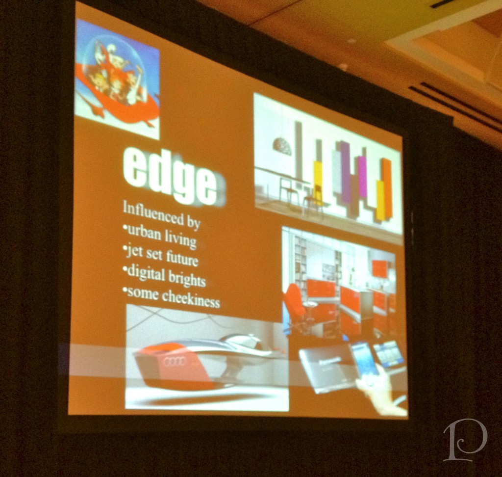 The colors are influenced by “blue tooth”, shiny happy future, superheroes, and Mad Men. These colors are also happy, art pop, shiny urban with metallic gleam blues in every hue with high gloss. This is EDGE.
This is classic design elements, a response to overly modern but definitely not simple.
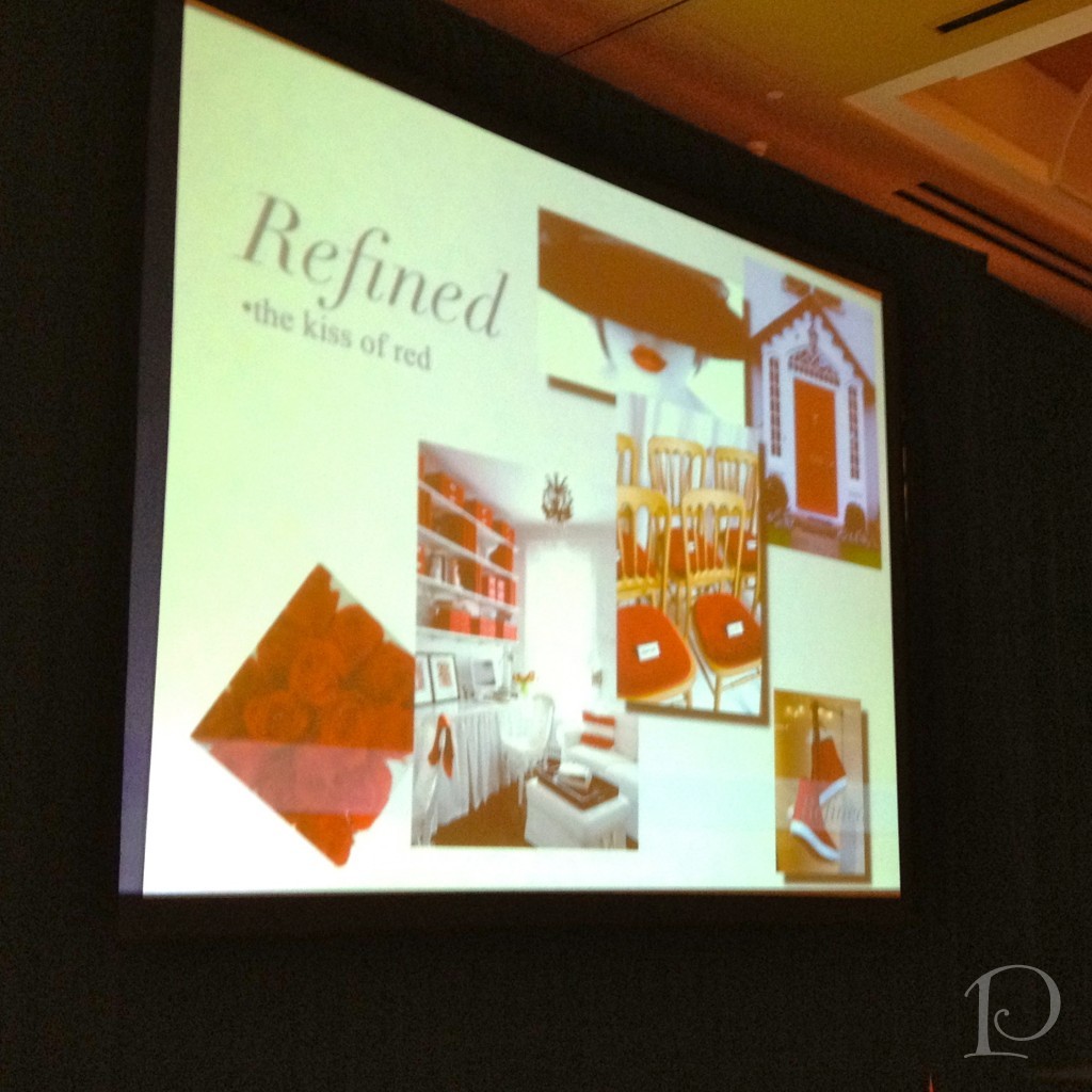 This is the classics revisited: a kiss of red, passion, blood running through our veins for our lifeline. A touch of gold in the warmth of 18k gold, icing embellishment colors in accented neutrals, blonde gold, neutral with a twist, along with rose and reds. This is REFINED.
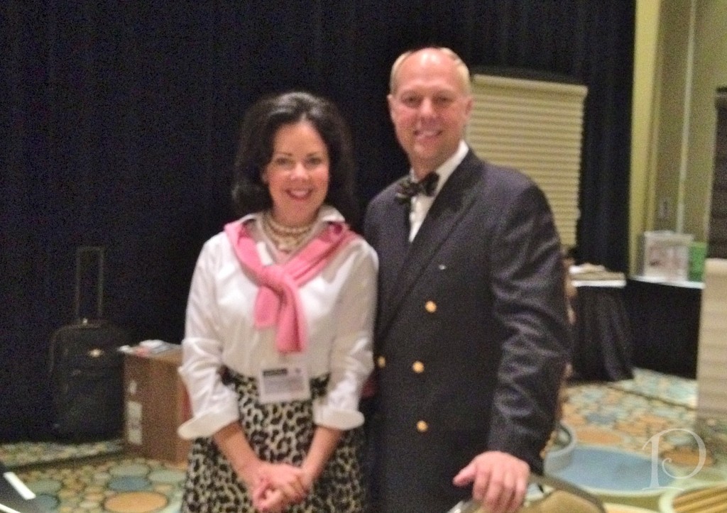
Mark Woodman and me
“There are times to be gentle with color, times to be brave, but never a time to be dull”
~Jane Faulkner
Speaking of color, thank you all SO MUCH for all your support with my Joss & Main Posh Palettes sale! I’ve gotten a lot of positive feedback and during this season of gratitude, I feel very blessed to have such wonderful friends and supporters!
xo,
Pamela
