Diary of an Interior Designer: Cape Cod Seaside Home, The Children’s Suite
May 01 2013 · 0 comments · Behind the Design, My Designs ·0
At nearly every Designer’s Show House I’ve attended, the Children’s Room is always among the favorite spaces. Designing children’s spaces presents the opportunity to incorporate whimsical touches, plenty of color and to think like a child again ~ how grand! The Children’s Suite in the Cape Cod retreat seems to me the perfect place to start our tour…
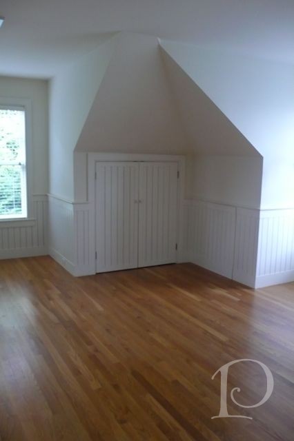
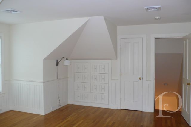
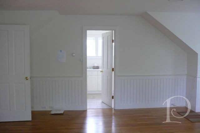
First, a few shots of the space before the re-design. The Children’s Suite is located in the space over the garage so while it is spacious, there are lots of nooks and angled walls…
The Move-In into this space took 3 days and 3 full-to-the-brim trucks (thank you Designer Services). It was snowing, of course, and icy. I love this photo of big, heavy, gentle hands moving with care this teeny tiny chair for the children.
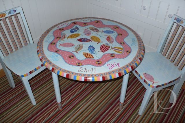
This adorable child sized table and chairs was hand painted by artist and designer Shelley Weiss. Isn’t it extra special and perfect for the waterfront location?
The suite was designed to accommodate the visiting married adult children and their little ones. This space is where the parents would sleep.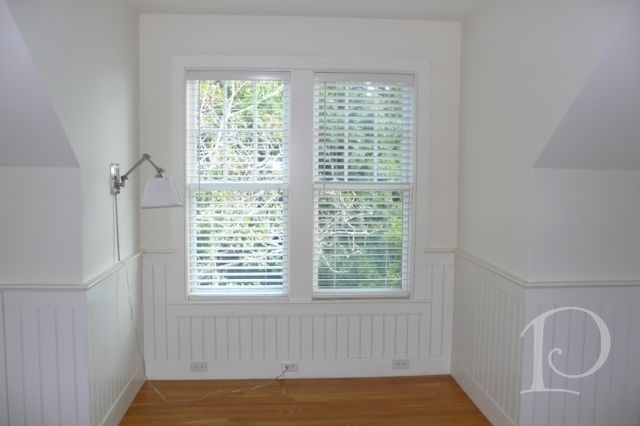
The upholstered headboard is a comfy backdrop for bedtime stories for the children and the swing-arm dimmer reading light is perfect for the late night adult reader.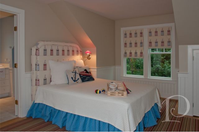
This little cubby by the windows is a welcoming spot for the wee visitor. 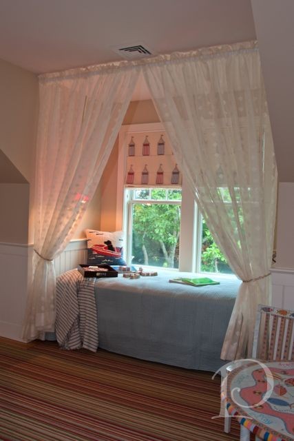
A twin bed fits just right in the alcove.
This cozy nook offers a comfortable spot for a nap as well a peek out the window at an ocean view…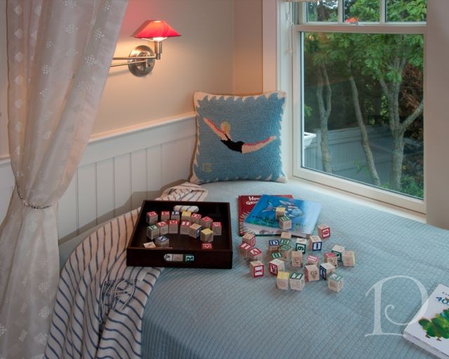
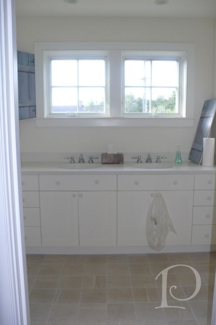
The bathroom before was quite plain and lacking personality:
Not for long…
This shell mirror is in perfect keeping with the Seaside theme.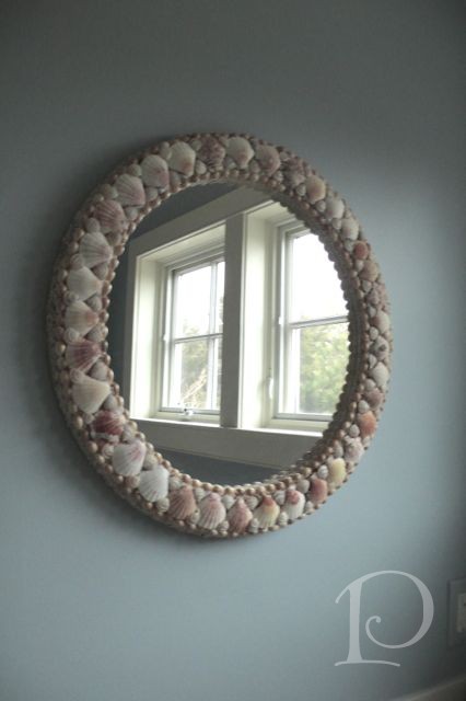
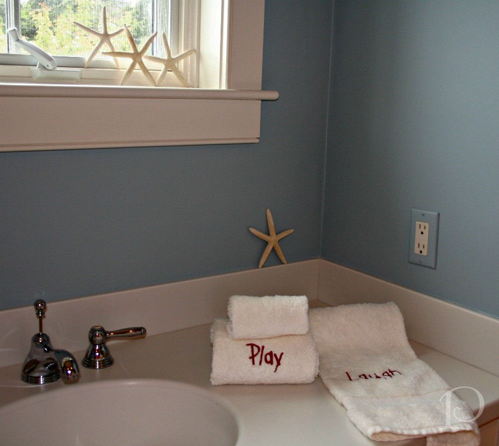
My organizing expert Tina Ghiz and I had so much fun selecting the towel monograms, can you tell? 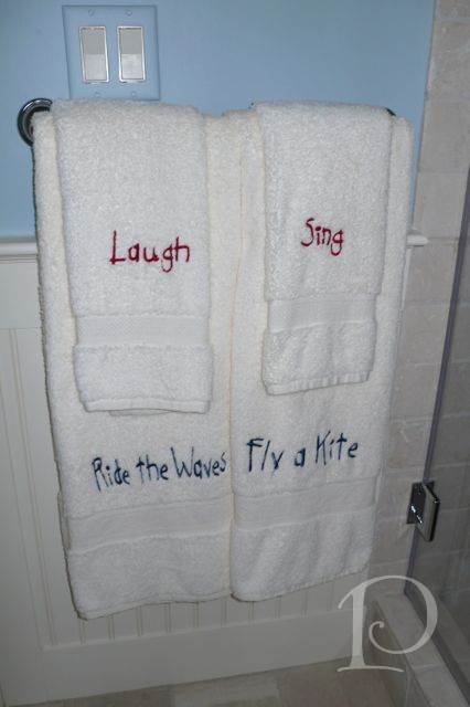
This wasn’t as easy as you would think. Keep in mind we did this for five bathrooms with different themes and colors. Naturally I insisted that we be creative with the color and font for each space, additionally, the phrases and words had to match the size of the towels! 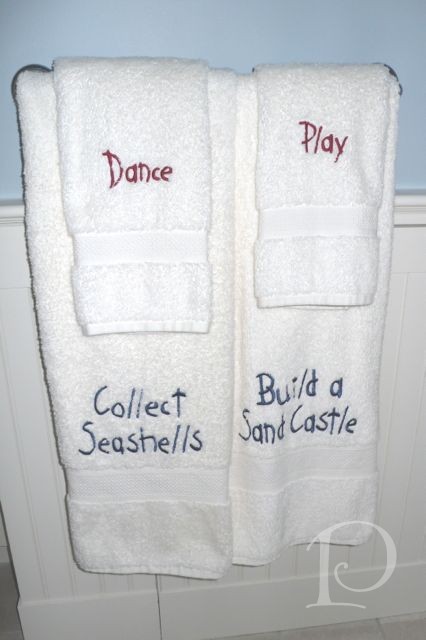
We definitely needed a glass of wine after five hours of that brainstorming session. It was totally worth it though, the custom monograms add such a unique and memorable charm to the space.
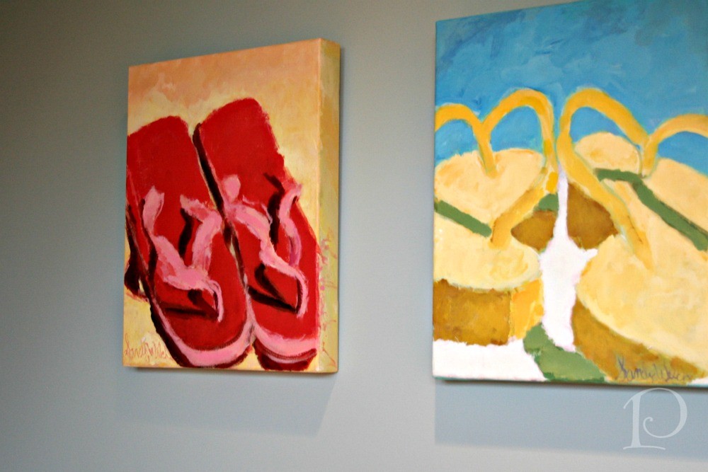
Finally, I can hardly design a space without original art ~ these colorful flip-flop paintings are by my dear friend, artist Sandy Welch. The perfect finishing touch!
I hope you’re enjoying this series! Next week I’ll be continuing my Diary of a Designer series with tours of more bedrooms and one of the living spaces in this beautiful home. Stay tuned…
xo,
Pamela
0
