Historic Hingham Home: Family Room Update
Sep 14 2016 · 5 comments · My Designs ·2
Today I am excited to share with you a recent project I completed for a wonderful family. The home is an Antique Colonial, in the heart of historic downtown Hingham. The home was extensively renovated in 2004 so all of the amenities and framework for a functional family space were in place. However my client wanted the interior design of the home to be more polished, cohesive, and functional for their young and active family. I actually was referred to this client by Winston Flowers in downtown Hingham and it turned out to be a great match!
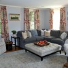
The first space I’m featuring is the Family Room. The Family Room is open to the kitchen but needed to have its own identity. The family of four had to fit comfortably for watching television, playing games, and relaxing. Another must was that all the fabrics were easy care, stain resistant, and family friendly. Although I can’t find a ‘before’ photo of the room (grrrr….), I do have this photo of one of my initial presentation boards that I shared with my client.
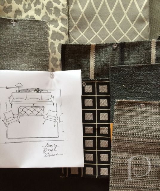
This client is very decisive ~ a dream for a designer! Her style and personality are multi-dimensional, she is athletic with a tailored aesthetic and is a true sweetheart. After viewing the rather neutral board pictured above, we determined that the space could handle a punch of color. So while the basic floor plan I suggested did make it to the final design, as you can see we switched up the color palette…
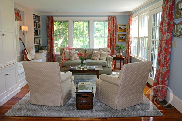
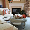
We paired neutrals (beiges & grays) with blues and corals for a winning combination. The pop of color and pattern adds interest to the room but doesn’t overshadow the beautiful woodwork and built-ins.
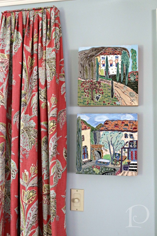
For the window wall with the French door, we chose this Kravet linen with a paisley print. The drapery is mounted on a stationary board with a self-piping detail at the top. The artwork is from my client’s collection and adds more color and life to the Family Room.
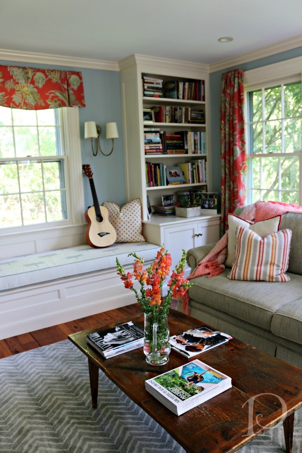
This view shows more of the built-ins including an oversized window seat illuminated by a sconce from Chimera.
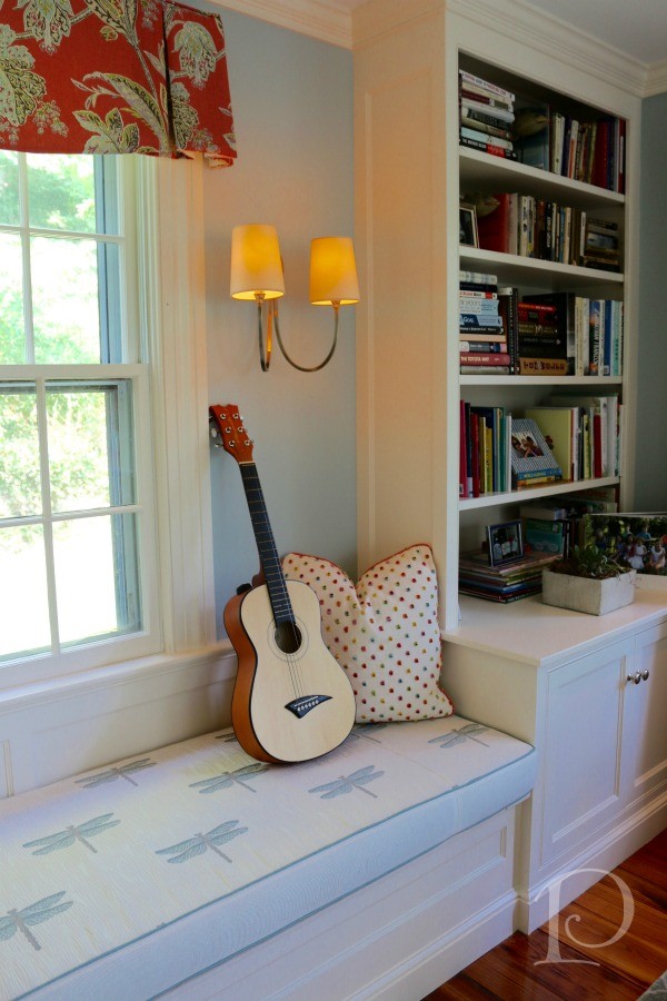
On this window we used the same coral paisley fabric but this time as a tailored valance with an inverted pleat. Not all window treatments in a space need to be identical! The thick foam we used on the seat is covered in a stain resistant Kravet dragonfly fabric (practical) and is cut to slightly hang over the edge of the seat for comfort when sitting.
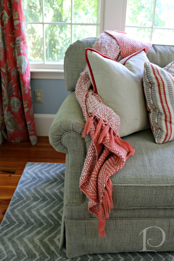
The sofa (from Kravet, of course) combined with the two swivel chairs (also Kravet) give plenty of seating without overpowering the room. Previously the room housed a sectional sofa that was too big for the space.
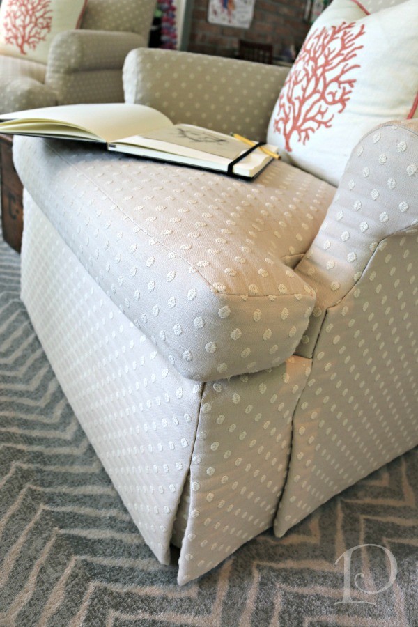
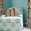
The box pleats of the swivel chairs lend a formal, tailored look that combines wonderfully with the playful dot fabric and exquisite zebra-reminiscent carpet from Colony Rug. The swivel chairs allow one to turn and face either the lovely garden view or the television (housed inside a built in cabinet).
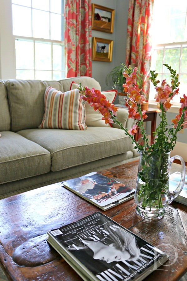
Overall I am thrilled with how the space came together ~ and most importantly my client and her family love it as well!
Stay tuned for more spaces from this home in the coming weeks. In the meantime, I invite you to follow me on Instagram for updates between blog posts: my Interior Design account: @pamela_copeman_design and my art account: @pamelacopemanart (where I’m currently doing the 30 Paintings in 30 Days Challenge!!). Do you have a space in your home you’d like to refresh? I’d love to work with you! Contact me to set up a consultation.
xo,
Pamela
all photos by Jen Bowles for Pamela Copeman Design Group
2

5 Comments
Emily Sullivan
On:
Pamela Copeman
On:
pcopeman
· author
GinnyBallou
On:
Pamela Copeman
On: