Junior League Show House 2016: The Nathaniel Allen House
Jun 16 2016 · 4 comments · Design Events ·0
This Spring the Junior League of Boston celebrated the 45th Anniversary Show House in at the Nathaniel Allen House in Newton.
Years ago I participated in the Arlington Show House in Boston and created the “Make Way for Ducklings Nursery”. Participating in a show house project is a perfect way for seasoned and new designers to gain attention and recognition for their designs. Each show house is an event and typically there are several parties, media days, and press as well as opportunities to mix and mingle with fellow designers and landscape artists.
I have attended the last couple of Show Houses as a guest and went again this year with my dear friend Paul..and we both agreed, things have changed.
This is the house as I entered…
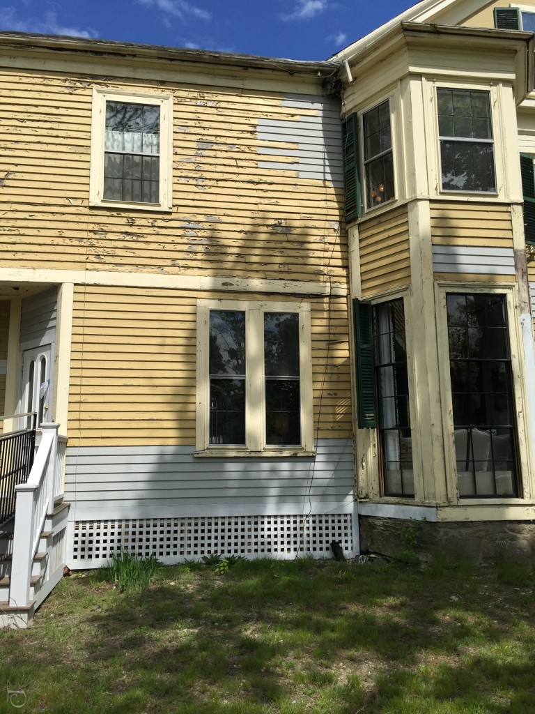
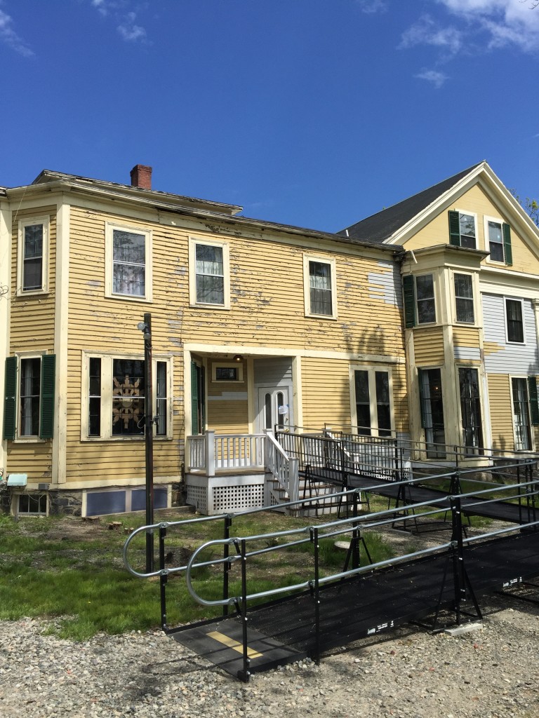 Could this really be the Show House?? Is it safe to go in?
The entrance to the ticket area was actually to the side of the house in a barn-like room which featured works of a handful of artisans for sale. Much different from the typical Show House boutique set-ups that I’ve seen.
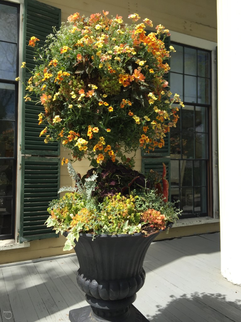
The front entrance did have this beautiful urn filled with fleurs that complimented the exterior color.
Once I entered the Foyer I saw that there were some treasures behind the peeling paint exterior.
Gerald Pomeroy of Gerald Pomeroy Interiors is one of my favorite Boston designers. His design aesthetic is traditional with exquisite wall coverings and layers of detail.
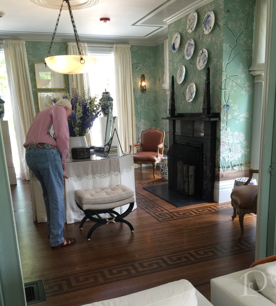
He also has the ability to add modern pieces that blend well with classic design.
.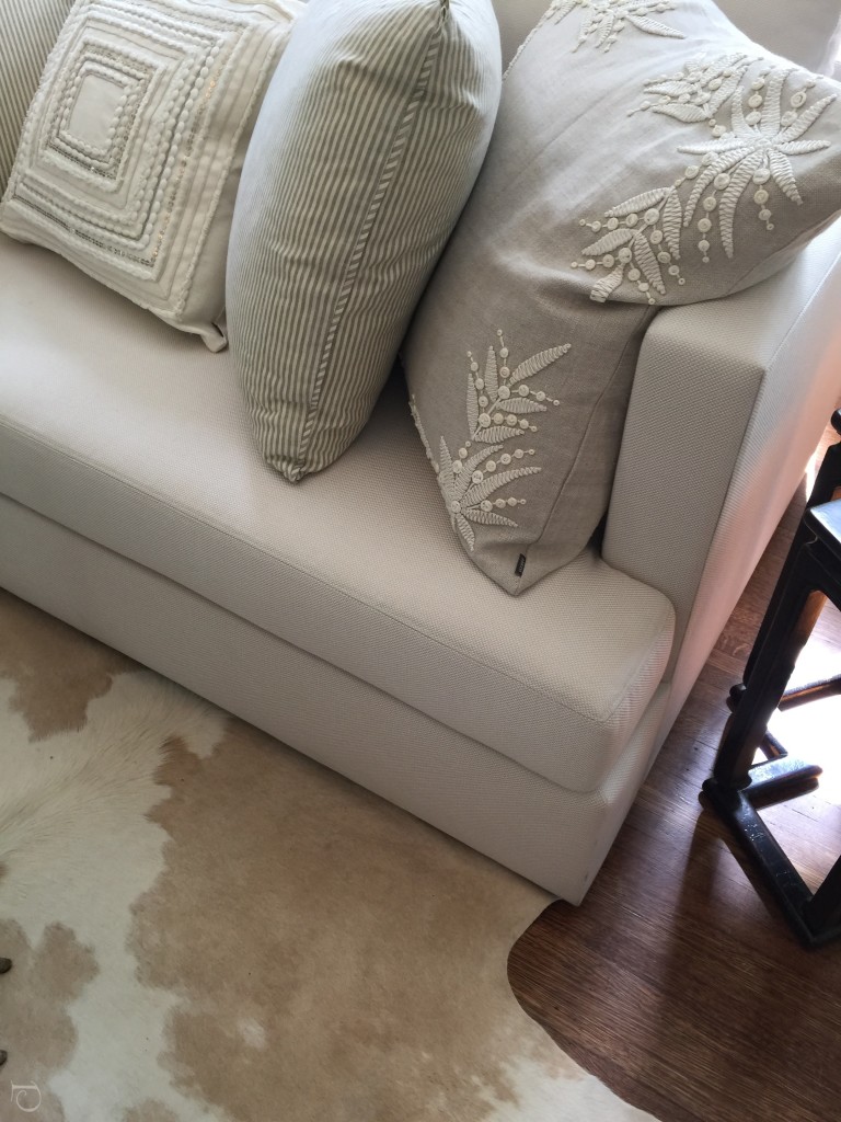
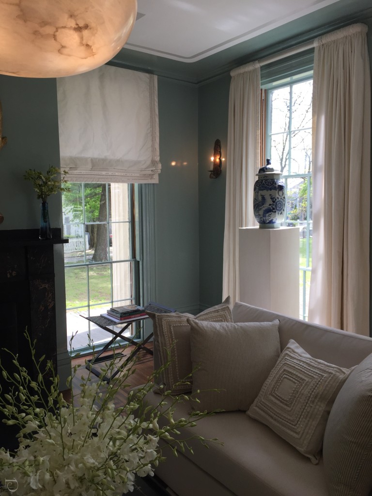
I adore the pillow detail and animal carpet ~ what a perfect compliment to the de Gournay Chinoiserie wallpaper.
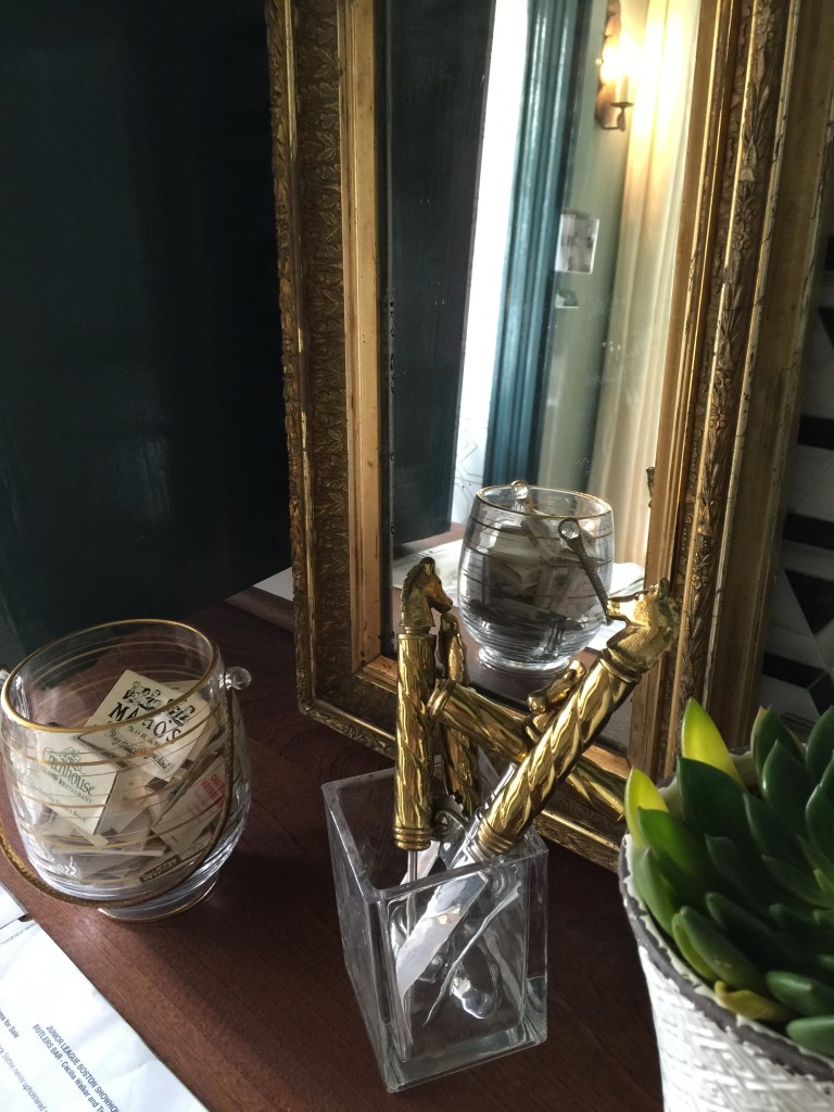
My friend Cecilia Walker designed The Bar and it was stunning!
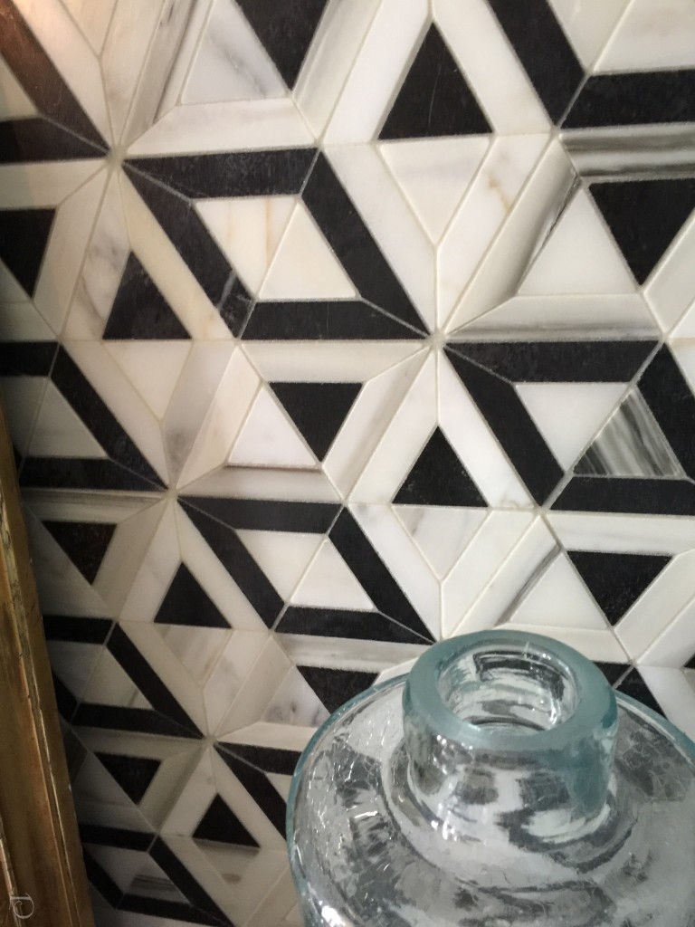
What a perfect place for a very busy geometric tile…it was eye-catching and a perfect background for bar essentials.
I feel the success of a project is in the details…
At the opposite end of the room, this loveseat is the perfect spot to share a cosmo and a secret. Note the handsome carpet by Colony Rug.
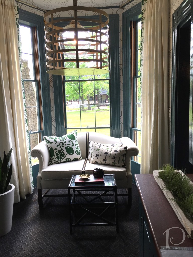
The piéce de resistance is the zipper on the center of the loveseat. 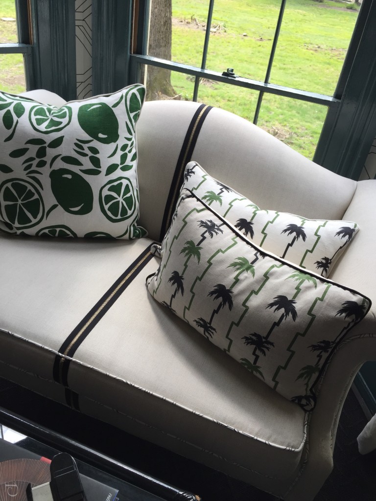 Cecilia Walker is a walking fashion magazine and I wonder if this was inspired by the popular visible back zippers in haute couture?…
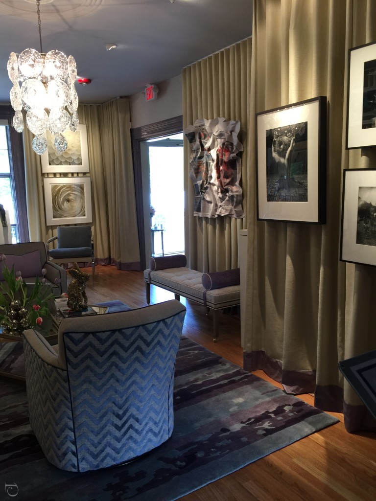
The Art Salon offered a variety of tastes in art and the walls were created with rippled fabric. This was the perfect solution to a hide both imperfections in the wall and dangling wires.
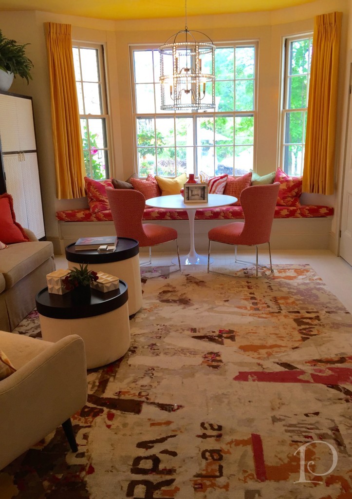
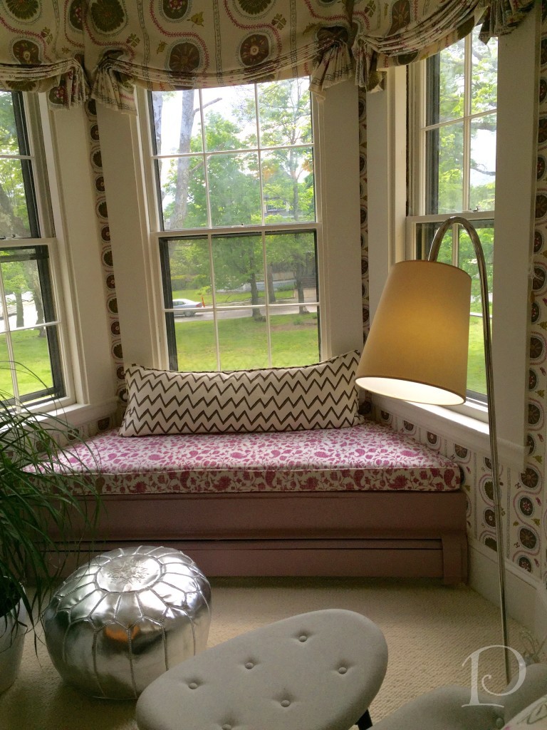
Next area of interest was the Morning Room by designer Kate McKusker of Theodore & Company. The pop of color that really stole my heart. There were many rooms that featured window seats and this one had a Spring view. Love the carpet with its contemporary feel.
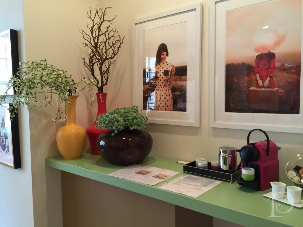
The Coffee Bar was filled with coffee and unusual art work as well.
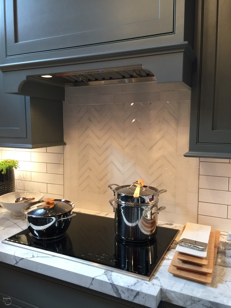
Vani Sayeed of Vani Sayeed Studios created an incredible kitchen with a 2 story wall complete with windows.
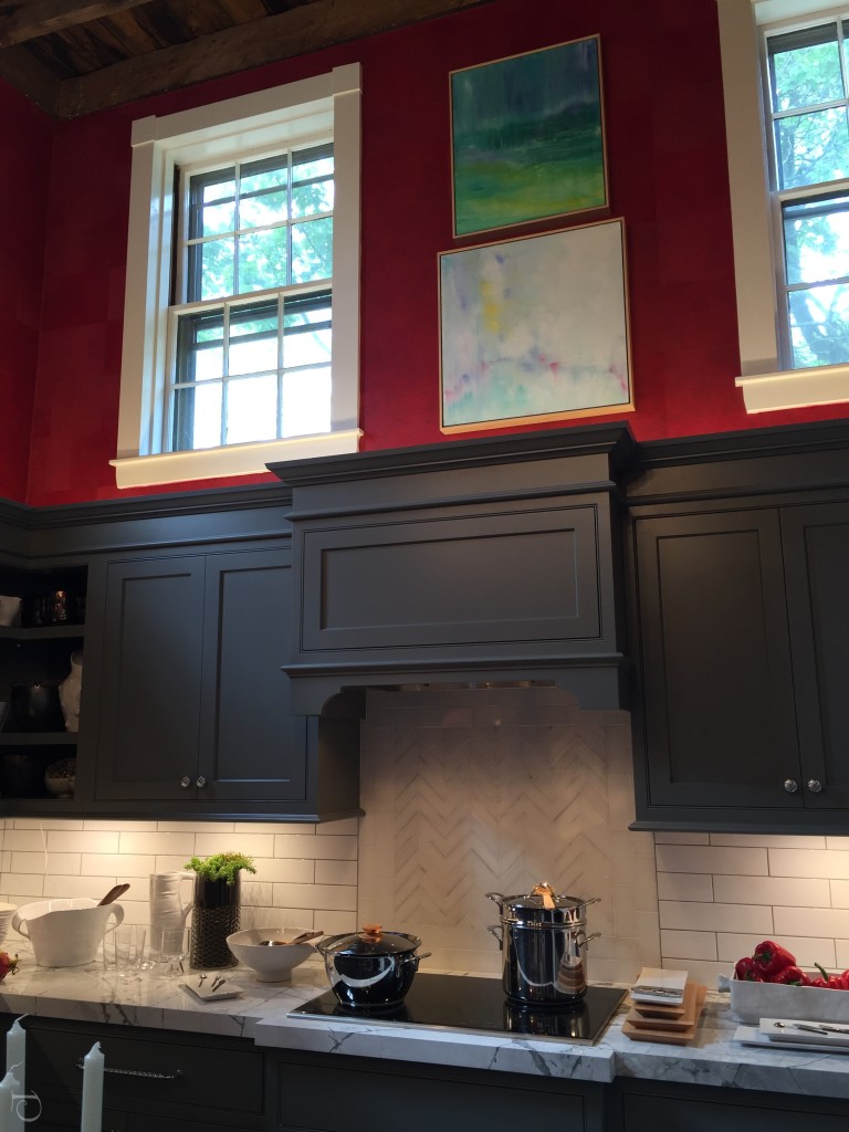
Vani’s use of color was what I loved the most about this space. This wallcovering by Donghia was a textured pure red (with blue undertones). The charcoal grey cabinets were the perfect compliment to the red walls.
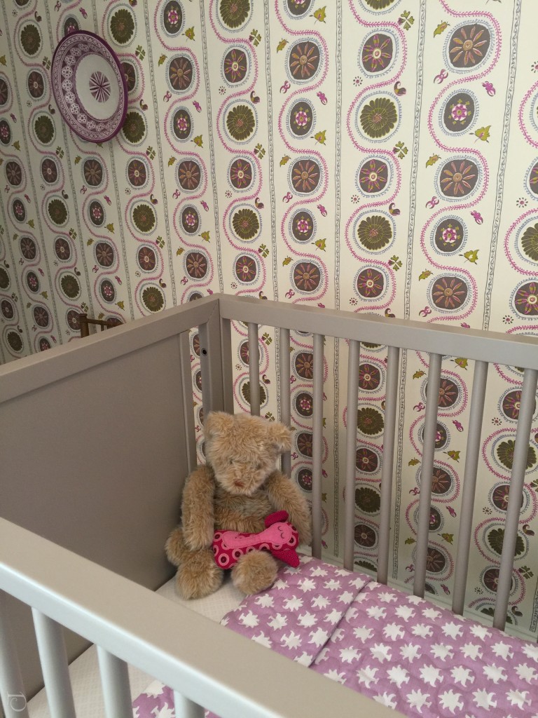
Every Show House has a Nursery. This year’s nursery was dreamed up by Mally Skok Design, an interior designer who also designs textiles and wall coverings. I loved her choice of textiles and colors and found this nursery to be a bit more understated and sophisticated than one might typically see.
Another stunning window seat~
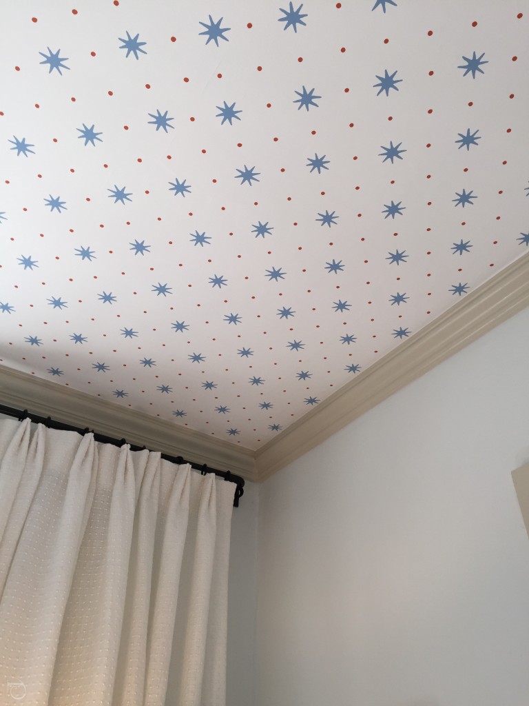
I noticed that ceilings were of big interest in this Show House. I love how Sarah Scales used this star motif…
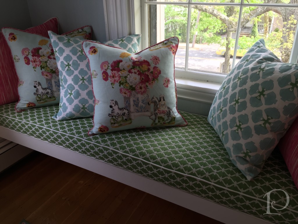
Elizabeth Benedict’s “Chinoiserie Chic” bedroom was filled with color as seen here in her window seat and collection of patterned pillows
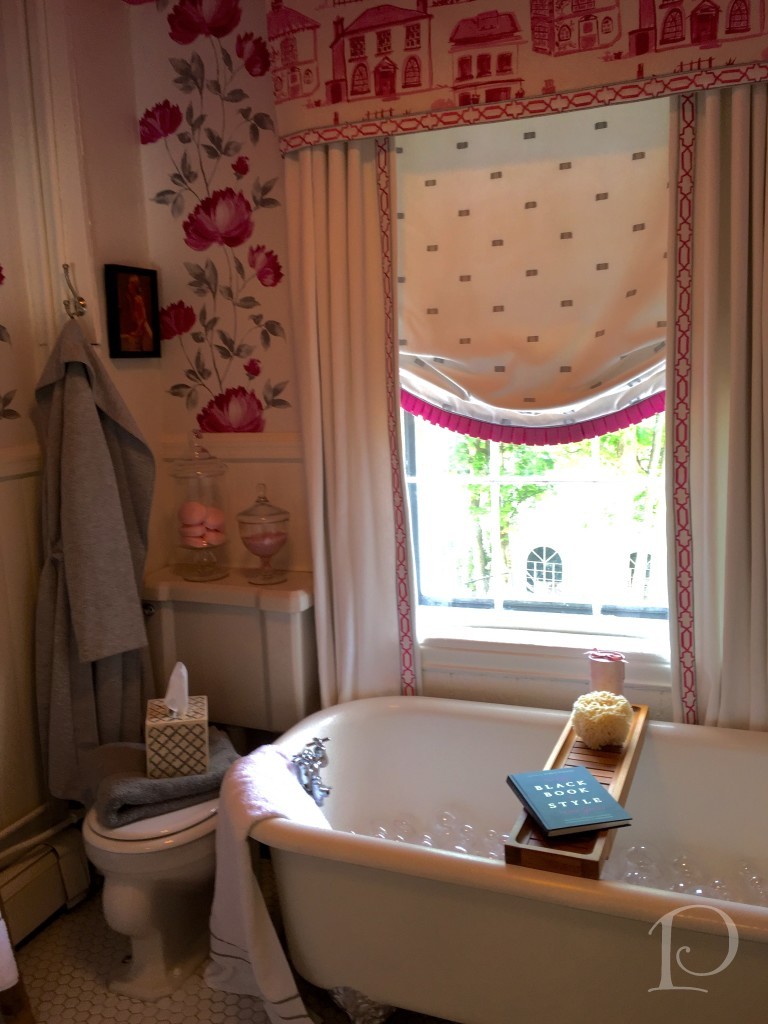
The Petite Retreat (Bathroom) had a very French feel and was very inviting. Nancy Seibel of LZM DeZigns designed this area complete with a painting by artist Jeanne MacFarland (on loan from La Petite Maison in Hingham) and beautiful window details.
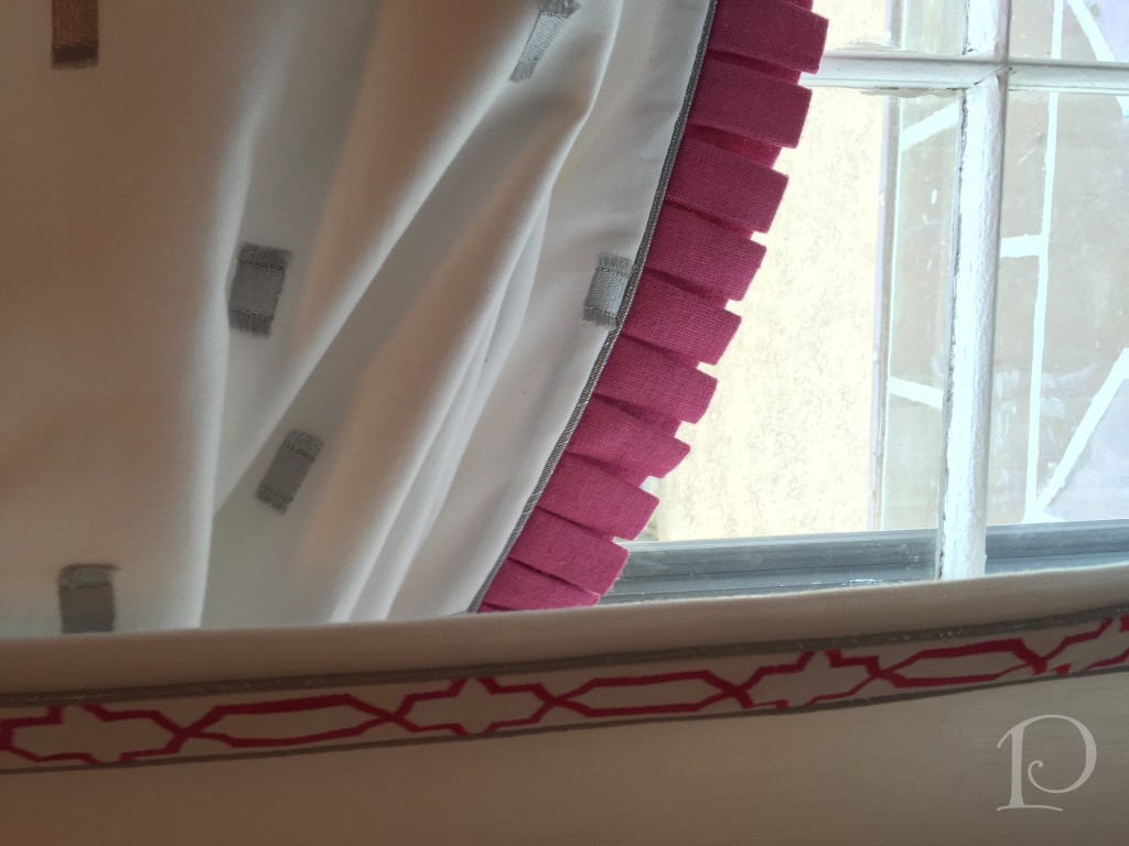
The Study by Holly Joe Interiors featured a great use of my favorite green palette, what do you think?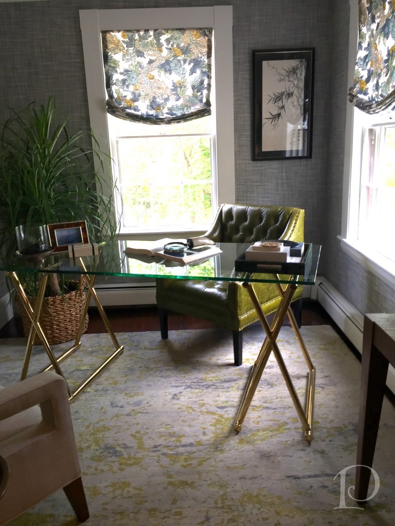
In my opinion, the most creative use of space in the entire house was The Little Kitchen That Could ~ great name too! A lot of thought went into the tiny kitchen and the attention to detail was perfect.
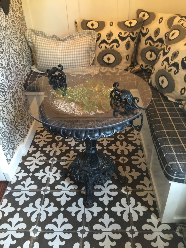
The table is a wrought iron urn with a round glass top.
The pantry area highlight was a hammered wall covering with nail heads. Very original and perfect in this space.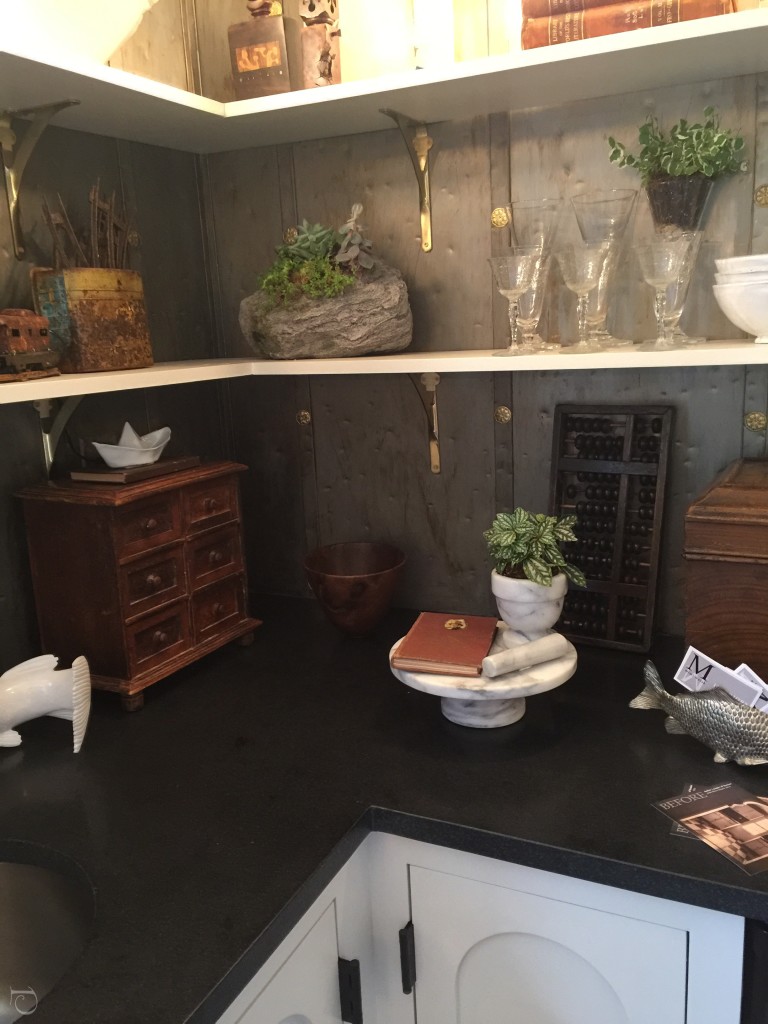
I am in love with the pendant fixture!
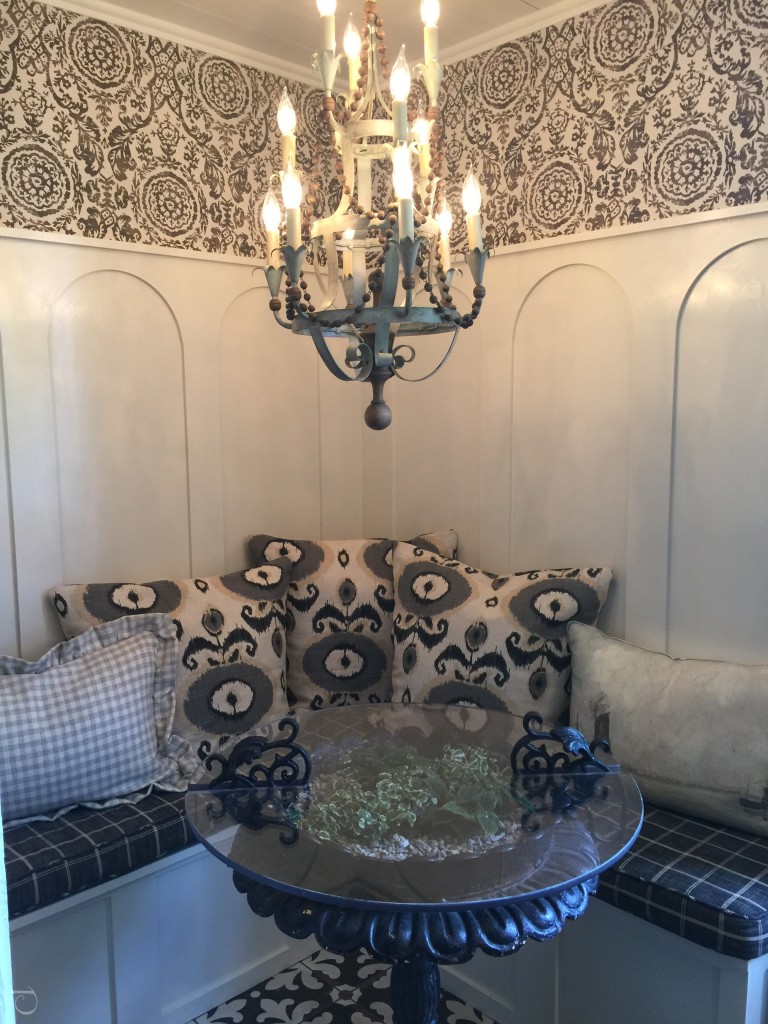
My favorite room in the house, excellent job designer Mimi Walsh!
Congratulations to all of the participating designers!
xo,
Pamela
0




4 Comments
Paula Villanova
On:
pcopeman
· author
Cecilia Walker
On:
pcopeman
· author