Pamela's Posh Picks: Color of the Year, Tangerine
Feb 06 2012 · 1 comment · Posh Picks ·0
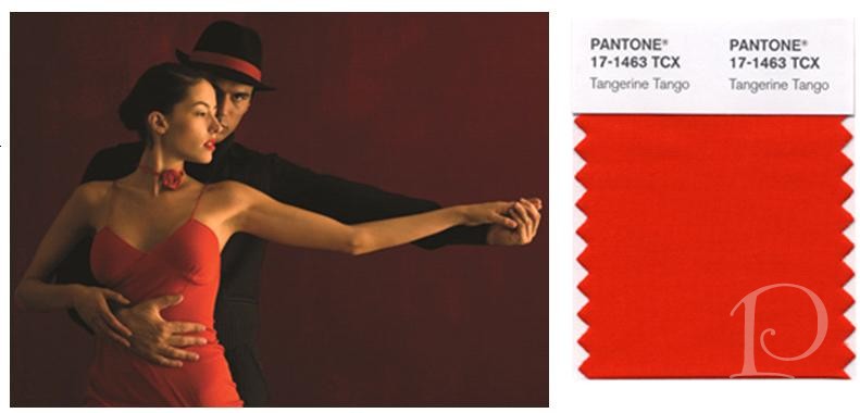
Pantone Color Institute, known for its trendsetting color predictions, recently announced its 2012 Color of the Year: TANGERINE TANGO
What a glorious color it is! According to Pantone, “Tangerine Tango is a spirited reddish orange, it provides the energy boost we need to recharge and move forward…”
During a recent visit to the Sherwin Williams studio at the Boston Design Center I selected some outstanding tangerine-hued paint colors from this warm palette. I just know one of these would look great in your next project. Take a peek and let me know your favorites~
Oh how I love the boldness of this color! Not shy or retiring, Daring makes a perfect accent paint. I can envision it for a piece of furniture, the edges of a frame or a fab pop of color inside a bookcase.
Mandarin has undertones of yellow which makes it a bit more of a safe choice. It’s a great choice for a wall or a floor in a solarium or even a ceiling. Such a fun color, use your imagination!
This is a true tangerine to my eye: bright, vibrant and warm. Navel would be perfect for a pair of Adirondack chairs on the lawn.
In real life this is a reddish-orange and oh so lovely. Quite truthfully I would be tempted to use it just based on its name: Daredevil. I dare you to use this in a dreary pantry or closet. Just think how it would brighten your day and energize your spirit!
With all this thinking about the color of Tangerine I feel the need to go have a nice big bite of one …..
xo,
Pamela
Contact me about Pamela Copeman Design Group services, including help with selecting your perfect palette of paint colors.
To follow me on Pinterest, click here.
To follow Pamela Copeman Design Group on Facebook, click here.
0


1 Comment
Posh Palettes Inspiration Board: Spring « Pamela Copeman Design Group
On: